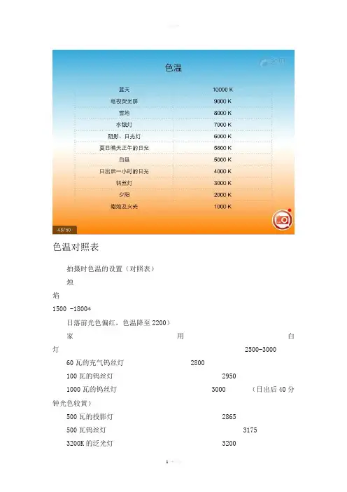
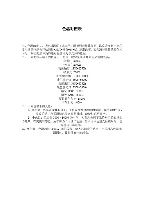
色温对照表
- 格式:pdf
- 大小:154.22 KB
- 文档页数:5
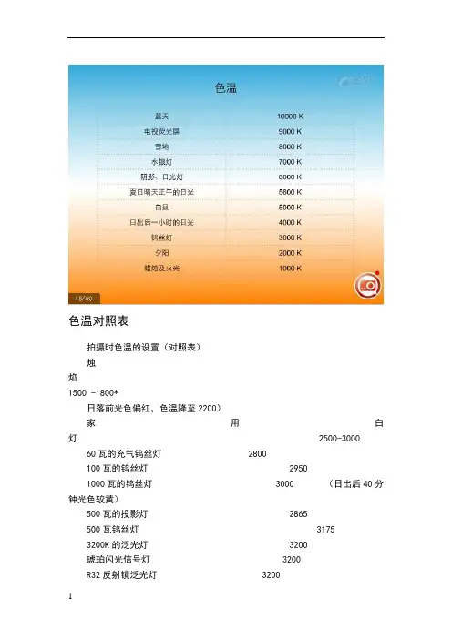
色温对照表色温对照表拍摄时色温的设置(对照表)拍摄时色温的设置(对照表)烛焰1500 -1800*日落前光色偏红,色温降至2200)家用白灯 2500-300060瓦的充气钨丝灯 2800100瓦的钨丝灯 29501000瓦的钨丝灯 3000 (日出后40分钟光色较黄)500瓦的投影灯 2865500瓦钨丝灯 31753200K的泛光灯 3200琥珀闪光信号灯 3200R32反射镜泛光灯 3200锆制的浓弧光灯 3200反射镜泛光灯 3400暖色的白荧光灯 3500清晰闪光灯信号 3800冷色的白荧光灯 4500白昼的泛光灯 4800(下午阳光雪白上升4800~5800)白焰碳弧灯 5000 (阳光直射下)M2B闪光信号灯 5100晴天 5200*正午的日光 5400高强度的太阳弧光灯 5550夏季的直射太阳光 5800早上10点到下午3点的直射太阳光6000*(摄影拍片黄金时间)蓝闪光信号灯 6000白昼的荧光灯 6500(阴天下6500~9000)正午晴空的太阳光 6500*(阴天正午时分约6500)阴天的光线 6800-7000 *高速电子闪光管 7000来自灰蒙天空的光线 7500-8400来自晴空蓝天的光线 10000-20000*在水域上空的晴朗蓝天 20000-27000*注:光源~以K (开尔文)为单位(K数为高越偏蓝调)色温(Color Temperature),单位:开尔文[Kelvin] 定义:•当光源所发出的颜色与“黑体”在某一温度下辐射的颜色相同时,“黑体”的温度就称为该光源的色温。
“黑体”的温度越高,光谱中蓝色的成份则越多,而红色的成份则越少。
色温是衡量一种光源“有多么热”或者“有多么冷”的指标,也是表示一种光源“白得程度”、“黄得程度”或者“蓝得程度”的指标。
•暖色<3300K;中间色3300至5000K;冷色>5000K。
如:海洋、无云的天空、雪地阴影、晴天里的阴影、室内、雨天、阴天(色温在9000-20000K)拍摄时色温的设置(对照表)烛焰 1500 -1800*(日落前光色偏红,色温降至2200)家用白灯 2500-300060瓦的充气钨丝灯 28001000瓦的钨丝灯 3000 (日出后40分钟光色较黄)500瓦的投影灯 2865500瓦钨丝灯 31753200K的泛光灯 3200琥珀闪光信号灯 3200R32反射镜泛光灯 3200锆制的浓弧光灯 3200反射镜泛光灯 3400暖色的白荧光灯 3500清晰闪光灯信号 3800冷色的白荧光灯 4500白昼的泛光灯 4800(下午阳光雪白上升4800~5800)白焰碳弧灯 5000 (阳光直射下)彩色胶片还可以分为日光型和灯光型两大类。
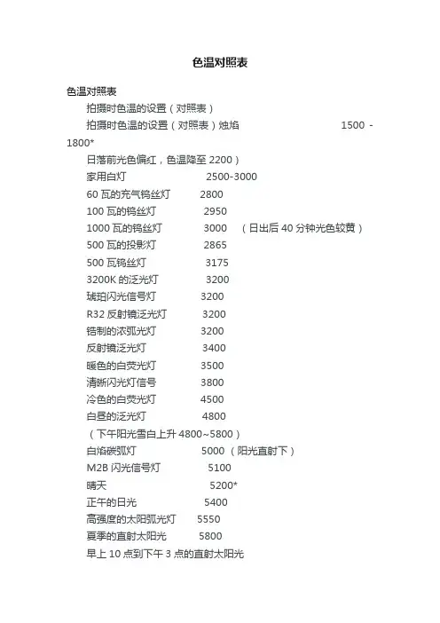
色温对照表拍摄时色温的设置(对照表)烛焰1500 -1800*日落前光色偏红,色温降至2200)家用白灯 2500-3000 60瓦的充气钨丝灯 2800100瓦的钨丝灯 29501000瓦的钨丝灯 3000(日出后40分钟光色较黄)500瓦的投影灯 2865500瓦钨丝灯 31753200K的泛光灯 3200琥珀闪光信号灯 3200R32反射镜泛光灯 3200锆制的浓弧光灯 3200反射镜泛光灯 3400暖色的白荧光灯 3500清晰闪光灯信号 3800冷色的白荧光灯 4500白昼的泛光灯 4800(下午阳光雪白上升4800~5800)白焰碳弧灯 5000 (阳光直射下)M2B闪光信号灯 5100晴天5200*正午的日光 5400高强度的太阳弧光灯 5550夏季的直射太阳光 5800早上10点到下午3点的直射太阳光6000*(摄影拍片黄金时间)蓝闪光信号灯 6000白昼的荧光灯6500(阴天下6500~9000)正午晴空的太阳光 6500*(阴天正午时分约6500)阴天的光线 6800-7000 * 高速电子闪光管 7000来自灰蒙天空的光线 7500-8400来自晴空蓝天的光线 10000-20000*在水域上空的晴朗蓝天 20000-27000*注:光源以 K (开尔文)为单位,(K数为高越偏蓝调)色温(Color Temperature),单位:开尔文[Kelvin]定义:当光源所发出的颜色与“黑体”在某一温度下辐射的颜色相同时,“黑体”的温度就称为该光源的色温。
“黑体”的温度越高,光谱中蓝色的成份则越多,而红色的成份则越少。
色温是衡量一种光源“有多么热”或者“有多么冷”的指标,也是表示一种光源“白得程度”、“黄得程度”或者“蓝得程度”的指标。
暖色<3300K;中间色3300至5000K;冷色>5000K。
如:海洋、无云的天空、雪地阴影、晴天里的阴影、室内、雨天、阴天(色温在9000-20000K)拍摄时色温的设置(对照表)烛焰1500-1800*(日落前光色偏红,色温降至2200)家用白灯2500-3000 60瓦的充气钨丝灯2800100瓦的钨丝灯29501000瓦的钨丝灯3000(日出后40分钟光色较黄)500瓦的投影灯2865500瓦钨丝灯31753200K的泛光灯3200琥珀闪光信号灯3200R32反射镜泛光灯3200锆制的浓弧光灯3200反射镜泛光灯3400暖色的白荧光灯3500清晰闪光灯信号3800冷色的白荧光灯4500白昼的泛光灯4800(下午阳光雪白上升4800~5800)白焰碳弧灯5000(阳光直射下)M2B闪光信号灯5100彩色胶片还可以分为日光型和灯光型两大类。
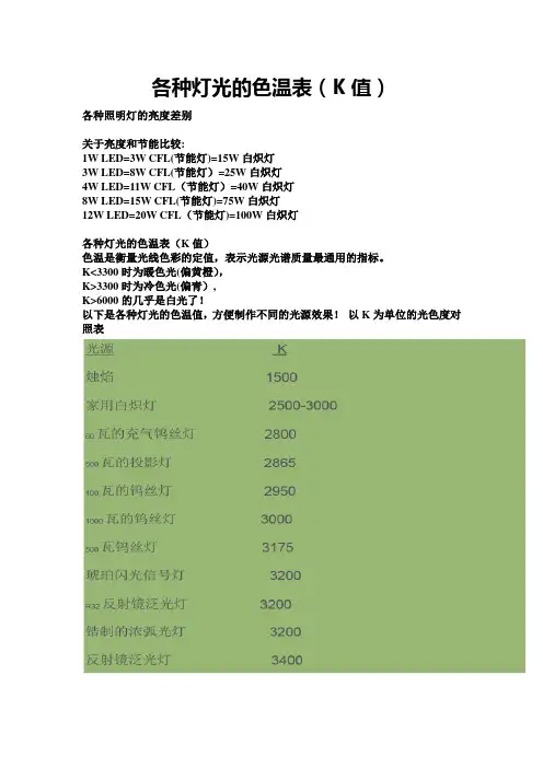
各种灯光的色温表(K值)各种照明灯的亮度差别关于亮度和节能比较:1W LED=3W CFL(节能灯)=15W白炽灯3W LED=8W CFL(节能灯)=25W白炽灯4W LED=11W CFL(节能灯)=40W白炽灯8W LED=15W CFL(节能灯)=75W白炽灯12W LED=20W CFL(节能灯)=100W白炽灯各种灯光的色温表(K值)色温是衡量光线色彩的定值,表示光源光谱质量最通用的指标。
K<3300时为暖色光(偏黄橙),K>3300时为冷色光(偏青),K>6000的几乎是白光了!以下是各种灯光的色温值,方便制作不同的光源效果!以K为单位的光色度对照表色温:光源发射光的颜色与黑体在某一温度下辐射光色相同时,黑体的温度称为该光源的色温。
因为在部分光源所发出的光通称为白光,故光源的色表温度或相关色温度即用以指称其光色相对白的程度,以量化光源的光色表现。
根据Max Planck的理论,将一具完全吸收与放射能力的标准黑体加热,温度逐渐升高光度亦随之改变;CIE 色座标上的黑体曲线显示黑体由红棗橙红棗黄棗黄白棗白棗蓝白的过程黑体加温到出现与光源相同或接近光色时的温度,定义为该光源的相关色温度,称色温,以绝对温度K(Kelvin,或称开氏温度)为单位(K=℃+273.15)因此,黑体加热至呈现红色时温度约为527℃即800K其他温度影响光色变化。
光色愈偏蓝,色温愈高;偏红则色温愈低。
一天当中光的光色亦随时间变化;日出后40分钟光色较黄色温3000K;下午阳光雪白,上升至4800-5800K;阴天正午时分则约6500K;日落前光色偏红,色温又降至2200K.因相关色温度事实上是以黑体辐射接近光源光色时,对该光源光色表现的评价值,并非一种精确的颜色对比,故具相同色温值的二光源,可能在光色外观上仍有些许差异.仅凭色温无法了解光源对物体的显色能力,或在该光源下特体颜色的再现如何.光源色温不同,光色也不同,色温在3300K以下有稳重的气氛,温暖的感觉;色温在3000—5000K为中间色温,有爽快的感觉;色温在5000K以上有冷的感觉,不同光源的不同光色组成最佳环境。
色温对照表
一、色温的定义:以绝对温度K来表示,即把标准黑体加热,温度升高到一定程度时该黑体颜色开始深红-浅红-橙黄-白-蓝,逐渐改变,某光源与黑体的颜色相同时,我们把黑体当的绝对温度称为该光源的色温。
二、不同光源环境下的色温:下面是一般常见照明灯具所采用的色温:
卤素灯 3000k
钨丝灯 2700k
高压钠灯 1950-2250k
蜡烛光 2000k
金属卤化物灯 4000-4600k
冷色营光灯 4000-5000k
高压汞灯 3450-3750k
暖色萤光灯 2500-3000k
晴空 8000-8500k
阴天 6500-7500k
夏日正午阳光 5500k
下午日光 4000k
三、不同色温下的光色:
1、低色温:色温在3300K以下,光色偏红给以温暖的感觉;有稳重的气氛,
温暖的觉;当采用低色温光源照射时,能使红色更鲜艳。
2、中色温:色温在3000–6000K为中间,人在此色调下无特别明显的视觉心理效,有爽快的感觉;所以称为“中性“色温。
当采用中色温光源照射时,使
蓝色具有清凉感。
3、高色温:色温超过6000K,光色偏蓝,给人以清冷的感觉,当采用高色温光
源照时,使物体有冷的感觉。
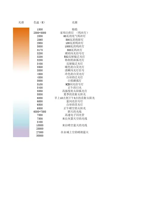
光谱色温(K)光源
1500烛焰
2500-3000家用白炽灯 (钨丝灯)
280060瓦的充气钨丝灯
2865500瓦的投影灯
2950100瓦的钨丝灯
30001000瓦的钨丝灯
3175500瓦钨丝灯
3200琥珀闪光信号灯
3200R32反射镜泛光灯
3200锆制的浓弧光灯
3400反射镜泛光灯
3500暖色的白荧光灯
3800清晰闪光灯信号
4500冷色的白荧光灯
4800白昼的泛光灯
5000白焰碳弧灯
5100M2B闪光信号灯
5400正午的日光
5550高强度的太阳弧光灯
5800夏季的直射太阳光
6000早上10点到下午3点的直射太阳光
6000蓝闪光信号灯
6500白昼的荧光灯
6500正午晴空的太阳光
6800-7000阴天的光线
7000高速电子闪光管
7500来自灰蒙天空的光线
8400
10000来自晴空蓝天的光线
20000
27000在水域上空的晴朗蓝天
30000。
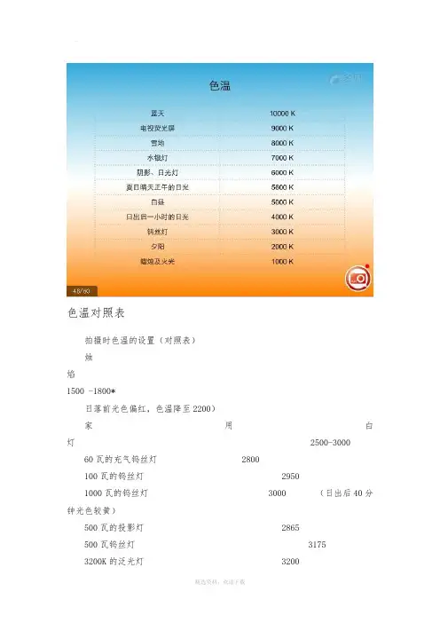
色温对照表拍摄时色温的设置(对照表)烛焰1500 -1800*日落前光色偏红,色温降至2200)家用白灯 2500-3000 60瓦的充气钨丝灯 2800100瓦的钨丝灯 29501000瓦的钨丝灯 3000(日出后40分钟光色较黄)500瓦的投影灯 2865500瓦钨丝灯 31753200K的泛光灯 3200琥珀闪光信号灯 3200R32反射镜泛光灯 3200锆制的浓弧光灯 3200反射镜泛光灯 3400暖色的白荧光灯 3500清晰闪光灯信号 3800冷色的白荧光灯 4500白昼的泛光灯 4800(下午阳光雪白上升4800~5800)白焰碳弧灯 5000 (阳光直射下)M2B闪光信号灯 5100晴天5200*正午的日光 5400高强度的太阳弧光灯 5550夏季的直射太阳光 5800早上10点到下午3点的直射太阳光6000*(摄影拍片黄金时间)蓝闪光信号灯 6000白昼的荧光灯6500(阴天下6500~9000)正午晴空的太阳光 6500*(阴天正午时分约6500)阴天的光线 6800-7000 * 高速电子闪光管 7000来自灰蒙天空的光线 7500-8400来自晴空蓝天的光线 10000-20000*在水域上空的晴朗蓝天 20000-27000*注:光源以 K (开尔文)为单位,(K数为高越偏蓝调)色温(Color Temperature),单位:开尔文[Kelvin]定义:当光源所发出的颜色与“黑体”在某一温度下辐射的颜色相同时,“黑体”的温度就称为该光源的色温。
“黑体”的温度越高,光谱中蓝色的成份则越多,而红色的成份则越少。
色温是衡量一种光源“有多么热”或者“有多么冷”的指标,也是表示一种光源“白得程度”、“黄得程度”或者“蓝得程度”的指标。
暖色<3300K;中间色3300至5000K;冷色>5000K。
如:海洋、无云的天空、雪地阴影、晴天里的阴影、室内、雨天、阴天(色温在9000-20000K)拍摄时色温的设置(对照表)烛焰1500-1800*(日落前光色偏红,色温降至2200)家用白灯2500-3000 60瓦的充气钨丝灯2800100瓦的钨丝灯29501000瓦的钨丝灯3000(日出后40分钟光色较黄)500瓦的投影灯2865500瓦钨丝灯31753200K的泛光灯3200琥珀闪光信号灯3200R32反射镜泛光灯3200锆制的浓弧光灯3200反射镜泛光灯3400暖色的白荧光灯3500清晰闪光灯信号3800冷色的白荧光灯4500白昼的泛光灯4800(下午阳光雪白上升4800~5800)白焰碳弧灯5000(阳光直射下)M2B闪光信号灯5100彩色胶片还可以分为日光型和灯光型两大类。
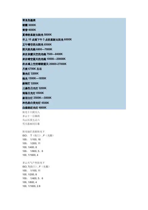
常见色温表朝霞3000K黄昏4000K夏季的直射太阳光5800K早上10点到下午3点的直射太阳光6000K 正午晴空的太阳光6500K阴天的光线6800—7000K来自灰蒙天空的光线7500—8400K来自晴空蓝天的光线10000—20000K在水域上空的晴朗蓝天20000-27000K月夜6700K左右聚光灯3200K烛光1500K—1850K新闻灯3200K三基色日光灯3200K商场日光灯4500K家用白灯2500K—3000K冷色的白荧光灯4500K白昼的泛光灯4800K阳光十六阴天八多云十一日幕四乌云压顶五点六雪天落雨同日幕阳光灿烂直射阳光下ISO,T(快门), F(光圈)100,1/100, 16100,1/200, 11100, 1/400, 8100,1/800, 5。
6100, 1/1600, 4多云天气户外阳光下ISO, T(快门), F(光圈)100,1/100, 11100, 1/200, 8100,1/400, 5。
6100, 1/800, 4100, 1/1600, 2.8阴天户外天光下ISO, T(快门), F(光圈)100, 1/100, 8100, 1/200, 5。
6100,1/400,4100,1/800,2.8100, 1/1600, 2下雨时或下雨前户外ISO, T(快门), F(光圈)100, 1/100, 5。
6100,1/200, 4100,1/400, 2。
8100, 1/800, 2100, 1/1600, 1。
4快门表:1/100、1/200、1/400、1/800、1/1600、1/3200、1/6400(按一档变化,曝光减一半) 光圈表:1、1.4、2、2.8、4、5。
6、8、11、16、22(按一档变化,曝光减一半)盘算方式就是:当ISO不变时,快门减少一档(即快门速度乘1/2),则光圈增添一档该法则要依据空气污染和时光做调整,以艳阳16为例,在现在的冬天只能在上午九点半到下午三点半之间使用,而上午八点半到九点半要用8――11的样子,自行试验了。
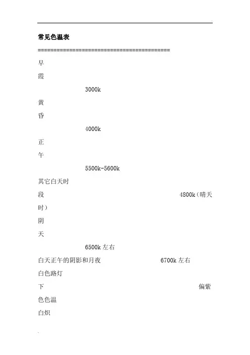
常见色温表==========================================早霞3000k黄昏4000k正午5500k-5600k其它白天时段 4800k(晴天时)阴天6500k左右白天正午的阴影和月夜 6700k左右白色路灯下偏紫色色温白炽灯土黄色聚光灯3200k烛光1850k新闻灯3200k三基色日光灯 3200k商场日光灯 4500 k蜡烛及火光1900K以下朝阳及夕阳2000K家用钨丝灯2900K日出后一小时阳光3500K摄影用钨丝灯3200K早晨及午后阳光4300K摄影用石英灯3200K平常白昼5000~6000K 220 V日光灯3500~4000K 晴天中午太阳5400K普通日光灯4500~6000K 阴天6000K以上HMI灯5600K晴天时的阴影下6000~7000K 水银灯5800K雪地7000~8500K 电视萤光幕5500~8000K 蓝天无云的天空10000K以上[推荐]常用色温值:光源 K烛焰 1500家用白灯 2500-300060瓦的充气钨丝灯 2800100瓦的钨丝灯 29501000瓦的钨丝灯 3000500瓦的投影灯 2865500瓦钨丝灯 31753200K的泛光灯 3200琥珀闪光信号灯 3200R32反射镜泛光灯 3200锆制的浓弧光灯 32001号,2号,4号泛光灯,反射镜泛光灯 3400 暖色的白荧光灯 3500切碎箔片,清晰闪光灯信号 3800冷色的白荧光灯 4500白昼的泛光灯 4800白焰碳弧灯 5000M2B闪光信号灯 5100正午的日光 5400高强度的太阳弧光灯 5550夏季的直射太阳光 5800早上10点到下午3点的直射太阳光 6000蓝闪光信号灯 6000白昼的荧光灯 6500正午晴空的太阳光 6500阴天的光线 6800-7000高速电子闪光管 7000来自灰蒙天空的光线 7500-8400来自晴空蓝天的光线 10000-20000在水域上空的晴朗蓝天 20000-27000人工光比赛火焰1700蜡烛火焰185040瓦白炽灯钨丝灯泡265075瓦白炽灯钨丝灯泡2820100瓦白炽灯钨丝灯泡2865500瓦白炽灯钨丝灯泡2960200瓦白炽灯钨丝灯泡29801000瓦白炽灯钨丝灯泡29903200开氏度钨灯3200Molarc“野蛮”的黄色火焰炭及力yf - 101过滤器(大约)3350 “卜蜂” (彩色摄影)工作室钨灯3350溢光灯或反光洪水3400日光蓝溢光灯4800白色火焰碳弧灯5000高强度的太阳弧光灯5500氙弧灯6420阳光阳光:日出或日落2000阳光:日出后一小时3500阳光:清晨4300阳光:尾盘4300夏季平均中午阳光(华盛顿特区)5400 直接仲夏阳光5800阴云密布的天空6000夏季平均日照(加上蓝色天窗)6500轻萨默谢德7100平均萨默谢德8000夏云天可能会有所不同从9500到30000。
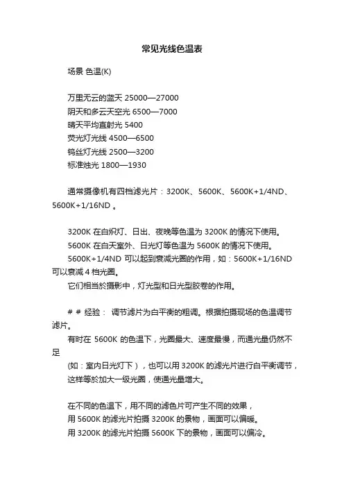
常见光线色温表场景色温(K)万里无云的蓝天 25000—27000阴天和多云天空光 6500—7000晴天平均直射光 5400荧光灯光线 4500—6500钨丝灯光线 2500—3200标准烛光 1800—1930通常摄像机有四档滤光片:3200K、5600K、5600K+1/4ND、5600K+1/16ND 。
3200K 在白炽灯、日出、夜晚等色温为3200K的情况下使用。
5600K 在白天室外、日光灯等色温为5600K的情况下使用。
5600K+1/4ND 可以起到衰减光圈的作用,如:5600K+1/16ND 可以衰减4档光圈。
它们相当於摄影中,灯光型和日光型胶卷的作用。
# # 经验:调节滤片为白平衡的粗调。
根据拍摄现场的色温调节滤片。
有时在5600K的色温下,光圈最大、速度最慢,而通光量仍然不足(如:室内日光灯下),也可以用3200K的滤光片进行白平衡调节,这样等於加大一级光圈,使通光量增大。
在不同的色温下,用不同的滤色片可产生不同的效果,用5600K的滤光片拍摄3200K的景物,画面可以偏暖。
用3200K的滤光片拍摄5600K下的景物,画面可以偏冷。
如:缩小光圈,可在白天的光线下,可以拍摄出夜晚的效果。
滤色片与灰片组合档滤色镜选择钮滤色镜拍摄环境1 透过日出、日落或室内2 5600K+1/4ND 晴天3 5600K 阴天或雨天4 5600K+1/16ND 非常亮的环境雪地或海边个人见解:其实滤色片的调节主要是配合光圈来使用的!根据导演要求你拍摄的效果而灵活运用的!没有很死板的用法!曾经我去应聘有人问我会用某种摄像机不! 说它的滤色片和别的摄像机不一样,说灰片和滤色片是分开的!我感觉很好笑!因为我想只要是专业的摄影师都应该知道在调节滤色片与灰片的时候,光圈应该处于自动状态;正常拍摄下依照光圈调节环的刻度表示来调节滤色片和灰镜是没有任何难度的!就是说你把每一档镜片都在这个光源下试验一下,看哪个镜片能使光圈环刻度处于中间值或接近中间值的位置就OK!因为你得为下一步调节光圈做准备,光圈环处于中间值,上下都留有余地方便调节!除非导演有其他的特殊要求,比如要在白天拍处夜晚效果那就不一样了!(个人见解,错误之处请指教)色温的概念1、色温----光的颜色标志用黑白胶片拍照片,只要根据光的强弱(物体的亮度) 定准光圈进行拍摄就行了。
光谱色温(K)光源
1500烛焰
2500-3000家用白炽灯 (钨丝灯)
280060瓦的充气钨丝灯
2865500瓦的投影灯
2950100瓦的钨丝灯
30001000瓦的钨丝灯
3175500瓦钨丝灯
3200琥珀闪光信号灯
3200R32反射镜泛光灯
3200锆制的浓弧光灯
3400反射镜泛光灯
3500暖色的白荧光灯
3800清晰闪光灯信号
4500冷色的白荧光灯
4800白昼的泛光灯
5000白焰碳弧灯
5100M2B闪光信号灯
5400正午的日光
5550高强度的太阳弧光灯
5800夏季的直射太阳光
6000早上10点到下午3点的直射太阳光
6000蓝闪光信号灯
6500白昼的荧光灯
6500正午晴空的太阳光
6800-7000阴天的光线
7000高速电子闪光管
7500来自灰蒙天空的光线
8400
10000来自晴空蓝天的光线
20000
27000在水域上空的晴朗蓝天
30000。
标准色温对照表色温是描述光源色彩的一个重要参数,通常用来表示光源的冷暖程度。
在不同的应用场景中,选择适合的色温可以有效提高视觉效果和舒适度。
因此,了解标准色温对照表对于正确选择合适的光源至关重要。
一、什么是色温?色温是用来描述光源颜色的一个物理量,单位是开尔文(K)。
一般来说,色温越高,光线就越偏蓝,越低则越偏红。
常见的光源色温范围大致为2700K-6500K,其中2700K以下的光源被称为暖光,而6500K以上的光源则被称为冷光。
二、标准色温对照表。
1. 2700K-3000K,这个色温范围的光源通常被称为暖光,它会给人一种温暖、舒适的感觉。
适合用于家庭、餐厅、卧室等舒适性要求较高的场所。
2. 4000K,这个色温对应的光线比较中性,不偏向暖色也不偏向冷色,适合用于办公室、教室、商店等需要清晰明亮的场所。
3. 5000K-6500K,这个色温范围的光源被称为冷光,它会给人一种清冷、明亮的感觉。
适合用于医院、实验室、工厂等需要高亮度和高对比度的场所。
三、如何选择合适的色温?1. 根据使用场景选择,不同的场所对光线的要求不同,因此在选择灯具时需要根据具体的使用场景来确定合适的色温。
比如,家庭环境适合选择2700K-3000K的暖光,而办公室则适合选择4000K的中性光。
2. 考虑人眼舒适度,在选择灯具色温时,也需要考虑人眼的舒适度。
过高或过低的色温都会对人的视觉造成不适,因此需要选择适合的色温来保护人眼健康。
3. 结合环境色彩,在选择灯具色温时,还需要考虑周围环境的色彩。
比如,如果周围装修色彩偏暖,那么选择暖光灯具会更加和谐。
四、总结。
标准色温对照表是选择合适灯具色温的重要参考依据。
在实际使用中,我们需要根据具体的使用场景、人眼舒适度和周围环境色彩来选择合适的色温,以达到最佳的视觉效果和舒适度。
希望本文能够帮助大家更好地了解标准色温对照表,并在实际选择灯具时有所帮助。
各种灯光的色温表(K值)各种照明灯的亮度差别关于亮度和节能比较:1W LED=3W CFL(节能灯)=15W白炽灯3W LED=8W CFL(节能灯)=25W白炽灯4W LED=11W CFL(节能灯)=40W白炽灯8W LED=15W CFL(节能灯)=75W白炽灯12W LED=20W CFL(节能灯)=100W白炽灯各种灯光的色温表(K值)色温是衡量光线色彩的定值,表示光源光谱质量最通用的指标.K〈3300时为暖色光(偏黄橙),K>3300时为冷色光(偏青),K>6000的几乎是白光了!以下是各种灯光的色温值,方便制作不同的光源效果!以K为单位的光色度对照表色温:光源发射光的颜色与黑体在某一温度下辐射光色相同时,黑体的温度称为该光源的色温. 因为在部分光源所发出的光通称为白光,故光源的色表温度或相关色温度即用以指称其光色相对白的程度,以量化光源的光色表现。
根据Max Planck的理论,将一具完全吸收与放射能力的标准黑体加热,温度逐渐升高光度亦随之改变;CIE色座标上的黑体曲线显示黑体由红棗橙红棗黄棗黄白棗白棗蓝白的过程黑体加温到出现与光源相同或接近光色时的温度,定义为该光源的相关色温度,称色温,以绝对温度K(Kelvin,或称开氏温度)为单位(K=℃+273.15)因此,黑体加热至呈现红色时温度约为527℃即800K其他温度影响光色变化。
光色愈偏蓝,色温愈高;偏红则色温愈低。
一天当中光的光色亦随时间变化;日出后40分钟光色较黄色温3000K;下午阳光雪白,上升至4800—5800K;阴天正午时分则约6500K;日落前光色偏红,色温又降至2200K。
因相关色温度事实上是以黑体辐射接近光源光色时,对该光源光色表现的评价值,并非一种精确的颜色对比,故具相同色温值的二光源,可能在光色外观上仍有些许差异。
仅凭色温无法了解光源对物体的显色能力,或在该光源下特体颜色的再现如何。
光源色温不同,光色也不同,色温在3300K以下有稳重的气氛,温暖的感觉;色温在3000-5000K为中间色温,有爽快的感觉;色温在5000K以上有冷的感觉,不同光源的不同光色组成最佳环境。
各种灯光场合的色温色温是衡量光线色彩的定值,表示光源光谱质量最通用的指标。
K<3300时为暖色光(偏黄橙),K>3300时为冷色光(偏青),K>6000的几乎是白光了!以下是各种灯光的色温值,方便制作不同的光源效果!以K为单位的光色度对照表光源K烛焰1500家用白炽灯2500-300060瓦的充气钨丝灯2800500瓦的投影灯2865100瓦的钨丝灯29501000瓦的钨丝灯3000500瓦钨丝灯3175琥珀闪光信号灯3200R32反射镜泛光灯3200锆制的浓弧光灯3200反射镜泛光灯3400暖色的白荧光灯3500清晰闪光灯信号3800冷色的白荧光灯4500白昼的泛光灯4800白焰碳弧灯5000M2B闪光信号灯5100正午的日光5400高强度的太阳弧光灯5550夏季的直射太阳光5800早上10点到下午3点的直射太阳光6000 蓝闪光信号灯6000白昼的荧光灯6500正午晴空的太阳光6500阴天的光线6800-7000高速电子闪光管7000来自灰蒙天空的光线7500-8400来自晴空蓝天的光线10000-20000在水域上空的晴朗蓝天20000-27000简易色温表蜡烛及火光1900K以下朝阳及夕阳2000K家用钨丝灯2900K 日出后一小时阳光3500K摄影用钨丝灯3200K 早晨及午后阳光4300K摄影用石英灯3200K 平常白昼5000~6000K220 V日光灯3500~4000K 晴天中午太阳5400K普通日光灯4500~6000K 阴天6000K以上HMI灯5600K 晴天时的阴影下6000~7000K水银灯5800K 雪地7000~8500K电视萤光幕5500~8000K 蓝天无云的天空10000K以上一般超市的灯光照度为700~900Lux,而百货一般是800~1500Lux,不过也要根据不同的商品和特殊陈列要求而有所变化。
色温色温:光源发射光的颜色与黑体在某一温度下辐射光色相同时,黑体的温度称为该光源的色温。
各种照明灯的亮度差别关于亮度和节能比较:1W LED=3W CFL(节能灯)=15W白炽灯3W LED=8W CFL(节能灯)=25W白炽灯4W LED=11W CFL(节能灯)=40W白炽灯8W LED=15W CFL(节能灯)=75W白炽灯12W LED=20W CFL(节能灯)=100W白炽灯各种灯光的色温表(K值)色温是衡量光线色彩的定值,表示光源光谱质量最通用的指标。
K<3300时为暖色光(偏黄橙),K>3300时为冷色光(偏青),K>6000的几乎是白光了!以下是各种灯光的色温值,方便制作不同的光源效果!以K为单位的光色度对照表光源 K烛焰 1500 家用白炽灯 2500-300060瓦的充气钨丝灯 2800500瓦的投影灯 2865100瓦的钨丝灯 29501000瓦的钨丝灯 3000500瓦钨丝灯 3175琥珀闪光信号灯 3200R32反射镜泛光灯 3200锆制的浓弧光灯 3200反射镜泛光灯 3400暖色的白荧光灯 3500清晰闪光灯信号 3800冷色的白荧光灯 4500白昼的泛光灯 4800白焰碳弧灯 5000M2B闪光信号灯 5100正午的日光 5400高强度的太阳弧光灯 5550夏季的直射太阳光 580010:00到15:00的直射阳光 6000蓝闪光信号灯 6000白昼的荧光灯 6500正午晴空的太阳光 6500阴天的光线 6800-7000高速电子闪光管 7000简易色温表蜡烛及火光1900K以下朝阳及夕阳 2000K家用钨丝灯2900K 日出后一小时阳光3500K摄影用钨丝灯3200K 早晨及午后阳光4300K摄影用石英灯3200K 平常白昼5000~6000K220V日光灯 3500~4000K 晴天中午太阳 5400K普通日光灯4500~6000K 阴天6000K 以上HMI灯5600K 晴天时的阴影下6000~7000K水银灯5800K 雪地7000~8500K电视萤光幕5500~8000K 蓝天无云的天空10000K以上一般超市的灯光照度为700~900Lux,而百货一般是800~1500Lux,不过也要根据不同的商品和特殊陈列要求而有所变化。
色温对照表
以下是常见的色温对照表,用于表示不同色温的光的特征:
2700K - 软白色,暖色调,类似于传统白炽灯的颜色。
3000K - 暖白色,较暖的色调,适合营造舒适温馨的氛围。
3500K - 自然白色,接近自然光的色调,适合用于家庭和
商业场所。
4000K - 日光白色,清晰明亮的色调,适合用于办公室和
商业场所。
5000K - 白色,类似于中午阳光下的色调,适合用于需要
高亮度和清晰度的环境。
6000K - 冷白色,冷色调,适用于需要高光亮度和冷色调
的环境,如手术室和实验室。
6500K - 蓝白色,非常冷的色调,类似于蓝天白云的色彩,适用于需要最高亮度和最冷色调的环境。
请注意,不同厂家和不同灯具可能会有些许差异,这个对
照表仅供参考。
White BalanceOccasionally the question arises as to how to reproduce the "real" color of light sources in a rendered environment. I set out to research this subject, and found a lot of very contradictory information. Some approaches try to categorize light sources by their color temperature. Some then try to come up with some meaningful way of converting that color temperature to RGB values to use in programs like Lightwave or Cinema 4D. Ultimately these approaches all fail to take into account several realities that work against trying to come up with a unified approach to light coloring and rendering.The human visual system is very good at "white balancing" what we look at. As long as the scene we are viewing contains a continuous spectrum of colors, we interpret the light as "white". In reality, the incandescent light we light our homes with is quite orange. Daylight is very blue. Fluorescent lights vary from sickly greens to reddish purples. And yet, we see all these lighting situations as more or less neutrally colored.In the real world, light consists of all visible colors, not just red, green, and blue wavelengths. The RGB color system that we use in computer graphics arose out of a peculiarity of human perception - we have structures in our eyes called "cones" that respond to red, green, and blue light sources. A monochromatic yellow light excites both the red and green cones in our eyes, and we see it as yellow. Such a yellow light in the real world would not allow a red object to appear red, or a green object to appear green. But in computer graphics a yellow light has both a red and green component, and so allows objects with those colors to appear fully colored. This is a limitation of many computer graphic programs at the moment.Film cameras cannot compensate for the varying shades of light in the way that our visual sense can. Thus, we have daylight film which has heavy orange filtering to tone down the blue quality of outdoor light. We have indoor film which has a boosted blue response to even out the amber lighting. For fluorescent situations, we can use a combination of film type and filters to color balance the scene we are photographing. If we were to pick a particular color of light, say daylight, and say that it is "white" and photograph everything, indoors and out, with a film stock that renders daylight as white, all of our indoor shots would be shades of orange and amber, and outdoor shots under blue sky would be intensely blue. This would be undesirable.Thus too it is undesirable to pick a similar approach with our 3D rendering of light. We have to be relative - and choose a light color to be "white" in our scene, with other types of light sources being colored relative to that one. In this way we can produce our synthetic "photos" to produce a pleasing result in our final renders. Of course, to understand how different types of light sources relate to each other, it is important to understand how these light sources work. To do this we are going to look at 3 basic types of light source.Black Body IlluminantsThe first group of light sources are the black body illuminants. These are materials that produce light when they are heated. The sun is a black body illuminant, as is a candle flame. The color of light of these types of sources can be characterized by their Kelvin temperature. Note that this temperature has nothing to do with how "hot" a light source is - just with the color of its light. A light source with a low Kelvin temperature is very red. One with a high Kelvin temperature is very blue. More accurately, when we see two light sources side by side in a scene, the higher Kelvin light appears more blue, and the lower Kelvin light appears more red. Its all relative.Black body illuminants produce a fairly even, continuous spectrum of colors, and so are perceived as "white" by our visual sense. Therefore, in the absence of comparative light sources in our scene, these should be rendered with warm, nearly white lights.Below is a chart of some common Kelvin Light Source temperatures coupled with their RGB Equivalents. These equivalents were arrived arbitrarily - I eyeballed them. There were a couple of converters I foundonline, each taking a different approach. One of them colored the sources by reference - you input a Kelvin temperature that you want to be "white" and the temperature to convert into an RGB value. Visually, however, the results were disappointing. They were scientifically correct, but failed to take into account the adaptability of the human visual sense. The other converter did even worse, ending up with greenish shades in the 4500K range that black body illuminants are incapable of creating. So, the alternative was to use my eye and judgment to arrive at these values.Light Source R G B ValuesCandle 1900 255, 147, 4140W Tungsten 2600 255, 197, 143100W Tungsten 2850 255, 214, 170Halogen 3200 255, 241, 224Carbon Arc 5200 255, 250, 244High Noon Sun 5400 255, 255, 251Direct Sunlight 6000 255, 255, 255Overcast Sky 7000 201, 226, 255Clear Blue Sky 20000 64, 156, 255SamplesCandle Tungsten 40W Tungsten 100WHalogen Carbon Arc High Noon SunDirect Sun Overcast Sky Blue Sky Fluorescent LightsThese light sources produce light by creating a large amount of UV light via high voltage electrical discharge through a tube filled with rare gasses. The UV light excites materials coating the tube to produce lightthrough fluorescence. These lights have broad but sometimes disjointed spectra. Depending on the quality of the tube and its intended purpose, the color can vary in ways that cannot be described by black bodyillumination. In fact, the disjointed nature of fluorescent spectra begin to exceed the ability to characterize these colors accurately in RGB. These values and samples are again based on my personal observations of different source types. Light Source R G B Values ColorWarm Fluorescent 255, 244, 229Standard Fluorescent 244, 255, 250Cool White Fluorescent 212, 235, 255Full Spectrum Fluorescent 255, 244, 242Grow Light Fluorescent 255, 239, 247Black Light Fluorescent 167, 0, 255SamplesWarm Fluorescent Standard Fluorescent Cool White FluorescentFull Spectrum Fluorescent Grow Light Fluorescent Black Light Fluorescent Gaseous Light SourcesThis final type of light source usually involves a metallic gas under pressure being excited by a high voltage coil. They do not produce a continuous spectrum at all, but instead produce a series of monochromatic lines of light energy. This confounds our ability to accurately reproduce the full effect of how these lights look and interact with colors in a scene. For example, a standard mercury vapor lamp, such as found in older city street lights and parking lots, produces only a few lines of monochromatic light - a yellow, a green, a blue, and a purple. To the casual eye, the light looks somewhat "whitish" but in fact, red objects in such light lose their color and appear black - there is no red component to the light at all. But in RGB, you cannot produce a "purple-green" color without using red. Thus, red objects will still appear red under such a simulated light. Until the day that 3D programs such as Cinema 4D allow you to define light sources by their spectral output instead by RGB value, there isn't much we can do about it.Again, the values in the following chart were eyeballed by myself, by looking at various night lights around my city.Light SourceR G B ValuesMercury Vapor 216, 247, 255Sodium Vapor 255, 209, 178Metal Halide 242, 252, 255High Pressure Sodium 255, 183, 76SamplesMercury Vapor Sodium Vapor Metal HalideHigh Pressure SodiumConclusionRemember, the values in the charts in this article are merely a starting point for your own explorations and experiments. Particularly with the black body illuminants, the color of lighting is all relative, so remember to adjust your values accordingly.。