ps制作网页效果图—多种模版
- 格式:doc
- 大小:1.43 MB
- 文档页数:55
在这篇网页设计教程里,你将学习制作可以用于整站的一个既优雅又专业的网页,我们将用到Photoshop软件里的一些基本的工具,比如:笔刷和图层等。
而且在教程下方包括了此网页的HTML/CSS/JAVASCRIPT模板和素材,你可以下载用作学习或使用都可以。
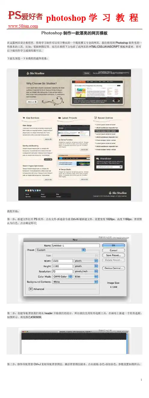
下面先预览一下本教程的最终效果:教程开始:第一步:新建文件打开PS软件,点击文件-新建命令或Ctrl+N键新建文件,设置宽度1020px,高度1180px,背景默认为白色,点击确定即可;第二步:创建导航背景我们将从header开始我们的设计,所以我们先用矩形选框工具,在画布上新建一个矩形选框,如图所示,填充颜色#393939;然后设置图层的混合模式为叠加,不透明度设为23%;第四步:创建网页logo和name对于教程中的logo,我使用了Georgia字体并设计为粗体并倾斜,设置‘SIX’的颜色为#FFFFFF,‘STUDIOS’的颜色为#F7E5C4,logo旁边的图片用的是素材中的boxupload32图片。
样式如图所示:第五步:加入导航链接活动链接的颜色我用的是#DBD1BE,普通链接用的颜色为:#ABAAAA。
为了使活动链接显示的更突出,在其后便添加一个矩形框。
选择圆角矩形工具,设置半径为5px,前景色为#464646,然后在活动链接处添加矩形背景,样式如图:给矩形背景图层添加内阴影和描边效果,具体设置参数如图:第六步:给特色区域添加背景在我们网页布局的顶部,需要有一块特色区域,这块区域通过播放幻灯片将网站的特色内容展示给来访者。
这块区域也可以同时包括对网站的介绍等,第一步我们需要做的就是利用矩形选框工具选中这块区域,然后在此矩形选区中填充颜色#D3CAB8。
然后你需要下载纹理图片,并把它放在特色区域图层的上方;第七步:去掉那些不需要的背景纹理第六步中的图放到PS中后,我们发现尺寸要大于特色区域图层,所以我们需要遮盖住不需要的区域,按住Ctrl键并单击特色背景区域图层,PS会自动选择特色区域选区。
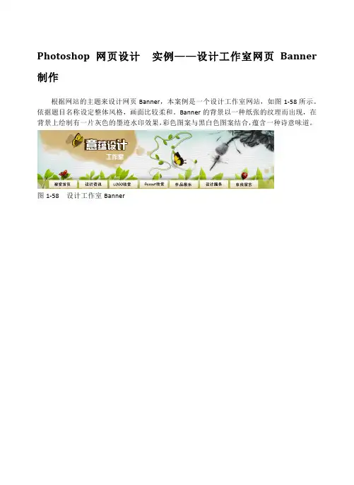
Photoshop 网页设计实例——设计工作室网页Banner 制作根据网站的主题来设计网页Banner,本案例是一个设计工作室网站,如图1-58所示。
依据题目名称设定整体风格,画面比较柔和。
Banner的背景以一种纸张的纹理而出现,在背景上绘制有一片灰色的墨迹水印效果,彩色图案与黑白色图案结合,蕴含一种诗意味道。
图1-58 设计工作室Banner操作步骤:(1)新建一个【宽度】和【高度】分为1000和250像素,10%灰色背景文档。
执行【滤镜】|【纹理】|【纹理化】命令,打开【纹理化】对话框,设置【纹理】为“画布”,设置参数,如图1-59所示。
图1-59 添加纹理效果(2)新建“图层1”,填充蓝色(#ABD5CF),单击【图层】面板下的【添加图层蒙版】按钮,对图层添加蒙版。
在蒙版处于工作状态下,使用黑色【画笔工具】,设置【硬度】为0%,在画布中央进行涂抹,如图1-60所示。
(3)打开“墨迹”图片素材,使用【魔棒工具】,设置【容差】为30像素,在画布白色出点击建立选区。
按Ctrl+Shift+I快捷键,反选选区。
新建“图层1”,将选区填充土黄色(#D1b57A),取消选区,如图1-61所示。
图1-61 绘制图形(4)使用【移动工具】,将图像放置到Banner文档中,命名图层为“墨迹”图层。
按Ctrl+T快捷键,对图像进行缩小变换,并按Enter键结束变换,如图1-62所示。
图1-62 放置图像(5)按住Ctrl键,单击该图层缩览图,载入选区。
执行【选择】|【修改】|【扩展】命令,设置【扩展量】为5像素,如图1-63所示。
图1-63 建立选区(6)新建图层“墨迹1”,填充土黄色(#D1b57A),设置【不透明度】为30%。
如同(2)步骤操作,对“墨迹”添加蒙版后在图像边缘进行涂抹,如图1-64所示。
图1-64 绘制墨迹水印效果(7)打开“水墨画”图片素材,执行【图像】|【模式】|【灰度】命令。
将图像由彩色转换为黑白。
如何用Photoshop制作网页设计图第一章:网页设计图的基本要素网页设计图是指在Photoshop中创建的一种视觉呈现,用于展示网页的布局、颜色、字体等设计元素。
在制作网页设计图时,需要注意以下几个基本要素:1. 页面尺寸:合适的页面尺寸可以确保网页在不同设备上显示完整。
常见的页面尺寸有1200px、1920px等。
在Photoshop中,可以通过选择“新建”来设置页面尺寸。
2. 布局结构:网页设计图应该包含网页的整体布局结构,如头部、导航栏、正文、侧边栏、底部等。
根据设计需要,可以使用参考线和网格来辅助布局。
3. 颜色方案:选取合适的颜色方案是网页设计中至关重要的一步。
Photoshop提供了丰富的颜色选择工具,如调色板、渐变工具等。
可以根据品牌色彩和网页主题选择合适的颜色。
4. 字体和排版:选择适合网页内容和风格的字体是网页设计的关键。
在Photoshop中,可以通过文本工具选择合适的字体、大小、行间距等,并进行对齐、调整字距等操作。
第二章:利用图层和样式创建网页元素在网页设计中,常见的元素有按钮、图标、标题、背景等。
借助Photoshop的图层和样式功能,可以轻松创建这些元素:1. 图层:使用图层可以将设计元素分开管理,方便修改和调整。
可以通过图层面板对图层进行命名、分组、调整不透明度等操作。
2. 图层样式:Photoshop提供了丰富的图层样式,如阴影、边框、渐变等。
通过在图层样式对话框中进行设置,可以快速添加元素的样式效果,使网页看起来更加美观。
3. 矢量图形:矢量图形可以无损放大,并能保持其清晰度和光滑度。
在Photoshop中,可以使用形状工具绘制矢量图形,并进行填充、描边、变换等操作。
第三章:优化和导出网页设计图在制作网页设计图后,还需要进行一些优化和导出操作,以确保图像加载速度和质量:1. 图像优化:使用Photoshop的图像处理工具,如图像调整、图像压缩等,可以优化网页设计图的质量。
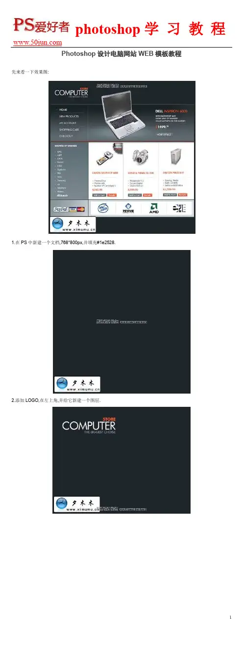
先来看一下效果图:
1.在PS中新建一个文档,768*800px,并填充#1e2528.
2.添加LOGO,在左上角,并给它新建一个图层.
3.新建一个图层.并使用图层样式为其添加一个渐变效果.
4.使用减淡工具,并设置10%的不透明度,给图像加个高光.如图:
5.现在加入菜单文字.使用文字工具并设置如图,颜色#444b44.
6.在文字下面加入下划线.也在菜单上面加入一条线,来做区分用.
7.在头部加个产品图像和产品介绍.
8.来看一下如何做按扭.首先用圆角矩形,画出按扭的形状.并填充#5a676c.并设置它的图层样式.
9.现在要添加两条线,一条大小为1px,相距也为1px.别一条大小为2px与第一条相距2px.
10.页眉做好之后,我们来看看页面的主体怎么做.利用矩形工具画出三个相等的矩形并填充白色.为它们各新建三个新图层.建好之后就可以添加产品了.如图:
11.为产品添加介绍和价格等之类必要的信息.
12.选择矩形选框,在左侧画出一个矩形来做产品菜单,并填充#6b7b81.
13.现在来做一个自定义画笔,新建一个3*3px,然后用画笔画出如图所示.
最终结果如图:
14.在下面画两个矩形并填充#d1dbdf.并添加图标,如图所示.
15.新建一个图层来创建页脚.使用圆角矩形工具,画一个圆角矩形出来,填充白色,然后利用矩形选区工具把上面的一部分删掉.
添加图标:
使用画笔工具给每个LOGO中画一条区分线,颜色为#D2D2D2.
16.最后我们来为网页装饰一下,添加一个小图标.下面是步骤载图:
利用椭圆工具画一个椭圆,然后填充白色并改为不透明30%.并添加文字.
photoshop学习教程
17.完成:
11。
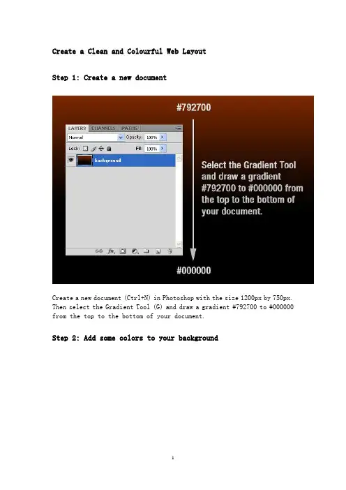
Create a Clean and Colourful Web LayoutStep 1: Create a new documentCreate a new document (Ctrl+N) in Photoshop with the size 1200px by 750px. Then select the Gradient Tool (G) and draw a gradient #792700 to #000000 from the top to the bottom of your document.Step 2: Add some colors to your backgroundCreate a new layer, select the Brush Tool (B), select a soft brush with the diameter 300px and add some colors to your layout. I have used red, orange and blue. Name this layer "color."Step 3: Add a texture to the backgroundNow we are going to create a texture for our background. Open in Photoshop the leafs image which you have downloaded at the beginning of the tutorial and move it into your document using the Move Tool (V). Right-click on this layer and select Convert to Smart Object. Then go to Filter > Artistic > Film Grain and use the settings from the following image. Then go to Filter > Pixelate > Mosaic, and again use the settings from the following image. Set the blend mode for this layer to Difference, the opacity to 30% and name it "texture"Step 4: Create a dark background for the contentCreate a new layer, select the Rounded Rectangle Tool (U), set the Radius to 3 pixels and create a rounded black rectangle. Then double-click on this layer to open the Layer Style window and use the settings from the following image for Drop Shadow. Set the opacity of this layer to 70% and name it "black shape."Step 5: Use groups to organize your layersHold down the Ctrl key and select all the layers which you have created until now and then group them (Ctrl+G). Name the group "background."Step 6: Create more groupsCreate a new group (Layer > New > Group) and name it "home." Then create another group inside the "home" group and name it "logo."Step 7: Add a logo and a taglineCreate a new layer inside the "logo" group. Then select the Type Tool (T) and write the name of your layout using the color #f4f4f4. Double-click on this layer to open the Layer Style window and use the settings from the following image. Then create a new layer and write a tagline using the color #eeeeee.Step 8: "Sign up" and "login" buttonsNow we are going to create two buttons in the upper right corner of our layout. Create a new group and name it "Sign up | Login." Then select the Rounded Rectangle Tool (U) and create a rounded rectangle like I did. Double-click on the shape’s layer to open the Layer Style window and use the settings from the following image. Set the foreground color to white and use the Type Tool (T) to write the words "Sign up | Login" on your button. Set the opacity of the text layer to 75%.Step 9: Create a blue line with the height of 1 pxCreate a new group and name it "Navigation." Create a new layer, select the Single Row Marquee Tool and click once on your document to create a selection with the height of 1px. Fill that selection with the color #406f94 and delete what is outside of the black rectangle using the Rectangular Marquee Tool (M). Set the opacity of this layer to 40% and name it "Line."Step 10: Add a gradient to the navigation barCreate a new layer, select the Rectangular Marquee Tool (M) and create a selection like I did (note: you can use some guides to help you create the selection). Then select the Gradient Tool (G) and draw a gradient #35423e to transparent from the bottom to the top of the selection. Hit Ctrl+D to deselect. Then go to Filter > Noise > Add Noise and use the settings from the following image. Name this layer "gradient" and leave a distance of 1 pixel between the line and the gradient.Step 11: Write the names of your layout’s pagesSelect the Type Tool (T) and write the names of your layout’s pages in the navigation bar. Then double-click on the text layer to open the Layer Style window and use the settings from the next image. The font which I have used is called Greyscale Basic.Step 12: Create a separatorNow we are going to create a separator. Create a new layer, select the Single Column Marquee Tool and click once on your layout. Then select the Rectangular Marquee Tool (M), click on the "Intersect with selection"button from the option bar and create a selection like the one from the next image. Fill the selection with white and hit Ctrl+D to deselect.Step 13Double-click on the layer which you have created at the previous step to open the Layer Style window and use the settings from the following image. Name this layer "line 1."Step 14:Duplicate the "line 1" layer (Ctrl+J) and name the new layer "line 2." Select the Move Tool (V) and hit once the right arrow on your keyboard to move this layer 1 pixel to the right. Then double-click on the "line 2" layer to open the Layer Style window and use the settings from the following image.Step 15: Convert the "line 1" and "line 2" layers into a smart objectHold down the Ctrl key and select the "line 1" and "line 2" layers. Then right-click on one of them and select Convert to Smart Object. Name the smart object "separator."Step 16: Create a blue highlightCreate a new layer beneath the "separator" layer. Select the Rectangular Marquee Tool (M), create a selection like the one from the following imageand fill it with the color #35423e. Right-click on this layer and selectConvert to Smart Object. Go to Filter > Blur > Gaussian Blur and use the settings from the next image. Then go to Filter > Noise > Add Noise and again use the settings from the following image. Set the opacity of this layer to 60% and name it "highlight."Step 17: Create a mask for the "separator" layerClick on the "separator" layer in the Layers palette to select it and then go to Layer > Layer Mask > Reveal All. Select the Gradient Tool (G) and draw a black to transparent gradient from the top to the middle of your separator.Step 18: Duplicate the separatorHold down the Ctrl key and click on the "separator" and "highlight" layers in the Layers palette to select them. Then select the Move Tool (V), hold down the Alt and Shift keys and then click on your document and drag the mouse. Now you have duplicated the selected layers. Use the Move Tool (V) to move these new layers to the right. Repeat this step and create as many separators as you need.Step 19: Group all the separatorsSelect all the "separator" and "highlight" layers in the Layers palette and hit Ctrl+G to group them. Name the group "separators."`Step 20: Create a button for the active pageNow we are going to create a background for the active menu page to differentiate it from the others. Select the Rectangle Tool (U) and create a rectangle like I did. Put this layer beneath the text layer which contains all the pages names. Double-click on this layer and use the settings from the following image for Gradient Overlay. Then name it "active menu" and set its opacity to 50%.Step 21: Create the search barCreate a new group (Layer > New > Group), name it "search" and put it above the "navigation" group. Select the Rounded Rectangle Tool (U), set the Radius to 3 px and create a rounded rectangle like I did using the color #104f59. Name this layer "text field" and set its opacity to 80%.Step 22: Create the search buttonSelect the Rectangle Tool (U) and create a rectangle like I did. Put this rectangle in the right side of the search bar. Double-click on this layer and use the settings from the following image for Gradient Overlay. Thenright-click on this layer and select Create Clipping Mask.Step 23: Write the word "search" on your buttonSelect the Type Tool (T) and write the word "search" using the white color. Set the opacity of this layer to 75%.Step 24: Create a vertical line for the search barSelect the Line Tool (U) and create a vertical line using the color #123036. Name this layer "line", put it beneath the "button" layer and move it between the search bar and the button using the Move Tool (V).Step 25: Create a blue rectangleCreate a new group (Layer > New > Group) and name it "Showcase." Create another group inside this one and name it "background." Select the Rectangle Tool (U) and create a rectangle using the color #219aad. My rectangle is 983 px wide by 273 px height (you may want to open the Info palette - Window > Info– before you create the rectangle, so you can see the exact size of your rectangle). Set the opacity of this layer to 55% and name it "bg4."Step 26: Add a texture to the blue rectangleOpen in Photoshop the "pixelated blue rectangle" image, move it into your document and put this image above your blue rectangle. Set the opacity of this layer to 55% and name it "bg3."Step 27: Add a gradient to the blue rectangleCtrl-click on the "bg4" layer’s vector mask to select it, then create a new layer, select the Gradient Tool (G) and draw a gradient #56b8e5 totransparent from the bottom to the top of your selection. Then hit Ctrl+D to deselect.Step 28: Create a smaller blue rectangleCreate a new layer, select the Rectangular Marquee Tool (M) and create a selection like I did. Select the Gradient Tool (G) and draw a gradient #0f2b42 to #2a607f from the bottom to the top of your selection. Then hit Ctrl+D to deselect. Name this layer "bg1."Step 29: "Sign up" buttonCreate a new group (Layer > New > Group) and name it "sign up button." Select the Rounded Rectangle Tool (U), set the Radius to 2 px and create a rounded rectangle like I did. Double-click on this layer to open the Layer Style window and use the settings from the following image. Then select the Type Tool (T) and write the words "sign up" using the white color.Step 30: "Learn more" buttonRepeat the previous step to create another button, but this time write the words "learn more" on your button. Then create a new layer, select the Custom Shape Tool (U) and create a white arrow like I did.Step 31: Create a button in the left side of the rectangleCreate a new group (Layer > New > Group) and name it "left arrow." Select the Ellipse Tool (U) and create a circle using the color #406f94. Double-click on this layer to open the Layer Style window and use the settings from the following image.Step 32: Create an arrow inside the blue circleCreate a new layer and use the Custom Shape Tool (U) to create a white arrow. Double-click on this layer to open the Layer Style window and use the settings from the following image. Set the opacity of this layer to 50%.Step 33: Create another arrow in the right side of the rectangleRepeat the previous two steps to create another arrow in the right side of the blue rectangle.Step 34: Create a featured imageCreate a new group (Layer > New > Group) and name it "image." Put a small image in this group and name the layer "image." Double-click on this layer to open the Layer Style window and use the settings from the following image.Step 35: Add a shadow to your imageGo to Layer > Layer Style > Create Layer. This will create a new layer beneath the original one with the style of that original layer. Now go to Layer > Layer Mask > Reveal All, select the Gradient Tool (G) and draw a black to transparent gradient from the bottom to the middle of your small image. Name this layer "shadow."Step 36: Add some textCreate a new group (Layer > New > Group), select the Type Tool (T) and add some text. Name this group "text."Step 37: Create a white rectangleCreate a new group and name it "content." Create another group inside this one and name it "shadows." Select the Rectangle Tool (U) and create a rectangle like I did using the white color. Name this layer "white shape" and set its opacity to 90%.Step 38: Add a top shadowCtrl-click on the vector mask of the "white shape" layer to select it. Then create a new layer, select the Gradient Tool (G) and draw a gradient #8f8f8f to transparent like I did. Set the opacity of this layer to 50% and name it "top shadow." Then select the Move Tool (V) and hit the down arrow on your keyboard two times.Step 39: Create two vertical shadows。
用Photoshop制作960网格的网页模板Photoshop网格设计呢,通常显得很整齐规范,有时看上去也比较专业。
但网格设计相对来说也是比较复杂的,往往需要精准的测量和栏目划分。
960 Grid System/960网格系统,这是一套可以让你快速创建网格设计的工具,之所以叫960,就是说模板的宽度是960像素。
而之所以用960像素来做为标准,是因为960像素宽具有高度的灵活性。
今天我们就来教大家制作一个960 Grid System的网页模板。
(960 Grid System官方网站:http://960.gs/)960 Grid System的特性是将960像素的网页分为12列的布局和16列布局。
12列布局将总宽分成12份,每份的宽度是60px,而16列的布局分成16份,每份的宽度是40px,每部分左右边距都是10px,从而每列产生20px的空隙。
先看最终效果图按照960 Grid System的定义,我们找一张960像素,12等份,每部分左右边距都是10px。
这里缩小了图片,大家做的时候按照960像素去切割,去960 grid system官方网站可以下载布局好的素材。
(参见"960 grid system"的官方网站介绍。
)新建图层,大小为填充中间的10等份,并与左右剩余的两个“等份”相距5像素。
填充为为黑色。
接着新建一个图层,为左右各添加白到黑色的渐变色,效果如下:删除中间的黑色图层。
接下来把中间的十等份全部删除吧。
当然,你可以隐藏中间的十等份,下面的操作可以参考这十等份来调节位置。
添加一条竖立的虚线,在网页制作的时候,这条虚线可以使用dashed border来制作,这里只是用ps来做效果而已。
完成文字和导航,导航的位置这里可以参考之前“十等份布局”的大约位置来布局。
为了使读者知道在第几页,我们把当前标签换一个颜色。
添加RSS阅读标签的图片。
.插入头图、文字好下面我们来对应一下十等份的位置!底色并复制右侧添加75*75像素的图片我们再给这些图片加上一个像素天蓝色边框,在网页切割时候我们可以直接写CSS就可以了。
用PS做网页版面.做网页的时候主要是分组,图层组,把这个应用好了,头是头的组,头里面再细分LOGO组,顶条组,广告组,导航菜单组,组套组,一个地方一个地方的做,慢慢的就把整个图片做出来了,你从网上下载一些PSD文件格式的韩国网页模板来学习学习,这样的话你可以从中领悟到点什么。
做网页不复杂,只是需要的耐心多一点,把平常学到的一些技巧应用到其中去就可以了。
做完之后切割,我不喜欢PS的切割,到是FW的切割我非常喜欢,所以我用PS做完后存一个GIF格式,然后到FW里面切割成小图片,再到DMX里面拉表格填充进去就好了。
整体的工序也不是很复杂。
一个好的站点,不但要有精彩的内容,还需要有一个美观的页面。
谈到美观就离不开图片,在页面中适当地用一些精美的图片作为点缀,会使你的网页大放异彩。
但是,图片使用不当,也会适得其反,把你的访问者给吓跑。
主要原因在于图片尺寸太大,访问者还没等打开就早已不耐烦了。
现在向大家介绍一些对图片进行处理的方法,以使图片能在网页中迅速显示出来。
选好图片格式图片文件的格式有很多,如GIF、JPEG(文件扩展名为.jpg)、BMP、PNG等,它们都是可以用浏览器浏览的,但到底选择哪种图片格式比较好呢?其实在一般情况下我们只需选择前面的两种,即GIF格式与JPEG格式。
因为这两种文件格式能对图像进行很大程度的压缩,使得在产生相近视觉效果的前提下,图像文件尺寸却小很多。
如果图像是通过扫描仪或者数码相机获取的,这种图片中所用到的色彩比较多,这时候我们应该选择使用JPEG格式来存储图像。
如果图片色彩比较少,一般选择GIF格式。
减少图片色彩数量图片内色彩数量愈多,文件尺寸就愈大,在Paint Shop Pro软件的“Color”下拉菜单中,有一项“Decrease Color Depth”功能,它是用来减少图像所用颜色数目的,你可以选择其中的“16 Colors”,即将图片所使用的色彩数量减到16种颜色。
Photoshop网页效果图设计课件 (一)Photoshop网页效果图设计是网页设计中必不可少的一部分。
随着互联网的发展,人们对网页的要求也越来越高,网页设计的要求也越来越高。
Photoshop网页效果图设计课件成为了学习网页设计的必修课程,下面我们来详细介绍一下。
一、Photoshop网页效果图设计Photoshop作为一款强大的图像处理软件,可以制作出非常漂亮的网页设计效果图,如导航菜单、图文展示、照片切换等。
Photoshop不仅能够处理图片,还能处理文本、按钮、线条、图标等。
使用Photoshop制作网页效果图,最主要的就是要学会各种制图技巧,如切图技巧、层次分明的布局技巧、插入素材等。
二、Photoshop网页效果图设计的重要性Photoshop网页效果图设计是Web设计中一项非常重要的工作,它能够使网站更美观、易用、易读。
Photoshop网页效果图设计可以进一步提高网站的用户体验,吸引更多的用户和流量,还能够直接增加网站的收益。
三、Photoshop网页效果图设计课件Photoshop网页效果图设计课件主要包括以下几个方面:1.基础知识:Photoshop软件界面、图像处理基础、栅格和矢量图像等。
2.技巧介绍:切片技巧、布局技巧、插入素材技巧等。
3.实例分析:通过实例分析,让学生能够更好的掌握网页设计的技巧和方法。
4.练习题:针对不同难度层次的练习题,让学生更深入地学习和练习Photoshop网页效果图设计。
通过Photoshop网页效果图设计课件的学习,学生能够打下坚实的技术基础,掌握Photoshop网页效果图设计的各种技巧和流程,同时也能够丰富自己的设计经验和设计思路。
四、总结Photoshop网页效果图设计是现阶段Web设计中不可或缺的一部分,Photoshop网页效果图设计课件的学习则是准备从事Web设计的学生必不可少的一项任务。
通过不断的练习和实践,相信学生可以在Photoshop网页效果图设计领域中获得成功。
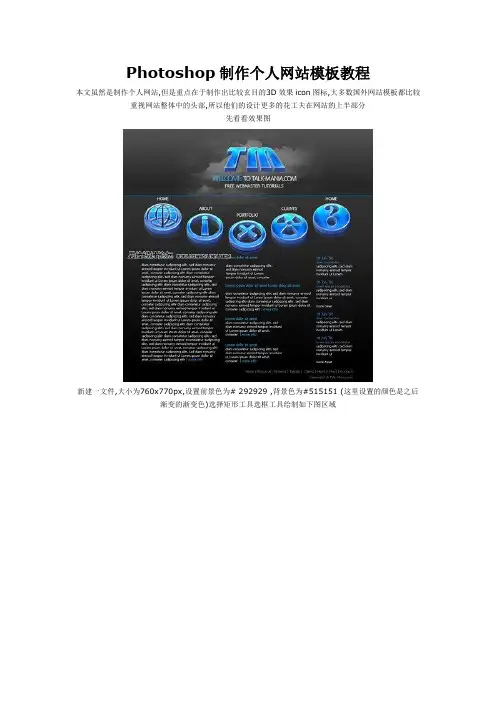
Photoshop制作个人网站模板教程本文虽然是制作个人网站,但是重点在于制作出比较玄目的3D效果icon图标,大多数国外网站模板都比较重视网站整体中的头部,所以他们的设计更多的花工夫在网站的上半部分先看看效果图新建一文件,大小为760x770px,设置前景色为# 292929 ,背景色为#515151 (这里设置的颜色是之后渐变的渐变色)选择矩形工具选框工具绘制如下图区域使用渐变工具,从选框底部向上拉一条渐变线按ctrl+d取消选框,随后再次使用矩形选框工具绘制如下图区域同样用渐变工具填充此区域,完成后ctrl+d取消选框你可能会发现两个渐变矩形之前有一条白色线条,我们将绘制一条蓝色线条取代它,使用直线工具,颜色选择#009aff ,在页面上绘制线条覆盖前面的白色线条导入一些icon图标现在我们将用PS为这些图标制作3D效果编辑>变换路径>透视,将图标制作成如图效果随后为图标添加图层样式完成后的效果如下图现在图标已经有了3D效果,但还不够立体,这里我们将图标多复制几次,每次复制后将图标往上移动几象素,这样重叠后就变得更加立体选择图标的所有图层,随后将这些图层进行复制,我们这样做是为了制作一个倒影效果将复制的图标图层选中,按ctrl+e将这些图层合并为一个图层将复制出的图标向下移动几个象素(注意复制出的图标图层因该在原始图层之下)设置不透明度为30%效果如下用同样的方法制作其他图标,随后排成如图半圆形状下载白云笔刷将笔刷安装进PS.随后选择笔刷绘制如下图选中绘制出的白云,模式选择正片叠底(Overlay)复制白云图层,编辑>变换>垂直翻转,向下移动到如下图位置使用橡皮檫,将复制出的白云边缘进行檫除,设置不透明度为70%随后加入网站的主要文字与标志LOGO站酷素材网/。
Photoshop绘制精美的企业网站模板你好,我的朋友们。
在本教程中,我将告诉您如何在短短的几个步骤里为您的企业建立网页布局,您可以使用于任何类型的业务,或再进行小的修改也可以创建一个投资组合布局。
如果您已经遵循了我,我相信你可以按照自己的需要修改这一教程上的一些布局。
像往常一样,我会创建一个新的文档,尺寸:1000 x 1100像素。
我将我的前景色设置为#333333,使用油漆桶工具,然后我将填补这个颜色的背景色。
我会选择矩形工具,我将创建一个像下面的图像的形状。
我将利用这个图片来创建布局头。
(图01)先看效果图图01对于白色的形状,我会添加下面的图层样式。
(图02)图02在添加图层样式布局看起来是这样的。
(图03)图03我这一个下面创建一个类似的形状,我将使用上面层的风格,但我会取消检查反向按钮。
(图04)图04下面是结果图05我将用更多的时间用矩形工具,创造另一个形状。
(图06)图06对于这种形状的,我会添加一些图层样式。
(图07、08、09)图07图08图09请点击下面的图片,看看它的外观。
(图10)图10创建一个新层(按上按Ctrl + Shift + ALT键+ N在同一时间)。
随着矩形选框工具我会就布局顶部选择。
(图11)图11我会选择以下像素模式,我会按我的内选择鼠标左键(请注意,您还需要选择新的层)(图12)图12这是我的结果(图13)图13使用橡皮擦工具,我会删除与此形成底部的细条纹的一部分。
我将使用顺利圆刷。
这是我的结果。
(图14)图14我将用更多的时间一矩形工具,创建一个形状,我将稍后添加一些按钮。
(图15)图15我会添加一些图层样式(图16、17、18、19)图16图17图18图19下面是结果(图20)图20在布局我将在中间创建一个新的圆角形状。
我将使用圆角矩形工具,半径为5或6像素。
(图21)图21你可以看到这个形状周围较平。
这一点用一个简单的图层样式就能解决。
(图22)图22我用钢笔工具下建立这种形状的阴影。
PS制作网页图标
学习点:1、画笔工具的使用
2、高斯模糊位移制作阴影效,滤镜波浪效果
3、图层样式:浮雕效果
4、裁剪、切片工具
操作步骤:
先看效果:
1.新建PS文件,背景白色,新建图层1。
2.在图层1上使用画笔工具,直径约为8。
按住SHIFT画水平直线。
3.滤镜—扭曲----波浪,
4.复制图层1为图层1副本。
选中图层1,执行滤镜—模糊—高斯模糊,半径3.5。
在执行滤镜---其他—位移
5.选中图层1副本,选择画笔工具,画一直线。
6.魔术棒工具选中两条线之间的空白部分,新建图层2。
7.渐变工具填充选区。
8.图层—图层样式—投影
9.使用裁剪工具,裁减得到合适的图形。
输入对应的图标文字
10.使用切片工具,将图切成如图样式
11.存储为WEB所用格式,自动生成一个图片文件夹,切好的图片都保存在里面,
直接到网页制作中用吧。
PS:只是一个例子,大家也可以拓展一下操作,颜色,步骤不是固定的,也许会有更好的效果。
在photoshop中创建一个简洁风格的网页效果图今天我将教给大家简洁风格的网页效果图在photoshop中是如何绘制的。
我想这个网站可能更适合一些产品介绍网站/blog,慈善网站,绿色的自然保护网站等等。
在这篇教程中,我们会用到一些矢量图标。
最终效果图好了,让我们开始吧。
打开photoshop创建一个新文档,尺寸是1020px X 1240px,背景颜色设置为#e6e9d4。
用矩形工具,创建一个形状,颜色 #bbc19c。
我的形状尺寸是 1020px X 327px好了,添加一个图层蒙版(保证你的图层是被选中状态)。
然后确定你选择中了蒙版。
选择渐变工具,保持默认颜色(黑色为前景色,白色为背景色),你可以简单的点击工具栏上面的小图标快速设置。
按照下图拖拽你的鼠标。
好了,我的效果是这个样子的。
Step 1 –创建logo和头部导航选择矩形工具,在文件顶部画出一个小的形状。
设置图层样式如下:我的效果:在右边的部分,用文字工具,创建导航文字。
我一般用的是字体“Helvetica” 。
接下来,用直线工具,创建一些导航上面的分割线。
设置宽度为1px,在文字中间画一些小的形状。
然后按照下图进行图层样式设置:我的效果:好了,接下来创建logo。
用矩形工具,创建一个类似的矩形,填充颜色#9cc1a2按照下图参数设置图层样式。
然后,在文件Complete Designer Set 中,我选择了一些矢量的装饰图案,在Illustrator中打开他们,选择一个然后拖拽到Photoshop中,装饰在绿色形状的上面。
用作衬托logo。
好了,选择中这一矢量图层,降低它的透明度到30%。
好了,导航和logo基本上完成了。
我用文字工具添加了一些引证,在文字导航的下面。
Step 2 –创建主导航选择矩形工具,创建一个形状,如下图。
我的尺寸是937px x 63px设置图层样式如下:添加一些文字,最终效果如下:现在,看起来主导航有一些单调,我添加了一些图标。
用Photoshop制作网页背景图网页背景图的制作一、建立新文件1.建立一个250 X 150(72像素/英寸)的新文件,不要太大,因为背景图一般是平铺在底面上的。
然后把背景填充上浅浅的颜色如淡黄色:(图txt5_step1)二、输入文字1. 选择你喜欢的字体和颜色输入文字,我这里输入“我的酷站”,然后调整字的大小和位置。
这里有几个注意事项:第一,字的大小和字型最好不要太死板,最好用另外的字体和不同的尺寸突出你想突出的一个或几个字,必要时可以拉长或压扁。
第二,字和背景的颜色搭配要得当,这没有什么规律可言,一般只要看着顺眼就行了。
如图:(图txt5_step2)2.然后选择“图层(Layer)->新建(New...)->图层(Layer)”两次,建立两个新层,如图所示:(图txt5_step3)3.分别在两个层上随便选择一定形状(什么形状?你自己随意啦。
)的范围,填充合适的颜色后,将这两个层的透明度降到35%:三、技术处理1. 下面的步骤很随意,你随便试几个滤镜,只要得到自己满意的效果就行了。
我这里的操作是这样的:绿色方块第一次滤镜:“滤镜(Filter)->模糊(Blur)->动感模糊(Motion Blur)”(角度:0度,距离:20像素)绿色方块第二次滤镜:“滤镜(Filter)->模糊(Blur)->径向模糊(Radiou Blur)”(数量:52,方法:转动)紫色方块第一次滤镜:“滤镜->纹理->颗粒”(强度:77,对比度:50,颗粒类型:软化) 紫色方块第二次滤镜:“滤镜->模糊->径向模糊”(数量:60,方法:缩放)这里的操作能真正体现出你个人的审美观点。
(图txt5_step5)3.在层面板上点击背景层前面的小眼睛,隐藏背景层,然后点击层面板右上方的小三角,选择“合并可见层”,如图:(图txt5_step5)4. 在层面板上点击背景层前面的空白区域,让小眼睛出现,重新显示背景层。
Photoshop详解制作漂亮的绿色首页模板,第一,对于一些做网站的爱好者,下面真的是个好例子;第二,设计出来的效果也很不错;第三,内容齐全,很值的学习。
在这篇教程中,你将学会如何在photoshop中制作一个漂亮的绿色的干净的网页效果图。
你将学会一些很时髦的设计技巧,像是如何制作3D丝带,或者是如何设置看上去很专业的渐变色。
这是教程的第一部分。
最终效果图看一看我们最终的效果图吧,看上去还不错:>在photoshop中新建文档1在photoshop中新建一个文档,尺寸为980px × 830px.2 如果你在photoshop软件界面中,没有看到在画布的周围看到标尺,点击试图>标尺(Ctrl + R)可以显示标尺。
3 在画布的四个边,分别拖拽四条标尺线。
在这四条线中间,我们将绘制我们的页面。
创建页面背景4 选择圆角矩形工具(U), 设置圆角半径为10px,设置颜色为#E0E0AC, 在你的整个画布中拖拽一个圆角矩形。
设置这个图层名字为“bg“.5 好了,现在,我们将扩大我们的画布。
首先,缩小我们的画布视图(ctrl+-),然后点击图像>画布尺寸(Alt + Ctrl + C),然后根据下面的截图设置参数。
6 再一次选择图像>画布尺寸(Alt + Ctrl + C),然后根据下面的截图设置参数。
7 在图层面板中点击背景图层,设置前景色为#6C821C,用油漆桶(G)填充背景。
8 在背景图层上面创建一个新图层,命名为”gradient“.9 在工具栏中选择渐变工具(G),从画布头部开始向下拖拽出一个从白色到黑色的渐变。
10 设置该图层渲染模式为颜色加深,然后设置图层图层透明度为10%.11 保持该图层仍为选定状态,点击图层>图层蒙版>显示全部。
12 在工具栏中选择渐变工具(G) ,从你的画布底部向上拖拽一个从黑色到透明的渐变。
可以根据下面的截图进行拖拽。
13 右键单击图层“gradient” ,在弹出的菜单中,设定转换为智能元件。
14 点击滤镜>杂点>添加杂点。
根据下图设置参数。
15 新建一个图层,用画笔工具(B),选择白色的软笔刷,直径为300px,在你的画布顶端,画一条白线。
16 设置这个图层的透明度为50% ,并命名该图层为“highlight“.17 在bg图层上面,新建图层。
点击键盘上的D,设置成默认的前景背景色(前景白色,背景黑色),然后点击滤镜>渲染>云彩。
18 在图层面板上,右键单击该图层,在弹出的菜单中,设置该图层为智能元件。
命名该图层为“texture“.19 保持图层”texture”仍未选定状态。
点击滤镜>模糊>动感模糊,根据截图进行参数设定。
20 然后点击滤镜>锐化>锐化。
21 给图层”texture”添加蒙版,点击图层>图层蒙版>显示全部。
22 选择渐变工具(G) ,从画布底部到顶端,拖拽一个黑色到透明的渐变。
23设置图层渲染模式为叠加,设置图层透明度为40%。
设置主要内容的背景24 双击“bg” 图层,打开图层属性面板。
根据下图进行外发光的参数设定。
25 新建图层,设置前景色为#2A2009, 选择画笔工具(B) ,用一个比较硬的直径为25px的画笔,在你的圆角矩形的下边缘,画一个圆。
26 在图层面板中右键单击该图层,设置图层为智能对象。
27 然后点击编辑>自由变化(Ctrl + T) ,根据下图进行变形。
28 点击滤镜>模糊>高斯模糊,按照下图进行参数设定。
29 设置该图层的渲染模式为整片叠底,透明度为30%。
最后,给该图层命名为”shadow“, 把这个图层放在bg图层的上面。
创建导航条30 好了,接下来,我们来做导航条。
选择矩形工具(U) ,设置颜色为#D8D8A5.31 在你之前创建的那个大的圆角矩形中,创建一个高为60px的矩形,命名该图层为“navigation bar“. Note: 打开信息面板(F8), 这样你就会看到你所创建的矩形的高度。
32 双击图层“navigation bar” 打开图层属性面板,按照下图设置参数。
33 你可能注意到,我们刚刚创建的矩形并没有圆角。
为了纠正这个小的细节,我们应用剪辑蒙板(clipping mask)这个概念。
右键点击图层“navigation bar” layer, 选择创建剪切蒙版。
34 好了,我们接下来要做的是,创建当前页的按钮。
选择矩形工具(U), 设置颜色为#A6A43F, 创建一个高为60px的矩形。
35 设置透明度为15%,命名该图层为”current page button“.36 然后向下设置剪辑蒙板。
37 选择刚刚的四个图层,点中ctrl然后分别在图层面板中点击这四个图层,然后点击Ctrl + G群组。
设置这个群组名为“bg & navigation bar“.38 选择文字工具(T),给导航添加一些文字,用颜色#A6A43F. 在这次的设计中,我用的字体是Avenir LT 65 Medium 。
如果你没有这个字体,可以用你喜欢的字体代替。
给“特色项目”部分,自定义一个图案39 好了,我们要创建一个图案。
新建一个文档,文件>新建(Ctrl + N), 尺寸是5px * 5px, 透明背景。
40 设置前景色为#2A2009, 在工具栏中选择铅笔工具(B) ,在你的画布中间,画一个1px大小的方框。
41 点击编辑>定义图案。
命名这个图案,然后点击ok。
好了,你可以关闭这个文件了。
创建“特色项目”区域42 选择矩形工具(U) ,创建一个高为330px的任何颜色的矩形。
43 在图层面板上,双击该图层,打开图层属性面板。
按照下图进行参数设定。
44 命名这个图层为“pattern“.45 选择圆角矩形工具(U), 设置圆角半径8px, 颜色#A6A43F, 创建一个宽940px 高240px的圆角矩形。
46 设置图层透明度为50%,命名该图层为“featured project bg“.47 选择矩形工具(U), 设置颜色#A6A43F, 创建一个尺寸为610px * 220px 的矩形。
这个将会是“特色项目”的图片的位置。
,命名该图层为“image bg.”48 导入任何你喜欢的图片。
(我用的是网站Envato website 的截图).49 把图片放在你刚刚创建的矩形的上面,在图层面板上单击创建图层剪切蒙版。
命名这个图层为“image“.50 选择文字工具(T) ,在右边添加一些文字。
按照下图进行书写。
群组这些文字,命名该群组为“text“.创建按钮call-to-action51 好了,我们要在“特色项目”的底部创建两个按钮。
选择圆角矩形工具(U), 设置半径为8px,颜色为#A6A42F, 创建一个小矩形。
命名该图层为“button 1“.52我们希望按钮的上面不是圆角。
按照下面的操作进行:A.确定图层”button 1″的蒙版是选中的。
B.选择直接选择工具(A),在你看到的路径上单击。
好了,这时候你将看到在每个圆角上都有两个锚点。
C.选择转换点工具(默认图标是个小钢笔头,在这一组工具中可以找到) ,单击这四个锚点。
•再次选择直接选择工具(A),按住shift键创建直角边。
53 设置该图层透明度为30%.54 然后用文字工具l (T)添加一些文字。
设置颜色为#EAEAB7.55 你也可以添加一些小图标。
如果你喜欢,可以去这里翻翻看。
56 群组所有的文字和图标图层,命名太群组为”button 1“.57 创建另一个按钮。
58 为了方便管理,群组所有关于”特色相聚”的图层和群组层,命名这个大的群组为”featured project“.创建3D丝带59 选择矩形(U) 创建一个高为130px的颜色为#A6A43F的矩形,如下图。
命名该图层为“ribbon background“.60 选择圆角矩形(U), 设置半径为10px ,在你刚刚创建的矩形的左边的位置,拖拽一个矩形。
在这一步,你可以拖拽一些标尺线作为辅助。
61 点击你之前创建的圆角矩形的矢量蒙版,让它被选中。
然后选择圆角矩形(U), 在属性栏中点击从形状减去区的按钮,创建一个圆角矩形。
按照下面的截图进行操作。
62 创建一个新的图层,右键点击设置为创建剪贴蒙版。
63 选择渐变工具(G),按照下面的截图拖拽一个白色到透明的渐变。
64 设置该图层渲染模式为叠加,透明度为30%,命名为“highlight“.65 选择矩形工具(U), 设置颜色为#878533 ,在图层”ribbon background”上创建一个矩形。
66 选择矩形工具(U), 在属性栏中点击从形状减去区按钮,然后创建一个矩形。
如图。
剪切掉我们不要的那部分。
67 双击图层,打开图层属性面板。
按照下面的截图进行参数设置。
68 重复以上步骤,不过这一次是在丝带的右边。
69 群组所有关于丝带的图层,命名该群组为”ribbon“.70 在图层”ribbon background”上创建一个新图层。
然后按照之前的操作,创建一个阴影。
71 选择圆角矩形工具(U), 设置半径为8px,颜色为#E1E0C1 ,创建四个圆角矩形,大小为220px * 110px.72 设置透明度为50%,然后群组他们。
命名该群组为”images“.73 在工具栏中选择文字工具(T) ,在你的布局下面添加一些文字。
也可以添加一些图标。
74 应用文字工具(T) ,颜色为#E0E0AC 。
在文档的顶端,写上整个站点的名字。
75 双击该图层,打开图层属性面板。
按照下图进行参数设定。
76 然后写标语。
77 为了让效果图更完整,你可以选择四个图片,导入到你的文档中。
放在你的丝带上。
好了,完成了!如果你按照该教程进行学习,你应该能得到下面的效果。
单击这里查看完整效果。
查看更多请点击(按住ctrl键点击)--------下面红色部分是赠送的工作总结,不需要的朋友可以编辑删除!谢谢行政管理干部个人总结20XX年上半年,在公司的正确领导下,在各科室部门的大力支持下,我按照公司的工作部署和工作要求,严格执行公司的工作方针,围绕中心,突出重点,狠抓落实,注重实效,在自身工作岗位上认真履行职责,做好各项行政管理工作,较好地完成了工作任务,取得了一定的成绩。
现将20XX年上半年个人工作情况总结如下:一、抓好自身建设,全面提高素质我作为一名负责公司行政管理的干部,肩负着公司赋予的重要工作职责,知道自己责任重大,努力按照政治强、业务精、善管理的复合型高素质的要求对待自己,加强政治理论与业务知识学习,把它学深学透,领会在心里,运用到具体实际工作中,以此全面提高自己的政治、业务和管理素质。