高考英语图表型作文写作模板+优秀范文(推荐)
- 格式:doc
- 大小:48.00 KB
- 文档页数:7
高考英语图表作文In the first graph, we can see a steady increase in the number of people using smartphones over the past decade. This is hardly surprising, given the rapid advancements in technology and the increasing availability of affordable smartphones. It seems that almost everyone has a smartphone these days, and it has become an essential tool for communication, entertainment, and even work.Moving on to the second graph, we can observe a similar trend in the use of social media. The number of active social media users has been steadily rising, with no signs of slowing down. This is indicative of the growing importance of social media in our daily lives, as it has become a primary platform for communication, information sharing, and even advertising.Looking at the third graph, we can see a significant increase in online shopping activities. This is not surprising, given the convenience and accessibility ofonline shopping platforms. With just a few clicks, people can purchase almost anything they need, and have it delivered right to their doorstep. It's no wonder that traditional brick-and-mortar stores are facing increasing competition from online retailers.In summary, these graphs paint a picture of a society that is increasingly reliant on technology for communication, social interaction, and consumption. It's clear that smartphones, social media, and online shopping have become integral parts of our daily lives, and their influence will only continue to grow in the future.。
高考英语作文模板图表The bar chart shows the percentage of people in different age groups who use social media on a daily basis. It is clear that the younger the age group, the higher the percentage of daily social media users. 。
The pie chart illustrates the distribution of online shopping frequency among different income groups. It can be seen that the majority of high-income earners shop online frequently, while low-income earners tend to shop online less often. 。
The line graph depicts the trend of smartphone ownership over the past decade. It is evident that smartphone ownership has been steadily increasing, with a significant surge in the last five years. 。
The table provides information on the top five most popular leisure activities among people of different age groups. Interestingly, watching TV is the most popularleisure activity for all age groups, followed bysocializing with friends for the younger age groups, and reading for the older age groups.The chart presents the average daily time spent on various activities by people of different education levels. It is notable that higher education levels are associated with less time spent on activities such as watching TV and socializing, and more time spent on work and studying.In conclusion, the data presented in the charts and tables offer valuable insights into the behaviors and preferences of different demographic groups. It is clear that age, income, education, and technological advancements play significant roles in shaping people's habits and activities.。

英语作文图表作文(五篇范文)第一篇:英语作文图表作文图表分析作文1As is clearly shown in the table/ figure/ graph / chart, 图表总体描述 between 年代 and 年代.Especially, 突出的数据变化.There are three reasons for 具体表示急剧上升、下降或特殊现象的词.To begin with, 原因一.In addition / Moreover, 原因二.For example, 具体例证.Last but no least, 原因三.In short,总结上文.As far as I am concerned, / For my part, / As for me,作者自己的观点.On the one hand, 理由一.On the other hand, 理由二.In brief,总结上文.图表分析作文2The table / figure / graph / chart shows that 图表总述from 年代to年代.It is self-evident that突出的数据变化.Three possible reasons contribute to 具体表示急剧上升、下降或特殊现象的词或代词代替上文内容.One reason is that原因一.Another reason is that 原因二.For instance,举例证.What’s more原因三.As a result, 重述上文之趋势.However, in my opinion 作者观点.For one thing,理由一.For another, 理由二.T o sum up,总结上文.图表分析作文3It can be seen from the table / figure / graph / chart that图表总述between年代and年代.Especially,突出的数据变化.Why are there such great changes during 图表涉及的年头数years? There are mainly two reasons explaining具体表示急剧上升、下降或特殊现象的词或代词代替上文内容.First,原因一.In the old days,比较法说明过去的情况.But now,说明现在的情况.Second,原因二.As a result,总结上文.In my viewpoint,作者自己的观点.On the one hand,论点一.On the other hand,论点二.图表分析作文4As the table / figure / graph / chart shows,图表总述in the past years年代.Obviously,突出的数据变化.Why are there suchsharp contrasts during 图表涉及的年头 years?Two main factors contribute to具体表示急剧上升、下降或特殊现象的词或代词代替上文内容.First of all,原因一.In the past,比较法说明过去的情况.But now 说明现在的情况.Moreover,原因二.Therefore,总结上文.As I see it,作者自己的观点.For one thing,论点一.For another,论点二.图表作文补充句型• As is shown in the graph…如图所示…•The graph shows that…图表显示…•As can be seen from the table,…从表格中可以看出…•From the chart, we know that…从这张表中,我们可知…• All these data clearly prove the fact that… 所有这些数据明显证明这一事实,即…• The increase of ….In the ci ty has reached to 20%.….在这个城市的增长已达到20%.• In 1985, the number remained the same.1985年,这个数字保持不变.• There was a gradual decline in 1989.1989年,出现了逐渐下降的情况.第二篇:英语图表作文图表描述专题训练(一)这类作文时,注意以下几点:第一,审题时,除了要把握好图表的表层信息外,还要分析图标的深层含义,如原因、根源、可能的发展趋势等。
英语高考作文图表类The bar chart shows the percentage of people in different age groups who spend more than 4 hours a day on their smartphones. As we can see, the younger age groups tend to spend more time on their phones, with over 80% of people aged 18-24 using their phones for more than 4 hours a day.The line graph illustrates the trend of smartphone usage over time. It is evident that smartphone usage has been steadily increasing over the years, with a significant spike in the last decade. This trend is likely to continue as technology advances and smartphones become more integrated into our daily lives.The pie chart displays the purposes for which people use their smartphones. The majority of people use their smartphones for social media, followed by entertainment, communication, and work. This reflects the growing importance of smartphones in staying connected andentertained, as well as their potential for productivity.The scatter plot shows the relationship between smartphone usage and mental health. It is clear that there is a negative correlation between the two, with increased smartphone usage being associated with higher levels of stress, anxiety, and depression. This highlights the need for individuals to be mindful of their smartphone usage and its potential impact on their mental well-being.In conclusion, the data presented in the charts paints a picture of the increasing prevalence of smartphone usage, particularly among younger age groups, and its potential implications for mental health. It is important for individuals to be aware of their smartphone usage andstrive for a healthy balance in order to maintain overall well-being.。
图表式作文It is obvious in the graphic/table that the rate/number/amount of Y has undergone dramatic changes. It has gone up/grown/fallen/dropped considerably in recent years (as X varies). At the point of X1, Y reaches its peak value of ...(多少).What is the reason for this change? Mainly there are ... (多少) reasons behind the situation reflected in the graphic/table. First of all, ...(第一个原因). More importantly, ...(第二个原因). Most important of all, ...(第三个原因).第一段:The table/graph/chart shows, as far as ______(is/are)concerned, _______________________.第二段:(第二段分为三种情况:1、一直上升;2、一直下降;3、一部分上升,一部分下降。
下面针对这三种情况进行结构模仿)。
1、(以1978年到1998年城镇乡村收入的稳步较长图为例)。
a.一直上升According to the figures show in the graph, we can see that________, had been increasing at a steady rate from the year of 1978 to 1998. In addition, during the period, ____________had raise from 349.9 Yuan to 5425 Yuan, morethan 5 times .Meanwhile, _______had also grown from 133.6 Yuan to 2100 Yuan.b. 一直下降According to the figures show in the graph, we can see that___________, had been decreasing at e steady rate from the year of 1978 to 1998. In addition, during the periond,____________had reduced from 349.9 Yuan to 5425 Yuan, more than 5 times .Meanwhile ,_______had also gone down 133.6 Yuan to 2100 Yuan.2、[以从1995年到1999年西安人的日常生活支出(食物、服装和娱乐)的变化为例]c. 一部分上升,一部分下降:According to the figures in the graph, we can see that__________had been increasing by 9% and 7%, respectively from the year of 1995 to1999. However,___________(the expenses on food)had been decline by30% ,during the same period. The statistics of rise and fall seem to exist in isolation but closely to one another. 第三段:There are several reasons for that phenomenon. On the hand, _____;On the other hand,_________,___________.注:横线部分为自己需填充的内容,这只是整篇文章的格式,红色横线部分视考题而定,可填充的内容经济类/发展类/旅游类/文化交流类:1. The policy of reformation and opening spreader widely in China should be taken into account firstly, when considering the reason for the steady increase of the citizen's income.2. The people of China has the spirit of working hard in order to improve their living.3. China's rapid economic development lays the base.4. In the past twenty five years, remarkable changes have taken place in China's tourism rank in the world.5. The economy of China has developed so fast in twenty years that China now becomes more and more important in the world.6. I'm confident that with the development of China the numbers of visitors and the foreign exchange earrings will certainly continues to increase in the future.7. With the rapid development of technology and the global economy ,the world is becoming international, cultural exchanges are becoming more and more frequent ,which is inevitably improving our mutual understanding and friendship with other countries.食品类:1、In order to live a healthy long life, we have to restrict our calorie intake eating the food with less fat.2、We should make our diet more nutritional and balance the calorie intake to enjoy a healthy life.3、To improve the bad situation, people should eat calcium-enriched food, such as fish,milk,beancurd and so on . 娱乐类/体育类:如看书/看电视1、We should make a balance between them to benefit themselves.2、The age in which we live now is an information one.3、People should go to the gym and take part in some sports, such as basketball, volleyball, swimming and so .All the exercise help people keep healthy.友谊类/文化交流类:1、People all over the world love and respect each other. The best way to show our love is to help others when they are in difficulties.2、Everyone should be encouraged required to try to be self-reliant.3、When one in trouble, others should help him.PS:经典句子:1、Scientists have warned that unless effective measures are taken, the problem of pollution will eventually get out of hand.2、For citizens ,they are supposed to conform to rules and regulations of the traffic.3、And the government should educate people in this respect ,which will draw people's attention of the serious problem.4、For drivers their speed should be restricted . Otherwise, they should be punished severely.5、It is time the anchorites concerned took proper steps the traffic problem.6、As long as each of us takes actions. I deeply believe the problem will be well resolved to an extend作文中可用的谚语或句子:As a saying goes:俗话说1、A good beginning is half done. 良好的开端是成功的一半。

题型17 图表作文命题特点图表作文一般是对某个具体问题的调查或统计,常常反映出一个普遍的问题。
考生在描述内容时应过渡到普遍现象。
写作特点:需要介绍图表中见了什么,数据有什么变动,反映了哪些问题和趋势,并分析问题或数据背后的原因, 结合自己的看法谈谈解决措施或给出观点。
写作特点:1. 审读图表,提炼要点;2.分析要点,确立主题;3.灵活运用横向对比,即描述数据的变化;纵向说明,反映出问题。
4.谋篇成文,呈现亮点;【满分词汇模板】【满分句型模板之开篇“风头”句】1.A survey on whether ...has been conducted recently, aiming to...一项关于是否……最近进行的调查,目的是为了.......2.The chart provides data about...该图表提供了关于......3.According to the charts, ...根据图表显示,……4.The number of smokers decreased from 25% in 1976 to 21% in 2000.吸烟者的人数从1976年的25%下降到2000年的21%5.As we can see from the graph above, great changes have taken place in...正如我们从上面的图表中可以看到的,......6.Actually, some factors always stand out on top of others, if we take closer look into theissue.实际上,如果我们仔细研究这个问题,一些因素总是最突出的。
7.Such phenomenon may be rooted in the following reasons.这种现象可能源于以下原因。
8.There is a phenomenon that...有一种现象是......9.With the development of science and technology,...随着科技的发展,......10.with the booming of the economy随着人民生活水平的显著提高;11.As is clearly shown on the chart, the majority of the students surveyed...从图表上可以清楚地显示出,大多数接受调查的学生。
【例析1】请你根据下表提供的信息写一篇题为Changes in Chinese People’s Diet的短文。
短文可分为三小节:1)state the changes in people's diet in the past five years;2)explain the changes and give possible reasons ;3)draw your own conclusions.注意: 1. 不要过多引用数据; 2. 词数100左右。
分析:本统计表描述中国人民从2001年至2005年饮食结构的变化。
Grain, the main food of the most people in China, is now playing a less important role. The amount of fruit and vegetables in the average people’s diet has also dropped by 1.5 percent from 2001 to 2005. The amount of milk and meat has increased.The changes in diet can be explained by several reasons. For one thing, with the development of the economy, people can afford to buy better foods. For another, people have realized the importance of a balanced diet.In a word, the changes are the signs of the improvement in people’s lives. There is no doubt that there will be great changes in people’s diet in the future.最近,关于“高中是否取消文理分科”的网上调查吸引了26万余名网民的积极参与。
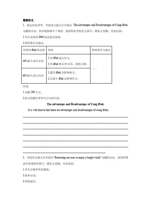
图表作文1.假定你是李华,学校英文报正在开展以The Advantages and Disadvantages of Using iPads注意:1.词数100左右;2.短文的题目和首句已为你写好。
The Advantages and Disadvantages of Using iPadsIt is well known that there are advantages and disadvantages of using iPads._______________________________________________________________________________ _______________________________________________________________________________ _______________________________________________________________________________ _______________________________________________________________________________ _______________________________________________________________________________ _______________________________________________________________________________ ______________________________________________________________2.学校英文报正在开展以“Protecting our eyes to enjoy a bright world”为题的讨论。
高考英语图表作文In the first chart, we can see the percentage of students who choose different majors in college. It's interesting to note that the majority of students prefer to study business, while only a small percentage choose to study art or music. This reflects the current trend of society, where business-related majors are considered more practical and promising for future career development.Moving on to the second chart, it shows the average monthly income of people in different age groups. What stands out is that the income tends to increase with age, reaching the highest point in the 40-49 age group. This is not surprising, as people in this age group are usually at the peak of their careers and earning potential. However, it's worth noting that the income starts to decline after the age of 50, which may be due to retirement or other factors.Looking at the third chart, it illustrates thedistribution of leisure activities among different age groups. It's clear that younger people tend to spend more time on activities such as socializing, sports, and shopping, while older people prefer activities like reading, gardening, and watching TV. This reflects the different priorities and interests of people at different stages of life.Finally, the fourth chart displays the percentage of people using various social media platforms. It's nosurprise that platforms like Facebook and Instagram are the most popular, especially among younger age groups. However, what's interesting is the growing popularity of platforms like TikTok, which has gained a significant number of users across all age groups in recent years.In conclusion, these charts provide valuable insights into the preferences and behaviors of people in different aspects of life. It's clear that there are significant differences in choices and habits across age groups, reflecting the diverse nature of society as a whole.。
1 2023年新高考英语应用文写作提分技能(模板+素材+策略) 类型模板之图画类
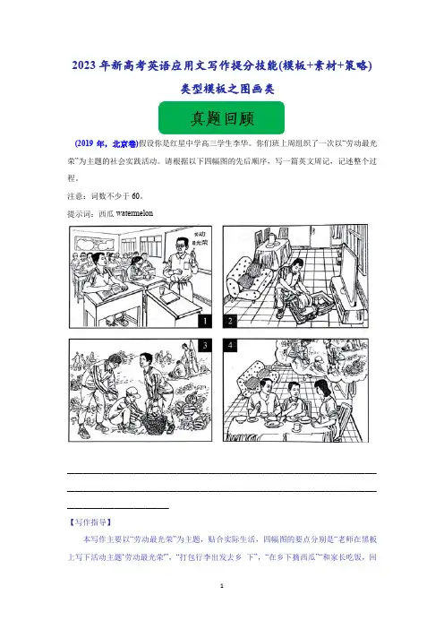
(2019年,北京卷)假设你是红星中学高三学生李华。你们班上周组织了一次以“劳动最光荣”为主题的社会实践活动。请根据以下四幅图的先后顺序,写一篇英文周记,记述整个过程。 注意:词数不少于60。 提示词:西瓜watermelon
________________________________________________________________________________________________________________________________________________________________________________________ 【写作指导】 本写作主要以“劳动最光荣”为主题,贴合实际生活,四幅图的要点分别是“老师在黑板上写下活动主题‘劳动最光荣'”,“打包行李出发去乡 下”,“在乡下摘西瓜”“和家长吃饭,回 2
忆劳动历程”;考生切忌在文章开篇犯低级语法错误,在保证要点齐全的前提下,适当添加细节,并且要注意句式的多样性及用词的准确性和丰富性,适当增加长难句的使用,如对非谓语动词、三大从句及特殊句式进行灵活运用,同时注意逻辑的流畅性。 【参考范文】 Last week I took part in a farmwork programme in the suburbs. At the class meeting, our teacher told us about the programme with the theme “Working is most beautiful”. And he stressed the importance of working with our own hands. When I got home, I packed up my luggage for the trip. On the farm, we helped pick watermelons. While working, I realised how hard it was to work in the fields under a hot sun. When I came back home, I shared my experiences with my parents. And they were very proud of me.
【例文】The average family income in our Kangming City increased from 8,000 yuan per year in 1998 to 20,000 yuan in 2008. In the meantime, the structure of the average family expenses has changed, too. These graphs show the change clearly.The biggest part of the average family expenses is housing. In 1998, the average family spent 25 percent of its income on housing. In 2880, expenses on housing rose to 42 percent. Food and drink are the second biggest part of the average family expenses. In 1998, about 18% of the average income was spent on this item. In 2008, the figure grew to 30%. As a result of such increase in the expenses on housing and food, expenses on other items have been reduced from 57% in 1998 to 28%in 2008.Thus, a conclusion can be drawn that as income increases, people can improve their living step. But still the average family has to spend a large part of income to meet the basic needs.【译文】在我们康明城市家庭平均收入从8000元,每年1998至2008年的20,000元。
高考英语作文图表类1. According to the chart, the number of people living in urban areas has been steadily increasing over the past decade.2. The data shows a significant rise in the use of smartphones among teenagers, with almost 90% of them owning a smartphone.3. The bar graph indicates a clear correlation between education level and income, with higher education leading to higher earning potential.4. The pie chart reveals that the majority of greenhouse gas emissions come from the transportation sector, highlighting the need for more sustainable transportation options.5. The line graph illustrates the fluctuating trend of global temperatures over the years, emphasizing the urgencyof addressing climate change.6. The data table presents a comparison of average life expectancy across different countries, showing disparities in healthcare access and quality.7. The scatter plot demonstrates a positiverelationship between hours of study and exam scores, suggesting that hard work does pay off in academic achievement.8. The chart displays the distribution of household income in a particular region, indicating income inequality and the need for economic reforms.9. The line graph depicts the increasing trend of online shopping, reflecting the convenience and popularity of e-commerce in today's digital age.10. The bar graph shows the consumption patterns of various age groups, highlighting differences in spending habits and preferences.。
高考英语图表作文万能模板高考英语图表作文万能模板The chart gives us an overall picture of the 图表主题.The first thing we notice is that 图表最大特点 .This means that as 进一步说明.We can see from the statistics given that 图表细节图表细节一 . After 动词-ing :细节一中的第一个变化, the动词-ed+幅度+时间(紧跟着的变化) .The figures also tell us that图表细节二 .In the column, we can see that accounts for (进一步描述).Judging from these figures, we can draw the conclusion that (结论).The reason for this, as far as I am concerned is that (给出原因). b或是 It is high time that we (发出倡议).图画类写作模板1.开头Look at this picture./The picture shows that.../From this picture, we can see.../As is shown in the picture.../As is seen in the picture...2.衔接句As we all know, .../As is known to all,.../It is well known that.../In my opinion,.../As far as I am concerned,.../This sight reminds me of something in my daily life.。
英语图表作文模板 第 1 页 共 7 页 英语图表作文模板推荐 The chart gives us an overall picture of the ____________(图表主题)。The first thing we notice is that_______________(图表最大特点)。This means that as __________, _________________(进一步说明)。 We can see from the statistics given that _______________(图表细节一)。After ving_________(细节一中的第一个变化), the _____Ved+幅度+时间(紧跟着的变化)。The figures also tells us that_________________________(图表细节二)。(数据位置,如In the second column), we can see that ____________accounts for _______(进一步描述)。 Judging from these figures, we can draw the conclusion that___________(结论)。The reason for this, as far as I am concerned is that_____________(给出原因)。/It is high time that we Ved(发出倡议) 英语四六级作文模板大全(二) 图表式作文模板 It is obvious in the graphic/table that the rate/number/amount of Y has undergone dramatic changes. It has gone up/grown/fallen/dropped considerably in recent years (as X varies). At the point of X1, Y reaches its peak value of …(多少). What is the reason for this change? Mainly there are … (多少)reasons behind the situation reflected in the graphic/table. First of all, …(第一个原因). More importantly, …(第二个原因). Most important of all, …(第三个原因). From the above discussions, we have enough reason to predict what will happen in the near future. The trend described in the graphic/table will continue for quite a long time (if necessary measures are not taken括号里的使用于那些不太好的变化趋势). 图表作文写作常识 1、图形种类及概述法: 泛指一份数据图表:a data graph/chart/diagram/illustration/table 饼图:pie chart 直方图或柱形图:bar chart / histogram 趋势曲线图:line chart / curve diagram 表格图:table 流程图或过程图:flow chart / sequence diagram 程序图:processing/procedures diagram 2、常用的描述用法 The table/chart diagram/graph shows (that) According to the table/chart diagram/graph As (is) shown in the table/chart diagram/graph As can be seen from the table/chart/diagram/graph/figures, figures/statistics shows (that)... It can be seen from the figures/statistics We can see from the figures/statistics It is clear from the figures/statistics It is apparent from the figures/statistics table/chart/diagram/graph figures (that) ... table/chart/diagram/graph shows/describes/illustrates how...... 3、图表中的数据(Data)具体表达法 数据(Data)在某一个时间段固定不变:fixed in time 在一系列的时间段中转变:changes over time 英语图表作文模板 第 2 页 共 7 页 持续变化的data在不同情况下: 增加:increase / raise / rise / go up ... 减少:decrease / grow down / drop / fall ... 波动:fluctuate / rebound / undulate / wave ... 稳定:remain stable / stabilize / level off ... 最常用的两种表达法: 动词 + 副词形式(Verb+Adverb form) 形容词 + 名词形式(Adjective+Noun form) 相关常用词组 1、主章开头 图表类型:table、chart、diagramgraph、column chart、pie graph 描述:show、describe、illustrate、can be seen from、clear、apparent、reveal、represent 内容:figure、statistic、number、percentage、proportion 2、表示数据变化的单词或者词组 rapid/rapidly 迅速的,飞快的,险峻的 dramatic/dramatically 戏剧性的,生动的 significant/significantly 有意义的,重大的,重要的 sharp/sharply 锐利的,明显的,急剧的 steep/steeply 急剧升降的 steady/steadily 稳固的,坚定不移的 gradual/gradually 渐进的,逐渐的 slow/slowly 缓慢的,不活跃的 slight/slightly轻微的、略微地 stable/stably 稳定的 3、其它在描述中的常用到的词 significant changes 图中一些较大变化 noticeable trend 明显趋势 during the same period 在同一时期 grow/grew 增长 distribute 分布,区别 unequally 不相等地 in the case of adv. 在...的情况下 in terms of / in respect of / regarding 在...方面 in contrast 相反,大不相同 government policy 政府政策 market forces 市场规率 measure n. 尺寸,方法,措施 v.估量,调节 forecast n. 先见,预见 v. 预测 英语图表写作套句精选 1.the table shows the changes in the number of……over the period from……to…… 该表格描述了在……年之……年间……数量的变化。 2.the bar chart illustrates that……该柱状图展示了…… 3.the graph provides some interesting data regarding……该图为我们提供了有关……有趣数据。 英语图表作文模板 第 3 页 共 7 页 4.the diagram shows (that)……该图向我们展示了…… 5.the pie graph depicts (that)……该圆形图揭示了…… 6.this is a cure graph which describes the trend of……这个曲线图描述了……的趋势。 7.the figures/statistics show (that)……数据(字)表明…… 8.the tree diagram reveals how……该树型图向我们揭示了如何…… 9.the data/statistics show (that)……该数据(字)可以这样理解…… 10.the data/statistics/figures lead us to the conclusion that……这些数据资料令我们得出结论…… 11.as is shown/demonstrated/exhibited in the diagram/graph/chart/table……如图所示…… 12.according to the chart/figures……根据这些表(数字)…… 13.as is shown in the table……如表格所示…… 14.as can be seen from the diagram,great changes have taken place in…… 从图中可以看出,……发生了巨大变化。 15.from the table/chart/diagram/figure,we can see clearly that……or it is clear/apparent from the chart that……从图表我们可以很清楚(明显)看到…… 16.this is a graph which illustrates……这个图表向我们展示了…… 17.this table shows the changing proportion of a & b from……to……该表格描述了……年到……年间a与b的比例关系。 18.the graph,presented in a pie chart, shows the general trend in…… 该图以圆形图形式描述了……总的趋势。 19.this is a column chart showing……这是个柱型图,描述了…… 20.as can be seen from the graph,the two curves show the flutuation of…… 如图所示,两条曲线描述了……的波动情况。 21.over the period from……to……the……remained level.在……至……期间,……基本不变。 22.in the year between……and……在……年到……期间…… 23.in the 3 years spanning from 1995 through 1998……1995年至1998三年里…… 24.from then on/from this time onwards……从那时起…… 25.the number of……remained steady/stable from (month/year) to (month/year)。 ……月(年)至……月(年)……的数量基本不变。 26.the number sharply went up to……数字急剧上升至…… 27.the percentage of……stayed the same between……and…… ……至……期间……的比率维持不变。 28.the figures peaked at……in(month/year)……的数目在……月(年)达到顶点,为…… 29.the percentage remained steady at……比率维持在…… 30.the percentage of……is sightly larger/smaller than that of…… ……的比例比……的比例略高(低)。 31.there is not a great deal of difference between……and…………与……的区别不大。 32.the graphs show a threefold increase in the number of…… 该图表表明……的数目增长了三倍。 33……decreased year by year while……increased steadily.……逐年减少,而……逐步上升。 34.the situation reached a peak(a high point at) of[%]. ……的情况(局势)到达顶(高)点,为……百分点。 35.the figures/situation bottomed out in……数字(情况)在……达到底部。 36.the figures reached the bottom/a low point/hit a trough.数字(情况)达到底部(低谷)。
高考英语图表作文In this article, we'll take a peek at the trends reflected in the chart about student participation in extracurricular activities.First up, let's talk about the rise in sports participation. It's clear that students are really getting into the swing of things and joining teams or clubs. I mean, who doesn't love the thrill of a game or the camaraderie of a team? It's not just about winning; it's about learning teamwork, discipline, and how to handle pressure.Then there's the steady growth in art and music activities. I bet it's because students are realizing that there's more to life than just studying. Creativity is an essential part of being human, and these activities give them a chance to express themselves in a unique way. Plus, who knows? Maybe some of them will even become the next Beethoven or Picasso!But wait, there's more! The chart also shows a spike in participation in community service. It's really heartwarming to see that students are interested in contributing to society. Helping others not only feels good, but it also teaches valuable life lessons about empathy and responsibility.And finally, we can't forget about the tech。
英语高考作文图表类The bar chart shows the percentage of people in different age groups who use social media on a daily basis. It is clear that the younger the age group, the higher the percentage of daily social media users. For example, 95% of people aged 18-24 use social media daily, while only 40% of those aged 65 and over do so.The line graph illustrates the trend of global temperatures over the past century. It is evident that there has been a steady increase in temperatures since the 1980s. The year 2016 saw the highest global temperatures on record, indicating a worrying trend of climate change.The pie chart displays the distribution of household expenses in a typical family. It can be seen that the largest portion of the budget is spent on housing, followed by transportation and food. Surprisingly, entertainment and leisure activities make up a relatively small percentage of the expenses.The table compares the average salaries of different professions in the United States. It is notable that medical professionals and software engineers earn the highest salaries, while service and retail workers earn the lowest. This data highlights the income disparity between different occupations.The scatter plot shows the relationship between hours of study and exam grades. There seems to be a positive correlation between the two, as students who study more hours tend to achieve higher grades. However, there are also outliers, indicating that other factors may influence academic performance.In conclusion, these visual representations provide valuable insights into various aspects of society, from technology usage to environmental trends and economic disparities. It is important to analyze and interpret data in order to understand and address the issues facing our world today.。
高考英语图表型作文写作模板+优秀范文!
(名师精心备课模板,建议下载保存) (绝对精品文档,价值很高,值得下载收藏)
图表型作文通常用图片、表格的方式反映出某一问题、现象或观点,该类作文要求考生首先对图表进行简单表述,然后点题并加以论证说明。这几年高考英语作文通常以书信类应用文为载体,而不常考的图表型作文反而容易被大家忽略,一旦考到,措手不及,今天小简老师就为大家分享高中英语图表型作文的写作模板,希望大家仔细阅读记忆。 图表作文是高中英语作文中较常见的类型,要求学生通过图中数据和提示内容写一短文,属于比较、对照类。也可根据提示写为议论文。通常我们采取三段式写法: 第一段:描述图表,得出结论。 第二段:紧扣主题,根据图表比较分析原因,论证结论。 第三段:发表议论,提出自己的看法。 必会词汇: 表格(table)、柱形图(bar chart)、 饼状图(pie chart)和折线图(diagram) 常用句式: 1.As can be seen from/in the chart/diagram/table/graph... 从表格/图形中我们可以看到…… 2.According to /As is shown in the Table /Figure/Chart...如表格/图表中显示…… 3.It can be seen from the chart/diagram/table/graph/figures/statistics that... 从表格/图表/数据中我们可以看到…… 4.From the table/figures/data/results/information above, it can/may be seen/concluded/shown/estimated/calculated/inferred that... 从以上的表格/图表/数据/结果/信息中,我们可以看到/总结/预测/计算/得出…… 5.The table shows the changes in the number of...over the period from...to... 该表格描述了在……年之……年间……数量的变化。 6.As can be seen from the graph, the two curves show the fluctuation of...如图所示,两条曲线描述了……的波动情况。 7.The pie charts show the changes on... in some place in 2000. 此饼形图显示了2000年一些地方……的变化。 8.The table shows a three times increase over that of last year. 表格显示比去年上升了3倍。 The number is 5 times as much as that of... 此数字是……的5倍。 9.It has increased by three times as compared with that of ... 同……相比,增长了3倍。 10.The figure of A is about twice as much as that of B. A的数字是B的两倍。 11.A has the highest sales figure in the three departments, followed by B and C. 在3个部门中,A的销售额最高,其次是B和C。 12.The rise lasted for two weeks and then began to level off in August. 上升两个星期后,8月份开始平稳。 13.It accounts for 30% of the total population. 占到总人口的30%。 14.The number of students has reached 500, indicating a rise of 20%, compared to last semester. 学生人数达到500人,与上个学期相比上升了20%。 15.It picked up speed at the end of this month. 这个月底加快了速度。 16.from this year on,there was a gradual declined reduction in the..., reaching a figure of... 从这年起,……逐渐下降至…… 17.There are a lot of similarities/differences between...and... ……与……之间有许多相似(不同)之处 18.It can be drawn from the chart that the proportions of A and B are going down, though the falling level of the latter is a lot lower/higher than that of the former. 尽管B的下降速度比A要慢/快,从表中我们可以看到A和B的比例都在下降。 19.The increase/decrease is more noticeable during the second half of the 5year period. 在5年期限的后半段,增长/降低比较明显。 20.It falls from 50% in 2000 to 30% in 2004, and then the trend reverse, finishing at 58% in 2005. 从2000年的50%降到2004年的30%,然后形势逆转,2005年达到了58%。 高中英语作文图表作文万能模板: As is shown by the figure/percentage in the table /picture,____ has been on rise/ decrease, significantly/dramatically rising/decreasing from ____ in _____ to _____ in _____. From the sharp rise/decline in the chart, it goes without saying that _____. There are at least two good reasons accounting for _____. In one hand, ____.In the other hand, _____ is due to the fact that ______.In addition, ______ is responsible for _____. Maybe there are some other reasons to show ______.But it is generally believed that the above mentioned reasons are commonly convincing. As far as I am concerned, I hold the point of view that _______. I am sure my opinion is both sound and well-grounded. 范文(一) A recent survey analyzed the change in number of film-goers and TV watchers in X city. As is shown by the graph, there has been a sharp decline in the number of film-goers during the period from 1992 to 2002, adding up to 20,000 in 2002. On the other hand, the number of TV watchers has steadily increase in the last decade, reaching 150,000 in 2002. Finally, it is interesting to note that there were as many film-goers as TV watchers in year 1998. There might be two reasons, I think, for the change. Firstly, TV is not only a convenient source of entertainment, but a comparatively cheap one. There is no point in arranging transport. And one needn’t pay for expensive seats at the cinema. Secondly, TV makes it possible for one to keep track of current events and the latest developments in science and technology. As a consequence, most people prefer to stay at