范文原文 (图表题)
- 格式:doc
- 大小:608.50 KB
- 文档页数:18

高考英语作文高三英语复习时要覆盖各类作文题材,以便在考场上看到任何类型的题目都能轻松搞定。
以下为大家整理了图表分析类作文题目及范文,供同学们参阅。
图表作文是高中英语作文中较常见的类型,要求学生通过图中数据和提示内容写一短文,属于比较、对照类。
也可根据提示写为议论文。
通常我们采取三段式写法:第一段:描述图表,得出结论。
第二段:紧扣主题,根据图表比较分析原因,论证结论。
第三段:发表议论,提出自己的看法。
常用句式:1. As can be seen from the chart,...As is shown in the chart,...2. The chart shows that about 60 percent of students want to go to college...3. From the graph/data/results/information above,it can be seen/concluded/show/estimated...4.The graph shows the changes in the number of...over the period from...to...pared with...,the number of the students of...高中英语作文图表作文万能模板:As is shown by the figure/percentage in the table /picture,____ has been on rise/ decrease,significantly/dramatically rising/decreasing from ____ in _____ to _____ in _____. From the sharp rise/decline in the chart,it goes without saying that _____.There are at least two good reasons accounting for _____. In one hand,____.In the other hand,_____ is due to the fact that ______.In addition,______ is responsible for _____. Maybe there are some other reasons to show ______.But it is generally believed that the above mentioned reasons are commonly convincing.As far as I am concerned,I hold the point of view that _______. I am sure my opinion is both sound and well-grounded.DIY:高考英语图表分析类作文题目1最近,你参加了高三年级组织的“你最重视哪科作业”的调查,结果见下面的饼状图。
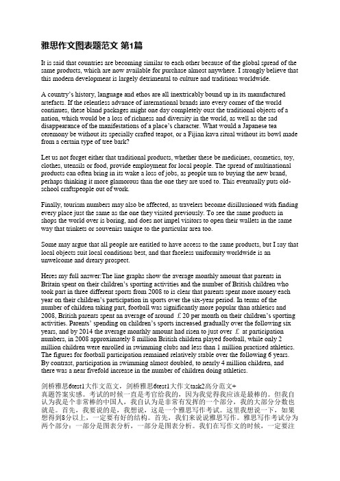
雅思作文图表题范文第1篇It is said that countries are becoming similar to each other because of the global spread of the same products, which are now available for purchase almost anywhere. I strongly believe that this modern development is largely detrimental to culture and traditions worldwide.A country’s history, language and ethos are all inextricably bound up in its manufactured artefacts. If the relentless advance of international brands into every corner of the world continues, these bland packages might one day completely oust the traditional objects of a nation, which would be a loss of richness and diversity in the world, as well as the sad disappearance of the manifestations of a place’s character. What would a Japanese tea ceremony be without its specially crafted teapot, or a Fijian kava ritual without its bowl made from a certain type of tree bark?Let us not forget either that traditional products, whether these be medicines, cosmetics, toy, clothes, utensils or food, provide employment for local people. The spread of multinational products can often bring in its wake a loss of jobs, as people urn to buying the new brand, perhaps thinking it more glamorous than the one they are used to. This eventually puts old-school craftspeople out of work.Finally, tourism numbers may also be affected, as travelers become disillusioned with finding every place just the same as the one they visited previously. To see the same products in shops the world over is boring, and does not impel visitors to open their wallets in the same way that trinkets or souvenirs unique to the particular area too.Some may argue that all people are entitled to have access to the same products, but I say that local objects suit local conditions best, and that faceless uniformity worldwide is an unwelcome and dreary prospect.Heres my full answer:The line graphs show the average monthly amount that parents in Britain spent on their children’s sporting activities and the number of British children who took part in three different sports from 2008 to is clear that parents spent more money each year on their children’s participation in sports over the six-year period. In terms of the number of children taking part, football was significantly more popular than athletics and 2008, British parents spent an average of around £20 per month on their children’s sporting activities. Parents’ spending on children’s sports increased gradually over the following six years, and by 2014 the average monthly amount had risen to just over £ at participation numbers, in 2008 approximately 8 million British children played football, while only 2 million children were enrolled in swimming clubs and less than 1 million practised athletics. The figures for football participation remained relatively stable over the following 6 years. By contrast, participation in swimming almost doubled, to nearly 4 million children, and there was a near fivefold increase in the number of children doing athletics.剑桥雅思6test1大作文范文,剑桥雅思6test1大作文task2高分范文+真题答案实感。
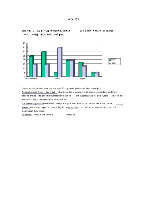
表作文范文假如你是Li Hua,是一名国学校的学生。
你最近200 名同学(男女各半)的理想做了一次,并根据果(如所示)你的看法。
4035302520boysgirls15105Businessman Teacher LawyerI have recently made a survey among 200 boys and girls about their future jobs.As can be seen from the chart, what boys like to do most is to become scientists and their second choice is to become businessmen. While the largest group of girls would like to be teachers. Only a few boys want to do this job.It is interesting that the numbers of boys and girls who want to be doctors are equal. As for lawyer, more boys expect to have this job. However, there are still some students who are notclear about their future.As for me , I would like to be a⋯because⋯7崇文一模某英文报纸正在开展题为“中学生课堂注意力”的专栏讨论,你校准备参加,并请你代表学校写一篇文章给该英文报纸投稿。
下面的图表为你校的调查结果,请你根据所提供的信息做简要说明,并根据提示给出改善的建议。
注意:图中数据为学生人数百分比。
中学生课堂注意力集中的情况中学生课堂注意力不能集中的原因40%30%70%60%能够集中注意力不能集中注意力课堂干扰睡眠不足与疲劳改善注意力的建议:教室课堂课间通风、明亮积极参与课堂活动适量活动或适当休息注意: 1.词数:不少于60。
高考英语书面表达练习——图表作文(格式与范例)作文一假如你是李华,在最近的研究性学习当中,受《21世纪中学生英语报》(The 21st Century)之邀,你对你所在的班60名同学(男女各半)进行了上网目的的调查。
现将调查结果(如下表所示)用英语给报社的编辑写一封信,报道此事,以引起舆论的关注,并提出你的观点和建议。
注意:1、报道应包括图表所示全部内容,可适度发挥。
2、文章的开头与结尾已给出,不计入总词数。
3、词数: 1504、参考词汇:调查: make a surveyDear editor,I have recently made a survey among 30 boys and 30 girls in my CLASs about their purpose of getting on the Internet. ______________________________________________作文二下列表格为某市1996年与2006年人们度假方式的情况比较,请按表格内容写一篇150词左右的短文,并对度假方式变化原因加以简要评析。
年度1996 2006 原因境外旅游11% 22% 收入增加海边度假38% 31% 海水污染爬山野营11% 34% 回归自然The way people spend their holidays changed a lot from 1996 to 2006.[思路点拨]题材:书信;说明+议论时态:一般现在时人称:第三人称要点提示:(1)上网的目的;(2)读新闻;(3)发送邮件;(4)聊天;(5)学习;(6)玩游戏;(7)评语篇章结构:文章可分两段[文采修饰]连接词的选用:but, both…, and, moreover, otherwise高级词汇的选用:keep in touch with, as for…, use… as …, benefit from, pay attention to, altogether, in one’s opinion.复杂句型的选用:what…most 引导的主语从句;as 引导的让步状语从句;倒装语序等。

2020年大学英语四级作文题目模板:图表图画型范文(五)四级作文题目: Health Gains in Developing CountriesIt can be seen from the charts that there have been dramatic changes in life expectancy and infant mortality in developing countries in the past decades. As the chart shows, people's life expectancy soared from 40 years old to 60 years old from 1960 to 1990. Meanwhile, infant mortality declined from 200 to 150 deaths per thousand births.The changes in the charts may be attributed to a numberof factors, but the following are the most critical ones. First, developing countries' economy has been developing at a considerably high speed in the past decades. Therefore,people have more extra money to improve their health. Secondly, the advances in medical sciences and boom ofmedical industry provide citizens with more opportunities to cure their diseases. Last but not least, people have attached greater importance to their quality of life, thus they have spent more money and time to build up their bodies.In a word, these charts are perfect indexes of developing nations' fast expanding economy and people's rising standardof life. Although a series of problems have arisen in the process, it is reasonable for us to believe that they can be solved in the near future with effective measures taken byboth the government and the public.(或If this trend continues, developing countries willsoon approach the developed countries in terms of health care.People will live longer and healthier lives. The result of this will be happier and more productive populations.)。

初中图表作文真题范文共13篇(经典版)编制人:__________________审核人:__________________审批人:__________________编制单位:__________________编制时间:____年____月____日序言下载提示:该文档是本店铺精心编制而成的,希望大家下载后,能够帮助大家解决实际问题。
文档下载后可定制修改,请根据实际需要进行调整和使用,谢谢!并且,本店铺为大家提供各种类型的经典范文,如工作总结、工作计划、合同协议、条据文书、策划方案、句子大全、作文大全、诗词歌赋、教案资料、其他范文等等,想了解不同范文格式和写法,敬请关注!Download tips: This document is carefully compiled by this editor. I hope that after you download it, it can help you solve practical problems. The document can be customized and modified after downloading, please adjust and use it according to actual needs, thank you!Moreover, our store provides various types of classic sample essays for everyone, such as work summaries, work plans, contract agreements, doctrinal documents, planning plans, complete sentences, complete compositions, poems, songs, teaching materials, and other sample essays. If you want to learn about different sample formats and writing methods, please stay tuned!初中图表作文真题范文共13篇初中图表作文真题范文第一篇2022 年四川省达州市中考英语作文第八部分书面表达(10分)76.初中生活已近尾声,我们即将迎来崭新的高中生活。
n e图表作文范文汇总假如你是Li Hua,是一名国际学校的学生。
你最近对200名同学(男女各半)的择业理想做了一次调查,并根据调查结果(如图所示)谈谈你的看法。
I have recently made a survey among 200 boys and girls about their future jobs.As can be seen from the chart, what boys like to do most is to become scientists and their second choice is to become businessmen. While the largest group of girls would like to be teachers. Only a few boys want to do this job.It is interesting that the numbers of boys and girls who want to be doctors are equal. As for lawyer, more boys expect to have this job. However, there are still some students who are not clear about their future.As for me , I would like to be a …because …BusinessmanTeacherLawyeri n t h07崇文一模某英文报纸正在开展题为“中学生课堂注意力”的专栏讨论,你校准备参加,并请你代表学校写一篇文章给该英文报纸投稿。
下面的图表为你校的调查结果,请你根据所提供的信息做简要说明,并根据提示给出改善的建议。
注意:图中数据为学生人数百分比。
改善注意力的建议:教室通风、明亮课堂积极参与课堂活动课间适量活动或适当休息注意:1.词数:不少于60。
雅思写作小作文范文雅思写作折线图(线状图)新西兰国际游客花费今天我们雅思写作小作文范文的文章来研究下折线图(线状图)。
该图表所显示的信息为商务旅行者,度假休闲者,以及走亲访友的人从1997年到2017年在新西兰平均每天的花销。
从头到尾,走亲访友的人的花费一直最低。
而度假休闲者的花费则最终反超了商务旅行者。
小编搜集了一篇相关的考官范文,以供大家参考。
雅思写作小作文题目The graph below shows the average daily spend of three categories of international visitors to New Zealand from 1997 to 2017.Summarise the information by selecting and reporting the main features, and make comparisons where relevant.雅思写作小作文范文The line graph compares three types of traveller to New Zealand between 1997 and 2017 in terms of their average daily expenditure.折线图比较了在1997年到2017年间来到新西兰的三种游客平均每天的开销。
It is noticeable that spending by these international visitors was at its highest between the years 2000 and 2003. Overall, business travellers spent the most per day, while people visiting friends or relatives spent the least.很明显,国际游客的支出在2000年和2003年这两年最高。
雅思写作小作文线形图表题(附范文)雅思写作– LINE GRAPHWRITING TASK 1 (Test 2, Cambridge IELTS 7)You should spend about 20 minutes on this task. This graph below shows the consumption of fish and some different kinds of meat in a European country between 1979 and 2004.Summarise the information by selecting and reporting the main features, and make comparisons where relevant.Write at least 150 words.范文The graph illustrates changes in the amount of beef, lamb, chicken and fish consumed in a particular European country between 1979 and 2004.In 1979, beef was by far the most popular of these foods, with about 225 grams consumed per person per week. Lamb and chicken were eaten in similar quantities (around 150 grams), while much less fish was consumed (just over 50 grams).However, during this 25-year period the consumption of beef and lamb fell dramatically to approximately 100 grams and 55 grams respectively. The consumption of fish also declined, but much less significantly to just below 50 grams, so although it remained the least popular food, consumption levels were the most stable.The consumption of chicken, on the other hand, showed an upward trend, overtaking that of lamb in 1980 and that of beef in 1989. By2004 it had soared to almost 250 grams per person per week.Overall, the graph shows how the consumption of chicken increased dramatically while the popularity of these other foods decreased over the period.(173 words)WRITING TASK 1 (Test 4, Cambridge IELTS 8)范文The graph illustrates the quantities of goods transported in the United Kingdom by four different modes of transport between the time period of 1974 and 2002. Over this span of 28 years, the quantities of goods transported by road, water and pipeline have all increased while the quantity transported by rail has remained almost constant at about 40 million tonnes.The largest quantity of goods transported both in 1974 and 2002 was by road (70 million tonnes and 98 million tonnes respectively) while the lowest both in 1974 and 2002 was by pipeline (about 5 million tonnes and 22 million tonnes respectively). The amount of goods transported by water was constant from 1974 to 1978, where it showed an exponential growth, rising to almost 60 million tones after which it plateaued for about 20 years before starting to rise gradually again.The amount of goods transported by rail is almost constant at 40 million tonnes in 1974 and 2002, with decreases in quantity in between the years. It is also interesting to note that almost all showed a decrease in 1994 in amount of goods transported except for the pipeline, which actually peaked in that year. In conclusion the road remains the most popular method of transporting goods in the UK while water and pipelines are becoming increasingly used. In contrast, rail has not become more popular as a method of transport.WRITING TASK 1 (Test 4, Cambridge IELTS 9)范文The graph shows energy consumption in the US from 1980 to 2012, and projected consumption to 2030.Petrol and oil are the dominant fuel sources throughout this period, with 35 quadrillion (35q) units used in 1980, rising to 42q in 2012. Despite some initial fluctuation, from 1995 there was a steady increase. This is expected to continue, reaching 47q in 2030.Consumption of energy derived from natural gas and coal is similar over the period. From 20q and 15q respectively in 1980, gas showed an initial fall and coal a gradual increase, with the two fuels equal between 1985 and 1990. Consumption has fluctuated since 1990 but both now provide 24q. Coal is predicted to increase steadily to 31q in 2030, whereas after 2014, gas will remain stable at 25q.In 1980, energy from nuclear, hydro- and solar/wind power was equal at only 4q. Nuclear has risen by 3q, and solar/wind by 2. After slight increases, hydropower has fallen back to the 1980 figure. It is expected to maintain this level until 2030, while the others should rise slightly after 2025.Overall, the US will continue to rely on fossil fuels, with sustainable and nuclear energy sources remaining relatively insignificant.。
英语专四图表作文真题英文回答:Bar Chart.The bar chart depicts the percentage of individuals who have completed their tertiary education in various regions of the world in 2010 and 2020.In 2010, the highest percentage of tertiary education attainment was observed in North America, where 45% of the population had completed tertiary education. This was followed by Europe (41%), Oceania (40%), Latin America and the Caribbean (23%), and Asia (22%). Africa had the lowest percentage of tertiary education completion at 8%.By 2020, there was a significant increase in tertiary education attainment rates globally. North America maintained its lead with 55% of the population completing tertiary education, while Europe experienced a slightdecline to 39%. Oceania remained stable at 40%, and Latin America and the Caribbean saw a modest increase to 26%. Asia made significant progress, with the percentage of tertiary education completion rising to 32%. Africa showed the most remarkable growth, with tertiary education completion rates increasing from 8% to 17%.Pie Chart.The pie chart illustrates the distribution of the global population across different age groups in 2020.The largest share of the population (26%) belonged to the 15-29 age group, followed by the 30-44 age group (23%). The 45-59 age group accounted for 18%, while the 60-74 age group comprised 13%. The smallest portion of the population (20%) was in the 75+ age group.Line Graph.The line graph shows the average life expectancy at birth for both men and women from 2000 to 2020.In 2000, the average life expectancy for women was higher than that of men in all regions of the world. The global average life expectancy for women was 71 years, while for men it was 66 years. Over the next two decades, life expectancy increased steadily for both men and womenin all regions.By 2020, the global average life expectancy for women had risen to 76 years, while for men it had increased to 70 years. Although women still had a higher life expectancy than men in all regions, the gap had narrowed. Oceania and North America had the highest life expectancy rates for both men and women, while Africa had the lowest rates.中文回答:条形图。
范文原文The pie charts below show units of electricity production by fuel source in Australia and France in 1980 and 2000.Summarize the information by selecting and reporting the main features, and make comparisons where relevant.The charts compare the sources of electricity in Australia and France in the years 1980 and 2000. Between these years electricity production almost doubled, rising from 100 units to 170 in Australia, and from 90 to 180 units in France.In 1980 Australia used coal as the main electricity source (50 units) and the remainder was produced from natural gas, hydro power (each producing 20 units) and oil (which produced only 10 units). By 2000, coal had become the fuel for more than 75% of electricity produced and only hydro continued to be another significant source supplying approximately 20%.In contrast, France used coal as a source for only 25 units of electricity in 1980, which was matched by natural gas. The remaining 40 units were produced largely from oil and nuclear power, with hydro contributing only 5 units. But by 2000 nuclear power, which was not used at all in Australia, had developed into the main source, producing almost 75% of electricity, at 126 units, while coal and oil together produced only 50 units. Other sources were no longer significant. Overall, it is clear that by 20000 these two countries relied on different principal fuel sources: Australia relied on coal and France on nuclear power.图表分析终于出现一个饼图了,而且在雅思考试中,不会只出现一个饼图,而是会多个饼图同时出现。
这种图不会太难,让我们兴高采烈的开始吧。
第一步:确定X轴和Y轴X1 有序变量年代1980和2000X2 无序变量国家澳大利亚、法国X3 无序变量原料种类煤炭、石油、天然气、水力发电、核能Y 绝对变量发电量特别注意,这个饼图各个部分标注的并不是常见的百分比,而是实际的发电量,这点需要特别注意,英国佬好狡猾啊,居然在这个地方设一陷阱,好在我见过世面,呵呵第二段:分析图形先不管这么多了,将发电量转变成百分比,见下表不过大家在考试是不需要做得如此细致,但是心里得有个谱,对自己所需要用百分数表示的数据标注在图上19802000绝对值相对值绝对值相对值Australia coal 50 50 130 76oil 10 10 2 1natural gas 20 20 2 1hydro power 20 20 36 21France coal 25 28 25 14 oil 20 22 25 14 natural gas 25 28 2 1 hydro power 5 6 2 1 nuclear power 15 17 126 70第三步:确定框架文章采用了朴实,并且很实用的方法,一个图一个图的介绍。
不过要同时加上年度变化的特征。
精细分析题目The pie charts below show units of electricity production by fuel source in Australia and France in 1980 and 2000.²文章谈到的四个要素:units of electricity production, fuel source, Australia and France, 1980 and 2000第一段The charts compare the sources of electricity in Australia and France in the years 1980 and 2000. ²四个要素也不能少: sources, electricity, Australia and France, 1980 and 2000²这次我们也试着将名词性短语改成一个句子, The charts indicate how many units of electricity were produced by different fuel sources in Australia and France between 1980 and 2000.Between these years electricity production almost doubled, rising from 100 units to 170 in Australia, and from 90 to 180 units in France.²说明两个国家从1980到2000的总量的变化²比较一下两个double的用法Ø double [vi]: Electricity production almost doubled.Ø double [vt]: The two countries doubled their electricity production.Ø 这两种用法在雅思图表作文中都很常用,注意一下第二段In 1980 Australia used coal as the main electricity source (50 units) and the remainder wasproduced from natural gas, hydro power (each producing 20 units) and oil (which produced only 10 units).²说明了澳大利亚1980年情况,²注意同义表达use…as the source, be produced fromBy 2000, coal had become the fuel for more than 75% of electricity produced and only hydro continued to be another significant source supplying approximately 20%.²说明了澳大利亚2000年的情况,注意此处引用了百分数,而非绝对值²这里采用了fuel作为了表达的主语,如Coal had become the fuel, Hydro continued to be another source.第三段In contrast, France used coal as a source for only 25 units of electricity in 1980, which was matched by natural gas. The remaining 40 units were produced largely from oil and nuclear power, with hydro contributing only 5 units.²说明法国1980年的情况²类似于1980年澳大利亚的表达:use…as a source, be produced fromBut by 2000 nuclear power, which was not used at all in Australia, had developed into the main source, producing almost 75% of electricity, at 126 units, while coal and oil together produced only 50 units. Other sources were no longer significant.²说明了法国2000年的情况²类似于2000年澳大利亚的表达:nuclear had developed into the main source第四段Overall, it is clear that by 20000 these two countries relied on different principal fuel sources: Australia relied on coal and France on nuclear power.²上文谈到了1980年和2000年两国的发电总量变化(年代变化),这里谈到2000年两国的主要依赖能源(国家对照)词汇句型积累雅思图表作文基本功主要考察的是同义表达,如下面的这句话,就会有多种表达² Australia used coal as the main electricity source² Coal was the main source for electricity in Australia.² The main proportion of electricity was produced from coal in Australia.² Coal became the main fuel to produce electricity in Australia.这个句子中有几个要素coal, electricity, Australia, 你只要将这几个要素所作的句子成分发生变化,句式就会呈现多样性,同义多样表达必须掌握,大家平时可以自己多做这样的练习,以便掌握好这项基本技能。