KaleidaGraph简单教程
- 格式:doc
- 大小:629.50 KB
- 文档页数:4
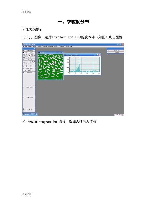
一、求粒度分布以米粒为例:1)打开图像,选择Standard Tools中的魔术棒(如图)点击图像2)拖动Histogram中的虚线,选择合适的灰度值3)选择Analysis-Particles-Find Particles4)选择Analysis-Particles-Analyze Particles搞定!二、简单实用技巧选中虚线方框,按住Alt健,在需要进行变换的区域拉出一个正方形然后点击Process,选择FFT即可,或者在画出上图中的红色方框后按Ctrl+F 即可得到这个软件还可以直接测量条纹间距,首先可以将图片放大(视条纹清晰与否),放大工具使用红色区域中的工具,然后点击图片即可。
然后选中ROL Tools中的第二个工具(虚线),上图中的第二个方框。
然后对着图中的标尺,从起点到末端拉一条直线,尽量与标尺一样长短(见下图)。
之后选择 Analyze 菜单中的 Calibrate,会弹出一个对话框,将对话框中的数字改成标尺的数字如10 , Units中选择 nm。
然后用刚才的虚线工具,画一条与条纹尽量垂直的直线,可以取10个或者20个条纹,取平均值。
直线的长度显示在Control面板中的L项。
Control面板可在 Window 菜单中调取出来,调取出来后,该面板显示在软件的左下方。
可以取10个或者20个条纹,取平均值。
三、各种晶系晶面夹角计算公式设晶面(h1k1l1)和晶面(h2k2l2)的面间距分别为d1、d2。
则二晶面的夹角φ以下列公式计算(V为单胞体积)。
立方晶系:正方晶系:六方晶系:正交晶系:菱方晶系:单斜晶系:三斜晶系:。

library(maps)library(maptools)library(rgdal)library(plyr)library(MASS)library(dplyr)library(ggplot2)set.seed(123)# 从整个数据集取出100行进行分析dsmall <- diamonds[sample(nrow(diamonds), 100), ]dim(dsmall)# 1.1.1根据x和y和数据集自动作图qplot(carat, price, data = diamonds)# 1.1.2根据log x和log y和数据集,自动作图qplot(log(carat), log(price), data = diamonds)# 1.1.3根据x和y和数据集按照color进行分类,自动作图qplot(carat, price, data = dsmall, colour = color)# 1.1.4根据x和y和数据集按照shape进行分类,自动作图qplot(carat, price, data = dsmall, shape = cut)# 1.1.5根据x和y和数据集,指定作图的类型,自动作图qplot(carat, price, data = dsmall, geom = c("point", "smooth"))# 1.1.6根据x和y和数据集,做箱线图qplot(cut, price / carat, data = diamonds, geom = "boxplot")# 1.1.7根据x和y和数据集,做条形图qplot(color, data = diamonds, geom = "bar")# 1.1.8根据x和y和数据集,做直方图qplot(carat, data = diamonds, geom = "histogram")# 1.1.9根据x和y和数据集,做核密度图qplot(carat, data = diamonds, geom = "density") 图 1.1.1 图 1.1.2 图 1.1.3 图 1.1.4 图1.1.5 图 1.1.6# 1.1.10 使用facets对需要分组的字段进行分组qplot(carat, data = diamonds, facets = color ~ .,geom = "histogram", binwidth = 0.1, xlim = c(0, 3))# 1.1.11 给图形添加信息qplot(carat, price, data = dsmall,xlab = "Price ($)", ylab = "Weight (carats)",main = "Price-weight relationship") 图 1.1.10 按照不同的颜色对重量进行统计 图1.1.11 添加和标题,X轴,Y轴解释案例2:地图(不包含中国) ggplot是基于图层进行作图的df <- data.frame(x = rnorm(2000), y = rnorm(2000))norm <- ggplot(df, aes(x, y))norm # 图层1norm + geom_point() # 图层2# 改变点的大小和形状norm + geom_point(shape = 1)norm + geom_point(shape = ".") 图层 1 图层2 图层3 采用ggplot2自带的美国城市数据集us.city 数据集变量简介## name 城市名称## country.etc 简称## pop 人口数量## lat 纬度## lon 经度## capital 是否是首府 2.1找出美国人口大于500000的城市big_cities <- subset(us.cities, pop > 500000)qplot(long, lat, data = big_cities) + borders("state", size = 0.5) 图 2.1 2.2 做出德州地图tx_cities <- subset(us.cities, country.etc == "TX")# 在使用map做地图的时候,记住x和y一定指的是经纬度ggplot(tx_cities, aes(long, lat)) +borders("county", "texas", colour = "grey70") +geom_point(colour = alpha("black", 0.5)) 图 2.2 德州地图 2.3结合USAssert来做出美国各个州的犯罪率# 从map中获取洲数据states <- map_data("state")# 获取犯罪数据arrests <- USArrests# 将犯罪的数据列名转换为小写names(arrests) <- tolower(names(arrests))# 获取根据行名获取区域数据arrests$region <- tolower(rownames(USArrests))# 将两个数据集进行合并choro <- merge(states, arrests, by = "region")# 按犯罪率升序排列choro <- choro[order(choro$order), ]# 2.3.1 犯罪率的分布qplot(long, lat, data = choro, group = group,fill = assault, geom = "polygon") # 2.3.2 谋杀率的分布qplot(long, lat, data = choro, group = group,fill = assault / murder, geom = "polygon") 图 2.3.1 结论:越往东北犯罪率越低 图 2.3.2 结论:越往西北谋杀率越低案例3:中国地图 3.1 做出各个省份人口的数量# 载入中国地图数据集china=readShapePoly('E:\\Udacity\\Data Analysis High\\R\\R_Study\\第一天数据\\bou2_4p.shp')# 获取数据x<-china@data# 转换为datafarmexs<-data.frame(x,id=seq(0:924)-1)# 将china转换为datafarmeshapefile_df <- fortify(china)# 组合成完整的dataframechina_mapdata<-join(shapefile_df, xs, type = "full")# 省份名称NAME<-c("北京市","天津市","河北省","山西省","内蒙古自治区","辽宁省","吉林省","黑龙江省","上海市","江苏省","浙江省","安徽省","福建省", "江西省","山东省","河南省","湖北省", "湖南省","广东省", "广西壮族自治区","海南省", "重庆市","四川省", "贵州省","云南省","西藏自治区","陕西省","甘肃省","青海省","宁夏回族自治区","新疆维吾尔自治区","台湾省","香港特别行政区")# 各个省份的人口pop<-c(7355291,3963604,20813492,10654162,8470472,15334912,9162183,13192935,8893483,25635291,2006 17253385,19029894,32222752,13467663,2451819,10272559,26383458,10745630,12695396,689521,11084516,7113833,1586635,1945064,6902850,23193638,7026400)# 组合成完整的d人口-省份的dataframepop<-data.frame(NAME,pop)# 和中国的地图信息相结合,组合成datdaframechina_pop<-join(china_mapdata, pop, type = "full")ggplot(china_pop, aes(x = long, y = lat, group = group,fill=pop))+geom_polygon( )+geom_path(colour = "grey40")# 使用subset来取出上海市的信息SH<-subset(china_mapdata,NAME=="上海市")ggplot(SH, aes(x = long, y = lat, group = group,fill=NAME))+ geom_polygon(fill="lightblue" )+geom_path(colour = "grey40")+ggtitle("中华人民共和国上海市")+annotate("text",x=121.4,y=31.15,label="上海市") 图 3.2案例4:时间数据 采用ggplot2自带的economics数据集 数据集变量简介## date 时间## pop 人口## uempmed 失业率## unemploy 失业人数 4.1 通过时间查看失业率ggplot(aes(x=date,y=uempmed),data=economics)+geom_line() 图4.1 图层1 4.2查看不同政党执政时期的失业率# 获取失业率的折线图图层1(unemp <- qplot(date, unemploy, data=economics, geom="line",xlab = "", ylab = "No. unemployed (1# 由于是1970年开始,所以去掉前三行,从尼克松开始统计presidential1 <- presidential[-(1:3), ]#确定x和y的边界yrng <- range(economics$unemploy)xrng <- range(economics$date)# 图层2unemp + geom_vline(aes(xintercept = start), data = presidential)# 图层3unemp + geom_rect(aes(NULL, NULL, xmin = start, xmax = end,fill = party), ymin = yrng[1], ymax = yrng[2],data = presidential1) + scale_fill_manual(values =alpha(c("blue", "red"), 0.2)) 4.2 图层2 图层 3 5.作图其他设置 5.1 叠加多个图形# 美国5大湖之一的休伦湖数据集huron <- data.frame(year = 1875:1972, level = LakeHuron)ggplot(huron, aes(year)) +geom_line(aes(y = level - 5), colour = "blue") +geom_line(aes(y = level ), colour = "black") +geom_line(aes(y = level + 5), colour = "red") 图5.1 5.2 颜色设置# 使用mtcars数据集# 制定乐填充色red和边框色blackggplot(birthwt, aes(x=bwt)) + geom_histogram(fill="red", colour="black") # 将cyl转变为因子mtcars$cyl <- factor(mtcars$cyl)# 对不同的ctl进行绘图ggplot(mtcars, aes(x=wt, y=mpg, colour=cyl)) + geom_point() 图5.2.1 图 5.2.2 5.3 图例# 采用的是植物数据集p <- ggplot(PlantGrowth, aes(x=group, y=weight, fill=group)) + geom_boxplot()# 5.3.1 默认的图例放在右边p# 5.3.2 不使用图例p + guides(fill=FALSE)# 5.3.3 将图例放在顶部p + theme(legend.position="top")# 5.3.4 指定图例的位置p + theme(legend.position=c(1,0), legend.justification=c(1,0)) 图 5.3.1 图 5.3.2 图 5.3.3 图5.4.4。


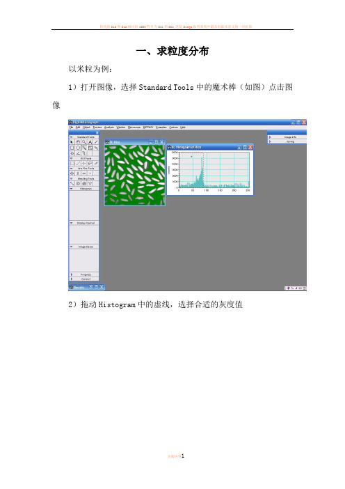
一、求粒度分布以米粒为例:1)打开图像,选择Standard Tools中的魔术棒(如图)点击图像2)拖动Histogram中的虚线,选择合适的灰度值3)选择Analysis-Particles-Find Particles4)选择Analysis-Particles-Analyze Particles搞定!二、简单实用技巧选中虚线方框,按住Alt健,在需要进行变换的区域拉出一个正方形然后点击Process, 选择FFT即可,或者在画出上图中的红色方框后按Ctrl+F即可得到这个软件还可以直接测量条纹间距,首先可以将图片放大(视条纹清晰与否),放大工具使用红色区域中的工具,然后点击图片即可。
然后选中ROL Tools中的第二个工具(虚线),上图中的第二个方框。
然后对着图中的标尺,从起点到末端拉一条直线,尽量与标尺一样长短(见下图)。
之后选择Analyze 菜单中的Calibrate,会弹出一个对话框,将对话框中的数字改成标尺的数字如10 , Units中选择nm。
然后用刚才的虚线工具,画一条与条纹尽量垂直的直线,可以取10个或者20个条纹,取平均值。
直线的长度显示在Control面板中的L项。
Control面板可在Window菜单中调取出来,调取出来后,该面板显示在软件的左下方。
可以取10个或者20个条纹,取平均值。
三、各种晶系晶面夹角计算公式设晶面(h1k1l1)和晶面(h2k2l2)的面间距分别为d1、d2。
则二晶面的夹角φ以下列公式计算(V为单胞体积)。
立方晶系:正方晶系:六方晶系:正交晶系:菱方晶系:单斜晶系:三斜晶系:知识改变命运。
一、求粒度分布以米粒为例:1)打开图像,选择Standard Tools中的魔术棒(如图)点击图像2)拖动Histogram中的虚线,选择合适的灰度值3)选择Analysis-Particles-Find Particles4)选择Analysis-Particles-Analyze Particles搞定!二、简单实用技巧选中虚线方框,按住Alt健,在需要进行变换的区域拉出一个正方形然后点击Process,选择FFT即可,或者在画出上图中的红色方框后按Ctrl+F即可得到这个软件还可以直接测量条纹间距,首先可以将图片放大(视条纹清晰与否),放大工具使用红色区域中的工具,然后点击图片即可。
然后选中ROL Tools中的第二个工具(虚线),上图中的第二个方框。
然后对着图中的标尺,从起点到末端拉一条直线,尽量与标尺一样长短(见下图)。
之后选择 Analyze 菜单中的 Calibrate,会弹出一个对话框,将对话框中的数字改成标尺的数字如10 , Units中选择 nm。
然后用刚才的虚线工具,画一条与条纹尽量垂直的直线,可以取10个或者20个条纹,取平均值。
直线的长度显示在Control面板中的L项。
Control面板可在Window菜单中调取出来,调取出来后,该面板显示在软件的左下方。
可以取10个或者20个条纹,取平均值。
三、各种晶系晶面夹角计算公式设晶面(h1k1l1)和晶面(h2k2l2)的面间距分别为d1、d2。
则二晶面的夹角φ以下列公式计算(V为单胞体积)。
立方晶系:正方晶系:六方晶系:正交晶系:菱方晶系:单斜晶系:三斜晶系:。

DigitalMicrograph软件傅立叶变换和反变换图文教程
, , ,
傅立叶变换的目的是标定高分辨像的傅立叶谱确定晶带轴;在倒空间乘上一个滤波函数,再进行发傅立叶变换可以降低噪音。
DigitalMicrograph也可以处理普通的TEM图像,比如锐化、平滑、颗粒分析、扣背底等。
1)打开一张高分辨像,选择ROI Tools中的矩形选框工具,按住Alt在图像上拉出一个正方形,先松开鼠标再松开Alt键。
*这很重要,因为FFT只对面积为2的n次方的区域有效*
2)选择Process-FFT
3)选择Masking Tool中的周期性Mask工具,在FFT of ***点击
4)选择周期性的Bragg点
5)选择Process-Apply Mask
6)选择Process-Inverse FFT
7)加标尺,选择Edit-Data Bar-Add Scale Maker
说明:
如果不加Mask就进行Inverse FFT,只是相当于把选的图像切下来;加Mask再进行Inverse FFT可以降低图像的噪音,突出周期性的信
息。
Kaleida Graph简单教程曹阳1、数据的导入a)File-import(不要有中文路径/文件名)●Excel格式,直接导入●文本格式,删除掉除数据以外的汉字等再导入,但有时导入时容易出现数据混乱,建议用excel做中转(数据-自文本-固定宽度)b)Copy-pastePS:在Kaleidagraph中不太清楚怎么做运算,建议在excel中将数据处理好以后再导入,只用Kaleidagraph作图。
2、曲线的绘制Gallery-lineara)Lineb)Scatter(散点,具体操作与line类似)c)Double X/Y3、拟合曲线举例:当我们得到应力应变曲线,希望得到线弹性阶段的斜率(弹性模量)时可以通过曲线拟合得到弹性阶段的直线方程,从而得到斜率。
(以陆子川昨天测得实验数据为例)步骤:1)将屈服后的数据隐藏(曲线不会出现隐藏数据)PS:隐藏功能还应用于隐藏掉实验得到的不理想或错误的数据点2)拟合数据(鼠标点图片,不要在数据框上,否则Curve Fit不会出现)3)查看拟合曲线的方程再点击Curve Fit-Linear-view下拉菜单中的view result隐藏塑性变形数据后的曲线线性拟合多项式拟合指数拟合对数拟合幂数拟合出现的黑色曲线即为拟合出来的直线4、曲线编辑以刚才得到的原始曲线和拟合曲线图为例,对曲线进行编辑1)坐标轴标识名称及字体大小的修改表经常用到的罗马字体(字母刷蓝后选择Alt.Font)a αb βe εl λq θw ωr ρt τs σm μ2)曲线属性的修改修改坐标轴的数字时方法一样3)坐标轴的修改(范围、显示间隔)4)各部分字体大小的规定以标准图例为例5、保存和输出数据和曲线的保存。
数据格式.QAD;曲线格式.QPC 曲线输出为图片格式:File-Export。
Kaleidoscope Pro 5Advanced ClassifiersWelcome to Kaleidoscope Pro from Wildlife Acoustics.This video will show how to create and tune an Advanced Classifier to find specific vocalizations in new input files.The Advanced Classifier will be much more discriminating than a Simple Classifier. An Advanced Classifier is used to reduce false positive rates by providing additional information to the analysis model to optimize the separation of statistically similar vocalizations.If you want to find a specific individual species or vocalization in a batch of files, an Advanced Classifier may be the right tool for the job. If you want to do a general survey of many species, a basic cluster analysis or Simple Classifier will probably be a better solution for that job.I’ve got two sets of audio recordings.I’m going to use the first set of data to build and train the Advanced Classifier. Then I’ll use the Advanced Classifier to sort the second set of data. I’ll choose the first data set for the Input directory. I’ll assign an Output directory. I’ll go to the Cluster Analysis tab and choose the first option to scan the input files for basic cluster analysis. I’m working with all default settings in this window. The default FFT window setting is optimized for most common birds. If I was looking for lower frequency sounds such as owls, I might set the FFT window to a larger size.I’ll run the cluster analysis batch process. Kaleidoscope Pro examines the input files for detected signals. The detected signals or vocalizations are then sorted based on statistical similarity. Clusters are created and sorted based on the similarities of the detected signals. The first listed cluster represents the most common set of similar detected signals.Once the first cluster analysis batch process is completed, the Viewer and Results window open.The goal is to train the Advanced Classifier to be able to accurately find the desired species or vocalization, and reduce false positive or false negative identifications. This is done by creating manual identifications for vocalizations within clusters, and then using those manual IDs to create and train the Advanced Classifier.The next step is to copy the cluster names to the Manual ID column in the Results window. Thisprovides general clusters destinations for the detected input signals from the new set of data.I am now going to manually label the best examples of the vocalizations I do want to isolate. I’ll check the first vocalization and audition the audio. I happen to know this vocalization is a spring peeper. I’m looking for birds and the spring peeper is a frog. The spring peeper sings constantly through the night and if I check the next several clusters I find that they are all spring peepers. The vocalizations have been sorted into separate clusters because although they are the same species, there are enough differences in the recordings to group them separately. The se clusters do not appear to contain any vocalizations that I want to isolate, so I’ll leave their cluster names alone. These clusters will be ready to catch spring peepers in the new batch of input data.Ok, this vocalization is not a peeper and if I audition it, it sounds like a titmouse. I do want the Advanced Classifier to be able to find titmice, so I’ll create a button label with that name. I press the button and that applies a manual verification to the vocalization and I see the verification listed in the Results window. The Auto Next File button is engaged so when I verify the vocalization the next vocalization on the list is cued up. I see the pattern is the same so I’ll add the manual titmouse verification to the next vocalization. I’ll continue to verify titmice until I start to see vocalizations that are either poor examples or not a titmouse at all. Vocalizations are listed in the order of the most similar examples of the statistical pattern. So as I get further into the cluster the examples start to become less obvious.What I’m doing by adding these manual verifications is training Kaleidoscope Pro to recognize the verified signals. If I see a poor example of the vocalization, or perhaps the detected signal contains a titmouse but also contains other birds or sounds, I will apply a blank label to that detected signal. Now this detected signal has no manual ID at all. That means it will not be used to train the Advanced Classifier. I only want training data that are good examples of what I do want to find, and what I don’t want to find.I’ll advance through the next clusters. This cluster looks like it could be a robin. I’m not lookin g for robins so I’ll leave the original cluster name alone. When new data is analyzed with the Advanced Classifier, any robin vocalizations will get sorted into this cluster. Here is another cluster that looks like titmice. Just like with the peepers I may find multiple clusters that contain titmice. I want to train the Advanced Classifier to recognize variations of the titmouse so I’ll continue to label the best examples of that species.Here are more peepers. These frogs are everywhere!Now I get to a vocalization that is not a peeper or a titmouse. I’ll audition and I think it’s a black capped chickadee. I’ll create another custom button label and start to verify the chickadee vocalizations. At this point I am building an Advanced Classifier that is trained to find both chickadees and titmice.Ok, now right in the middle of this chickadee cluster I find something that is not a chickadee. It’s another peeper! The peeper has enough in common with the chickadee that it got included in this cluster.I don’t want the Advanced C lassifier to think this vocalization is a chickadee, so I’ll leave the original cluster name. Now if Kaleidoscope Pro is finding chickadees and it comes across a peeper that is similar to the chickadee, it will be able to discriminate between the two and the peeper will get separated and sorted into its own cluster.At this point I’ve created new cluster names for two species. If I wanted to identify other species besides the chickadees and titmice, I may be better off building separate Advanced Classifiers for those additional species.I can check through the remaining clusters but I think I’ve got what I need for now.I’ll go to the Results window File menu and choose Save. The Results window represents an underlying cluster.csv file that was created in the Outputs directory during the initial cluster analysis batch process. Saving updates the .csv file with my manual verifications.Now it’s time to build the Advanced Classifier. Under the Batch tab I keep the Input Directory set to the original batch of recordings. I’ll select a new Output Directory. I go back to the Cluster Analysis tab and choose the second option. The second clustering option will re-scan the original recordings and make new clusters based on the manual verifications in the underlying edited .csv file. I’ll run the second cluster analysis batch process.Only the vocalizatio ns that I’ve labelled will be used as the statistical models for the new clusters. Once the batch process is complete the Viewer and Results window open. I can do a quick check and what I’m seeing here are named clusters based on my manual IDs and the original training data as detected signals.When Kaleidoscope Pro runs a Cluster Analysis batch process it creates the cluster.csv file and it also creates a cluster.kcs file. The .kcs file is similar to the .csv file in that it contains information about the clusters. The purpose of the .kcs file is that it can be used as a classifier for new data. This second step of cluster analysis has created a cluster.kcs file that has been trained via the manual IDs. The new cluster .csv and cluster.kcs files have been created in the second Outputs directory. The new cluster.kcs file is the Advanced Classifier.If I want to further tune the Advanced Classifier I can repeat the previous step of manually checking and labeling the detected signals in the clusters. I can then repeat the step of using the newly edited .csv file to compare against the original training data. That will produce a new .kcs file that is the tuned Advanced Classifier. When I’m happy with the results I get from the original training data I’m ready to use the Advanced Classifier to sort new input data.Now for my Input d irectory I’ll choose the second data set.I’ll se lect a new Output directory. Under the Cluster Analysis tab I’ll choose the third clustering option. This third option uses an existing cluster.kcs file to analyze and sort new input data. What’s going to happen here is the new set of data will be analyzed using the trained cluster.kcs file to sort and identify the new vocalizations.Once this last batch process is complete the Viewer and Results window open again. The vocalizations in the Results window have been detected from the new batch of files. They have been analyzed, named, and sorted based on the information in the Advanced Classifier.Here are chickadees. Here are titmice. I don’t see any false positive identifications because the trained Advanced Classifier can now discriminate between similar but different vocalizations. And lastly, here are the general clusters with their original names, which I can just disregard.Kaleidoscope Pro has done a first-rate job of finding the specific vocalizations I’m looking for in the new input recordings.Thank you for watching.。
Wo l f r a m A l p h a使用方法一、数字1.基本运算:加(+)、减(-)、乘(*)、除(/)、乘方(^)、开方(a q r(_)或_^(1/2))、2.大于等于(>=π)、(p i)、对数l o g(_,_)、3.进制转换:219t o b i n a r y(将219转化为二进制)、t e r n a r y三进制,q u a n t e r n a r y四进制,q u i n a r y五进制,s e n a r y六进制,s e p t e n a r y七进制,o c t o n a r y八进制,n o v e n a r y九进制,U n d e c i m a l十一进制d u o de c i m a l十二进制4.求因数:f a c t o r_二、代数、函数、方程1.因式分解:f a c t o r_2.解方程:直接输入方程3.图像:直接输入函数或方程4.求方程的整数解:s o l v e_o v e r t h e i n t e g e r s5.求导函数:d e r i v a t i v e o f_(一阶导),s e c o n d d e r i v a t i v e o f(二阶导)6.求不定积分:i n d e f i n i t e i n t e g r a l o f_或i n t e g r a t e_7.求定积分:i n t e g r a t e_d x f r o mx=_t o_三、向量运算1.画向量:v e c t o r{}2.向量的加减:{}+{}3.求向量外积:{}c r o s s{}例、输入,就可以从几何数据1/25(3x+4y+5)^2=(x -1)^2+(y -1)^2(G e o m e t r i c f i g u r e )一栏得到如图数据表:焦点(f o c u s ),顶点(v e r t e x ),半轴长度(s e m i -a x i s l e n g t h ),焦点参数(f o c a l p a r a m e t e r ),离心率(e c c e n t r i c i t y ),准线(d i r e c r i x )在表格上会显示曲线的类型(图中p a r a l o l a 表示抛物线)圆锥曲线的一般方程:e =|x s i n θ+y c o s θ+d |+(x -m )2(y -n )2其中e 为离心率,准线为,焦点为(m ,n )。
Digitalmicrograph使用教程编辑整理:尊敬的读者朋友们:这里是精品文档编辑中心,本文档内容是由我和我的同事精心编辑整理后发布的,发布之前我们对文中内容进行仔细校对,但是难免会有疏漏的地方,但是任然希望(Digitalmicrograph使用教程)的内容能够给您的工作和学习带来便利。
同时也真诚的希望收到您的建议和反馈,这将是我们进步的源泉,前进的动力。
本文可编辑可修改,如果觉得对您有帮助请收藏以便随时查阅,最后祝您生活愉快业绩进步,以下为Digitalmicrograph使用教程的全部内容。
一、求粒度分布以米粒为例:1)打开图像,选择Standard Tools中的魔术棒(如图)点击图像2)拖动Histogram中的虚线,选择合适的灰度值3)选择Analysis-Particles-Find Particles4)选择Analysis-Particles-Analyze Particles搞定!二、简单实用技巧选中虚线方框,按住Alt健,在需要进行变换的区域拉出一个正方形然后点击Process,选择FFT即可,或者在画出上图中的红色方框后按Ctrl+F即可得到这个软件还可以直接测量条纹间距,首先可以将图片放大(视条纹清晰与否),放大工具使用红色区域中的工具,然后点击图片即可。
然后选中ROL Tools中的第二个工具(虚线),上图中的第二个方框.然后对着图中的标尺,从起点到末端拉一条直线,尽量与标尺一样长短(见下图).之后选择 Analyze 菜单中的 Calibrate,会弹出一个对话框,将对话框中的数字改成标尺的数字如10 , Units中选择 nm。
然后用刚才的虚线工具,画一条与条纹尽量垂直的直线,可以取10个或者20个条纹,取平均值。
直线的长度显示在Control面板中的L项。
Control面板可在 Window菜单中调取出来,调取出来后,该面板显示在软件的左下方。
可以取10个或者20个条纹,取平均值。
Kaleida Graph简单教程
曹阳
1、数据的导入
a)File-import(不要有中文路径/文件名)
●Excel格式,直接导入
●文本格式,删除掉除数据以外的汉字等再导入,但有时导入时容易出现数据混乱,建议
用excel做中转(数据-自文本-固定宽度)
b)Copy-paste
PS:在Kaleidagraph中不太清楚怎么做运算,建议在excel中将数据处理好以后再导入,只用Kaleidagraph作图。
2、曲线的绘制Gallery-linear
a)Line
b)Scatter(散点,具体操作与line类似)
c)Double X/Y
3、拟合曲线
举例:当我们得到应力应变曲线,希望得到线弹性阶段的斜率(弹性模量)时可以通过曲线拟合得到弹性阶段的直线方程,从而得到斜率。
(以陆子川昨天测得实验数据为例)
步骤:
1)将屈服后的数据隐藏(曲线不会出现隐藏数据)
PS:隐藏功能还应用于隐藏掉实验得到的不理想或错误的数据点
2)拟合数据(鼠标点图片,不要在数据框上,否则Curve Fit不会出现)
3)查看拟合曲线的方程
再点击Curve Fit-Linear-view下拉菜单中的
view result
隐藏塑性变形数据后的曲线
线性拟合多项式拟合指数拟合对数拟合幂数拟合出现的黑色曲线即为拟合出来的直线
4、曲线编辑
以刚才得到的原始曲线和拟合曲线图为例,对曲线进行编辑1)坐标轴标识名称及字体大小的修改
表经常用到的罗马字体(字母刷蓝后选择Alt.Font)
a α
b β
e ε
l λ
q θ
w ω
r ρ
t τ
s σ
m μ
2)曲线属性的修改
修改坐标轴的数字时方法一样
3)坐标轴的修改(范围、显示间隔)
4)各部分字体大小的规定
以标准图例为例
5、保存和输出
数据和曲线的保存。
数据格式.QAD;曲线格式.QPC 曲线输出为图片格式:File-Export。