图表作文+范文++模板
- 格式:doc
- 大小:118.00 KB
- 文档页数:10
初中英语作文图表类模板及范文In the realm of English essay writing for junior high students, the chart and graph essay genre poses a unique challenge. This type of essay requires students to analyze and interpret data presented visually, translate it into meaningful insights, and then communicate these insights clearly and coherently. To assist students in this endeavor, a template and sample essay are provided below.**Template for Chart/Graph Essay**1. **Introduction**:* Briefly introduce the chart/graph and its purpose.* State the main trend or observation. 2. **Body Paragraph 1**:* Describe the data related to the first key aspect of the chart/graph. * Analyze the reasons behind the trend or observation. * Discuss the significance or implicationsof this trend. 3. **Body Paragraph 2**:* Describe the data related to the second key aspect of the chart/graph. * Analyze the reasons behind the trend orobservation. * Discuss the significance or implications of this trend. 4. **Conclusion**:* Summarize the main trends and observations. * Provide a closing thought or recommendation based on the analysis.**Sample Essay****Title**: Interpreting Trends in Teenage Sleep Habits In the chart below, we see a comparison of average sleep hours among teenagers in different countries. The chart reveals a concerning trend: the majority of teenagers in these countries are not getting enough sleep.In the United States, the average teenager sleeps just over 7 hours per night, which is below the recommended 8-10 hours. This could be due to various factors, such as late-night social media use, academic pressure, or extracurricular activities. The lack of sufficient sleep among American teenagers could have serious implicationsfor their health and academic performance.In contrast, teenagers in China sleep an average of over 8 hours per night. This could be attributed tocultural differences in sleep habits or the relatively lighter academic workload compared to their peers in the United States. The higher sleep hours among Chinese teenagers might explain their better performance in international academic competitions.Overall, the chart highlights the need for a global effort to improve sleep habits among teenagers. Parents, educators, and policymakers should work together to create an environment that encourages healthy sleep patterns. For example, schools could implement earlier start times and provide more breaks during the day to encourage better sleep habits among students. Additionally, parents can set limits on screen time before bedtime and ensure a quiet and comfortable sleep environment for their children. By prioritizing sleep, we can help teenagers achieve theirfull potential both academically and physically.**解析**:这篇图表类英语作文围绕“青少年睡眠习惯的趋势”展开。
英语四级图表类作文万能模板【优秀3篇】(经典版)编制人:__________________审核人:__________________审批人:__________________编制单位:__________________编制时间:____年____月____日序言下载提示:该文档是本店铺精心编制而成的,希望大家下载后,能够帮助大家解决实际问题。
文档下载后可定制修改,请根据实际需要进行调整和使用,谢谢!并且,本店铺为大家提供各种类型的经典范文,如总结报告、合同协议、规章制度、条据文书、策划方案、心得体会、演讲致辞、教学资料、作文大全、其他范文等等,想了解不同范文格式和写法,敬请关注!Download tips: This document is carefully compiled by this editor. I hope that after you download it, it can help you solve practical problems. The document can be customized and modified after downloading, please adjust and use it according to actual needs, thank you!Moreover, our store provides various types of classic sample essays, such as summary reports, contract agreements, rules and regulations, doctrinal documents, planning plans, insights, speeches, teaching materials, complete essays, and other sample essays. If you want to learn about different sample formats and writing methods, please pay attention!英语四级图表类作文万能模板【优秀3篇】英语四级考试中作文是拉分差距较大的题型,如何让自己的作文更出彩?除了考前多练笔,根据模板进行仿写也是非常实用的方法,下面是本店铺整理的英语四级图表类作文万能模板【优秀3篇】,在大家参照的同时,也可以分享一下本店铺给您最好的朋友。
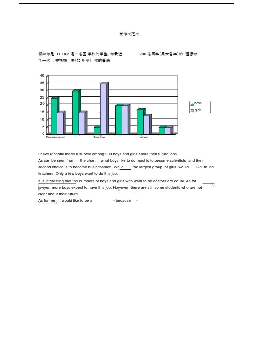
表作文范文假如你是Li Hua,是一名国学校的学生。
你最近200 名同学(男女各半)的理想做了一次,并根据果(如所示)你的看法。
4035302520boysgirls15105Businessman Teacher LawyerI have recently made a survey among 200 boys and girls about their future jobs.As can be seen from the chart, what boys like to do most is to become scientists and their second choice is to become businessmen. While the largest group of girls would like to be teachers. Only a few boys want to do this job.It is interesting that the numbers of boys and girls who want to be doctors are equal. As for lawyer, more boys expect to have this job. However, there are still some students who are notclear about their future.As for me , I would like to be a⋯because⋯7崇文一模某英文报纸正在开展题为“中学生课堂注意力”的专栏讨论,你校准备参加,并请你代表学校写一篇文章给该英文报纸投稿。
下面的图表为你校的调查结果,请你根据所提供的信息做简要说明,并根据提示给出改善的建议。
注意:图中数据为学生人数百分比。
中学生课堂注意力集中的情况中学生课堂注意力不能集中的原因40%30%70%60%能够集中注意力不能集中注意力课堂干扰睡眠不足与疲劳改善注意力的建议:教室课堂课间通风、明亮积极参与课堂活动适量活动或适当休息注意: 1.词数:不少于60。
英语柱状图图表英语作文模板英文回答:Bar Chart Writing Template.Introduction:Begin with a clear statement of the main purpose of the bar chart.State the topic or subject of the chart and any relevant context or background information.Body Paragraphs:Divide the chart data into logical categories or sections.For each category, analyze and describe the data, highlighting key trends, patterns, and relationships.Support your analysis with specific numerical data and percentages from the chart.Use appropriate modifiers, transition words, and phrases to connect your ideas.Conclusion:Summarize the main findings of the bar chart.Restate the purpose of the chart and the key takeaways.If applicable, make predictions or recommendations based on the data presented.Example Bar Chart Template:Introduction:The bar chart below illustrates the global sales of smartphones in 2021.Body Paragraph 1:Total smartphone sales reached 1.5 billion units in 2021, an increase of 7% from the previous year.Apple maintained its dominance with a market share of 25%, followed by Samsung at 22%.Body Paragraph 2:The growth in smartphone sales was driven by strong demand in emerging markets.China accounted for the largest share of sales with 38%, while India and Southeast Asia also experienced significant growth.Body Paragraph 3:The average selling price (ASP) of smartphones decreased slightly in 2021, due to the increasingavailability of affordable models.5G-enabled smartphones gained market share, with a 40% increase in sales.Conclusion:The bar chart provides a clear picture of the global smartphone market in 2021. Apple and Samsung remain the leading vendors, while emerging markets continue to drive growth. The decreasing ASP and increasing popularity of 5G suggest that the smartphone market will continue to evolve and expand in the years to come.中文回答:柱状图图表英语作文模板。
新高考英语图表类作文素材一、常用素材Recently a survey has been done to find out ... In this survey, ...were interviewed. Most of the surveyed answered...为了找出/发现……,最近做了一项调查。
在这项调查中,……接受了采访。
大多数受访者回答说……The results are as follows.结果如下。
As is apparently shown in the table above, ...正如上表所突显的那样,……As is shown in the table(chart)/As can be indicated in the table(chart)/According to the figures given in thetable(chart), ...如表(图)所示,……It can be seen from the table that.../From the table we can see that...从表中可看出…/从表中我们可知……As is shown in the(pie/bar)chart/graph/diagram/table ...如图(饼图/条形图)图表/图形/表格所示……As we can see from the table that...正如我们从表中看到的那样……As can be seen from the diagram, great changes have taken place in ...从图表中可以看出,……发生了巨大的变化……As is shown by the graph, we can easily find out that...如图所示,我们可以很容易找到发现……It is expected to increase ... times.预计将/有望增加……倍。
图表类写作模版(1)模版1According to the chart / graph / diagram / table, we clearly learn that _________. As early as _________,___________. Then,_________.Last,__________. In contrast, by _________,__________.There are many reasons accounting for _________. Firstly,_________.Secondly,__________. Finally,_________. As a result,_________.As far as I am concerned,_________. For one thing,__________. Foranother,________. In brief, I hold that__________.(2)模版2What is shown in the chart / graph / diagram / table above indicates that in recent years, more and more people pay attention to _________. The number of those who _________ has increased ________, and furthermore,____________.There are two factors responsible for the changes. In the first place,_________. Moreover,__________. Yet, it is noticeable that __________.From the analysis, we can safely draw the conclusion that__________. It is possible that in the future, the tendency will__________.(3)模版3As is shown in the chart / graph / diagram / table above, __________ has charged drastically in the past _________. While ___________,now the percentage of__________ is __________. Meanwhile, the number of _________ has soared up to ________.There are mainly two possible reasons contributing to the rapid changes. The first is that _________. Secondly,__________.In my point of view, the changes have a great influence on _________. At the same time,_______. To sum up ,_________.讨论观点类文章(1)模版1Different people have different views on_____.Some people think that_____,whereas others aegue that __________.As far as I am concerned, I agree with the opinion that ___________.For one thing,I firmly believe that ___________.For another,_____________.Just thinkof________,who/which_______.Taking all these factors into consideration,we may safely come to the conclusion that______.Only if_______can we _______,just as the saying goes,________________.(2)模版2In recent years there have been many reports of ________.It turnsa new chapter of _________in China,and will have far-reaching effects in the forthcoming years.The biggest benefit,in my eyes,is that_______.Inaddition,_______.Finally,______________.Apart from the benefits mentioned above,we should also face several unavoidable chall enges.In the first place,_____________.In the second place,________.What’s more,_______________.In summary,we should_______________.(3)模版3Nwadays more and more ______are commonly and widely used in everyday life,ranging from __________to_____________.The popularity of _______will have a great influence on ______.On the one hand,_________.On the other hand,__________.To conclude,____________are just like a double-edged sword.With them we may________.However,one point should be kept in mind that we should make sensible use,always being a master instead of slaving of them.提出问题类作文写作模版(1)模版1It is quite natural for ________to ponder over the question of whether to _______________.Many _________will choose not to______________,generally for three reasons.On the one hand,___________.On the other hand,______________.Mostimportantly,__________.Nevertheless, oher people adopt a completely different view,thinking that_____________.Moreover, they further argue that___________.From what we have discussed above,we can draw the conclusion that the question quite depends on personal choice.In my own eyes,________.(2)模版2When taking about whether _____________,we will be most surprised to fnd that the present situation is utterly complicated,For onething ,__________.For another,_________.Three factors,in my point of view,account for this phenomenon.First and foremost,________.Secondly,____________.Last but not least,____________.As far as I am concerned,I firmly believe that____________,onlywhen_____________.(3)模版3 A national debate has sprung up on_____________.Many people welcome it with applause and enthusiasm,believing that___________.However, those who strongly oppose the _________are not among the minority.They hold that______________.Moreover,____________.In aword,______________.From my perspective,________should be____________.On the one hand,personally I would argue that_____________.On the other hand,____________.Inconclusion,____________.解决办法类作文写作模版(1)模版1With the rapid growth of national economy,more andmore_________,which causes a serious problem of_________.Urgent measures are needed to tackle the above-mentioned problem.On the one hand ,_________so that ____________is at hand.On the other hand,_____________.More importantly,____________.All in all,only when______can we solve the problem of _____________so as to meet everyone’s need .Ultimately,_____________.(2)模版2 Nowadays, __________.It has become such a serious problem that it is arousing the concern of the entire society.To put an end to the serious problem, in my mind, it calls for the efforts from all sides. First of all,__________. Moreover,___________. Last but not least,___________.In my point of view, only when all of us join in the efforts of __________ at all levels can we expect to have _________ and ___________.(3)模版3If the Chinese people even want to improve their life quality, the problem of __________ has to be solved. With more and more people _______, this problem is becoming more and more serious in terms of scale and scope.First of all,_________. What’s more,__________. Only when all the people stop pursuing personal interests at the price of ________ can we hope to put an end to this unfavorable situation.The _________ is of great importance to every member of our society. As long as the government, society and individuals make joint efforts, a sound solution is not far away.评论反驳类作文写作模版(1)模版1Recently it seems that____________.MANYpeople,especially___________,think it will certainly do goodto_____________because_____________.Moreover,_________.Nevertheless,after careful consideration,I have to state that the above view is more than biased,given the following readons.First ofall,____________.Besides,__________.Furthermore,__________.We can see clearly that although_________may bring favorable results,there are still problems concerning_______.It seems necessary for ___________to makea careful consideration befero________.(2)模版2Until recently most people hold hostile attitudestowards_______.Some people view it as_____________while others considerit____________.Recent research,however,shows that___________is of great benefit in many respects._________,scientists tell us,_____________.Surprisinglyenougu,____________also_______.The most remarkable thing about_______isthat_______.Now we can draw the conclusion that_______.I strongly advocate that we should make good use of it to_________.(3)模版3In current society,we come across too many peole who put much emphasis on __________.In many cases,________has become the sole criterion for judging a person’s__________.I argue that we should not put too much emphasis on________.To begin with,we should not take it for granted that those who__________will naturally______________.Moreover,_____________.Yet,_____________.The above discussion points to a fact that_______________.Consequently,it is of vital importance for us to realize that_____________.分析原因类作文写作模版(1)模版1_________ is currently becoming a serve problem in China, which happen to ________. So long as ________, ___________ will always unsurprisingly ________.Why does ________ become so rampant? First and foremost,__________. Secondly,_________. Last but not least, ________. As a consequence,___________.(2)模版2During the last decade, there has been a steady rise in the number of _________. In detail,________.Three reasons, in my mind, account for this social phenomenon. First andforemost,__________. Moreover,_________. In addition,___________. As aresult,__________.Personally, I firmly believe that the problem derives from __________. Thus, if the government make relevant policies and take relevant measure to __________, the problem can be readily solved in __________.(3)模版3Nowadays,_________ is/are doing great harm to ___________.What are the incentives that drive people to _________? The most important factors should be __________. Furthermore,________. It directly leads to the patent and salient harmfulness that ________.Consequently, it is high time that the whole society should contribute to the collective efforts to put an end to ________.应用文写作模版(1)建议信Dear ________,I’m very ___________ to know / learn that __________. I am writing to voice my suggestions / proposals / views concerning _________. In my opinion,_________. On the on hand,__________. On the other hand,__________.As to _________, I would like to suggest / recommend that __________, because __________. It would be __________. In addition,___________. I am sure that__________.Please inform me of your feedback on __________. I am looking forward to__________.Truly yours,1) describe the cartoons,2) interpret its meaning, and3) point out its implications in our life.范文1:In the above cartoons, a young woman happily eats bananas and casually discards the peels on the street, unaware of the fact that such actions not only pollute the environment but also pose a danger to others. In the next illustration adisabled man struggles to properly dispose of the trash she has left behind. Despite the girl's youth and beauty, it is the disabled man who is truly beautiful. True beauty comes from one's actions rather than one's appearance.While most of us enjoy pretty appearances, it is more important to cultivatea clean and beautiful soul. Only such souls can create a genuinely beautiful society.Chinese traditionally uphold the virtues of modesty, generosity,broad mindedness, and politeness. Confucian teachings such as: “do not do to others as you would not want done to you” and “one should be delighted to hear criticism,” are wise and worthwhile. If people embody these teachings our society can only improve and progress.The thoughts of great minds like Confucius are also worth studying. His writings set fine and noble examples for us to follow. Another proverb thus comes to mind: in the company of three one always can find a teacher. We should always be willing and able to learn from those around us.译文:在上面的漫画里,一个年轻女子愉快地吃着香蕉,然后随手就把香蕉皮扔到了街上——丝毫没顾及到这样的举动不仅会污染环境,还会给他人带来危险。
Writing a report based on facts and figures一.写作任务假定你叫李华。
你的美国笔友Susan正在研究一个课题“各国学生的择业取向”。
她希望你帮助她调查中国学生的选择。
你利用学校网站,对男女各200名学生的未来职业选择做了一次调查。
请根据下表的调查结果,给Susan写一篇题为“Students’ attitudes towards future jobs”注意:1、词数不少于120个;报告的开头已经给出,但不计入总词数。
2、参考词汇:公务员civil servant; 理想ideal二.点拔指导1、文体解读报告是就调查、观察的结果提出详细书面材料或作口头叙述,是针对某一问题作出深入研究和认真分析、并给出相关意见或建议的文体。
一般包括标题、正文、结论。
报告的标题要反映主题,正文部分的表述要能够准确反映调查的客观事实和分析结果,并在结论部分提出对策。
本篇书面表达用报告的形式来对所提供的材料进行对比,应使用客观的对比说明方式进行叙述,在写作中通过数据来反映事实,而不流露作者自己的态度。
在进行对比时应注意对男女生在择业方面的异同和悬殊性的说明。
可采用分段形式进行写作,第一段说明双方较为喜欢的职业,第二段则说明双方较为悬殊的职业倾向。
2、词语聚焦base on, attitude, vary, while, field, make up,though, show interest in, ability3、常用表达1. conduct a survey on a website2. both…and…3.in my opinion/in short /in general/in conclusion 三.范文展示Students’ attitudes towards future jobsI’ve recently conducted a survey on my school website based on a sample of 200 boy students and 200 girl students about their attitudes towards their future jobs. _________________________________________________________________________(他们对未来职业的态度差异很大)。
研究生英语图表类作文模板图表类作文模板:There is a chart/diagram/graph illustrating thechanges/variation/trends in [subject] over a period of [time]. Overall, the chart/diagram/graph shows an overallincrease/decrease in [subject] during this period. Here, I will present and analyze the data in detail.First and foremost, let's take a look at the [x-axis] which represents [variable]. On the opposite, the [y-axis] represents [variable], with values ranging from [minimum value] to [maximum value]. The data is categorized into [categories], with each category represented by a different color/bar/line.Looking closely at the data, we can observe some interesting patterns/trends. For instance, at the beginning of the period, the [subject] started at a [specific value]. As time went on, we see a gradual/inconsistent increase/decrease in [subject], reaching its peak at [value] in [specific year/month]. This indicates that [explanation of the trend]. Furthermore, between [specificyear/month] and [specific year/month], there was a significant fluctuation in [subject], with a sharp rise/fall between these two points. This can be attributed to [explanation of the cause]. After this period, however, we can witness a steady/steadilysteep/gradual decline, eventually stabilizing at [value].In addition, it is worth noting that there were some variations in [subject] between [specific years/months]. For instance, in [specific year/month], there was a sudden surge/drop in [subject]. This sudden change can potentially be attributed to [possiblecauses/explanations].In conclusion, the chart/diagram/graph demonstrates the changes in [subject] over a given time period. The data clearly illustrates an overall increase/decrease in [subject] with some fluctuations and variations. These patterns and trends suggest that [explanation of the trend]. Taking into consideration the entire period, it is evident that [subject] experienced significant changes, proving the significance of this phenomenon.。

高考作文——图表类实用模板一.写作要领(三段式)段一:点明主题:图表反映的现象段二:描写数据(facts),阐明原因(reasons)段三:归纳总结,发表评论二.写作模板(一)展开模式A1,B1…A2,B2…A3,B3①Last week/month, we had a survey amony受访群体on/about 调查内容.②The survey show that ___A1__,while___B1___.(③The reason is that 原因1____.)④As the data shows, ______A2__, but____B2____.(⑤It largely results from the fact that____原因2________.)⑥However, __A3 , __B3___.(⑦It lies in the fact that____ ___原因3_____.)⑧From what has been discussed above, we can draw the conclusion that_作者观点__,⑨because___原因1______, __原因2______.⑩Therefore, attention must be paid on____事物___.三. 真题实战:1.07广州卷上周,我们以“谁是你的偶像”为题,在2600名学生中进行了一次调查(survey)。
以下是调查数据:[写作内容]根据以上数据,写一篇短文,包括以下内容:1. 调查时间、调查问题以及调查对象;2. 男女生在以明星为偶像方面的差异;3. “父母”在男女生偶像中的排序差异;4. 男女生在以伟人为偶像方面的异同;5. 你的偶像及理由。
[写作要求]1.只能使用5个句子表达全部内容;2.文中不能出现真实姓名和学校名称。
[评分标准]句子结构准确,信息内容完整,篇章结构连贯。
英语作文图表分析范文(汇总30篇)(经典版)编制人:__________________审核人:__________________审批人:__________________编制单位:__________________编制时间:____年____月____日序言下载提示:该文档是本店铺精心编制而成的,希望大家下载后,能够帮助大家解决实际问题。
文档下载后可定制修改,请根据实际需要进行调整和使用,谢谢!并且,本店铺为大家提供各种类型的经典范文,如工作总结、工作计划、合同协议、条据文书、策划方案、句子大全、作文大全、诗词歌赋、教案资料、其他范文等等,想了解不同范文格式和写法,敬请关注!Download tips: This document is carefully compiled by this editor. I hope that after you download it, it can help you solve practical problems. The document can be customized and modified after downloading, please adjust and use it according to actual needs, thank you!Moreover, our store provides various types of classic sample essays for everyone, such as work summaries, work plans, contract agreements, doctrinal documents, planning plans, complete sentences, complete compositions, poems, songs, teaching materials, and other sample essays. If you want to learn about different sample formats and writing methods, please stay tuned!英语作文图表分析范文(汇总30篇)英语作文图表分析范文第1篇图表类写作模版(1)模版1According to the chart / graph / diagram / table, we clearly learn that _________.As early as _________,___________.Then,_________.Last,__________.In contrast, by _________,__________.There are many reasons accounting for _________.Firstly, _________.Secondly,__________.Finally,_________.As a result,_________.As far as I am concerned,_________.For one thing,__________.For another,________.In brief, I hold that__________.(2)模版2What is shown in the chart / graph / diagram / table above indicates that in recent years, more and more people payattention to _________.The number of those who _________has increased ________,and furthermore,____________.There are two factors responsible for the changes.In the first place,_________.Moreover,__________.Yet, it is noticeable that __________.From the analysis, we can safely draw the conclusion that__________.It is possible that in the future,the tendency will__________.(3)模版3As is shown in the chart / graph / diagram / table above,__________has charged drastically in the past _________.While ___________,now the percentage of__________is __________.Meanwhile,the number of _________has soared up to ________.There are mainly two possible reasons contributing to the rapid changes.The first is that _________.Secondly,__________.In my point of view, the changes have a great influence on _________.At the same time,_______.To sum up ,_________.英语作文图表分析范文第2篇1、图形种类及概述法:泛指一份数据图表: a data graph/chart/diagram/illustration/table饼图:pie chart直方图或柱形图:bar chart / histogram趋势曲线图:line chart / curve diagram表格图:table流程图或过程图:flow chart / sequence diagram程序图:processing/procedures diagram2、常用的描述用法The table/chart diagram/graph shows (that)According to the table/chart diagram/graphAs (is)shown in the table/chart diagram/graphAs can be seen from the table/chart/diagram/graph/figures,figures/statistics shows (that)……It can be seen from the figures/statisticsWe can see from the figures/statisticsIt is clear from the figures/statisticsIt is apparent from the figures/statisticstable/chart/diagram/graph figures (that)……table/chart/diagram/graph shows/describes/illustrates how……3、图表中的数据(Data)具体表达法数据(Data)在某一个时间段固定不变:fiXed in time在一系列的时间段中转变:changes over time持续变化的data在不同情况下:增加:increase / raise / rise / go up ……减少:decrease / grow down / drop / fall ……波动:fluctuate / rebound / undulate / wave ……稳定:remain stable / stabilize / level off ……最常用的两种表达法:动词+副词形式(Verb+Adverb form)形容词+名词形式(Adjective+Noun form)英语作文图表分析范文第3篇雅思考试学术类图表作文分析考试学术类图表作文要求考生观察一幅图表并用自己的语言呈现出图表中的信息。
英语作文图表模板The bar chart shows the percentage of people in different age groups who own a smartphone. As we can see, the highest percentage of smartphone ownership is in the18-24 age group, with over 90% of people owning a smartphone. This percentage decreases as the age group increases, with the lowest percentage in the 65+ age group, where only around 40% of people own a smartphone.The pie chart illustrates the distribution of household spending in a typical family. The largest portion of the spending goes to housing, accounting for nearly 30% of the total expenditure. This is followed by transportation, which makes up around 20% of the spending. Other major categories include food, healthcare, and entertainment, each accounting for around 10-15% of the total spending.The line graph depicts the change in average temperature over the course of a year in a specific location. We can see that the temperature fluctuatesthroughout the year, reaching its peak in the summer months and dropping to its lowest point in the winter. There are also noticeable fluctuations within each season, indicating the variability of the weather in that particular location.The table provides information on the top 10 countries with the highest GDP. The United States tops the list witha GDP of over 20 trillion dollars, followed by China, Japan, and Germany. The table also includes the GDP per capita for each country, showing that while some countries have a high overall GDP, the GDP per capita may vary significantly.The scatter plot shows the relationship between hoursof study and exam scores for a group of students. There isa clear positive correlation between the two variables, indicating that students who study more tend to achieve higher exam scores. However, it is important to note that correlation does not imply causation, and there may beother factors at play.。
1 考研英语图表作文范文 2010英语(2)大纲样题 48. Directions: In this section, you are asked to write an essay based on the following table, in which you should 1) describe the table and 2) state your opinions drawn from it. You should write at least 150 English words. Accidents in a Chinese City (2005)
Main accident causes Number of accidents in 2005
Percentage rise (+) or fall
(-)
over 2004 1. drivers turning left without due care 608 +10%
2. drivers traveling too close to other vehicles 411 +9%
3. pedestrians crossing roads carelessly 201 +12%
4. drivers driving under the influence of alcohol 281 +15%
5. drivers failing to give a signal 264 -5% 高分作文 The above is a table showing the vehicle-related traffic accidents in the year 2005, as is contrasted with those of the corresponding classes or categories in the previous year. There are 5 classes of vehicle-related accidents in the table, divided in accordance with the causes of the accidents. Of all the 5 classes of accidents, 4 have gone up, and only one goes down slightly, showing a worsening situation. Of the classes of accidents that have gone up, the largest in scale of increase (15%) comes in the accidents caused by drivers who have drunk alcohol. Under the influence of alcohol, drivers are liable to lose their control or even consciousness, thus causing disasters. The total banning of alcohol from the drivers who are about to drive is in nature an action to save lives. Unfortunately, over four hundred pedestrians have become victims of traffic accidents due to their own 2
carelessness. A conclusion can be easily drawn that strict observance of traffic laws and regulations, both drivers and pedestrians, is the precondition and a necessity of avoiding traffic accidents. Wheeled vehicles have been invented and produced as a help to human life, rather than a killer of human lives. 2011 (2) Part B 48. Directions: Write an essay based on the following chart. In your writing, you should: 1) interpret the chart and 2) give your comments. You should write at least 150 words. Write your essay on ANSWER SHEET 2. (15points)
2008、2009年国内轿车市场部分品牌份额示意图 What is shown in the column chart above indicates that dramatic changes have taken place in the market share of certain brands in domestic car markets from 2008 to 2009. During the period, there was a marked jump of 8% from 25% to 33% in the market portion of Chinese brands, while that of Japanese brands declined significantly by 10% from 35% to 25%. At the same time, the percentage of American brands remained steady. There are at least two fundamental causes accounting for these changes. On the one hand, advancements in science and technology have offered a technical foundation for the rapid development of Chinese automobile industry by providing material basis and technical means. Meanwhile, it won’t be difficult to notice these days that national automobile companies in 3
mounting numbers turn to price promotions to boost sales. On the other hand, the dishonest words and behaviors of Japanese automobile corporations such as Toyota in recent years cheapens their image and finally ruin their reputation. To sum up, brands are insubstantial treasure. They are akin to a product’s or a company’s reputations. Obviously, if Chinese automobile industry wants to make continuous profits, what they need is to try promotions that reinforce Chinese brands’ image. (新东方 王江涛) 2010 (2) 48. Directions: In this section, you are asked to write an essay based on the following chart. In your writing, you should 1) interpret the chart and 2) give your comments. You should write at least 150 words. Write your essay on ANSWER SHEET 2. (15 points)
As is shown in the chart, mobile phone subscriptions grow rapidly from 2000 to 2008. We can also find out that developing countries are the driving force for such a rapid growth. According to the chart, mobile-phone subscription number increased to 8 times from 2000 to 2008, that is from around 0.5 billion to 4 billion, while subscription number only increased twice from around 0.5 billion to 1 billion.