英语饼状图作文
【篇一:英语写作—饼状图】
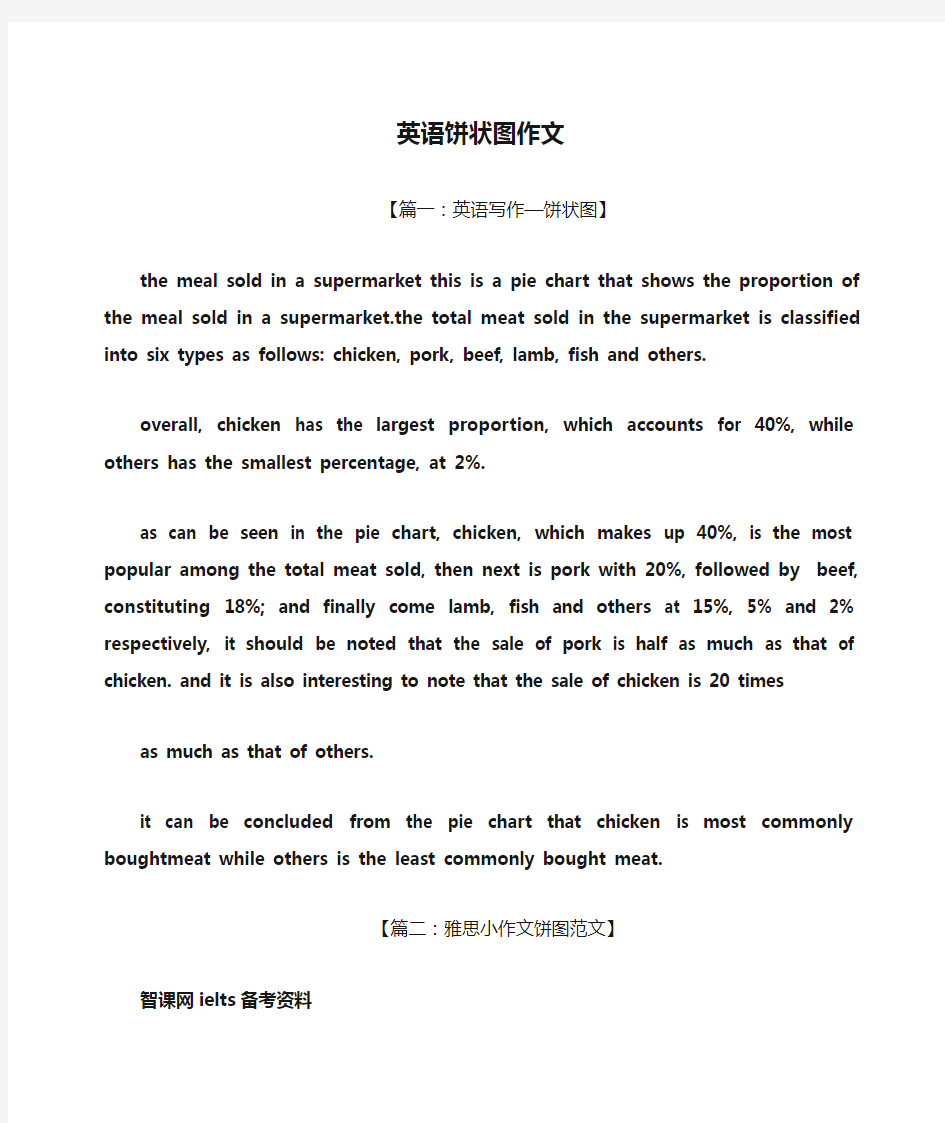
the meal sold in a supermarket this is a pie chart that shows the proportion of the meal sold in a supermarket.the total meat sold in the supermarket is classified into six types as follows: chicken, pork, beef, lamb, fish and others.
overall, chicken has the largest proportion, which accounts for 40%, while others has the smallest percentage, at 2%.
as can be seen in the pie chart, chicken, which makes up 40%, is the most popular among the total meat sold, then next is pork with 20%, followed by beef, constituting 18%; and finally come lamb, fish and others at 15%, 5% and 2% respectively, it should be noted that the sale of pork is half as much as that of chicken. and it is also interesting to note that the sale of chicken is 20 times
as much as that of others.
it can be concluded from the pie chart that chicken is most commonly boughtmeat while others is the least commonly bought meat.
【篇二:雅思小作文饼图范文】
智课网ielts备考资料
雅思小作文饼图范文
摘要:雅思小作文饼图范文。饼图在雅思小作文中是常考题型,本文为大家整理了饼图的真题及范文,以及饼图写作必备的词汇,详情请看下文!
饼状图是是雅思写作必须要拿下的题型,考生要准备一两篇成熟的范文,本文为大家提供雅思小作文饼图范文及专用词汇,希望对大家有帮助!
雅思小作文饼图范文:
writing task 1:
you should spend about 20 minutes on this task.
* the charts below show us spending patterns from 1966 to 1996.
* summarise the information by selecting and reporting the main features, and make comparisons where relevant.
you should write at least 150 words.
写作范例:
the piecharts show changes in american spending patterns between 1966 and 1996.
food and cars made up the two biggest items of expenditure in both years. together they comprised over half of household spending. foodaccounted for 44% of spending in 1966, but this dropped by two thirdsto 14% in 1996. however, the outlay on cars doubled, rising from 23% in 1966 to 45% in 1996.
other areas changed significantly. spending on eating out doubled, climbing from 7% to 14%. the proportion of salary spent on computersincreased dramatically, up from 1% in 1996 to 10% in 1996. however, as computer expenditure rose, the percentage of outlay on books plunged from 6% to 1%.
some areas remained relatively unchanged. americans spentapproximately the same amount of salary on petrol and furniture in both years.
in conclusion, increased amounts spent on cars, computers, and eating out were made up for by drops in expenditure on food and books.
雅思小作文饼图常用词汇
①动词“占”的表达:
account for, hold, make up, take up, constitute, comprise, represent
②百分比的表达
percentage,proportion, share, 某些情况下可以用rate,如literacy rate
③约数表达
the majority of, most of, a considerable number of, a minority of , just over…, slightly more than…/less than…, nearly half… 等
④确切数字表达
分数与百分比的转化:one third, two fifths,one tenth
常见表达:a quarter, a half…………
雅思小作文必备词汇表pdf版下载
以上是小编为大家整理的雅思小作文饼图范文的资料,考生可以下载电子版,慢慢练习!最后整理出自己熟悉的范文模板,考试的时候灵活变化!
相关字搜索:雅思小作文饼图范文
【篇三:雅思小作文饼状图】
you should spend about 20 minutes on this task. write a report for a university
lecturer describing the information shown below. you should write at least 150 words.
in this analysis we will examine three pie charts. the first one is headed ‘world spending.’ the second is ‘world population’ and the third is ‘consumption of resources.’
in the first chart we can see that people spend most of their income (24%) on food. in some countries this percentage would obviously be much higher. transport and then housing are the next major expenses at 18% and 12% respectively. only 6% of income is spent on clothing.
in the second chart entitled ‘world population’, it is not surprising to find that 57% of people live in asia. in fact china and india are two of the most populated countries in the world and they are both situated on this continent. europe and the americans account for nearly 30% of the total, whilst 10% of people live in africa.
finally, the third chart reveals that the usa and europe consume a huge 60% of the world’s resource.
to sum up, the major expenditure is on food, the population figures are the highest for asia and the major consumers are the usa and europe.
the two graphs show that oil was the major energy source in the usa in both 1980 and 1990.
oil supplied the largest percentage of energy, although the percentage decreased from 42% in 1980 to 33% in 1990. coal in 1990 was the second largest source of energy, increasing its proportion to 27% from 22% in the previous decade. natural gas, the second largest source in 1980 at 26%, decreased its share very slightly to provide 25% of america’s energy ten years later. there was no change in the percentage supplied by hydroelectric power which remained at 5% of the total energy used. nuclear power the greatest change: in 1990 it was 10%, twice that of the 1980s.
占…比例: occupyaccount for take part in
剑4 p54 剑8 p53 剑8 p3 剑7 p101