IEEE TRANSACTIONS VISUALIZATION AND COMPUTER GRAPHICS An Insight-based Methodology for Eval
- 格式:pdf
- 大小:666.98 KB
- 文档页数:13
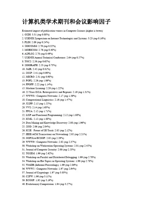
计算机类学术期刊和会议影响因子Estimated impact of publication venues in Computer Science (higher is better)1. OSDI: 3.31 (top 0.08%)2. USENIX Symposium on Internet Technologies and Systems:3.23 (top 0.16%)3. PLDI: 2.89 (top 0.24%)4. SIGCOMM: 2.79 (top 0.32%)5. MOBICOM: 2.76 (top 0.40%)6. ASPLOS: 2.70 (top 0.49%)7. USENIX Annual Technical Conference: 2.64 (top 0.57%)8. TOCS: 2.56 (top 0.65%)9. SIGGRAPH: 2.53 (top 0.73%)10. JAIR: 2.45 (top 0.81%)11. SOSP: 2.41 (top 0.90%)12. MICRO: 2.31 (top 0.98%)13. POPL: 2.26 (top 1.06%)14. PPOPP: 2.22 (top 1.14%)15. Machine Learning: 2.20 (top 1.22%)16. 25 Years ISCA: Retrospectives and Reprints: 2.19 (top 1.31%)17. WWW8 / Computer Networks: 2.17 (top 1.39%)18. Computational Linguistics: 2.16 (top 1.47%)19. JSSPP: 2.15 (top 1.55%)20. VVS: 2.14 (top 1.63%)21. FPCA: 2.12 (top 1.71%)22. LISP and Functional Programming: 2.12 (top 1.80%)23. ICML: 2.12 (top 1.88%)24. Data Mining and Knowledge Discovery: 2.08 (top 1.96%)25. SI3D: 2.06 (top 2.04%)26. ICSE - Future of SE Track: 2.05 (top 2.12%)27. IEEE/ACM Transactions on Networking: 2.05 (top 2.21%)28. OOPSLA/ECOOP: 2.05 (top 2.29%)29. WWW9 / Computer Networks: 2.02 (top 2.37%)30. Workshop on Workstation Operating Systems: 2.01 (top 2.45%)31. Journal of Computer Security: 2.00 (top 2.53%)32. TOSEM: 1.99 (top 2.62%)33. Workshop on Parallel and Distributed Debugging: 1.99 (top 2.70%)34. Workshop on Hot Topics in Operating Systems: 1.99 (top 2.78%)35. WebDB (Informal Proceedings): 1.99 (top 2.86%)36. WWW5 / Computer Networks: 1.97 (top 2.94%)37. Journal of Cryptology: 1.97 (top 3.03%)38. CSFW: 1.96 (top 3.11%)39. ECOOP: 1.95 (top 3.19%)40. Evolutionary Computation: 1.94 (top 3.27%)41. TOPLAS: 1.92 (top 3.35%)42. SIGSOFT FSE: 1.88 (top 3.43%)43. CA V: 1.88 (top 3.52%)44. AAAI/IAAI, Vol. 1: 1.87 (top 3.60%)45. PODS: 1.86 (top 3.68%)46. Artificial Intelligence: 1.85 (top 3.76%)47. NOSSDA V: 1.85 (top 3.84%)48. OOPSLA: 1.84 (top 3.93%)49. ACM Conference on Computer and Communications Security: 1.82 (top 4.01%)50. IJCAI (1): 1.82 (top 4.09%)51. VLDB Journal: 1.81 (top 4.17%)52. TODS: 1.81 (top 4.25%)53. USENIX Winter: 1.80 (top 4.34%)54. HPCA: 1.79 (top 4.42%)55. LICS: 1.79 (top 4.50%)56. JLP: 1.78 (top 4.58%)57. WWW6 / Computer Networks: 1.78 (top 4.66%)58. ICCV: 1.78 (top 4.75%)59. IEEE Real-Time Systems Symposium: 1.78 (top 4.83%)60. AES Candidate Conference: 1.77 (top 4.91%)61. KR: 1.76 (top 4.99%)62. TISSEC: 1.76 (top 5.07%)63. ACM Conference on Electronic Commerce: 1.75 (top 5.15%)64. TOIS: 1.75 (top 5.24%)65. PEPM: 1.74 (top 5.32%)66. SIGMOD Conference: 1.74 (top 5.40%)67. Formal Methods in System Design: 1.74 (top 5.48%)68. Mobile Agents: 1.73 (top 5.56%)69. REX Workshop: 1.73 (top 5.65%)70. NMR: 1.73 (top 5.73%)71. Computing Systems: 1.72 (top 5.81%)72. LOPLAS: 1.72 (top 5.89%)73. STOC: 1.69 (top 5.97%)74. Distributed Computing: 1.69 (top 6.06%)75. KDD: 1.68 (top 6.14%)76. Symposium on Testing, Analysis, and Verification: 1.65 (top 6.22%)77. Software Development Environments (SDE): 1.64 (top 6.30%)78. SIAM J. Comput.: 1.64 (top 6.38%)79. CRYPTO: 1.63 (top 6.47%)80. Multimedia Systems: 1.62 (top 6.55%)81. ICFP: 1.62 (top 6.63%)82. Lisp and Symbolic Computation: 1.61 (top 6.71%)83. ECP: 1.61 (top 6.79%)84. CHI: 1.61 (top 6.87%)86. ACM Symposium on User Interface Software and Technology: 1.59 (top 7.04%)87. ESOP: 1.58 (top 7.12%)88. ECCV: 1.58 (top 7.20%)89. ACM Transactions on Graphics: 1.57 (top 7.28%)90. CSCW: 1.57 (top 7.37%)91. AOSE: 1.57 (top 7.45%)92. ICCL: 1.57 (top 7.53%)93. Journal of Functional Programming: 1.57 (top 7.61%)94. RTSS: 1.57 (top 7.69%)95. ECSCW: 1.56 (top 7.78%)96. TOCHI: 1.56 (top 7.86%)97. ISCA: 1.56 (top 7.94%)98. SIGMETRICS/Performance: 1.56 (top 8.02%)99. IWMM: 1.55 (top 8.10%)100. JICSLP: 1.54 (top 8.19%)101. Automatic Verification Methods for Finite State Systems: 1.54 (top 8.27%)102. WWW: 1.54 (top 8.35%)103. IEEE Transactions on Pattern Analysis and Machine Intelligence: 1.54 (top 8.43%) 104. AIPS: 1.53 (top 8.51%)105. IEEE Transactions on Visualization and Computer Graphics: 1.53 (top 8.59%) 106. VLDB: 1.52 (top 8.68%)107. Symposium on Computational Geometry: 1.51 (top 8.76%)108. FOCS: 1.51 (top 8.84%)109. A TAL: 1.51 (top 8.92%)110. SODA: 1.51 (top 9.00%)111. PPCP: 1.50 (top 9.09%)112. AAAI: 1.49 (top 9.17%)113. COLT: 1.49 (top 9.25%)114. USENIX Summer: 1.49 (top 9.33%)115. Information and Computation: 1.48 (top 9.41%)116. Java Grande: 1.47 (top 9.50%)117. ISMM: 1.47 (top 9.58%)118. ICLP/SLP: 1.47 (top 9.66%)119. SLP: 1.45 (top 9.74%)120. Structure in Complexity Theory Conference: 1.45 (top 9.82%)121. IEEE Transactions on Multimedia: 1.45 (top 9.90%)122. Rules in Database Systems: 1.44 (top 9.99%)123. ACL: 1.44 (top 10.07%)124. CONCUR: 1.44 (top 10.15%)125. SPAA: 1.44 (top 10.23%)126. J. Algorithms: 1.42 (top 10.31%)127. DOOD: 1.42 (top 10.40%)128. ESEC / SIGSOFT FSE: 1.41 (top 10.48%)130. Advances in Petri Nets: 1.41 (top 10.64%)131. ICNP: 1.40 (top 10.72%)132. SSD: 1.39 (top 10.81%)133. INFOCOM: 1.39 (top 10.89%)134. IEEE Symposium on Security and Privacy: 1.39 (top 10.97%)135. Cognitive Science: 1.38 (top 11.05%)136. TSE: 1.38 (top 11.13%)137. Storage and Retrieval for Image and Video Databases (SPIE): 1.38 (top 11.22%) 138. NACLP: 1.38 (top 11.30%)139. SIGMETRICS: 1.38 (top 11.38%)140. JACM: 1.37 (top 11.46%)141. PODC: 1.37 (top 11.54%)142. International Conference on Supercomputing: 1.36 (top 11.62%)143. Fast Software Encryption: 1.35 (top 11.71%)144. IEEE Visualization: 1.35 (top 11.79%)145. SAS: 1.35 (top 11.87%)146. TACS: 1.35 (top 11.95%)147. International Journal of Computer Vision: 1.33 (top 12.03%)148. JCSS: 1.32 (top 12.12%)149. Algorithmica: 1.31 (top 12.20%)150. TOCL: 1.30 (top 12.28%)151. Information Hiding: 1.30 (top 12.36%)152. Journal of Automated Reasoning: 1.30 (top 12.44%)153. ECCV (1): 1.29 (top 12.53%)154. PCRCW: 1.29 (top 12.61%)155. Journal of Logic and Computation: 1.29 (top 12.69%)156. KDD Workshop: 1.28 (top 12.77%)157. ML: 1.28 (top 12.85%)158. ISSTA: 1.28 (top 12.94%)159. EUROCRYPT: 1.27 (top 13.02%)160. PDIS: 1.27 (top 13.10%)161. Hypertext: 1.27 (top 13.18%)162. IWDOM: 1.27 (top 13.26%)163. PARLE (2): 1.26 (top 13.34%)164. Hybrid Systems: 1.26 (top 13.43%)165. American Journal of Computational Linguistics: 1.26 (top 13.51%)166. SPIN: 1.25 (top 13.59%)167. ICDE: 1.25 (top 13.67%)168. FMCAD: 1.25 (top 13.75%)169. SC: 1.25 (top 13.84%)170. EDBT: 1.25 (top 13.92%)171. Computational Complexity: 1.25 (top 14.00%)172. International Journal of Computatinal Geometry and Applications: 1.25 (top 14.08%)174. IJCAI (2): 1.24 (top 14.25%)175. TACAS: 1.24 (top 14.33%)176. Ubicomp: 1.24 (top 14.41%)177. MPC: 1.24 (top 14.49%)178. AWOC: 1.24 (top 14.57%)179. TLCA: 1.23 (top 14.66%)180. Emergent Neural Computational Architectures Based on Neuroscience: 1.23 (top 14.74%) 181. CADE: 1.22 (top 14.82%)182. PROCOMET: 1.22 (top 14.90%)183. ACM Multimedia: 1.22 (top 14.98%)184. IEEE Journal on Selected Areas in Communications: 1.22 (top 15.06%)185. Science of Computer Programming: 1.22 (top 15.15%)186. LCPC: 1.22 (top 15.23%)187. CT-RSA: 1.22 (top 15.31%)188. ICLP: 1.21 (top 15.39%)189. Financial Cryptography: 1.21 (top 15.47%)190. DBPL: 1.21 (top 15.56%)191. AAAI/IAAI: 1.20 (top 15.64%)192. Artificial Life: 1.20 (top 15.72%)193. Higher-Order and Symbolic Computation: 1.19 (top 15.80%)194. TKDE: 1.19 (top 15.88%)195. ACM Computing Surveys: 1.19 (top 15.97%)196. Computational Geometry: 1.18 (top 16.05%)197. Autonomous Agents and Multi-Agent Systems: 1.18 (top 16.13%)198. EWSL: 1.18 (top 16.21%)199. Learning for Natural Language Processing: 1.18 (top 16.29%)200. TAPOS: 1.17 (top 16.38%)201. TAPSOFT, Vol.1: 1.17 (top 16.46%)202. International Journal of Computational Geometry and Applications: 1.17 (top 16.54%) 203. TAPSOFT: 1.17 (top 16.62%)204. IEEE Transactions on Parallel and Distributed Systems: 1.17 (top 16.70%)205. Heterogeneous Computing Workshop: 1.16 (top 16.78%)206. Distributed and Parallel Databases: 1.16 (top 16.87%)207. DAC: 1.16 (top 16.95%)208. ICTL: 1.16 (top 17.03%)209. Performance/SIGMETRICS Tutorials: 1.16 (top 17.11%)210. IEEE Computer: 1.15 (top 17.19%)211. IEEE Real Time Technology and Applications Symposium: 1.15 (top 17.28%)212. TAPSOFT, Vol.2: 1.15 (top 17.36%)213. ACM Workshop on Role-Based Access Control: 1.15 (top 17.44%)214. WCRE: 1.14 (top 17.52%)215. Applications and Theory of Petri Nets: 1.14 (top 17.60%)216. ACM SIGOPS European Workshop: 1.14 (top 17.69%)218. Mathematical Structures in Computer Science: 1.14 (top 17.85%)219. Workshop on the Management of Replicated Data: 1.13 (top 17.93%)220. ECCV (2): 1.13 (top 18.01%)221. PPSN: 1.13 (top 18.09%)222. Middleware: 1.13 (top 18.18%)223. OODBS: 1.12 (top 18.26%)224. Electronic Colloquium on Computational Complexity (ECCC): 1.12 (top 18.34%) 225. UML: 1.12 (top 18.42%)226. Real-Time Systems: 1.12 (top 18.50%)227. FME: 1.12 (top 18.59%)228. Evolutionary Computing, AISB Workshop: 1.11 (top 18.67%)229. IEEE Conference on Computational Complexity: 1.11 (top 18.75%)230. IOPADS: 1.11 (top 18.83%)231. IJCAI: 1.10 (top 18.91%)232. ISWC: 1.10 (top 19.00%)233. SIGIR: 1.10 (top 19.08%)234. Symposium on LISP and Functional Programming: 1.10 (top 19.16%)235. PASTE: 1.10 (top 19.24%)236. HPDC: 1.10 (top 19.32%)237. Application and Theory of Petri Nets: 1.09 (top 19.41%)238. ICCAD: 1.09 (top 19.49%)239. Category Theory and Computer Science: 1.08 (top 19.57%)240. Recent Advances in Intrusion Detection: 1.08 (top 19.65%)241. JIIS: 1.08 (top 19.73%)242. TODAES: 1.08 (top 19.81%)243. Neural Computation: 1.08 (top 19.90%)244. CCL: 1.08 (top 19.98%)245. SIGPLAN Workshop: 1.08 (top 20.06%)246. DPDS: 1.07 (top 20.14%)247. ACM Multimedia (1): 1.07 (top 20.22%)248. MAAMAW: 1.07 (top 20.31%)249. Computer Graphics Forum: 1.07 (top 20.39%)250. HUG: 1.06 (top 20.47%)251. Hybrid Neural Systems: 1.06 (top 20.55%)252. SRDS: 1.06 (top 20.63%)253. TPCD: 1.06 (top 20.72%)254. ILP: 1.06 (top 20.80%)255. ARTDB: 1.06 (top 20.88%)256. NIPS: 1.06 (top 20.96%)257. Formal Aspects of Computing: 1.06 (top 21.04%)258. ECHT: 1.06 (top 21.13%)259. ICMCS: 1.06 (top 21.21%)260. Wireless Networks: 1.05 (top 21.29%)261. Advances in Data Base Theory: 1.05 (top 21.37%)262. WDAG: 1.05 (top 21.45%)263. ALP: 1.05 (top 21.53%)264. TARK: 1.05 (top 21.62%)265. PATAT: 1.05 (top 21.70%)266. ISTCS: 1.04 (top 21.78%)267. Concurrency - Practice and Experience: 1.04 (top 21.86%)268. CP: 1.04 (top 21.94%)269. Computer Vision, Graphics, and Image Processing: 1.04 (top 22.03%) 270. FTCS: 1.04 (top 22.11%)271. RTA: 1.04 (top 22.19%)272. COORDINATION: 1.03 (top 22.27%)273. CHDL: 1.03 (top 22.35%)274. Theory of Computing Systems: 1.02 (top 22.44%)275. CTRS: 1.02 (top 22.52%)276. COMPASS/ADT: 1.02 (top 22.60%)277. TOMACS: 1.02 (top 22.68%)278. IEEE Micro: 1.02 (top 22.76%)279. IEEE PACT: 1.02 (top 22.85%)280. ASIACRYPT: 1.01 (top 22.93%)281. MONET: 1.01 (top 23.01%)282. WWW7 / Computer Networks: 1.01 (top 23.09%)283. HUC: 1.01 (top 23.17%)284. Expert Database Conf.: 1.00 (top 23.25%)285. Agents: 1.00 (top 23.34%)286. CPM: 1.00 (top 23.42%)287. SIGPLAN Symposium on Compiler Construction: 1.00 (top 23.50%) 288. International Conference on Evolutionary Computation: 1.00 (top 23.58%) 289. TAGT: 1.00 (top 23.66%)290. Workshop on Parallel and Distributed Simulation: 1.00 (top 23.75%) 291. FTRTFT: 1.00 (top 23.83%)292. TPHOLs: 1.00 (top 23.91%)293. Intelligent User Interfaces: 0.99 (top 23.99%)294. Journal of Functional and Logic Programming: 0.99 (top 24.07%)295. Cluster Computing: 0.99 (top 24.16%)296. ESA: 0.99 (top 24.24%)297. PLILP: 0.99 (top 24.32%)298. COLING-ACL: 0.98 (top 24.40%)299. META: 0.97 (top 24.48%)300. IEEE MultiMedia: 0.97 (top 24.57%)301. ICALP: 0.97 (top 24.65%)302. IATA: 0.97 (top 24.73%)303. FPGA: 0.97 (top 24.81%)304. EuroCOLT: 0.97 (top 24.89%)305. New Generation Computing: 0.97 (top 24.97%)306. Automated Software Engineering: 0.97 (top 25.06%)307. GRID: 0.97 (top 25.14%)308. ISOTAS: 0.96 (top 25.22%)309. LPNMR: 0.96 (top 25.30%)310. PLILP/ALP: 0.96 (top 25.38%)311. UIST: 0.96 (top 25.47%)312. IPCO: 0.95 (top 25.55%)313. ICPP, Vol. 1: 0.95 (top 25.63%)314. PNPM: 0.95 (top 25.71%)315. HSCC: 0.95 (top 25.79%)316. ILPS: 0.95 (top 25.88%)317. RIDE-IMS: 0.95 (top 25.96%)318. Int. J. on Digital Libraries: 0.95 (top 26.04%)319. STTT: 0.94 (top 26.12%)320. MFPS: 0.94 (top 26.20%)321. Graph-Grammars and Their Application to Computer Science: 0.93 (top 26.28%) 322. Graph Drawing: 0.93 (top 26.37%)323. VRML: 0.93 (top 26.45%)324. VDM Europe: 0.93 (top 26.53%)325. AAAI/IAAI, V ol. 2: 0.93 (top 26.61%)326. Z User Workshop: 0.93 (top 26.69%)327. Constraints: 0.93 (top 26.78%)328. SCM: 0.93 (top 26.86%)329. IEEE Software: 0.92 (top 26.94%)330. World Wide Web: 0.92 (top 27.02%)331. HOA: 0.92 (top 27.10%)332. Symposium on Reliable Distributed Systems: 0.92 (top 27.19%)333. SIAM Journal on Discrete Mathematics: 0.92 (top 27.27%)334. SMILE: 0.91 (top 27.35%)335. HART: 0.91 (top 27.43%)336. ICPP, Vol. 3: 0.91 (top 27.51%)337. FASE: 0.91 (top 27.60%)338. TCS: 0.91 (top 27.68%)339. IEEE Transactions on Information Theory: 0.91 (top 27.76%)340. C++ Conference: 0.91 (top 27.84%)341. ICSE: 0.90 (top 27.92%)342. ARTS: 0.90 (top 28.00%)343. Journal of Computational Biology: 0.90 (top 28.09%)344. SIGART Bulletin: 0.90 (top 28.17%)345. TREC: 0.89 (top 28.25%)346. Implementation of Functional Languages: 0.89 (top 28.33%)347. Acta Informatica: 0.88 (top 28.41%)348. SAIG: 0.88 (top 28.50%)349. CANPC: 0.88 (top 28.58%)350. CACM: 0.87 (top 28.66%)351. PADL: 0.87 (top 28.74%)352. Networked Group Communication: 0.87 (top 28.82%)353. RECOMB: 0.87 (top 28.91%)354. ACM DL: 0.87 (top 28.99%)355. Computer Performance Evaluation: 0.87 (top 29.07%)356. Journal of Parallel and Distributed Computing: 0.86 (top 29.15%)357. PARLE (1): 0.86 (top 29.23%)358. DISC: 0.85 (top 29.32%)359. FGCS: 0.85 (top 29.40%)360. ELP: 0.85 (top 29.48%)361. IEEE Transactions on Computers: 0.85 (top 29.56%)362. JSC: 0.85 (top 29.64%)363. LOPSTR: 0.85 (top 29.72%)364. FoSSaCS: 0.85 (top 29.81%)365. World Congress on Formal Methods: 0.85 (top 29.89%)366. CHARME: 0.84 (top 29.97%)367. RIDE: 0.84 (top 30.05%)368. APPROX: 0.84 (top 30.13%)369. EWCBR: 0.84 (top 30.22%)370. CC: 0.83 (top 30.30%)371. Public Key Cryptography: 0.83 (top 30.38%)372. CA: 0.83 (top 30.46%)373. CHES: 0.83 (top 30.54%)374. ECML: 0.83 (top 30.63%)375. LCTES/OM: 0.83 (top 30.71%)376. Information Systems: 0.83 (top 30.79%)377. IJCIS: 0.83 (top 30.87%)378. Journal of Visual Languages and Computing: 0.82 (top 30.95%)379. WADS: 0.82 (top 31.04%)380. Random Structures and Algorithms: 0.81 (top 31.12%)381. ICS: 0.81 (top 31.20%)382. Data Engineering Bulletin: 0.81 (top 31.28%)383. VDM Europe (1): 0.81 (top 31.36%)384. SW AT: 0.80 (top 31.44%)385. Nordic Journal of Computing: 0.80 (top 31.53%)386. Mathematical Foundations of Programming Semantics: 0.80 (top 31.61%)387. Architectures and Compilation Techniques for Fine and Medium Grain Parallelism: 0.80 (top 31.69%)388. KBSE: 0.80 (top 31.77%)389. STACS: 0.80 (top 31.85%)390. EMSOFT: 0.80 (top 31.94%)391. IEEE Data Engineering Bulletin: 0.80 (top 32.02%)392. Annals of Mathematics and Artificial Intelligence: 0.79 (top 32.10%)393. WOSP: 0.79 (top 32.18%)394. VBC: 0.79 (top 32.26%)395. RTDB: 0.79 (top 32.35%)396. CoopIS: 0.79 (top 32.43%)397. Combinatorica: 0.79 (top 32.51%)398. International Journal of Geographical Information Systems: 0.78 (top 32.59%)399. Autonomous Robots: 0.78 (top 32.67%)400. IW-MMDBMS: 0.78 (top 32.76%)401. ESEC: 0.78 (top 32.84%)402. WADT: 0.78 (top 32.92%)403. CAAP: 0.78 (top 33.00%)404. LCTES: 0.78 (top 33.08%)405. ZUM: 0.77 (top 33.16%)406. TYPES: 0.77 (top 33.25%)407. Symposium on Reliability in Distributed Software and Database Systems: 0.77 (top 33.33%) 408. TABLEAUX: 0.77 (top 33.41%)409. International Journal of Parallel Programming: 0.77 (top 33.49%)410. COST 237 Workshop: 0.77 (top 33.57%)411. Data Types and Persistence (Appin), Informal Proceedings: 0.77 (top 33.66%)412. Evolutionary Programming: 0.77 (top 33.74%)413. Reflection: 0.76 (top 33.82%)414. SIGMOD Record: 0.76 (top 33.90%)415. Security Protocols Workshop: 0.76 (top 33.98%)416. XP1 Workshop on Database Theory: 0.76 (top 34.07%)417. EDMCC: 0.76 (top 34.15%)418. DL: 0.76 (top 34.23%)419. EDAC-ETC-EUROASIC: 0.76 (top 34.31%)420. Protocols for High-Speed Networks: 0.76 (top 34.39%)421. PPDP: 0.75 (top 34.47%)422. IFIP PACT: 0.75 (top 34.56%)423. LNCS: 0.75 (top 34.64%)424. IWQoS: 0.75 (top 34.72%)425. UK Hypertext: 0.75 (top 34.80%)426. Selected Areas in Cryptography: 0.75 (top 34.88%)427. ICATPN: 0.74 (top 34.97%)428. Workshop on Computational Geometry: 0.74 (top 35.05%)429. Integrated Network Management: 0.74 (top 35.13%)430. ICGI: 0.74 (top 35.21%)431. ICPP (2): 0.74 (top 35.29%)432. SSR: 0.74 (top 35.38%)433. ADB: 0.74 (top 35.46%)434. Object Representation in Computer Vision: 0.74 (top 35.54%)435. PSTV: 0.74 (top 35.62%)436. CAiSE: 0.74 (top 35.70%)437. On Knowledge Base Management Systems (Islamorada): 0.74 (top 35.79%)438. CIKM: 0.73 (top 35.87%)439. WSA: 0.73 (top 35.95%)440. RANDOM: 0.73 (top 36.03%)441. KRDB: 0.73 (top 36.11%)442. ISSS: 0.73 (top 36.19%)443. SIGAL International Symposium on Algorithms: 0.73 (top 36.28%)444. INFORMS Journal on Computing: 0.73 (top 36.36%)445. Computer Supported Cooperative Work: 0.73 (top 36.44%)446. CSL: 0.72 (top 36.52%)447. Computational Intelligence: 0.72 (top 36.60%)448. ICCBR: 0.72 (top 36.69%)449. ICES: 0.72 (top 36.77%)450. AI Magazine: 0.72 (top 36.85%)451. JELIA: 0.72 (top 36.93%)452. VR: 0.71 (top 37.01%)453. ICPP (1): 0.71 (top 37.10%)454. RIDE-TQP: 0.71 (top 37.18%)455. ISA: 0.71 (top 37.26%)456. Data Compression Conference: 0.71 (top 37.34%)457. CIA: 0.71 (top 37.42%)458. COSIT: 0.71 (top 37.51%)459. IJCSLP: 0.71 (top 37.59%)460. DISCO: 0.71 (top 37.67%)461. DKE: 0.71 (top 37.75%)462. IWAN: 0.71 (top 37.83%)463. Operating Systems Review: 0.70 (top 37.91%)464. IEEE Internet Computing: 0.70 (top 38.00%)465. LISP Conference: 0.70 (top 38.08%)466. C++ Workshop: 0.70 (top 38.16%)467. SPDP: 0.70 (top 38.24%)468. Fuji International Symposium on Functional and Logic Programming: 0.69 (top 38.32%) 469. LPAR: 0.69 (top 38.41%)470. ECAI: 0.69 (top 38.49%)471. Hypermedia: 0.69 (top 38.57%)472. Artificial Intelligence in Medicine: 0.69 (top 38.65%)473. AADEBUG: 0.69 (top 38.73%)474. VL: 0.69 (top 38.82%)475. FSTTCS: 0.69 (top 38.90%)476. AMAST: 0.68 (top 38.98%)477. Artificial Intelligence Review: 0.68 (top 39.06%)478. HPN: 0.68 (top 39.14%)479. POS: 0.68 (top 39.23%)480. Research Directions in High-Level Parallel Programming Languages: 0.68 (top 39.31%) 481. Performance Evaluation: 0.68 (top 39.39%)482. ASE: 0.68 (top 39.47%)483. LFCS: 0.67 (top 39.55%)484. ISCOPE: 0.67 (top 39.63%)485. Workshop on Software and Performance: 0.67 (top 39.72%)486. European Workshop on Applications and Theory in Petri Nets: 0.67 (top 39.80%) 487. ICPP: 0.67 (top 39.88%)488. INFOVIS: 0.67 (top 39.96%)489. Description Logics: 0.67 (top 40.04%)490. JCDKB: 0.67 (top 40.13%)491. Euro-Par, Vol. I: 0.67 (top 40.21%)492. RoboCup: 0.67 (top 40.29%)493. Symposium on Solid Modeling and Applications: 0.66 (top 40.37%)494. TPLP: 0.66 (top 40.45%)495. CVRMed: 0.66 (top 40.54%)496. POS/PJW: 0.66 (top 40.62%)497. FORTE: 0.66 (top 40.70%)498. IPMI: 0.66 (top 40.78%)499. ADL: 0.66 (top 40.86%)。
时序数据的异常检测可视化综述1介绍时序数据被定义为一系列基于一个准确时间测量的结果,时间间隔通常是规律的[1]。
例如按照一定时间间隔统计到的排名数据,实时检测的传感器数据,社交网络中每天的转发回复数据。
对于时序数据的分析在今天越来越广泛的应用在科学,工程,和商业领域,可视化帮助人们利用感知减少认知负荷进而理解数据[2]。
长期以来,可视化也已经成功的被应用在对于时序数据的分析中来[3]。
例如社交媒体[4],城市数据[5],电子交易[6],时序排名[7]。
在不同领域的时序数据中发现重要的特征和趋势的日益增长的需求刺激了许多可视交互探索工具的发展[8]:Line Graph Explore[9],LiveRAC[2],SignalLens[10]和Data Vases[11]等。
时序数据的可视分析任务中,包括特征提取[14],相关性分析和聚类[7],模式识别[9],异常检测[10]等。
而异常检测在不同的研究领域都是一个重要的问题,异常检测表示发现数据中不符合预期行为的模式[12]。
异常检测的目的是找到某些观察结果,它与其他的观察结果有很大的偏差,以至于引起人们怀疑它是由不同的机制产生的[17]。
对应到不同的领域中,网络安全中的异常表示网络设备异常或者可疑的网络状态[13]。
情感分析中的异常表示一组数据中反常的观点,情绪模式,或者产生这些模式的特殊时间[16]。
社交媒体中的异常可以是反常的行为,例如识别网络机器人[20],反常的传播过程,例如谣言的传播[19]。
这些异常信息或模式的产生原因,可能是会影响日常生活,社会稳定的因素,例如电脑侵入,社交机器人,道路拥堵状况等。
提早发现识别这些异常有助于及时找到产生原因和实际状况,从而进一步分析或解决问题。
异常检测已经有许多成熟的方法,而且在机器学习领域也引起了广泛的关注[12],包括有监督[21]和无监督的异常检测方法[22]。
自动化的学习算法通常基于这样的假设,即有充足的训练数据可用,同时这些数据理应是正常的行为,否则,正常的学习模型不能把新的观测结果按照异常来进行分类,很有可能新的观测数据是不常见的正常事件[25],但当涉及到人工标注数据的问题时,往往需要大量的数据,费事费力,难以获取,同时又十分依赖于主观认为的判断,这些极大地影响了最后的分析结果质量[20]。

CCF推荐的国际学术会议和期刊目录修订版发布CCF(China Computer Federation中国计算机学会)于2010年8月发布了第一版推荐的国际学术会议和期刊目录,一年来,经过业内专家的反馈和修订,于日前推出了修订版,现将修订版予以发布。
本次修订对上一版内容进行了充实,一些会议和期刊的分类排行进行了调整,目录包括:计算机科学理论、计算机体系结构与高性能计算、计算机图形学与多媒体、计算机网络、交叉学科、人工智能与模式识别、软件工程/系统软件/程序设计语言、数据库/数据挖掘/内容检索、网络与信息安全、综合刊物等方向的国际学术会议及期刊目录,供国内高校和科研单位作为学术评价的参考依据。
目录中,刊物和会议分为A、B、C三档。
A类表示国际上极少数的顶级刊物和会议,鼓励我国学者去突破;B类是指国际上著名和非常重要的会议、刊物,代表该领域的较高水平,鼓励国内同行投稿;C类指国际上重要、为国际学术界所认可的会议和刊物。
这些分类目录每年将学术界的反馈和意见,进行修订,并逐步增加研究方向。
中国计算机学会推荐国际学术刊物(网络/信息安全)一、 A类序号刊物简称刊物全称出版社网址1. TIFS IEEE Transactions on Information Forensics andSecurity IEEE /organizations/society/sp/tifs.html2. TDSC IEEE Transactions on Dependable and Secure ComputingIEEE /tdsc/3. TISSEC ACM Transactions on Information and SystemSecurity ACM /二、 B类序号刊物简称刊物全称出版社网址1. Journal of Cryptology Springer /jofc/jofc.html2. Journal of Computer SecurityIOS Press /jcs/3. IEEE Security & Privacy IEEE/security/4. Computers &Security Elsevier http://www.elsevier.nl/inca/publications/store/4/0/5/8/7/7/5. JISecJournal of Internet Security NahumGoldmann. /JiSec/index.asp6. Designs, Codes andCryptography Springer /east/home/math/numbers?SGWID=5 -10048-70-35730330-07. IET Information Security IET /IET-IFS8. EURASIP Journal on InformationSecurity Hindawi /journals/is三、C类序号刊物简称刊物全称出版社网址1. CISDA Computational Intelligence for Security and DefenseApplications IEEE /2. CLSR Computer Law and SecurityReports Elsevier /science/journal/026736493. Information Management & Computer Security MCB UniversityPress /info/journals/imcs/imcs.jsp4. Information Security TechnicalReport Elsevier /locate/istr中国计算机学会推荐国际学术会议(网络/信息安全方向)一、A类序号会议简称会议全称出版社网址1. S&PIEEE Symposium on Security and Privacy IEEE /TC/SP-Index.html2. CCSACM Conference on Computer and Communications Security ACM /sigs/sigsac/ccs/3. CRYPTO International Cryptology Conference Springer-Verlag /conferences/二、B类序号会议简称会议全称出版社网址1. SecurityUSENIX Security Symposium USENIX /events/2. NDSSISOC Network and Distributed System Security Symposium Internet Society /isoc/conferences/ndss/3. EurocryptAnnual International Conference on the Theory and Applications of Cryptographic Techniques Springer /conferences/eurocrypt2009/4. IH Workshop on Information Hiding Springer-Verlag /~rja14/ihws.html5. ESORICSEuropean Symposium on Research in Computer Security Springer-Verlag as.fr/%7Eesorics/6. RAIDInternational Symposium on Recent Advances in Intrusion Detection Springer-Verlag /7. ACSACAnnual Computer Security Applications ConferenceIEEE /8. DSNThe International Conference on Dependable Systems and Networks IEEE/IFIP /9. CSFWIEEE Computer Security Foundations Workshop /CSFWweb/10. TCC Theory of Cryptography Conference Springer-Verlag /~tcc08/11. ASIACRYPT Annual International Conference on the Theory and Application of Cryptology and Information Security Springer-Verlag /conferences/ 12. PKC International Workshop on Practice and Theory in Public Key Cryptography Springer-Verlag /workshops/pkc2008/三、 C类序号会议简称会议全称出版社网址1. SecureCommInternational Conference on Security and Privacy in Communication Networks ACM /2. ASIACCSACM Symposium on Information, Computer and Communications Security ACM .tw/asiaccs/3. ACNSApplied Cryptography and Network Security Springer-Verlag /acns_home/4. NSPWNew Security Paradigms Workshop ACM /current/5. FC Financial Cryptography Springer-Verlag http://fc08.ifca.ai/6. SACACM Symposium on Applied Computing ACM /conferences/sac/ 7. ICICS International Conference on Information and Communications Security Springer /ICICS06/8. ISC Information Security Conference Springer /9. ICISCInternational Conference on Information Security and Cryptology Springer /10. FSE Fast Software Encryption Springer http://fse2008.epfl.ch/11. WiSe ACM Workshop on Wireless Security ACM /~adrian/wise2004/12. SASN ACM Workshop on Security of Ad-Hoc and Sensor Networks ACM /~szhu/SASN2006/13. WORM ACM Workshop on Rapid Malcode ACM /~farnam/worm2006.html14. DRM ACM Workshop on Digital Rights Management ACM /~drm2007/15. SEC IFIP International Information Security Conference Springer http://sec2008.dti.unimi.it/16. IWIAIEEE International Information Assurance Workshop IEEE /17. IAWIEEE SMC Information Assurance Workshop IEEE /workshop18. SACMATACM Symposium on Access Control Models and Technologies ACM /19. CHESWorkshop on Cryptographic Hardware and Embedded Systems Springer /20. CT-RSA RSA Conference, Cryptographers' Track Springer /21. DIMVA SIG SIDAR Conference on Detection of Intrusions and Malware and Vulnerability Assessment IEEE /dimva200622. SRUTI Steps to Reducing Unwanted Traffic on the Internet USENIX /events/23. HotSecUSENIX Workshop on Hot Topics in Security USENIX /events/ 24. HotBots USENIX Workshop on Hot Topics in Understanding Botnets USENIX /event/hotbots07/tech/25. ACM MM&SEC ACM Multimedia and Security Workshop ACM。
情感分歧可视化⽅法随着互联⽹技术的飞速发展,⼈们越来越习惯通过⽹络发布信息和获取信息,也更加习惯在互联⽹上发表⼀些包含⾃⼰感情或者意见的信息。
因此,各种各样的表达情感的⽂本信息在⽹络上⼴泛分布,例如个⼈博客、新浪微博、贴吧、知乎、Twitter、Facebook这样的社交⽹站中,这些信息有关于某些产品的评论、对当下热门新闻事件的参与讨论及对任何事件的情感或看法等。
尽管⼈们可以⽅便得通过⽹络发布和参看这些信息,但是⾯对如此海量的源数据,如果不加以整理和归纳,⼈们⽆法从中获取任何有价值的信息,分析这些信息所表达的情感倾向并将情感可视化分析正是在这⼀背景下应运⽽⽣的。
这些情感信息的发布和传播对我们了解公共事件的影响⼒及⼈们对事件的反应起到了指⽰器的作⽤,能够预测某⼀事件是向好的⽅向发展还是向坏的⽅向发展。
同时这些情感信息对于⽤户来说是⾮常重要的,不仅可以给出⼈们在⽹络世界的情感快照,⽽且对不同层⾯的⼈来说都有潜在的经济学和社会学的价值,举例来说,消费者在购买某件商品,特别是在⽹上购物时,很⾃然得会去看之前的⽤户对此商品或服务的评价信息,并作为参考,以此来最终决定是否购买此商品。
商家在⽣产某件商品之前,会调查⽤户对该公司及其产品的喜好及意见,以制订合理的⽣产计划,避免产⽣不必要的开⽀。
国家在制订某项⽅针政策后,可在试⾏阶段通过⼈们在⽹络上发布的关于此项政策的情感信息,以了解⼈民⼤众的总体情感倾向,以此进⼀步确定此项⽅针政策是否需要改进还是继续推⾏,从⽽使国家制定的政策更加合理有效。
⾯对如此⼤量的⾮结构化的情感数据,,如何将情感分类结果以⼀种更加直观、更加有效的⽅式提供给⽤户,由于情感数据随着时间有着动态变化的特点,所以在研究情感分析结果可视化时要充分考虑到这⼀点,需要再图形中呈现出随时间的动态演变趋势。
⽽且,情感分类的各个类别之间并没有绝对的界线,也就是情感存在强弱之分,也需要在可视化图形中充分体现这⼀点。
![校学位[2012]5号 北京理工大学关于博士、硕士学位申请者发表学术论文的规定](https://uimg.taocdn.com/7917275033687e21af45a975.webp)
北京理工大学关于博士、硕士学位申请者发表学术论文的规定校学位[2012]5号为了进一步提高我校研究生教育水平,保证学位授予质量,激励研究生原始创新,引导和促进研究生在高水平学术刊物上发表反映学位论文工作成果的学术论文,特对研究生发表学术论文作如下规定:一、申请学位发表学术论文基本要求1.申请博士、硕士学位者,需满足本学科博士、硕士学位申请者发表学术论文的要求,具体见附件1、2。
2.在《SCIENCE》、《NATURE》期刊上发表1篇论文即可满足申请博士学位发表学术论文基本要求。
二、说明1. 本规定中发表的学术论文(含其他成果)内容应与申请者学位论文工作密切相关。
2.本规定中发表学术论文必须是申请者为第一作者(若导师为第一作者,申请者为第二作者可视同),且第一署名单位为北京理工大学;科技获奖必须第一署名单位为北京理工大学;授权专利必须第一专利权人为北京理工大学。
3.本规定中发表学术论文是指已正式发表(含网上在线on line)的学术论文,允许有1篇学术论文处于录用状态。
处于录用状态的学术论文需提交有确定卷期号的录用通知书、版面费收据及论文底稿;对在国外期刊上发表的论文,提交国外出版社的Email录用通知书或信函录用通知书及国外出版社提供的版权转让签字单、文章校样。
4.本规定中SCI是指美国《科学引文索引》的英文简称,其英文全称为:Science Citation Index,含网络版;EI是指美国《工程索引》的简称,其英文全称为:Engineering Index。
SCI、EI源期刊以及SCI影响因子以学术论文收稿日期前(无收稿日期则以发表日期计)最新公布为准。
5.本规定中“核心期刊”是指《中文核心期刊要目总览》(北京大学图书馆、北京高校图书馆期刊工作研究会主编,北京大学出版社)和《中国科技期刊引证报告》(中国科技信息研究所每年出版一次)。
以学术论文收稿日期前(无收稿日期则以发表日期计)最新版本为准。
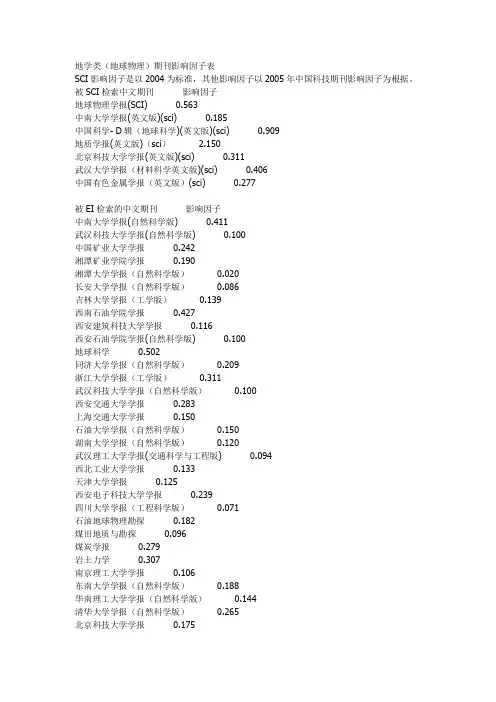
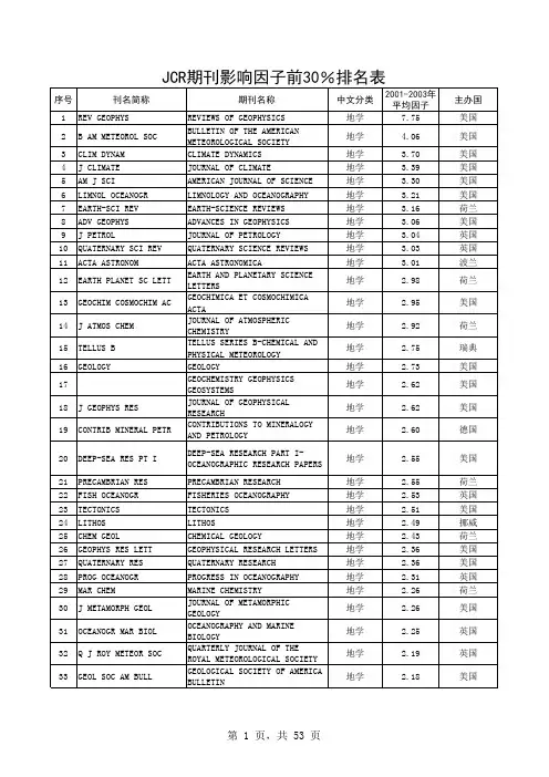
地学类(地球物理)期刊影响因子表SCI影响因子是以2004为标准,其他影响因子以2005年中国科技期刊影响因子为根据。
被SCI检索中文期刊影响因子地球物理学报(SCI) 0.563中南大学学报(英文版)(sci) 0.185中国科学- D辑(地球科学)(英文版)(sci) 0.909地质学报(英文版)(sci) 2.150北京科技大学学报(英文版)(sci) 0.311武汉大学学报(材料科学英文版)(sci) 0.406中国有色金属学报(英文版)(sci) 0.277被EI检索的中文期刊影响因子中南大学学报(自然科学版) 0.411武汉科技大学学报(自然科学版) 0.100中国矿业大学学报0.242湘潭矿业学院学报0.190湘潭大学学报(自然科学版)0.020长安大学学报(自然科学版)0.086吉林大学学报(工学版)0.139西南石油学院学报0.427西安建筑科技大学学报0.116西安石油学院学报(自然科学版) 0.100地球科学0.502同济大学学报(自然科学版)0.209浙江大学学报(工学版)0.311武汉科技大学学报(自然科学版)0.100西安交通大学学报0.283上海交通大学学报0.150石油大学学报(自然科学版)0.150湖南大学学报(自然科学版)0.120武汉理工大学学报(交通科学与工程版) 0.094西北工业大学学报0.133天津大学学报0.125西安电子科技大学学报0.239四川大学学报(工程科学版)0.071石油地球物理勘探0.182煤田地质与勘探0.096煤炭学报0.279岩土力学0.307南京理工大学学报0.106东南大学学报(自然科学版)0.188华南理工大学学报(自然科学版)0.144清华大学学报(自然科学版)0.265北京科技大学学报0.175华南理工大学学报(自然科学版)0.144 大连理工大学学报0.237地质学报 1.816地质科技情报0.303地质科学0.791地质论评 1.249其他有关期刊影响因子地球物理学进展0.243物探与化探0.199物探化探计算技术0.542地球学报0.515地质通报0.176地质与勘探0.155地学前缘 1.028地震学报0.720矿产与地质0.108地震研究0.084地震0.425地震地质0.424地震地磁观测与研究0.105地球化学0.783矿物学报0.475江汉石油学院学报0.09工程地质学报0.298工程勘察0.172矿床地质 1.047矿物岩石地球化学通报0.149地质力学学报0.208西北地震学报0.139测绘类(SCI&EI中文期刊)遥感学报0.912测绘学报0.876大地测量与地球动力学0.854遥感技术与应用0.621国土资源遥感0.519遥感信息0.485测绘科学0.462测绘通报0.269测绘工程0.170测绘类(SCI&EI英文)Computers&geosciences 0.904Earth and planetary science letters 3.499Remote sensing of environment 3.185Photogrammetric engineering and remote sensing 1.574Ieee transactions on geoscience and remote sensing 1.476 Planetary and space science 1.459Isprs journal of photogrammetry and remote sensing 1.317 Space science reviews 1.235International journal of remote sensing 1.128Earth planets and space 0.839Journal of geodesy 0.732earth-science reviews 4.543information systems 2.343journal of digital imaging 2.098bulletin of the seismological society of america 1.812ieee transactions on visualization and computer graphics 1.694 ieee computer graphics and applications 1.602 geomorphology 1.591journal of geodynamics 1.454earth surface processes and landforms 1.394canadian journal of earth sciences 1.264soil & tillage research 1.237international journal of geographical information science 1.234 earthquake engineering & structural dynamics 0.724 imaging science journal 0.463被SCI检索的英文期刊影响因子geophysics 1.087geophysical research letters 2.378journal of geophysical research-atmosphere 2.839reviews of geophysics 8.667geophysical journal international 2.014geophysical prospecting 0.649advances in geophysics 1.667surveys in geophysics 1.405journal of geochemical exploration 0.427journal of geodesy 0.732journal of geodynamics 1.454journal of geology 2.097journal of the geological society of india 0.345journal of the geological society 1.890journal of geometry and physics 1.048geomorphology 1.591geophysical and astrophysical fluid dynamics 0.829annals of geophysics 0.413pure and applied geophysics 0.840nonlinear processes in geophysics 1.324pure and applied chemistry 1.449Geology 2.925journal of geochemical exploration 0.427geoscience canada 0.280journal of sedimentary research 1.323journal of seismic exploration 0.170journal of seismology 0.592energy exploration & exploitation 0.274geochemistry international 0.306geochemical journal 0.759geochimica et cosmochimica acta 3.811Geoderma 1.345geodinamica acta 1.188geografiska annaler series a-physical geography 0.520 geologica carpathica 0.494geologiya i geofizika 0.716geological journal 0.711geological magazine 1.188geologie en mijnbouw-netherlands journal of geosciences 0.943 geology of ore deposits 0.515geological society of america bulletin 2.381geometric and functional analysis 0.889Geomagnetism and aeronomy 0.529geo-marine letters 0.859geometriae dedicata 0.433geomicrobiology journal 2.580annales geophysicae 1.610doklady earth sciences 0.159journal of african earth sciences 0.889australian journal of earth sciences 1.333journal of south american earth sciences 1.299international journal of earth sciences 1.147journal of asian earth sciences 1.095science in china series d-earth sciences 0.909transactions of nonferrous metals society of china 0.277 transactions of the indian institute of metals 0.114 geological society of america bulletin 2.381acta geologica sinica-english edition 2.150proceedings of the yorkshire geological society 0.312 petroleum science and technology 0.312australian journal of earth sciences 1.333journal of clinical investigation 14.204geochimica et cosmochimica acta 3.811geologie en mijnbouw-netherlands journal of geosciences 0.710 progress in natural science 0.485ieee transactions on geoscience and remote sensing 1.467 comptes rendus geoscience 0.645petroleum geoscience 0.638。

矿产资源开发利用方案编写内容要求及审查大纲
矿产资源开发利用方案编写内容要求及《矿产资源开发利用方案》审查大纲一、概述
㈠矿区位置、隶属关系和企业性质。
如为改扩建矿山, 应说明矿山现状、
特点及存在的主要问题。
㈡编制依据
(1简述项目前期工作进展情况及与有关方面对项目的意向性协议情况。
(2 列出开发利用方案编制所依据的主要基础性资料的名称。
如经储量管理部门认定的矿区地质勘探报告、选矿试验报告、加工利用试验报告、工程地质初评资料、矿区水文资料和供水资料等。
对改、扩建矿山应有生产实际资料, 如矿山总平面现状图、矿床开拓系统图、采场现状图和主要采选设备清单等。
二、矿产品需求现状和预测
㈠该矿产在国内需求情况和市场供应情况
1、矿产品现状及加工利用趋向。
2、国内近、远期的需求量及主要销向预测。
㈡产品价格分析
1、国内矿产品价格现状。
2、矿产品价格稳定性及变化趋势。
三、矿产资源概况
㈠矿区总体概况
1、矿区总体规划情况。
2、矿区矿产资源概况。
3、该设计与矿区总体开发的关系。
㈡该设计项目的资源概况
1、矿床地质及构造特征。
2、矿床开采技术条件及水文地质条件。
毕业设计数据可视化系统参考外文文献毕业设计数据可视化系统是一个涉及多个领域的综合性项目,因此需要参考多方面的外文文献。
以下是一些可能相关的外文文献资源:1. Data Visualization: A Handbook for Data Driven Design作者: Isabel Meirelles这本手册提供了数据可视化的基础知识和技术,包括数据清理、数据转换和可视表示等方面的内容。
2. The Visual Display of Quantitative Information作者: Edward R. Tufte这是一本经典的数据可视化书籍,详细介绍了如何使用图表、图形和表格等视觉元素来表示和呈现定量数据。
3. Data Visualization: A Practical Introduction作者: Jacqueline Peterson这本书提供了一个全面的数据可视化指南,从数据清理和准备到可视表示和解释等方面都有详细的介绍。
4. Information Visualization: Perception for Design作者: Collin F. Lynch这本书介绍了信息可视化的基本概念和技术,包括认知、感知和可视化等方面的内容。
它还提供了一些实用的设计技巧和工具。
5. Visualizing Data: Exploring and Explaining Data Through Tables, Charts, Maps, and more作者: Andy Kirk这本书提供了一系列的数据可视化方法和技巧,包括各种图表、地图和图形等。
它还强调了数据可视化的解释和传达方面的内容。
此外,还可以查阅一些专门针对数据可视化的学术期刊和会议论文集,例如IEEE Transactions on Visualization and Computer Graphics、Proceedings of the IEEE Symposium on Information Visualization等。
数据可视化参考文献数据可视化,又称信息可视化,是一种基于计算机软件的数据分析和展示技术,它可以使复杂的数据以图表、曲线、地图等形式展示出来,从而使分析者可以直观地查看和理解数据,有效地提高分析效率。
随着计算机技术的发展,数据可视化技术也发展得越来越快,它已经成为非常重要的分析和展示工具。
本文将介绍数据可视化的一些相关参考文献,以便于人们以后可以更好的了解和利用数据可视化技术。
一、数据可视化的概念数据可视化是一种通过图形、曲线、地图等图形展示数据的技术,它可以把复杂的数据以更加直观的形式展示出来,从而让分析者更容易获取所需的信息,从而提高分析效率。
数据可视化技术有很多种,其中常用的有折线图、柱状图、饼图、热力图等。
二、数据可视化的参考文献1. Tufte, E. R. (2001). The Visual Display of Quantitative Information. Cheshire, CT: Graphics Press.Tufte的《量化信息的可视显示》这本书是一本关于数据可视化的经典著作,全书分为三部分,主要讲述了数据可视化的原理、技巧以及具体的实例,可以帮助读者深入地理解数据可视化的概念,并学习如何有效地使用数据可视化技术。
2. Few, S. (2009). Now You See It: Simple Visualization Techniques for Quantitative Analysis. Berkeley, CA: Analytics Press.Few的《现在你看见它了:量化分析的简单可视化技术》是一本关于数据可视化的参考书,介绍了多种数据可视化技术,如折线图、柱状图、饼图、热力图等,以及如何使用这些技术进行数据可视化,可以帮助读者学习如何使用这些技术来分析数据。
3. Wong, K. (2015). Interactive Data Visualization: Foundations, Techniques, and Applications. Boca Raton, FL: CRC Press.Wong的《交互式数据可视化:基础、技巧和应用》是一本关于交互式数据可视化的参考书,介绍了交互式数据可视化的基本原理、技术和应用,可以帮助读者更好地理解这种技术,并更好地使用它进行数据分析和展示。
计算机核心期刊排名近年来,随着计算机技术的飞速发展,计算机科学和技术也成为了许多学者和研究人员关注的焦点。
计算机期刊的发展和排名已成为了衡量和评估计算机领域内学术成果的重要标准。
本文将针对国际上计算机核心期刊的排名进行系统综述和比较,以期为广大计算机学者和研究人员提供参考。
一、期刊排名概述计算机核心期刊排名体系已经形成,并被广泛应用在学术界和企业中。
影响力和排名地位在计算机领域内十分重要,不仅代表期刊的品位和质量,更代表期刊对于学者和研究人员的吸引力和感召力。
目前国际上对计算机核心期刊排名的评估方法有以下几种:1.雪球法这种方法是利用期刊自身的影响力评价其他期刊的影响力。
即,先选定一个期刊作为起点期刊,再选择跟它相似的其他期刊,将它们的影响力进行比较。
然后选出其中对于起点期刊影响力较大的期刊,再以这些期刊为新的起点,重复上述操作,最终得出所有期刊的影响力排名。
2.因子分析法这种方法是以期刊的影响力因子来评价期刊的影响力。
影响力因子指的是某期刊在前几年内发表的论文被引用的次数之和除以这些论文的数量。
期刊的影响力因子越高,代表该期刊的研究成果在同学科领域内的关注度就越高。
因此,以影响力因子为标准评价期刊的排名,已成为当前计算机核心期刊排名的主流方法之一。
3.专家评审法这种方法是采用专家意见和经验,结合多种评价因素,综合评价期刊的影响力和排名地位。
这种方法具有较高的主观性,并且需要投入大量的人力和经济资源,因此使用较少。
二、计算机核心期刊排名综述1.管理科学与工程领域(1)IEEE Transactions on Software Engineering (影响因子18.722)该期刊是IEEE Computer Society下的一个子刊,刊载的内容涉及软件工程和软件技术方面的研究成果。
该期刊于1975年首次出版,现有4500余名注册读者。
该期刊在影响因子排名上名列第一,是计算机领域内影响力最大的期刊之一。
白光分解到红绿蓝色坐标公式解释说明以及概述1. 引言1.1 概述本文将探讨白光分解到红绿蓝色坐标公式的解释说明以及概述。
在可视化和颜色科学领域,白光是一个重要的研究对象。
了解如何将白光转换为红绿蓝(RGB)色坐标对于理解颜色的生成和表示方式至关重要。
1.2 文章结构本文主要分为四个部分。
首先,将介绍文章的背景和目的。
接着,在第二部分中,我们将详细介绍白光的组成与性质以及红绿蓝色坐标系统的基本知识。
然后,我们将推导出白光分解到红绿蓝色坐标公式的具体过程。
在第三部分中,我们将探讨这一公式在实际应用领域中的意义和应用方法,并讨论其对颜色概念和表达方式的影响。
最后,在结论部分,我们将总结主要观点和发现,并展望未来对该公式进行进一步研究和应用的可能性。
1.3 目的本文旨在提供一个清晰简明的解释说明,帮助读者理解白光如何分解到红绿蓝色坐标公式,并认识其在实际应用中的重要性和意义。
通过本文的阅读,读者将能够更好地理解颜色的生成和表达方式,以及如何利用白光分解到红绿蓝色坐标公式进行实际应用和分析结果可视化表示。
2. 白光分解到红绿蓝色坐标公式的解释说明:2.1 白光的组成与性质:白光是由多种颜色的光波混合而成的。
在可见光谱中,白光包含了所有频率和波长的色彩。
根据干涉和衍射现象,我们知道白光可以被分解为不同颜色的光譜。
2.2 红绿蓝色坐标系统简介:红绿蓝色坐标系统是一种常用的表示和描述颜色的方式,也被称为RGB(Red Green Blue)颜色模型。
该模型中,通过对于红、绿、蓝三种基本颜色的不同强度组合,可以产生出所有其他可能的颜色。
在RGB模型中,每个基本颜色有一个取值范围从0到255之间。
其中0代表该基本颜色没有贡献到最终颜色中,255则代表该基本颜色得到了最大程度上的贡献。
2.3 白光分解到红绿蓝色坐标公式的推导过程:当白光经过适当方式的分解装置后,可以将其分解为特定强度和频率范围内的红、绿和蓝光。
然后,通过测量每个颜色通道的强度,可以计算出对应的RGB分量值。
阈值阈值3.4585225序号63646870838891 118122 124 125136 139 141 142 145 151157158 160161170 174 177 187189 197ISSN刊名简称分区刊1.931 1.1121区2区0737-0024HUM-COMPUT INTERACT1HUMANINTERACTION 0129-0657INT J NEURAL SYST1InternationalSystems 0920-5691INT J COMPUT VISION1INTERNATIOF COMPUTER VISION 1089-778X IEEE T EVOLUT COMPUT1IEEE TRANEVOLUTIONARY1741-2560J NEURAL ENG2Journal of N0020-0255INFORM SCIENCES2INFORMAT0730-0301ACM T GRAPHIC1ACM TRANGRAPHICS 1063-6706IEEE T FUZZY SYST2IEEE TRANFUZZY SYSTEMS 1083-4419IEEE T SYST MAN CY B2IEEE TRANSYSTEMS MAN ANDCYBERNETICS PART B-CYBERNETICS 1045-9227IEEE T NEURAL NETWOR2IEEE TRANNEURAL NETWORKS 1556-603X IEEE COMPUT INTELL M2IEEE CIntelligence Magazine 1057-7149IEEE T IMAGE PROCESS2IEEE TRANIMAGE PROCESSING1066-8888VLDB J2VLDB0018-9448IEEE T INFORM THEORY2IEEE TRANINFORMATION THEORY 0004-5411J ACM2JOURNAL1532-4435J MACH LEARN RES2JOURNALLEARNING RESEARCH1541-1672IEEE INTELL SYST2IEEE INSYSTEMS 0004-3702ARTIF INTELL2ARTIFICIAL0098-5589IEEE T SOFTWARE ENG2IEEE TRANSOFTWARE ENGINEERING 0066-4200ANNU REV INFORM SCI2ANNUALINFORMATION SCIENCEAND TECHNOLOGY0031-3203PATTERN RECOGN2PATTERN1570-8268J WEB SEMANT2Journal of1524-9050IEEE T INTELL TRANSP2IEEE TRANINTELLIGENTTRANSPORTATION 1089-7801IEEE INTERNET COMPUT2IEEECOMPUTING 1568-4946APPL SOFT COMPUT2APPLIED SO0360-1315COMPUT EDUC2COMPUTER0268-3962J INF TECHNOL2JOURNAL OTECHNOLOGY3773区期刊数期刊数阈值198 202 203 220 241 244 245 246 261274 285 310 314 315 343 345362 374 391422 424 429 432443 449475 4830378-7206INFORM MANAGE-AMSTER2INFORMANAGEMENT1063-6560EVOL COMPUT2EVOLCOMPUTATION 1077-2626IEEE T VIS COMPUT GR2IEEE TRANVISUALIZATION ANDCOMPUTER GRAPHICS 0824-7935COMPUT INTELL-US2COMPINTELLIGENCE0957-4174EXPERT SYST APPL2EXPERT SAPPLICATIONS1064-5462ARTIF LIFE2ARTIF1083-4427IEEE T SYST MAN CY A2IEEE TRANSYSTEMS MAN ANDCYBERNETICS PART A-SYSTEMS AND HUMANS 0167-9236DECIS SUPPORT SYST2DECISIOSYSTEMS0219-1377KNOWL INF SYST2KNOWINFORMATION SYSTEMS 1041-4347IEEE T KNOWL DATA EN2IEEE TRANKNOWLEDGE AND DATAENGINEERING1384-5810DATA MIN KNOWL DISC3DATA MKNOWLEDGE DISCOVERY 1094-6977IEEE T SYST MAN CY C2IEEE TRANSYSTEMS MAN ANDCYBERNETICS PART C-APPLICATIONS AND RE 0893-6080NEURAL NETWORKS2NEURAL1545-5963IEEE ACM T COMPUT BI3IEEE-ACMComputational Biology andBioinformatics0950-7051KNOWL-BASED SYST3KNOWLESYSTEMS0888-613X INT J APPROX REASON3INTERNATIOF APPROXIMATE 0734-2071ACM T COMPUT SYST3ACM TRANCOMPUTER SYSTEMS 0169-023X DATA KNOWL ENG3DATA & KENGINEERING1943-068X IEEE T COMP INTEL AI3IEEE TraComputational Intelligence and 0885-6125MACH LEARN3MACHIN0740-7459IEEE SOFTWARE3IEEE S0306-4379INFORM SYST3INFORMAT1432-7643SOFT COMPUT3SOFT C1387-2532AUTON AGENT MULTI-AG3AUTONOMAND MULTI-AGENT 1076-9757J ARTIF INTELL RES3JOURNALINTELLIGENCE RESEARCH 0306-4573INFORM PROCESS MANAG3INFOPROCESSING &0018-9340IEEE T COMPUT3IEEE TRANCOMPUTERS493494 495 503 525 535553 556583 587 594 621 627 628 642 6510960-085X EUR J INFORM SYST3EUROPEAINFORMATION SYSTEMS 0925-2312NEUROCOMPUTING3NEURO1556-4681ACM T KNOWL DISCOV D3ACM TraKnowledge Discovery from 0884-8173INT J INTELL SYST3INTERNATIOF INTELLIGENT SYSTEMS 0952-1976ENG APPL ARTIF INTEL3ENGIAPPLICATIONS OF 0165-5515J INF SCI3JOURNAL OSCIENCE1046-8188ACM T INFORM SYST3ACM TRANINFORMATION SYSTEMS 1386-4564INFORM RETRIEVAL3INFORMAT0178-2770DISTRIB COMPUT3DISTRIBUT0362-5915ACM T DATABASE SYST3ACM TRANDATABASE SYSTEMS 0167-8655PATTERN RECOGN LETT3PATTERNLETTERS1091-9856INFORMS J COMPUT3INFORMSCOMPUTING0932-8092MACH VISION APPL3MACHINEAPPLICATIONS0218-4885INT J UNCERTAIN FUZZ3INTERNATIOF UNCERTAINTYFUZZINESS AND1562-2479INT J FUZZY SYST3InternationaSystems1073-0516ACM T COMPUT-HUM INT3ACM TraComputer-Human Interaction4区总计期刊数期刊数期刊数102217093年平均IF 2011年IF 4.133 3.7414.111 3.3413.889 1.4763.8364.2843.58 3.4893.4334.263.401 3.8372.987 2.8332.965 3.3682.9363.0422.9293.082.825 2.9522.815 2.3532.775 2.5612.76 1.5642.6983.0092.665 1.982.628 2.9552.623 2.1542.607 2.2522.6013.4522.54122.509 2.2922.501 1.3022.432 2.6212.426 2.3212.375 2.612刊名全称MAN-COMPUTERINTERACTIONtional Journal of NeuralSystemsNATIONAL JOURNALOF COMPUTER VISIONTRANSACTIONS ONEVOLUTIONARY of Neural Engineering RMATION SCIENCES TRANSACTIONS ONGRAPHICSTRANSACTIONS ONFUZZY SYSTEMSTRANSACTIONS ON SYSTEMS MAN ANDCYBERNETICS PART B-CYBERNETICSTRANSACTIONS ONNEURAL NETWORKSEE ComputationalIntelligence Magazine TRANSACTIONS ONIMAGE PROCESSINGVLDB JOURNAL TRANSACTIONS ONINFORMATION THEORYRNAL OF THE ACM RNAL OF MACHINELEARNING RESEARCHEE INTELLIGENT SYSTEMS ICIAL INTELLIGENCE TRANSACTIONS ONSOFTWARE ENGINEERINGNUAL REVIEW OF INFORMATION SCIENCE AND TECHNOLOGY ERN RECOGNITION al of Web Semantics TRANSACTIONS ON INTELLIGENT TRANSPORTATION EEE INTERNET COMPUTING ED SOFT COMPUTING UTERS & EDUCATION AL OF INFORMATIONTECHNOLOGY2.374 2.2142.3510.9712.346 2.2032.272 1.0612.162 2.2152.148 1.6872.148 2.2252.128 2.2822.0832.1232.043 2.0092.011 2.1821.931 1.6571.911 1.5451.907 1.9481.819 1.1881.818 1.5431.768 2.4221.739 1.5871.686 1.5081.63 1.4221.617 1.6171.609 1.2131.605 1.1431.586 1.1981.573 1.881.525 1.1191.5111.103NFORMATION &MANAGEMENT EVOLUTIONARY COMPUTATION TRANSACTIONS ON VISUALIZATION AND COMPUTER GRAPHICSOMPUTATIONAL INTELLIGENCEERT SYSTEMS WITH APPLICATIONS ARTIFICIAL LIFETRANSACTIONS ON SYSTEMS MAN AND CYBERNETICS PART A-SYSTEMS AND HUMANSCISION SUPPORT SYSTEMS NOWLEDGE ANDINFORMATION SYSTEMSTRANSACTIONS ON KNOWLEDGE AND DATAENGINEERING ATA MINING AND KNOWLEDGE DISCOVERYTRANSACTIONS ON SYSTEMS MAN AND CYBERNETICS PART C-APPLICATIONS AND REURAL NETWORKS ACM Transactions on Computational Biology andBioinformatics OWLEDGE-BASED SYSTEMS NATIONAL JOURNAL OF APPROXIMATE TRANSACTIONS ON COMPUTER SYSTEMSTA & KNOWLEDGE ENGINEERING EE Transactions onComputational Intelligence andCHINE LEARNING EEE SOFTWARE RMATION SYSTEMS OFT COMPUTING ONOMOUS AGENTS AND MULTI-AGENT RNAL OF ARTIFICIAL INTELLIGENCE RESEARCHINFORMATION PROCESSING &TRANSACTIONS ON COMPUTERS1.489 1.51.487 1.581.487 1.6651.47 1.2991.419 1.4191.393 1.6531.3610.9141.3560.9761.2960.8381.276 1.0771.259 1.7811.203 1.1571.191 1.0341.189 1.0761.17 1.0091.1541OPEAN JOURNAL OF INFORMATION SYSTEMSUROCOMPUTING M Transactions on Knowledge Discovery fromNATIONAL JOURNALOF INTELLIGENT SYSTEMSENGINEERING APPLICATIONS OFAL OF INFORMATION SCIENCETRANSACTIONS ON INFORMATION SYSTEMSRMATION RETRIEVAL IBUTED COMPUTING TRANSACTIONS ON DATABASE SYSTEMSERN RECOGNITION LETTERSORMS JOURNAL ON COMPUTINGCHINE VISION AND APPLICATIONSNATIONAL JOURNAL OF UNCERTAINTY FUZZINESS ANDtional Journal of FuzzySystemsM Transactions onComputer-Human Interaction。
计算机视觉领域期刊计算机视觉和模式识别领域的代表就是四⼤顶会了:ICCV、ECCV、CVPR、NIPS,还有就是难度最⾼的PAMI了,这些都让⼈望⽽⽣畏。
那么除了这些⽿熟能详的期刊和会议之外,还有哪些该领域的期刊呢?下⾯我收集了⼀些该领域的代表性期刊,并介绍了他们的影响因⼦以及投稿难度和审稿周期。
希望对⼤家有帮助吧,后期⼤家还有发现的可以留⾔,补充哦。
⾸先介绍计算机视觉领域的4个顶级代表性期刊吧。
(1) IEEE Transactions on Pattern Analysis and Machine Intelligence,IEEE模式分析与机器智能汇刊,简称PAMI,是IEEE最重要的学术性汇刊之⼀。
在各种统计中,PAMI被认为有着很强的影响因⼦(2011年影响因⼦为4.9)和很⾼的排名。
显然,这个期刊的中稿难度那是相当的⼤,⼀般先投中CVPR之后再加点东西投该期刊会⽐较好中⼀点。
(2) ACM Transactions on Graphics。
美国计算机协会图形汇刊,简称TOG,该刊侧重于计算机图形的处理,影响因⼦在该领域也⽐较⾼,2011年为3.5。
中稿的难度也极⼤,⼀般该刊对每年的SIGGRAPH(Special Interest Group for Computer GRAPHICS,计算机图形图像特别兴趣⼩组)会议论⽂全⽂收录。
(3) International Journal of Computer vision,该刊也是该领域的顶级期刊之⼀,相⽐于PAMI来讲,该刊侧重于理论的推导。
2011年影响因⼦为3.7,中稿难度也相当⼤。
(4) IEEE Transactions on Image Processing,该刊也是图像处理领域的代表性期刊之⼀,相⽐于上⾯三个期刊来讲,该刊稍微低⼀点层次。
2011年影响因⼦为3.042,中稿难度也⽐较⼤。
审稿周期⼀年左右。
除了上述让⼈望⽽⽣畏的顶级期刊之外,我们再看看⼀般的期刊吧。
CCF 推荐国际学术期刊中国计算机学会推荐国际学术期刊 (计算机系统与⾼性能计算)⼀、A类⼆、B类三、C类中国计算机学会推荐国际学术刊物(计算机⽹络)⼀、A类序号刊物简称刊物全称出版社⽹址1TOCS ACM Transactions on Computer Systems ACM 2TOC IEEE Transactions on ComputersIEEE 3TPDSIEEE Transactions on Parallel and Distributed SystemsIEEE序号刊物简称刊物全称出版社⽹址1TACO ACM Transactions on Architecture and Code OptimizationACM 2TAAS ACM Transactions on Autonomous and Adaptive SystemsACM 3TODAES ACM Transactions on Design Automation of Electronic SystemsACM 4TECS ACM Transactions on Embedded Computing Systemsn ACM 5TRETS ACM Transactions on Reconfigurable Technology and SystemsACM 6TOS ACM Transactions on StorageACM 7TCAD IEEE Transactions on COMPUTER-AIDED DESIGN of Integrated Circuits and Systems IEEE 8TVLSI IEEE Transactions on VLSI SystemsIEEE 9JPDC Journal of Parallel and Distributed Computing Elsevier 10 PARCOParallel ComputingElsevier 11Performance Evaluation: An International JournalElsevier序号刊物简称刊物全称出版社⽹址1 Concurrency and Computation: Practice and Experience Wiley 2DC Distributed ComputingSpringer 3FGCS Future Generation Computer Systems Elsevier 4Integration Integration, the VLSI JournalElsevier 5 JSA The Journal of Systems Architecture: Embedded Software DesignElsevier 6 Microprocessors and Microsystems: Embedded Hardware DesignElsevier 7JGC The Journal of Grid computing Springer 8TJSC The Journal of SupercomputingSpringer 9JETC The ACM Journal on Emerging Technologies in Computing SystemsACM 10JETJournal of Electronic Testing-Theory and ApplicationsSpringer序号刊物简称刊物全称出版社⽹址⼆、B类三、C类中国计算机学会推荐国际学术刊物 (⽹络与信息安全)⼀、A类⼆、B类1TON IEEE/ACM Transactions on NetworkingIEEE, ACM 2JSAC IEEE Journal of Selected Areas in Communications IEEE 3TMCIEEE Transactions on Mobile ComputingIEEE序号刊物简称刊物全称出版社⽹址1TOIT ACM Transactions on Internet Technology ACM 2TOMCCAP ACM Transactions on Multimedia Computing, Communications and Applications ACM 3TOSN ACM Transactions on Sensor Networks ACM 4CN Computer NetworksElsevier 5TOC IEEE Transactions on CommunicationsIEEE 6TWCIEEE Transactions on Wireless CommunicationsIEEE序号刊物简称刊物全称出版社⽹址1 Ad hoc NetworksElsevier 2CC Computer CommunicationsElsevier 3TNSM IEEE Transactions on Network and Service Management IEEE 4 IET CommunicationsIET 5JNCA Journal of Network and Computer Applications Elsevier 6MONETMobile Networks & Applications Springer 7 NetworksWiley 8PPNA Peer-to-Peer Networking and Applications Springer 9WCMC Wireless Communications & Mobile Computing Wiley.10Wireless NetworksSpringer序号刊物简称刊物全称出版社⽹址1TDSC IEEE Transactions on Dependable and Secure Computing IEEE 2TIFS IEEE Transactions on Information Forensics and Security IEEE 3Journal of CryptologySpringer序号刊物简称刊物全称出版社⽹址1TISSEC ACM Transactions on Information and System SecurityACM 2 Computers & SecurityElsevier 3 Designs, Codes and Cryptography Springer 4JCSJournal of Computer SecurityIOS Press三、C类中国计算机学会推荐国际学术刊物 (软件⼯程、系统软件与程序设计语⾔)⼀、A类⼆、B类三、C类序号刊物简称刊物全称出版社⽹址1CLSR Computer Law and Security Reports Elsevier 2 EURASIP Journal on Information Security Springer 3 IET Information SecurityIET 4IMCS Information Management & Computer Security Emerald 5ISTR Information Security Technical Report Elsevier 6IJISP International Journal of Information Security and PrivacyIdea GroupInc 7IJICS International Journal of Information and Computer SecurityInderscience8SCNSecurity and Communication NetworksWiley序号刊物简称刊物全称出版社⽹址1TOPLAS ACM Transactions on Programming Languages &SystemsACM 2TOSEM ACM Transactions on Software Engineering MethodologyACM 3TSEIEEE Transactions on Software EngineeringIEEE序号刊物简称刊物全称出版社⽹址1ASE Automated Software Engineering Springer 2 Empirical Software EngineeringSpringer 3 TSC IEEE Transactions on Service Computing IEEE 4 IETS IET SoftwareIET 5 IST Information and Software Technology Elsevier 6JFP Journal of Functional Programming Cambridge University Press7 Journal of Software: Evolution and Process Wiley 8JSS Journal of Systems and Software Elsevier 9RE Requirements Engineering Springer 10SCP Science of Computer Programming Elsevier 11SoSyM Software and System Modeling Springer 12SPE Software: Practice and ExperienceWiley 13STVRSoftware Testing, Verification and ReliabilityWiley序号刊物简称刊物全称出版社⽹址1 Computer Languages, Systems and Structures Elsevier 2IJSEKEInternational Journal on Software Engineering and Knowledge EngineeringWorld Scientific中国计算机学会推荐国际学术刊物 (数据库、数据挖掘与内容检索)⼀、A类⼆、B类三、C类3STTT International Journal on Software Tools for Technology TransferSpringer 4 Journal of Logic and Algebraic Programming Elsevier 5JWE Journal of Web EngineeringRinton Press 6 Service Oriented Computing and Applications Springer 7 SQJ Software Quality JournalSpringer 8TPLPTheory and Practice of Logic ProgrammingCambridge University Press序号刊物简称刊物全称出版社⽹址1TODS ACM Transactions on Database Systems ACM 2TOIS ACM Transactions on Information and SystemsACM 3TKDE IEEE Transactions on Knowledge and Data Engineering IEEE Computer Society 4VLDBJVLDB JournalSpringer-Verlag序号刊物简称刊物全称出版社⽹址1TKDD ACM Transactions on Knowledge Discovery from DataACM 2AEI Advanced Engineering Informatics Elsevier 3DKE Data and Knowledge Engineering Elsevier 4DMKD Data Mining and Knowledge Discovery Springer 5EJIS European Journal of Information Systems The OR Society6 GeoInformaticaSpringer 7IPM Information Processing and Management Elsevier 8 Information Sciences Elsevier 9ISInformation SystemsElsevier 10JASISTJournal of the American Society for Information Science and TechnologyAmerican Society for Information Science and Technology 11JWS Journal of Web SemanticsElsevier 12KIS Knowledge and Information Systems Springer 13TWEBACM Transactions on the WebACM序号刊物简称刊物全称出版社⽹址1DPD Distributed and Parallel Databases Springer 2I&M Information and Management Elsevier 3IPL Information Processing Letters Elsevier 4Information RetrievalSpringer中国计算机学会推荐国际学术刊物 (计算机科学理论)⼀、A类⼆、B类三、C类5IJCIS International Journal of Cooperative Information SystemsWorld Scientific 6IJGIS International Journal of Geographical Information ScienceTaylor &Francis 7IJIS International Journal of Intelligent Systems Wiley 8IJKM International Journal of Knowledge ManagementIGI 9IJSWIS International Journal on Semantic Web and Information SystemsIGI 10JCIS Journal of Computer Information Systems IACIS 11JDM Journal of Database Management IGI-Global 12JGITM Journal of Global Information Technology ManagementIvy League Publishing 13JIIS Journal of Intelligent Information Systems Springer 14JSISJournal of Strategic Information SystemsElsevier序号刊物简称刊物全称出版社⽹址1IANDC Information and Computation Elsevier 2SICOMPSIAM Journal on ComputingSIAM序号刊物简称刊物全称出版社⽹址1TALG ACM Transactions on Algorithms ACM 2TOCL ACM Transactions on Computational LogicACM 3TOMS ACM Transactions on Mathematical Software ACM 4 AlgorithmicaSpringer 5 Computational complexity Springer 6FAC Formal Aspects of Computing Springer 7 Formal Methods in System Design Springer 8 INFORMS Journal on ComputingINFORMS 9JCSS Journal of Computer and System Sciences Elsevier 10JGO Journal of Global Optimization Springer 11 Journal of Symbolic ComputationElsevier 12MSCS Mathematical Structures in Computer Science Cambridge University Press 13TCSTheoretical Computer ScienceElsevier序号刊物简称刊物全称出版社⽹址1 Annals of Pure and Applied Logic Elsevier2 Acta InformaticaSpringer 3Discrete Applied MathematicsElsevier中国计算机学会推荐国际学术期刊 (计算机图形学与多媒体)⼀、A类⼆、B类三、C类4 Fundamenta Informaticae IOS Press5 Higher-Order and Symbolic ComputationSpringer 6Information Processing Letters Elsevier 7JCOMPLEXITY Journal of ComplexityElsevier 8LOGCOMJournal of Logic and Computation Oxford University Press 9 Journal of Symbolic LogicAssociation for Symbolic Logic10LMCS Logical Methods in Computer Science LMCS 11SIDMA SIAM Journal on Discrete Mathematics SIAM 12Theory of Computing SystemsSpringer序号刊物简称刊物全称出版社⽹址1TOG ACM Transactions on GraphicsACM 2TIP IEEE Transactions on Image ProcessingIEEE 3TVCGIEEE Transactions on Visualization and Computer GraphicsIEEE序号刊物简称刊物全称出版社⽹址1TOMCCAP ACM Transactions on Multimedia Computing,Communications and Application ACM 2CAD Computer-Aided DesignElsevier 3CAGD Computer Aided Geometric Design Elsevier 4CGF Computer Graphics Forum Wiley 5GM Graphical ModelsElsevier 6 TCSVT IEEE Transactions on Circuits and Systems for Video TechnologyIEEE 7TMM IEEE Transactions on Multimedia IEEE 8JASA Journal of The Acoustical Society of AmericaAIP 9SIIMS SIAM Journal on Imaging Sciences SIAM 10Speech ComSpeech CommunicationElsevier序号刊物简称刊物全称出版社⽹址1CAVW Computer Animation and Virtual Worlds Wiley 2C&G Computers & Graphics-UKElsevier 3CGTA Computational Geometry: Theory and ApplicationsElsevier 4DCG Discrete & Computational Geometry Springer 5 IET Image Processing IET 6IEEE Signal Processing LetterIEEE中国计算机学会推荐国际学术刊物 (⼈⼯智能与模式识别)⼀、A类⼆、B类7JVCIR Journal of Visual Communication and Image Representation Elsevier 8MS Multimedia SystemsSpringer 9MTA Multimedia Tools and Applications Springer 10 Signal ProcessingElsevier 11 Signal procesing:image communication Elsevier 12TVCThe Visual ComputerSpringer序号刊物简称刊物全称出版社⽹址1AI Artificial IntelligenceElsevier 2TPAMI IEEE Trans on Pattern Analysis and Machine IntelligenceIEEE 3IJCV International Journal of Computer Vision Springer 4JMLRJournal of Machine Learning ResearchMIT Press序号刊物简称刊物全称出版社⽹址1TAP ACM Transactions on Applied Perception ACM 2TSLP ACM Transactions on Speech and Language Processing ACM 3 Computational LinguisticsMIT Press 4CVIU Computer Vision and Image Understanding Elsevier 5DKE Data and Knowledge Engineering Elsevier 6 Evolutionary ComputationMIT Press 7TAC IEEE Transactions on Affective Computing IEEE 8TASLP IEEE Transactions on Audio, Speech, and Language ProcessingIEEE 9 IEEE Transactions on CyberneticsIEEE 10TEC IEEE Transactions on Evolutionary Computation IEEE 11TFS IEEE Transactions on Fuzzy Systems IEEE 12TNNLS IEEE Transactions on Neural Networks and learning systemsIEEE 13IJAR International Journal of Approximate Reasoning Elsevier 14JAIR Journal of AI ResearchAAAI 15Journal of Automated ReasoningSpringer 16JSLHRJournal of Speech, Language, and Hearing ResearchAmerican Speech-Language Hearing Association 17 Machine Learning Springer 18 Neural Computation MIT Press 19Neural NetworksElsevier三、C类20Pattern Recognition Elsevier序号刊物简称刊物全称出版社⽹址1TALIP ACM Transactions on Asian LanguageInformation ProcessingACM3Applied Intelligence Springer 4AIM Artificial Intelligence in Medicine Elsevier 5Artificial Life MIT Press6AAMAS Autonomous Agents and Multi-AgentSystemsSpringer7Computational Intelligence Wiley 8Computer Speech and Language Elsevier9Connection Science Taylor & Francis10DSS Decision Support Systems Elsevier 11EAAI Engineering Applications of Artificial Intelligence Elsevier 12Expert Systems Blackwell/Wiley 13ESWA Expert Systems with Applications Elsevier 14Fuzzy Sets and Systems Elsevier15T-CIAIGIEEE Transactions on Computational Intelligence andAI in GamesIEEE16IET Computer Vision IET 17IET Signal Processing IET 18IVC Image and Vision Computing Elsevier 19IDA Intelligent Data Analysis Elsevier20IJCIA International Journal of ComputationalIntelligence and ApplicationsWorldScientific21IJDAR International Journal on Document Analysisand RecognitionSpringer22IJIS International Journal of Intelligent Systems Wiley23IJNS International Journal of Neural SystemsWorld Scientific24IJPRAI International Journal of Pattern Recognitionand Artificial IntelligenceWorldScientific25International Journal of Uncertainty,Fuzziness and KBSWorldScientific26JETAI Journal of Experimental and TheoreticalArtificial IntelligenceTaylor &Francis27KBS Knowledge-Based Systems Elsevier 28Machine Translation Springer 29Machine Vision and Applications Springer 30Natural Computing Springer31NLE Natural Language Engineering Cambridge University32NCA Neural Computing & Applications Springer 33NPL Neural Processing Letters Springer中国计算机学会推荐国际学术期刊 (⼈机交互与普适计算)⼀、A类⼆、B类三、C类中国计算机学会推荐国际学术期刊 (前沿、交叉与综合)⼀、A类⼆、B类34 NeurocomputingElsevier 35PAA Pattern Analysis and Applications Springer 36PRL Pattern Recognition Letters Elsevier 37 Soft ComputingSpringer 38WIASWeb Intelligence and Agent SystemsIOS Press序号刊物简称刊物全称出版社⽹址1TOCHI ACM Transactions on Computer-Human Interaction ACM 2IJHCSInternational Journal of Human Computer StudiesElsevier序号刊物简称刊物全称出版社⽹址1CSCW Computer Supported Cooperative Work Springer 2HCI Human Computer Interaction Taylor & Francis 3IWC Interacting with ComputersOxford University Press4UMUAIUser Modeling and User-Adapted InteractionSpringer序号刊物简称刊物全称出版社⽹址1BIT Behaviour & Information TechnologyTaylor & Francis 2IJHCI International Journal of Human-Computer Interaction Taylor & Francis3PMC Pervasive and Mobile Computing Elsevier 4PUCPersonal and Ubiquitous ComputingSpringer序号刊物简称刊物全称出版社⽹址1Proc. IEEE Proceedings of the IEEE IEEE 2JACMJournal of the ACMACM序号刊物简称刊物全称出版社⽹址1 BioinformaticsOxford UniversityPress 2 Briefings in BioinformaticsOxford UniversityPress3CognitionCognition :International Journal of Cognitive ScienceElsevier 4 PLOS Computational BiologyPublic Library of Science5TMI IEEE Transactions on Medical Imaging IEEE 6TGARSIEEE Transactions on Geoscience and Remote SensingIEEEIEEE Transactions on Intelligent三、C类7TITS Transportation Systems IEEE 8TR IEEE Transactions on Robotics IEEE 9TASAE IEEE Transactions on Automation Science and Engineering IEEE 10JCST Journal of Computer Science and TechnologySCIENCE PRESS/Springer 11JAMIA Journal of the American Medical Informatics AssociationBMJ Journals 12 Science China Information Sciences Science in China Press/Springer 13The Computer JournalOxford UniversityPress序号刊物简称刊物全称出版社⽹址1 BMC BioinformaticsBioMed Central 2 Cybernetics and SystemsTaylor &Francis 3 IEEE Geoscience and Remote Sensing Letters IEEE 4TITB IEEE Transactions on Information Technology in BiomedicineIEEE 5TCBB IEEE-ACM Transactions on Computational Biology and BioinformaticsIEEE/ACM6 IET Intelligent Transport Systems IET7 Medical Image Analysis Elsevier 8FCSFrontiers of Computer ScienceHigher Education Press。
矿产资源开发利用方案编写内容要求及审查大纲
矿产资源开发利用方案编写内容要求及《矿产资源开发利用方案》审查大纲一、概述
㈠矿区位置、隶属关系和企业性质。
如为改扩建矿山, 应说明矿山现状、
特点及存在的主要问题。
㈡编制依据
(1简述项目前期工作进展情况及与有关方面对项目的意向性协议情况。
(2 列出开发利用方案编制所依据的主要基础性资料的名称。
如经储量管理部门认定的矿区地质勘探报告、选矿试验报告、加工利用试验报告、工程地质初评资料、矿区水文资料和供水资料等。
对改、扩建矿山应有生产实际资料, 如矿山总平面现状图、矿床开拓系统图、采场现状图和主要采选设备清单等。
二、矿产品需求现状和预测
㈠该矿产在国内需求情况和市场供应情况
1、矿产品现状及加工利用趋向。
2、国内近、远期的需求量及主要销向预测。
㈡产品价格分析
1、国内矿产品价格现状。
2、矿产品价格稳定性及变化趋势。
三、矿产资源概况
㈠矿区总体概况
1、矿区总体规划情况。
2、矿区矿产资源概况。
3、该设计与矿区总体开发的关系。
㈡该设计项目的资源概况
1、矿床地质及构造特征。
2、矿床开采技术条件及水文地质条件。