雅思写作Task1曲线图考官范文(4)
本文为大家收集整理了雅思写作Task1曲线图考官范文(4)。认真研读一定的雅思范文及作文模板可以帮助我们检验自己的写作水平,并能很好地吸收和应用优秀范文里的优秀内容。
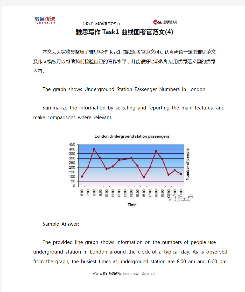
The graph shows Underground Station Passenger Numbers in London.
Summarize the information by selecting and reporting the main features, and make comparisons where relevant.
Sample Answer:
The provided line graph shows information on the numbers of people use underground station in London around the clock of a typical day. As is observed from the graph, the busiest times at underground station are 8:00 am and 6:00 pm.
The highest numbers of people use the station in the morning and more specifically at around 8:00 in the morning. A rapid growth can be observed between 6:00 am and 8:00 am in the morning when around 400 people use the station at around 7:30 am. This number then quickly drops to below 200 at around 10:00 am. Again this number rises between 11:00 and 3:00 pm when around 300 people use the underground station with some fluctuations.
In the afternoon, this numbers decline, with less than 100 people using the station at 4:00 pm. At 6:00 pm this number reaches at 380. After 7:00 pm, the total number of passengers declines significantly and fluctuates for last to hours from 8:00 pm to 10:00 pm.
In summary, London underground station remains busy in the starting of the day at morning and in early evening.
(Approximately 185 words)
雅思写作Task1曲线图考官范文(5) 本文为大家收集整理了雅思写作Task1曲线图考官范文(5)。认真研读一定的雅思范文及作文模板可以帮助我们检验自己的写作水平,并能很好地吸收和应用优秀范文里的优秀内容。 The chart and graph below give information about sales and share prices for Coca-Cola. Write a report for a university lecturer describing the information shown below. Sample Answer: The given pie chart and line graphs show the data on sales volume and share price of Coca-Cola. As is given in the illustration, in the year 2000, Coca-Cola was sold most in America where it had more than 55% sales volume. The share price of Coca-Cola was highest in 1998 and reached to around 55 in 2001 with some fluctuation.
As is presented in the pie chart, in 2000, Coca-Cola had more than 55% sales in Latin and North America. In Europe it had more than 20% sales volume, in Asia 16.45% and in Africa it had 7% sales volume. This indicates that American continent has the largest market for Coca-Cola while this market is least in African Continent. Again, the share price of Coca-Cola was only $ 33 in 1996 and this price increased to $ 68 in 1997. The price reached to the highest in 1998 when it was $ 80 per share. The price then started dropping and with some fluctuations it reached it around $ 60 in 2001. In summary, the American Continent was the largest market for Coca-Cola in 2000 and the average share price of it is $60 though this price varies year to year. (Approximately 202 words)
You should spend about 20 minutes on this task. The graph below compares the number of visits to two new music sites on the web. Write a report for a university lecturer describing the information shown below. You should write at least 150 words. model answer: The graph shows people using new music places on the Internet in fifteen days period of time namely personal choice and trendy pop music. The overall trend shows fluctuation with slight Increased towards the end of the period. Starting with Music Choice websites; 40,000 poeple went on this new site on first-day. Half of them backed out the next day. In Contrast to this Pop Parade net sites were visited by 120,000 music lovers on day one which decreased slightly on the next day thereafter regaining the same fame on 3rd day. After 3rd day the enthusiasm for both music lines on Internet dropped slowly- reaching maximum fall of 40,000 on 7th day. Whereas Music choice gained popularity, slightly Improoving to get the original strength of 30,000 viewers on screen, but was getting still less visiters than their opponent Pop group i.e. 40,000 on day 7. In the biegining of the next week both gained remarkable recovery after a few fluctuations for
雅思写作Task1饼状图考官范文(4) 本文为大家收集整理了雅思写作Task1饼状图考官范文(4)。认真研读一定的雅思范文及作文模板可以帮助我们检验自己的写作水平,并能很好地吸收和应用优秀范文里的优秀内容。 The table below shows CO2 emissions for different forms of transport in the European Union. The Pie Chart shows the percentage of European Union funds being spent on different forms of transport. Write a report for a university lecturer describing the information in the graph below.
Sample Answer: The given graphs provide information on the amount of Carbon dioxide emission per person from different vehicles in the European Union and also show the expenditures on different modes of transportations. As is observed from the given illustration, the highest amount of CO2 per person is emitted by the Air transports and European Union spends highest percentage of funds for the road transportation system. According to the bar graph, a single passenger of a personal cars emit around 130 gm of CO2 per kilometer while a passenger in a bus contribute to 65 gm of emission per kilometer. Coaches, maritime and rail passengers emit the lowest amount of CO2which is about 50 grams per passenger in a kilometer. Finally a single passenger of airplane contributes to 370 km of CO2 per kilo which is the highest amount of CO2 emission among the given transportations. Based on the pie chart, the European Union spent the highest amount (52%) on the road transportation system while spent only 1% or 2% on ports, waterway airport
题目: In the developed world, average life expectancy is increasing. What problems will this cause for individuals and society? Suggest some measures that could be taken to reduce the impact of ageing populations. 范文: It is true that people in industrialised nations can expect to live longer than ever before. Although there will undoubtedly be some negative consequences of this trend, societies can take steps to mitigate these potential problems. As people live longer and the populations of developed countries grow older, several related problems can be anticipated. The main issue is that there will obviously be more people of retirement age who will be eligible to receive a pension. The proportion of younger, working adults will be smaller, and governments will therefore receive less money in taxes in relation to the size of the population. In other words, an ageing population will mean a greater tax burden for working adults. Further pressures will include a rise in the demand for healthcare, and the fact young adults will increasingly have to look after their elderly relatives. There are several actions that governments could take to solve the problems described above. Firstly, a simple solution would be to increase the retirement age for working adults, perhaps from 65 to 70. Nowadays, people of this age tend to be healthy enough to continue a productive working life. A second measure would be for governments to encourage immigration in order to increase the number of working adults who pay taxes. Finally, money from national budgets will need to be taken from other areas and spent on vital healthcare, accommodation and transport facilities for the rising numbers of older citizens. In conclusion, various measures can be taken to tackle the problems that are certain to arise as the populations of countries grow older. (265 words, band 9)
雅思写作Task1饼状图考官范文(4) The table below shows CO2 emissions for different forms of transport in the European Union. The Pie Chart shows the percentage of European Union funds being spent on different forms of transport. Write a report for a university lecturer describing the information in the graph below. Sample Answer: The given graphs provide information on the amount of Carbon dioxide emission per person from different vehicles in the European Union and also show the expenditures on different modes of transportations. As is observed from the given illustration, the highest amount of CO2 per person is emitted by the Air transports and European Union spends highest percentage of funds for the road transportation system.
雅思写作Task1曲线图考官范文(1) 这是一篇雅思写作Task1曲线图考官范文。认真研读一定的雅思范文及作文模板可以帮助我们检验自己的写作水平,并能很好地吸收和应用优秀范文里的优秀内容。 The graphs below show the numbers of male and female workers in 1975 and 1995 in several employment sectors of the republic of Freedonia. Write a report for a university teacher describing the information shown.
Sample Answer: The provided line graphs compare the employment history of men and women in 1975 and 1995 dividing in six major sectors namely: manufacturing, communications, finance/ banking, wholesale & retail trade, non-defence public sectors and defence public sectors. As is observed from the given illustration, significant changes have been made in women's employment and women appear to have made remarkable improvements in almost the entire job sectors in Freedonia and in some sectors women went well ahead of men. Initially in 1975, men were notably ahead of women in every sector of employment. For example, in communication sector about 260 men worked against 220 women in every thousand employees. Twenty years later, though the number of men remained unchanged, the number of women rose to over 550 in one thousand. A similar trend can be seen in the wholesale and retail trade sector, where the number of women rose from about 550 to almost 800 in every 1000 employees of this sector two decades later. The number of men in this sector remained stable over the period, at around 700 / thousand.
17 01. 02. 03. 04. 05. 06. 07. 08. 09. 10. 11. 12. 13. 14. 15. 16. 17.
1. Many people prefer to watch foreign ?lms rather than locally produced ?lms. Why could this be? Should governments give more ?nancial support to local ?lm industries? It is true that foreign ?lms are more popular in many countries than domestically produced ?lms. There could be several reasons why this is the case, and I believe that governments should promote local ?lm-making by subsidising the industry. There are various reasons why many people ?nd foreign ?lms more enjoyable than the ?lms produced in their own countries. Firstly, the established ?lm industries in certain countries have huge budgets for action, special effects and to shoot scenes in spectacular locations. Hollywood blockbusters like ‘Avatar’ or the James Bond ?lms are examples of such productions and the global appeal that they have. Another reason why these big-budget ?lms are so successful is that they often star the most famous actors and actresses, and they are made by the most accomplished producers and directors. The poor quality, low-budget ?lmmaking in many countries suffers in comparison. In my view, governments should support local ?lm industries ?nancially. In every country, there may be talented amateur ?lm-makers who just need to be given the opportunity to prove themselves. To compete with big-budget productions from overseas, these people need money to pay for ?lm crews, actors and a host of other costs related to producing high-quality ?lms. If governments did help with these costs, they would see an increase in employment in the ?lm industry, income from ?lm sales, and perhaps even a rise in tourist numbers. New Zealand, for example, has seen an increase in tourism related to the 'Lord of the Rings' ?lms, which were partly funded by government subsidies. In conclusion, I believe that increased ?nancial support could help to raise the quality of locally made ?lms and allow them to compete with the foreign productions that currently dominate the market. (295 words, band 9)
雅思写作Task1饼状图考官范文(3) 本文为大家收集整理了雅思写作Task1饼状图考官范文(3)。认真研读一定的雅思范文及作文模板可以帮助我们检验自己的写作水平,并能很好地吸收和应用优秀范文里的优秀内容。 The charts below show the percentage of food budget the average family spent on restaurant meals in different years. The graph shows the number of meals eaten in fast food restaurants and sit-down restaurants. Write a report for a university lecturer describing the information in the graph below.
Sample Answer: The given illustration compares the amounts spent on restaurant foods and on home cooking foods in four different years and gives data on the number of meals eaten in two different restaurant types. As is presented in the pie chart, initially in 1970, 90% of total food budget was spent on home-made foods while only 10% was spent on restaurant foods. The amount spent on restaurant meals increased to 15% in 1980 while it reached to 35% in 1990. Finally in 200 average family spent half of the total budget in restaurant meals and that shows a rapid increase on the people’s habit of having meals in restaurants. In the line graph, we can observe that in 1970, the fast foods and sit-down restaurant meals were taken 20 thousand times each and over time these numbers kept increasing. Finally in 2000, more than 90 thousands fast food meals were eaten while the sit-down restaurant meals were eaten 50 thousand times a year. This indicates the changes of
2011雅思小作文写作万能模板 1、通过第一个曲线图,我们可以知道____,也说明了结果是___ According to the first graph, it can be seen that ______________, it can also be concluded from it that ______________. 2、一张有趣、有教育意义的、(内容)的图片(这句模板在雅思小作文中的应用非常的广泛。) There is an interesting and instructive picture which goes like this: __________. 3、当前有一张涉及______的增长曲线图,许多人______,然而其他人倾向于___ Nowadays there is a growing concern over ______________. Many people like ______________, while others are inclined to ______________. 4、目前,共同之处是_________,许多人喜欢______因为_______除此之外还由于_____ Nowadays, it is common to ______________. Many people like______________ because ______________. Besides, ______________. 5、(图表所示)_____,就像许多其他事物,被____更加喜爱,然而这一观点正被________所抨击,一些人认为_________,他们指出___________ ______________, just like many other things, are preferred by ____________. While being attacked by the idea that ______________, some people consider ______________. They point that ______________. 6、每种事物都有两面性和________,是没有异议的,包括利和弊 Everything has two sides and ______________ is not an exception, it has both advantages and disadvantages. 7、_____作为_____被观察了许多年,但是人们现在像发现新大陆一样注视着它 For years ______________ had been viewed as ______________. But people are taking a fresh look at it now. 8、政府保证________,对于这份保证,大多数人做出了强烈地回应,因为_____ It has stipulated by the government that ______________. To this stipulation, many people respond actively because ______________. 9、_______出现在我们日常生活中是很平常的,无论我们做什么,_______都是不可避免的______________ is a common occurrence in our daily life. Whatever we do, ______________ can't be avoided. 10、_____在人群中已经成为热门话题,特别是在年轻人中,激烈的争论无休止______________ has become a hot topic among people, especially among the young, and heated debates are right on their way. 1 according to the chart```
雅思图表作文TASK1精讲精练
雅思图表作文TASK1精讲精练 A理论部分: 雅思小作文概论 1、文章结构:主要分三部分:i。introductory sentence;ii。body paragraph;iii。Concluding sentence 具体讲:第一段introductory sentence只要写一句话,交待图形(如the line graph, pie chart等等),描述对象(如图表描述的是the number of tourists visiting England),地点(如the US, the UK等)以及时间(如between 1988 and 1997等等);另外要注意的就是第一段不能和图表上方已给的句子太过相似!否则,会失分的! 第二部分一般写1~3段,这要视情况而定。这部分主要就是对比不同的数据,如相似或相同的数据;某个数据是另一个数据的2倍;某个数据所占比例最大或最小等等。 最后一段concluding sentence也只要写一句话,
主要是总结图表的整个趋势。 2。文章的效果。很多学生会发现小作文的例文特别简单(特别是剑桥书里提供的)。原因很简单,这个report的目的就是要让university lecturer了解某个事物的发展趋势,因此写出来的文章必须结构清晰、易懂,绝对不能太复杂,也不要把每个数据都描写出来,只要描写有代表性的,重要的数据即可。 以下为雅思小作文的四个基本步骤 第一步:改写题目 经过同义词转换在短短的1分钟内就写好作文的第一段。 举例:The graph below shows the percentage of people unable to find work in three major countries from 1983 to 1992. 题目中划线的单词都能够进行同义转换: graph—figure, show—illustrate, percentage—proportion, major—key, from…to…—between…and…, 第二步:分析时态
climate change essay 题目: Some people think that instead of preventing climate change, we need to find a way to live with it. To what extent do you agree or disagree? 范文: Climate change represents a major threat to life on Earth, but some people argue that we need to accept it rather than try to stop it. I completely disagree with this opinion, because I believe that we still have time to tackle this issue and reduce the human impact on the Earth's climate. There are various measures that governments and individuals could take to prevent, or at least mitigate, climate change. Governments could introduce laws to limit the carbon dioxide emissions that lead to global warming. They could impose “green taxes” on drivers, airline companies and other polluters, and they could invest in renewable energy production from solar, wind or water power. As individuals, we should also try to limit our contribution to climate change, by becoming more energy efficient, by flying less, and by using bicycles and public transport. Furthermore, the public can affect the actions of governments by voting for politicians who propose to tackle climate change, rather than for those who would prefer to ignore it. If instead of taking the above measures we simply try to live with climate change, I believe that the consequences will be disastrous. To give just one example, I am not optimistic that we would be able to cope with even a small rise in sea levels. Millions of people would be displaced by flooding, particularly in countries that do not have the means to safeguard low-lying areas. These people would lose their homes and their jobs, and they would be forced to migrate to nearby cities or perhaps to other countries. The potential for human suffering would be huge, and it is likely that we would see outbreaks of disease and famine, as well as increased homelessness and poverty. In conclusion, it is clear to me that we must address the problem of climate change, and I disagree with those who argue that we can find ways to live with it. 'economic progress' essay 题目: Many governments think that economic progress is their most important goal. Some people, however, think that other types of progress are equally important for a country.? Discuss both these views and give your own opinion. 范文: People have different vi ews about how governments should measure their countries’ progress. While economic progress is of course essential, I agree with those who believe that other measures of progress are just as important. There are three key reasons why economic growth is seen as a fundamental goal for countries. Firstly, a healthy economy results in job creation, a high level of employment, and better salaries for all citizens. Secondly, economic progress ensures that more money is available for governments to spend on infrastructure and public services. For example, a
图表作文讲解2:柱状图和饼状图
分析思路: 1.第一幅柱状图的描述单位是百万,即人数;第二幅则是百分比。 2.第二幅柱状图仅显示了1970年和2000年的信息,而第一幅柱状图显示了1970、1980、 1990、2000年的信息。 3.由第一幅柱状图可以看出,从1980年到2000年,结婚人数和离婚人数的变化趋势相似。 4.从第二幅图可以看出,在2000年,结婚和寡居的成年人的比例有所降低而从未结婚过 和离婚的比例则有所上升。 文分析 One chart①shows the number of marriages and divorces in the USA in 1970, 1980, 1990 and 2000.The other②shows the marital status of adult Americans in 1970 and 2000. 首段概述图表信息,对题目进行改写,注意动词的用法和时态。 ?描述类的常用词有:show/describe/illustrate/demonstrate/indicate;
分析思路 1.四个饼状图可以分为两组,一组是澳大利亚,一组是法国; 2.饼状图由五部分组成:coal, oil, natural gas, hydro power, nuclear power; 3.图中的时间是1980年和2000年 4.单位是units 文分析 The charts①compare the sources of electricity in Australia and France in the years 1980 and 2000. Between these years electricity production almost②doubled, ③rising from 100 units to 170 in Australia, and from 90 to 180 units in France. ①对比:compare ②翻番:double ③从多少增长到多少:rise from……to…… In 1980 Australia used coal as the main electricity source (50 units) and the①remainder was produced from natural gas, hydro power (each producing 20 units) and oil (which produced only 10 units). By 2000, coal had become the fuel for more than 75% of electricity produced and only hydro②continued to be another significant