【雅思写作真题】剑桥9 Test3 饼图类小作文实例参考
“真题:剑桥9 Test3 图表类小作文”
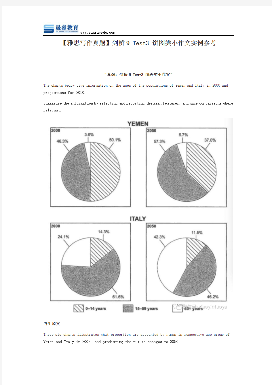
The charts below give information on the ages of the populations of Yemen and Italy in 2000 and projections for 2050.
Summarise the information by selecting and reporting the main features, and make comparisons where relevant.
考生原文
These pie charts illustrates what proportion are accounted by human in respective age group of Yemen and Italy in 2002, and predicting the future changes to 2050.
In Yemen, 0-14 years old young children were the domain group in 2000, at 50.1%. And smaller proportion of 15-19 years old person in the same period, which was 46.3%. While 50 years past, 15-59 years old people will become the most group of people, rising to 57.3%. Although there is a increase in old people who are over 60 years old. But they still the least group of person, which were rising from 3.6% in 2000 to 5.7% in 2005.
In terms of Italy, according to projection, 15-59 years old people experience a dramatic decrease, declining from 61.6% in 2000 to 46.2% in 2050. While it still the most group of people. In 2000, the proportion of over 60 years old was 24.1%, which doubled the percentage in 2050 through projection. Contrary to Yemen, the percentage of people who are 15-59 years old is the least no matter what period.
Overall, there are decrease of young children in both countries. Even in Italy, the percentage of children is much smaller than those in Italy.
批改By 晟睿 Anna
本次批改严格按照IELTS小作文评分标准进行。IELTS小作文评分项:
TA (内容的完整性), CC (连贯性及一致性), GRA (语法范围及精准度), LR (词汇资源)。
文末会进行总评及打分。
用词不当逻辑错误语法错误修改添加
These pie charts illustrates (主谓一致语法错误,illustrate) what proportion are accounted by human in respective age group of Yemen and Italy (这样的表述太臃肿了,改为:the age distribution in Yemen and Italy by three different groups) in 2002, and predicting (这个动词和illustrate 并列,改为predict) the future changes to 2050.
In Yemen, 0-14 years old young children (这个年龄组包含了:infant, children和teenagers,所以建议你不要用children这个词,直接说citizens aged 14 years and below) were the domain (应该是想用dominant, 词性混乱,domain是名词,做“范围”;dominant是形容词,做“主导的”) group in 2000, at 50.1%. And smaller proportion of 15-19 years old person in the same period (这句主句没有动词,可改为:A smaller proportion appeared in the group of 15-19), which was 46.3%. While 50 years past (用词改进:50 years later), 15-59 years old people will (用词改进:is predicted to) become themost (largest) group of people, rising to 57.3%. Although there is a (an,冠词使用要保持一致性)increase in old people who are over 60 years old (多余,去除). But they (are,缺少系动词,句子没有了灵魂) still(把副词still当成谓语动词使用了) the least group of person (表述改进:in terms of the proportion of population), which were rising (进行时强调持续变化,这里只要表示上升即可,改为rose) from 3.6% in 2000 to 5.7% in 2005.
In terms of Italy, according to (the) projection, 15-59 years old people (要用数量词:the percentage of those aged 15-59; 这一错误是中国学生最常见的错误,描述主体根本没有找准)experience (改为:is expected to experience这里的时态不当,到2050年,是预测性的内容,而不能用一般现在时)a dramatic decrease, declining from 61.6% in 2000 to 46.2% in 2050. While (这句是从句,改为逗号,while小写)it (was) still the most (largest) group of people. In 2000, the proportion
of (这里要先加上名词:those,介词后面要跟具有名词性的内容) over 60 years old was 24.1%, which doubled the percentage in 2050 through projection. Contrary to Yemen, the percentage of people who are 15-59 years old is the least no matter what period. (用词改进:over the entire period)
Overall, there are decrease (was a decrease) of young children in both countries. Even in Italy, the percentage of children is much smaller than those in Italy. (为什么句首说even in Italy 句末又说than those in Italy?逻辑及其混乱,不知所云)
总评分5分(TA5 CC5.5 LR5 GRA5)
词汇上是准确的,并且内容基本正确,但没有特别出彩的词汇。
分段准确,但是连接词上还可以更多变一些,建议试图多使用从句以及过渡句。
语法问题太多了。大大降低了分数,尤其是许多句子少了动词,这点扣分会很严重,因为英文的句子,没有了谓语动词,就如没有了灵魂一般。
在任务完成项目上,学生缺少静态比较方面的语言,该图表实际上是“动静结合”。
参考范文
The given pie charts (分词做后置定语修饰) show data on the population ages in Yemen and Italy in the year 2000 and also project(连词并列连接了两个谓语动词,加长了句子)these portions of population for the year 2050.
According to the provided data, more than half of the population of Yemen was below 14 years old in the year 2000. In this same year, their population from 15 to 59 years old was just over 46% and only about 3%(表述非常准确:“只有约3%”) of their population was over 60 years old. In this year there was one-fourth population(分数表达) in Italy over 60 years old and more than 60% of their population was 15 to 59 years old. The percentage of aged people(对于60岁以上的人口,做了替换,避免重复) in Italy was much higher than that in(比较关系使用得当) Yemen in 2000. Finally the percentage of population up to 14 years in Italy was less than 15%.
The pie charts also give the projection of the percentage of population based on age group for the year 2050and according to this projection(连词连接两个句子,加强了句子的延展性), the percentage of younger people in Yemen would decrease(表示可能性,不表示肯定发生,时态运用准确) while the number of aged people over 60 years would increase only by 2%. On the contrary, the aged people in Italy in 2050 would be more than 40% while they would have less young people.
两个雅思写作小作文饼图练习题 雅思小作文饼图是所有图表中出现次数最多的一个,所以需要大家更为关注。下面为大家搜集整理了雅思写作小作文饼图的练习题,共有两个,都是比较简单的两个饼图,大家在备考的时候,注意结构和顺序的描写。 1. The following pie charts illustrate the energy use in the USA. Write a report for a u niversity lecturer describing the information given in the pie charts below. 2. The following two pies show the average family income of New Zealand in 1990 and 2000 and the way people spend their income. Write a report for a university lecturer describing the information given in the pie charts below.
以上就是这两个雅俗写作小作文饼图练习题的全部内容,包括了美国的能源使用和新西兰的平均家庭收入两个话题。大家在备考雅思写作小作文饼图的时候,可以适当的练习一下上面的这两个题目。 雅思小作文图表描述方式小结 雅思小作文的图表描述是有自己的方式和特点的,掌握了这个方式可以让大家的小作文备考更快也更加贴近考试的要求。下面就为大家整理了雅思小作文图表描述的方式,供大家参考。 1. 与趋势有关的词语: 上升(v.):increase, rise, climb, ascend, surge, shoot up 下降(v.):decrease, decline, drop, fall, descend, plunge 持平(v.):remain stable, keep constant, level off, flatten out 波动(v.):fluctuate, wave, go up and down
雅思写作Task1饼状图考官范文(4) 本文为大家收集整理了雅思写作Task1饼状图考官范文(4)。认真研读一定的雅思范文及作文模板可以帮助我们检验自己的写作水平,并能很好地吸收和应用优秀范文里的优秀内容。 The table below shows CO2 emissions for different forms of transport in the European Union. The Pie Chart shows the percentage of European Union funds being spent on different forms of transport. Write a report for a university lecturer describing the information in the graph below.
Sample Answer: The given graphs provide information on the amount of Carbon dioxide emission per person from different vehicles in the European Union and also show the expenditures on different modes of transportations. As is observed from the given illustration, the highest amount of CO2 per person is emitted by the Air transports and European Union spends highest percentage of funds for the road transportation system. According to the bar graph, a single passenger of a personal cars emit around 130 gm of CO2 per kilometer while a passenger in a bus contribute to 65 gm of emission per kilometer. Coaches, maritime and rail passengers emit the lowest amount of CO2which is about 50 grams per passenger in a kilometer. Finally a single passenger of airplane contributes to 370 km of CO2 per kilo which is the highest amount of CO2 emission among the given transportations. Based on the pie chart, the European Union spent the highest amount (52%) on the road transportation system while spent only 1% or 2% on ports, waterway airport
雅思写作Task1饼状图考官范文(3) 本文为大家收集整理了雅思写作Task1饼状图考官范文(3)。认真研读一定的雅思范文及作文模板可以帮助我们检验自己的写作水平,并能很好地吸收和应用优秀范文里的优秀内容。 The charts below show the percentage of food budget the average family spent on restaurant meals in different years. The graph shows the number of meals eaten in fast food restaurants and sit-down restaurants. Write a report for a university lecturer describing the information in the graph below.
Sample Answer: The given illustration compares the amounts spent on restaurant foods and on home cooking foods in four different years and gives data on the number of meals eaten in two different restaurant types. As is presented in the pie chart, initially in 1970, 90% of total food budget was spent on home-made foods while only 10% was spent on restaurant foods. The amount spent on restaurant meals increased to 15% in 1980 while it reached to 35% in 1990. Finally in 200 average family spent half of the total budget in restaurant meals and that shows a rapid increase on the people’s habit of having meals in restaurants. In the line graph, we can observe that in 1970, the fast foods and sit-down restaurant meals were taken 20 thousand times each and over time these numbers kept increasing. Finally in 2000, more than 90 thousands fast food meals were eaten while the sit-down restaurant meals were eaten 50 thousand times a year. This indicates the changes of
雅思写作Task1饼状图考官范文(4) The table below shows CO2 emissions for different forms of transport in the European Union. The Pie Chart shows the percentage of European Union funds being spent on different forms of transport. Write a report for a university lecturer describing the information in the graph below. Sample Answer: The given graphs provide information on the amount of Carbon dioxide emission per person from different vehicles in the European Union and also show the expenditures on different modes of transportations. As is observed from the given illustration, the highest amount of CO2 per person is emitted by the Air transports and European Union spends highest percentage of funds for the road transportation system.
图表作文讲解2:柱状图和饼状图
分析思路: 1.第一幅柱状图的描述单位是百万,即人数;第二幅则是百分比。 2.第二幅柱状图仅显示了1970年和2000年的信息,而第一幅柱状图显示了1970、1980、 1990、2000年的信息。 3.由第一幅柱状图可以看出,从1980年到2000年,结婚人数和离婚人数的变化趋势相似。 4.从第二幅图可以看出,在2000年,结婚和寡居的成年人的比例有所降低而从未结婚过 和离婚的比例则有所上升。 文分析 One chart①shows the number of marriages and divorces in the USA in 1970, 1980, 1990 and 2000.The other②shows the marital status of adult Americans in 1970 and 2000. 首段概述图表信息,对题目进行改写,注意动词的用法和时态。 ?描述类的常用词有:show/describe/illustrate/demonstrate/indicate;
分析思路 1.四个饼状图可以分为两组,一组是澳大利亚,一组是法国; 2.饼状图由五部分组成:coal, oil, natural gas, hydro power, nuclear power; 3.图中的时间是1980年和2000年 4.单位是units 文分析 The charts①compare the sources of electricity in Australia and France in the years 1980 and 2000. Between these years electricity production almost②doubled, ③rising from 100 units to 170 in Australia, and from 90 to 180 units in France. ①对比:compare ②翻番:double ③从多少增长到多少:rise from……to…… In 1980 Australia used coal as the main electricity source (50 units) and the①remainder was produced from natural gas, hydro power (each producing 20 units) and oil (which produced only 10 units). By 2000, coal had become the fuel for more than 75% of electricity produced and only hydro②continued to be another significant
雅思小作文:饼图写法全解析 朗阁雅思考试研究中心 在雅思的学术类小作文中我们经常会遇到饼状图写作,不要看着一张一张的图,就退缩了,但是相对来说,这个题型还是比较容易写的一种图形,不过学生们也一定不要当做这是一件简单的事情,想要拿高分还是需要努力的,千万不能掉以轻心,否则不要就是因为这部分得分的不达标而影响到最后的综合得分。那么下面的文章中,朗阁雅思考试研究中心写作组的专家将要探讨的是饼图中静态数据和动态数据写法中的一些区别,并且将会从高分的角度来对各种写法作一汇总,希望对大家考试的准备有一定的帮助。 首先我们必须搞清楚什么是静态什么是动态数据的饼图: 当我们在考试中看到这个图示上的数据都是固定的,没有发生任何变化的时候,那么就能够认定这属于静态数据,搞清楚之后我们就能够开始写作了。 图二:
不要以为这里有很多的数据就属于动态的,其实这个图示还是表示是静态的,因为我们看到在途中的各项比重相对来说也是比较稳定的,因此这个饼图的数据也是属于静态的,那么究竟哪种数据属于动态的呢? 图三:
这个就是动态的图示,为什么这么说呢,因为两张图种的占比数据上出现了很大的差异,这是两个年份的数据,但是各自的所占比重有所不同,所以是动态的数据。 由此,我们可以得出结论,如果我们看到的是一张饼图,而且描述的是一段时间之内比较稳定的数据,那么我们就能基本上断定那就是静态的数据,但是我们如果看到的时候两张饼图,在两个时间段时间的对比,数据出现了明显的变化,那么就能够基本上断定这张图表示的就是动态的题型。
一、静态数据饼图的主体段写作理论 朗阁雅思考试研究中心建议考生可先按照扇形面积大小从大到小排列数据,若遇到饼图中有总数的描述,宜在开头先写。主体段在描写各个扇形数据的时候,要注意详略,即最大和第二大的扇形要重点描述。下面我们先以图一作为例子来详细解读这种写作套路: 首先,我们可以看到,在图中央有一个总数,因此我们先在开头段将其预先作交代:Overall, Coca-cola sold a total of 17.1 billion cases of their fizzy drink product worldwide in the year 2000. 或者我们还可以这样写: Overall, a total of 17.1 billion cases of Coca-cola fizzy drink were sold worldwide in the year 2000. 接着,我们就可以直接来写主体段了: The largest consumer was North America, where 30.4 percent of the total volume was purchased. The second biggest consume r was Latin America, taking up slightly over a quarter. Europe and Asia purchased 20.5 and 16.4 percent of the total volume respectively while Africa and the Middle East remained fairly small consumers at 7 percent of the total volume of sales. 以下我们来解读一下这种写法:图中一共有5块扇形区域,最大和第二大的扇形区域我们分别使用主系表的简单句引导数据的含义,请大家注意划线的部分。其中,两个句子的主语和表语其实都是可以互换的,这个可以让句子成分再多变些,另外,两个句子后面接续的数据描写的句型我们也要做到不同,比如第1个句子后面我们用的是定语从句,而第2个句子后面我们就用分词结构来描写了。接下来第3大的数据由于处于中间的位置,既非最大也非最小,不是很重要,因此就直接用简单句描写了。最小的那块扇形面积可以和前面的连起来组合成一个并列句,也可以单独写,若是单独写的话还可以用主系表的简单句引导,但是表语一般用insignificant,如:The figure for Africa and Middle East was insig nificant,…后面再接续数据即可。 在描写最大的两块扇形面积区域的时候,我们也是用相似的句式,即主系表来描述,然后接续定语从句或者介宾短语来说明数据。饼图中所占份额相对较小的我们就采用略写的方式交
雅思小作文:饼状图一例 Many women want or need to continue working after they have children. The chart below shows the working after they have children. The chart below shows the working pattern of mothers with young children. 作文写作要点: 介绍各扇面及总体的关系。 各个扇面之间的比较,同类扇面在不同时间、不同地点的比较。 重点突出特点最明显的扇面:最大的、最小的、互相成倍的。 The basic trends of the four charts: Just after bearing children, back to work. The older child…the more… Most part-time during child 5~9 Child 10+, full time double, part-time less the introduction can be written like this: Even just after having a child, a large number women return to work. As the child grows older, the percentage of mothers who choose or need to continue working rises. At least until the child is ten, the larger number of working mothers take part-time occupations. When the child is ten years or older, the number of the full-timers more than doubles while that of the part-timers decrease. Each chart entails / contains instruction, which illustrates what the chart involves rather than the over trends. Writing Paragraphs: Information analyzed according to the pie charts. Child 0~2, 30% back to work (19p.t., 11f.t.)
雅思写作Task1饼状图考官范文(2) 本文为大家收集整理了雅思写作Task1饼状图考官范文(2)。认真研读一定的雅思范文及作文模板可以帮助我们检验自己的写作水平,并能很好地吸收和应用优秀范文里的优秀内容。 The pie chart below shows information on the highest level of education of women in someland in 1945 and 1995. Write a report for a university lecturer describing the information in the two graphs below.
Sample Answer: The given pie charts compare the highest education level among women of someland in 50 years duration. As is observed from the given data, the women made remarkable progress in education over the 50 yea r’s period in someland. Initially in 1945, more than one third women in someland did not have any schooling experience while another one third could manage education till third grade only. Less than 1% women in this year managed to get their graduation or post-graduation degree. This reflects the poor education level among the female of someland in 1945. After 50 years, the education level among women in someland remarkably improved and more than 50% women finished their first degree while 20% of them completed their post graduates. Remaining women either finished their 12th grade education or studied till 9th grade. No women were left unattended to school and that’s a remarkable progress for women in education in somland. In conclusion, education level among women improved significantly over the 50 years period in someland.
三一文库(https://www.doczj.com/doc/7e2176253.html,) 〔2015最新的雅思作文模板(饼状图)〕▲雅思小作文模板--饼状图 ▲ 1.描述 It is clear that the most (adj.) xx is A, which accounts for m% of all x . B is the next largest(adj.)xx ,n% lower than A of all x and followed closely by C . The above three items of xx take uo about o% of the x% By contrast D E andF make uo the smallest percentage of total x , which are p% q% and r% ,respectively.
The regions can be divided into two groups-one where … and the other where the reverse is the case. ▲ 2.比较,占据,百分数 Form, comprise, make up, occupy In 1950, the urban population represented less than 13% of the total. It is now about 40% and is expected to reach 60% by 2030. (摘自BBC) ▲ 3.比例,倍数 A quarter of… Half of…
雅思小作文饼图写法全解析
雅思小作文:饼图写法全解析 朗阁雅思考试研究中心 在雅思的学术类小作文中我们经常会遇到饼状图写作,不要看着一张一张的图,就退缩了,可是相对来说,这个题型还是比较容易写的一种图形,不过学生们也一定不要当做这是一件简单的事情,想要拿高分还是需要努力的,千万不能掉以轻心,否则不要就是因为这部分得分的不达标而影响到最后的综合得分。那么下面的文章中,朗阁雅思考试研究中心写作组的专家将要探讨的是饼图中静态数据和动态数据写法中的一些区别,而且将会从高分的角度来对各种写法作一汇总,希望对大家考试的准备有一定的帮助。 首先我们必须搞清楚什么是静态什么是动态数据的饼图:
当我们在考试中看到这个图示上的数据都是固定的,没有发生任何变化的时候,那么就能够认定这属于静态数据,搞清楚之后我们就能够开始写作了。 图二:
不要以为这里有很多的数据就属于动态的,其实这个图示还是表示是静态的,因为我们看到在途中的各项比重相对来说也是比较稳定的,因此这个饼图的数据也是属于静态的,那么究竟哪种数据属于动态的呢? 图三:
这个就是动态的图示,为什么这么说呢,因为两张图种的占比数据上出现了很大的差异,这是两个年份的数据,可是各自的所占比重有所不同,因此是动态的数据。 由此,我们能够得出结论,如果我们看到的是一
张饼图,而且描述的是一段时间之内比较稳定的数据,那么我们就能基本上断定那就是静态的数据,可是我们如果看到的时候两张饼图,在两个时间段时间的对比,数据出现了明显的变化,那么就能够基本上断定这张图表示的就是动态的题型。 一、静态数据饼图的主体段写作理论 朗阁雅思考试研究中心建议考生可先按照扇形面积大小从大到小排列数据,若遇到饼图中有总数的描述,宜在开头先写。主体段在描写各个扇形数据的时候,要注意详略,即最大和第二大的扇形要重点描述。下面我们先以图一作为例子来详细解读这种写作套路: 首先,我们能够看到,在图中央有一个总数,因此我们先在开头段将其预先作交代: Overall, Coca-cola sold a total of 17.1 billion cases of their fizzy drink product worldwide in the year . 或者我们还能够这样写:Overall, a total of 17.1 billion cases of Coca-cola fizzy drink were sold worldwide
雅思考试优秀作文范文:是否禁烟? Version 122 Some people claim that using tobacco has brought severe social problems and smoking should be banned. To what extent do you agree with the above statement? Introduction (56 words) Since the discovery of tobacco related to a number of health problems, an increasing number of people have called for prohibiting smoking. It is undeniable that still a considerable amount of smokers exist in this world. I would like to examine the advantages and disadvantages of smoking cigarettes as following and then offer my own opinion. Body1(95words) There are some advantages to taking tobacco.(topic sentence) First, tobacco industry contributes a great proportion of revenue to the nation. Extremely high taxation imposed on tobacco yielding and cigarette manufacturing has released the financial burden for both the government and the individual taxpayer generation by generation. Second, the soothing effects of smoking has been confirmed by ordinary smokers; particularly those who have hard-brain-working jobs are in favor of it; they claim that smoking cigarettes can make them calm and stimulate brain cells to work more efficiently. Finally, cigarettes play an important role in social activities. Body2 (106words) On the other hand, smoking demonstrates numerous negative effects.(topic sentence) Initially, nicotine may bring takers a number of diseases. Second-hand smoking also does harm to your health. Moreover, hatred from non-smokers always grow against smokers hence some conflicts arise frequently. We then look at the statistics showing that thousands of fire accidents worldwide occur each year due to the litter of non-extinguished cigarette ends, not to mention the related deaths and losses. Last but not least, expenses have to be taken \into\ consideration. Fine cigarettes are not cheap. If you get addicted to them, your daily amount of cigarette consumption will increase inevitably, emptying your pocket money. Conclusion(88words) After all, so far no direct evidence has been provided that smoking can definitely result in takers' death of lung cancer, and those fire accidents are the result of carelessness or irresponsibility of the smokers, not tobacco to be laid blames. Also, spending pocket money can never be considered as a financial burden. In addition, I suggest more restricted smoking areas be planned so as not to violate non-smokers' rights. After weighing the pros and cons of using tobacco, I, for one, am against the act to ban smoking. 声明:本范文为赖老师专供无忧雅思作品,转载请注明作者和出处!范文仅供参考,切不可背诵,否则可能得非常低的分数,甚至0分。
雅思小作文饼图写作结构解析 雅思小作文饼图写作结构一文总结了出现在雅思学术类考试的小作文中,4种不同的饼图的处理方式和写作思路。今天给大家带来了雅思小作文饼图写作结构,希望能够帮助到大家,一起来学习吧。 雅思小作文饼图写作结构 许多考生觉得饼图十分简单,也就是一些百分比及数字的列举,对该类图表不太重视,准备并不充分。笔者根据学生的日常作业来看,很多学生并没能准确把握这一图表的特征。在实际考试中,真题大多是多个饼图结合出现,如果一味地罗列数据照搬词组,不但*读起来枯燥无味,句式和词汇也缺少变化,是无法得到理想的分数的。*中,写作组的专家将对饼图的分析方法、词汇句型和写作套路进行总结和分类,以帮助考生理清写作思路,更准确地回应题目的要求。 1. 分析思路 在实际考试中,一般以三到四个饼图出现为主,最多曾出现过六个饼图的组合,但无论如何变化,多饼图一般可分为以下两种模式,笔者将举出一些实例进行分析: 1)无关型饼图
三个饼图它们分别介绍了世界上的不同花费比例,世界人口分布及资源消耗的去向,三个饼图涉及的内容和划分标准不尽相同,不可能将三者结合起来一起论述。 对于这种图表,我们的*框架架构如下: Introduction:分别概述三个饼图所说明的信息 如:The three pie charts respectively illustrate some data regarding the distribution in world spending, global population and consumption of resources. Body:分别说明各饼图的内容,辅以数据(段落层次按照个数划分即可,本题就可以分成三个段落)分别进行排序,稍后详细分析。 Conclusion(选用):说明三个饼图的相关含义,如无,可提炼一下每个饼图最典型的特征(如果已达到要求字数且充分说明内容,结尾段可以略去) 详细来看,世界花费主要支出在食物方面,交通、房产和穿着次之,其他项目合计占到总数的40%;亚洲是世界人口的主要****地,欧洲、美洲和非洲均占到10%以上,其他地区人口较少。这两个饼图都可以用“排序”的方式来列举数据,具体的写法我们会在下面详细说明。最后一个图表可以用比较的办法突出美国欧洲等发达地区耗费了世界上五分之二的资源。
英语饼图作文万能模板小作文 饼图是雅思小作文写作中最常见的一种形式,下面雅思小编会根据饼图的形式介绍一些相关技巧和饼图必须记忆的词汇,同学们参考。 饼形图与柱形图或者是线形图所截然不同的是它没有了横轴与 纵轴,而以饼形的分割来表示百分比,但我们仍可以依照三步的审题分析法来进行观察: Step 1: 观察共有几张饼图,以及它们之间的关系是什么(一般说来,雅思图表题中极少见到单饼图); Step 2: 观察每张饼图中有哪几个区域,以及各个区域分别代表什么; Step 3: 观察单个饼图中各区域间的百分比差异,以及相同区域在各个饼图间的百分比的比较或发展。 由于饼图主要以比例说明和数字列举为主,我们需要在考前准备好以下素材: ①动词“占”的表达: account for, hold, make up, take up, constitute, comprise, represent ②百分比的表达 percentage,proportion, share, 某些情况下可以用rate,如literacy rate ③约数表达 the majority of, most of, a considerable number of, a
minority of , just over…, slightly more than…/less than…, nearly half…等 ④确切数字表达 分数与百分比的转化:one third, two fifths,one tenth 常见表达:a quarter, a half ⑤句式 要灵活运用以上的词汇结合一定的句子,变换表达方式。 例:亚洲人口占世界比例近50%。 — Asia accounts for almost a half of world population. — Nearly 50% of people in the world come from Asia. — The percentage of Asian in the world population is slightly less than a half. — Asia has the largest percentage of population in the world( approximately 50%). ⑥排序段 在列举饼图数据时,为了防止单调枯燥,我们常常运用排序的方式进行说明: — China takes the lead in world population. 类似的表达还有“be leading, the majority, mostly, most 等” — Next comes food, whose percentage is higher than that of clothing.
雅思小作文:饼图解题主要思路和语言点 饼图是雅思小作文写作中最常见的一种形式,所以大家在备考雅思小作文写作的时候,一定要准备一些关于饼图的雅思小作文写作技巧。下面就为大家搜集整理了这类题型写作技巧,供大家参考,希望给大家带来帮助。 饼形图与柱形图或者是线形图所截然不同的是它没有了横轴与纵轴,而以饼形的分割来表示百分比,但我们仍可以依照三步的审题分析法来进行观察: Step 1: 观察共有几张饼图,以及它们之间的关系是什么(一般说来,雅思图表题中极少见到单饼图); Step 2: 观察每张饼图中有哪几个区域,以及各个区域分别代表什么; Step 3: 观察单个饼图中各区域间的百分比差异,以及相同区域在各个饼图间的百分比的比较或发展。 现在我们就来分析一下下面的饼形图: Many women want or need to continue working even after they have children.The charts below show the working patterns of mothers with young children tocare for.Write a report for a university lecturer describing the information onthe charts below. Step 1: 一共有四张饼图,它们分别按照由母亲照料的最年幼孩子的年龄大小来进行排列,从0 ~ 2岁到10岁以上;
Step 2:每张饼图中都有三种区域:白色区、深色区和浅色区。它们分别表示母亲的工作状态:白色区为“没有工作”,深色区为“兼职工作”,浅色区为“全职工作”; Step 3: 白色区在0 ~2岁时处于绝对优势,占70%,而随着孩子年龄的增长,白色区渐渐地变小,在10岁以上时只有26%;深色区在孩子年幼时比例很小:0 ~2岁时只有19%。随着孩子的长大,深色区急剧扩张,在5 ~9岁时达到顶峰,占48%,但在10岁以后却轻微下降到45%;而浅色区的变化则是在同一时期内分别占到了11%,11%,14%和29%。 当然,在开始写文章之前,我们还必须决定文章所用的时态。在这张图的要求里,并没有说是过去的时间里做的调查,因此我们就默认为是一般现在时。 做完了审图的工作后,我们就可以着手开始选词了。在饼图中,表示百分比的句子是必不可少的。一般表示百分比有两种比较容易掌握的句型。我将用上图中第一张饼里的11%来举例。 a. The full time working mothers with 0 to 2 year old child to care formake up 11%. b. The percentage of the full time working mothers with 0 to 2 year oldchild to care for makes up 11%. 大家可以明显看出这两句话的区别,即主语选用的对象不同。那么,如果所有的句子都这样写的话,是不是会造成很多的重复呢?这点考生不用担心,因为就象我们可以用“goup”来代替“increase”一样,表示占多少百分比也有一些动词词组来替换“make up”。比如说,“accountfor”和“constitute”,甚至可以用“be”动词。但是,有的培训老师会告诉学生,“occupy”也可以,因为它的意思是“占据”,但实际上在英文里,表示百分比是不可以用这个词的,这点大家要注意。