图表作文写作技巧
- 格式:doc
- 大小:61.50 KB
- 文档页数:4
图表作文图表作文与写议论文和说明文的写作方法大致相同,唯一的差异就是如何利用浓缩在图表中的信息阐明图中各种数据和信息所反映的问题。
因此考生在写此类作文时只有在看懂图表的基础上才能动笔写。
如果不能全部领会图中信息,在写作中就会出现这样或那样的问题。
因此考生在阅读图表时应注意以下两点:第一,掌握图表上提供的信息及每一栏上面的小标题的标注,由此弄清设计者想通过图表反映出的信息、问题或现象。
第二,在掌握全部信息的基础上,着手分析这些信息和表上的具体数字。
通过分析与对比,抓住问题,便可以开拓思路,构思文章的布局、段落的划分及上下文的连贯等。
段落的划分可根据内容而定。
一般第一段应对图表做一简要的概述,点出所要涉及的问题;中间段落应对图表的重要问题进行分析;结尾段对全文做一小结。
举例说明For this part, you are allowed 30 minutes to write a composition of no less than 150 words under the title of “Changes in People’s Diet”. Your composition should be based on the following table.审题:这张图表介绍了1990年~1999年人们食品结构发生的变化,包括四大类食品:粮、奶、肉及水果蔬菜。
从图表上看,粮食消费量在逐年下降,奶和肉的消费量在上升,可见人民生活水平提高了。
蔬菜水果消费量上升的原因可否归结为人民生活富裕了,而且更加重视合理的饮食结构。
最后总结:整个图表反应了人民生活水平提高,更加经济快速发展。
Changes in People’s DietGreat changes have taken place in people’s diet these ten years. The above table tells us that grain, formerly the main food of most Chinese people, began to play a less important role in people’s diet, while the proportion of high-energy food, milk and meat, has generally increased.I think there are two main reasons that may account for the changes. First, people are becoming better off. They can now afford to buy more meat and milk, whose prices are much higher than that of grain. Second, people now pay more attention to the structure of their diet. They are seeking the most reasonable diet structure, wholesome,nutritious, and beneficial to their health.In short, the above changes in people’s diet in the ten years reflect the improvement in people’s living standard and the rapid development of the country’s economy. Such positive changes will surely continue in our future life.图表类作文的常用句型1. As is shown by the graph/in the table...(概述图表)正如曲线所示,最近54年来该国人口飞速增长。
图表类作文方法总结+范文中的优秀句子【命题趋势】图表类作文是近年出现在高考试题屮的一•种文体。
由于这类图表在现实生活屮应用广泛,因此具有很强的现实意义。
它要求考生通过对数据或文字内容进行分析与讨论,准确地表达内容,然后得出令人信服的结论。
图表类作文有以下趋势:1•图表作文是说明文或议论文。
如是议论文多采川三段式。
2. 信息可适当发挥,但决不允许白行立意,漫天发挥。
3. 讲究写作技巧,要求注意把握要点词的逻辑句子。
【应试对策】一、点明主题常用的词有:1 .table, chart, figure, graph,2. describe, tell, show, represent 等等。
二、分析差异在描写变化及总趋势特征吋,可采用分类式或对比式以支持主题,并阐明必要的理由。
常用的词汇有:l.rise, increase, drop, reduce, decre ase, fall,升高降低2. while, but, on the contrary, however,转折3. compare...to/with...,in contrast 相比Z下4. as...as, the same as, similar to,相同5. be different from., differ from 不同三、常用句式1. As is shown by the graph/in the table that/ As we can see clearly from the chart above...(概述图表)2. The results of the survey seem to suggest that… (得出结论)3•…amount to…(数量总计)(add up to /come to /sum up to )4. …increase (rise/ fall/ drop ) from …to … (数量增减)5. (be) three times as + 形容词 + as6. Compared with …,…7. There is (was) a rapid rise in …8 The changes ....can be explained for several reasons・9. It is reported that 85% of...10 In recent years/during this years ......11 ・・・ are also the reason why the number in creasing so fast.12 From the increased number we can get that...8 •结尾段屮常用的句型:1. In conclusionffo conclude/We can draw the conclusion that...,2. In my opinion/ Pers on ally, I …3. In short (= In brief), in a word,…4 it seems clear that /Ifs clear from the chart that...,5 We can learn/know that..四、优秀句子饮食・1 There have been some changes in the diet of Chinese people. ^Grain, the main food of most people in China, is now playing a less important role. ・3The amount of ............ h as also dropped by 1.5 percent from1998 to 2002・・4The amount of milk and meat has increased・•5 There is no doubt that there will be greater changes in peopled diet in the future.教育•6 It is reported that 85% of the Chinese students felt a heavy workload in their study.7 ...more than 50%of the information is forgotten after one hour, and almost two-thirds within one day・8 2000 the number had in creased to 83%,still much lower for girlsthan for boys・9 The results of the survey seem to suggest that Chinese students abroad have little time for part-time jobs.旅游0 In contrast, the number of people going abroad in 1996 increased.11 There is a growing tendency for Chinese to spend their holiday abroad ・ 12 Compared with the number 5 years ago, which was only 20%, now more than 50% of the families prefer to spend their holiday traveling.志愿者13 The number of people who do voluntary work are growing.14 Increasing numbers of Chinese youth want to make a contribution to society.其他15 Of all other things they spend their wages on, the most important were phone calls (40%), followed closely by clothes and makeup (35%)and going out (15%).16 In 1995 there were only two or three computers in per hundred families.17 In the past, one in three families could afford to buy houses, while now 70% of them have their own flat. 调査18 On 8th November 2004, a survey was conducted among 400 Chinese students at different universities in Auckland.19 The purpose of the survey was to discover what the students do in their free time, after school.20 The survey was conducted by means of a questionnaire given to the students to complete・附:分数表示法3/4 three fourths 或three quarters1/3 one third 或a third1/2 a half。
如何描写图表作文
1认真读图,不要缺失任何一个部分。
图表作文总的来说是结合说明和表达观点的文章,所以首先就要审好题,无论是以什么形式展现出来的图表作文,我们首先都要看清楚说的内容以及它的数据,分析它要我们写什么。
2三段论——第一段(描述段):
考试的作文三段论通常是跑不掉的,见到英语考试有图表作文不要慌。
我们还是把作文分为三部分,第一段对图表来一个总体的描述,简单概括一下图表的内容,基本就不会有什么岔子了。
3三段论——第二段(分析段):
分析图表内容,这一段就不是概括那么简单了,我们要横向地、纵向地对图表进行分析,特别是数据的最大值、最小值等等,通常图表作文都会有一个主题,我们分析之余要往这个方向靠。
不要罗列数字,要分析出规律。
4三段论——第三段(表达段):
这一段通常就文章的大意,或者顺着出题者的意思去进行一个“自己的意见”补充,也就是对这个现象或者是情况作出一种总结和评论。
这一点大家写作文通常都会有,就不用太担心了。
5检查与修改:
写完一篇作文后,如果有时间,尽量去检查一下单词有没有错误,因为图表作文通常都要用到一些平时不常用的短语,注意看看有没有对图的描述还有没有其他的遗漏,如果有尽量作出一点补充。
有效运用作文图表和数据的技巧作文是我们学习中必不可少的一项任务,而图表和数据的运用则是作文中重要的一环。
通过图表和数据,我们可以更加直观地表达观点,增强文章的可信度和说服力。
然而,要想有效地运用作文图表和数据,需要掌握一些技巧。
本文将从选择合适的图表和数据、正确解读图表和数据以及巧妙结合图表和数据进行论述等方面进行探讨。
首先,选择合适的图表和数据是运用作文图表和数据的基础。
在选择图表时,我们应根据文章的主题和需要表达的内容来选择合适的图表类型,如柱状图、折线图、饼图等。
同时,要注意图表的数据来源的可靠性和准确性,避免使用来历不明或经过篡改的数据。
在选择数据时,我们应根据文章的需要选择具有代表性和说服力的数据,避免过多使用无关或重复的数据。
只有选择合适的图表和数据,才能更好地支持我们的观点和论述。
其次,正确解读图表和数据也是运用作文图表和数据的关键。
在解读图表时,我们应仔细观察图表的各个部分,包括横纵坐标、图例、数据标签等,以确保对图表的内容有全面的理解。
同时,要注意对比和分析图表中的数据,寻找规律和趋势,从而得出有价值的结论。
在解读数据时,我们应注意数据的单位和范围,并结合图表进行综合分析,避免片面地理解和使用数据。
只有正确解读图表和数据,才能准确地表达我们的观点和论述。
最后,巧妙结合图表和数据进行论述是运用作文图表和数据的重要技巧之一。
我们可以通过引用图表和数据来支持我们的观点和论述,增强文章的说服力。
例如,当我们想表达某个问题的严重性时,可以引用相关的数据来说明问题的规模和影响。
当我们想比较两个事物的优劣时,可以通过图表的对比来展示它们的差异。
此外,我们还可以利用图表和数据来进行预测和推测,从而为我们的观点提供更多的依据。
通过巧妙结合图表和数据进行论述,可以使文章更加有说服力和可信度。
综上所述,有效运用作文图表和数据需要掌握选择合适的图表和数据、正确解读图表和数据以及巧妙结合图表和数据进行论述等技巧。
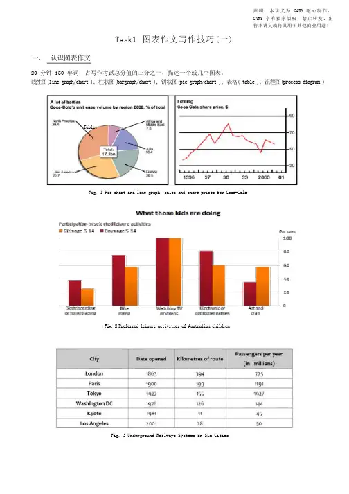
声明:本讲义为GARY 呕心制作,GARY 享有独家版权,禁止转发、出售本讲义或将其用于其他商业用途!Task1 图表作文写作技巧(一)一、认识图表作文20 分钟 150 单词,占写作考试总分值的三分之一,描述一个或几个图表。
线性图(line graph/chart );柱状图(bargraph/chart );饼状图(pie graph/chart );表格( table );流程图(process diagram ) Table:Fig. 1 Pie chart and line graph: sales and share prices for Coca-ColaFig.2 Preferred leisure activities of Australian childrenFig. 3 Underground Railways Systems in Six Cities二、图表作文审题要素1. 描述对象整个图表的数据都是针对描述对象的。
图表的上方标题一般会指示描述对象。
弄清描述对象非常重要,因为在行文时,需要频繁地用到它。
如:sales of Coca Cola,share price of Coca Cola,the preferred leisure activities of Australian kids aged 5-14, wages growth rate。
2. 描述单位对于有 X 轴(horizontal axis)和 Y 轴(vertical axis)的图表,描述单位一般在 Y 轴以符号的形式标明。
弄清描述单位对于数据的准确描述非常关键,把握不准的话就容易被当做跑题。
一般要弄清数字 ( number )和百分比( percentage; proportion )的区别。
另外,记住几个常用的单位缩写符号:$:dollarbn:billionm: million 或 metrekm: kilometre%: percentage / proportion 区别: per cent,000s: thousand比如,第一页的描述单位: bottle / percentage (pie chart), dollar (line chart), percentage (bar chart) 三、图表作文标准结构Part 1 开头段,介绍写作目的,需包含四个要素:图表类型主要描述动词describe,show,present,depict,indicate,representcompare / make a comparison between …描述对象背景信息(地点 + 时间)例如:The line graph gives some detailed information about the wages growth rate of some country over adecade from 1993 to 2003.The pie charts below show the percentage of men and women who smoked in Australia during a 40-yearperiod, between 1960 and 2000.Part 2 主体段:1 + N 结构1: 一句话概括总趋势或总特征( general trend or feature )套句:… have shown striking changes/differences.N: N 段 ( N≥1 )细节描述( striking trends or features )Part 3 结尾段结尾段给出结论。
图表作文写作攻略及必背模板句型1.写作攻略图表作文是英语写作中较为常见的题型之一,也是难度较大的一种写作题型。
写作考试时,这类作文一般也以三段式写作方法来组织文章,第一段总结归纳信息反映的整体情况,点出主题思想,第二段回答第一段所得出的问题,对数字、数据等做出有条理的分析比较,第三段做出总结或给以简单的评论。
表格和图表题型写作要点:(1)图表作文一般采用的时态为一般现在时,但如果图表中给出了具体时间参照,考生则应对时态进行相应的调整。
(2)图表作文有一些固定句型和表达法,考生应对此融会贯通。
(3)图表作文可以细分为表格,曲线图、柱形图和饼形图。
除了上述共同要点,考生还应了解这四种图在写作方面的不同特点。
⏹表格(table)可以表示多种事物的相互关系,所以考生要对表格中所给出的大量数字进行比较分析,从中找出其变化规律。
⏹曲线图(diagram)常表示事物的变化趋势,考生应认真观察坐标系所显示的数据信息,并且密切注意交汇在坐标横轴和纵轴上的数字及单位。
⏹柱形图(bar chart)用来表示各种事物的变化情况及相互关系,要求考生通过宽度相等的柱形的高度或长度差别来判断事物的动态发展趋势,因此考生应密切关注坐标线上的刻度单位及图表旁边的提示说明与文字。
考生应清楚掌握部分与整体,部分与部分之间的相互关系,这种关系通常是以百分比的数字形式给出的。
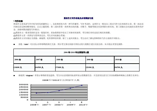
2006-2010年出国留学总人数:687600人从表格/图表中我们可以看到……The table shows a three times increase over that of last year. 表格显示比去年上升了3倍。
According to /As is shown in the table / diagram/chart...如表格/图表中显示……The number is 5 times as much as that of...此数字是……的5倍。
一、表格图图表作文的写作要点1横向比较。
介绍横向各个数据的区别,变化和趋势2不需要将每一个数据分别说明,突出强调数据最大值和最小值3最对比时要总结出数据对比最悬殊的和最小的二、曲线图图表作文的写作要点1极点说明。
即,对图表当中最高的,最低的点要单独进行说明2趋势说明。
即,对图表当中曲线的连续变化进行说明,如上升,下降,波动,持平3交点说明。
即,对图表当中多根曲线的交点进行对比说明三、饼状图图表作文的写作要点1介绍各扇面及总体的关系2各个扇面之间的比较,同类扇面在不同时间,不同地点的比较3重点突出特点最明显的扇面:最大的,最小的,互相成倍的四、综合图图表作文的写作要点1不求甚解,不拘泥于细节2分门别类,分段落详细介绍各个图表3不画蛇添足,主观臆断或猜测图表之间的关系以上就是这四类图表作文的写作要点介绍,对于各个图表的特点和描写的重点的不同进行了对比,大家可以在备考图表作文考试的时候,提前进行适当的参考和借鉴。
英语四级图表作文讲解及参考范文图表作文也是四(六)级考试中常见,而且被认为是一种较难的作文形式。
图表作文就是把非文字信息(通常为各种图表表示的数字信息等)转换成文字信息的一种作文。
它要求我们用文字来描述非文字性的图表或对图表显示的关系作解释说明。
第一节图表作文的出题形式和写作要领一、图表作文常见出题形式图表作文一般在题目中给出作文的标题和一个或几个统计表格、圆形图、曲线图或条形图,有时还用英文或中文提纲的形式给出提示,要求我们:1)用文字描述图表,客观解释图表中所传递的信息,并找出某种规律或趋势; 2)就图表中所反映的某种趋势或问题分析其原因或后果。
图表作文着重说明事实,常常是通过对图表中所反映的具体数据的说明、分析、比较,对某种事物或现象的事实或变化情况等加以说明,并提出结论或看法。
因此,图表作文常常采用议论文体的写作方法。
写好图表作文,关键在于能否读懂图表中所提供的信息,把握各信息间的联系,用准确流畅的语言把这一信息表达出来,并就这一信息发表自己的看法。

图表作文的写作要领(1) 观察图表,确定主题句观察图表是为了准确地理解图表所传递的信息。
观察图表首先要看清楚图表的文字说明,然后仔细研究图表以发现数据的主要特征和变化趋势,以此来确定主题句。
(2) 选择典型材料仔细观察表中数据的变化,并加以比较和归纳,选出差距变化最大、最有意义、最能说明主题的信息。
避免过分详细,逐一罗列。
换句话说,并不是图表中的任何一个数字都要进行描述。
(3) 分类确定全文的时态图表有两类,一类是有时间参照的,另一类是无时间参照的。
有时间参照的图表一般在描写时用现在时,有时间参照的可有两种情况:①如果参照的时间在过去就用一般过去时态。
②虽有过去时间参照,但叙述的是经常出现的情况,这种情况整篇文章总的时态仍用现在时态。
(4) 熟练掌握常用套句和短语由于图表包含丰富的信息和各种各样的数据,要清楚有效地把它们呈现出来并不是一件容易的事情,尤其是数据以及发展趋势的变化。
考生应该熟练掌握常用套句和短语。
如果考生能够熟练运用这些套句和短语,自然会信心倍增,对图表作文的恐惧也就消失了。
写作流程第一段:描述图表反映的总情况。
(用能充分说明主题的典型数据描述图表)第二段:分析原因。
(仔细分析比较数字,归纳出增减速率并找出产生变化的原因)第三段:结论。
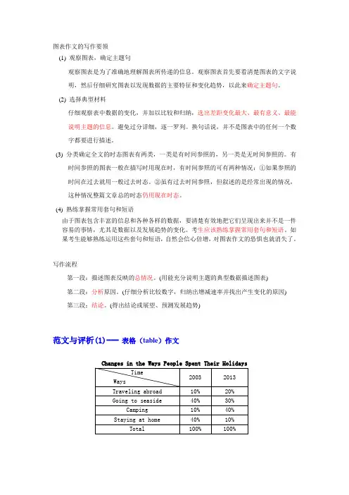
(得出结论或展望、预测发展趋势)范文与评析(1)---表格(table)作文Directions: You are required to write an essay with the topic “C hanges in the W ays P eople S pent T heir H oliday s. You should base your essay on the information from the table.Changes in the Ways People Spent Their Holidays From the table we could know that the ways people spent their holidays have changed greatly. In 2003, 40% people spent their holidays at home, but their number dropped to 10% in 2013. It was no doubt that people were becoming more and more mobile, and they wanted to get entertainment outside their homes.Seaside still had its attraction to people, though its rate dropped slightly from 40% in 2003 to 30% in 2013, and there might be a further decrease in the future because of the marine pollution. The table shows that a great number of people spent their holidays traveling abroad. The rate in 2013 doubled as compared with 2003. With the increase of their income, more and more people could afford their holidays abroad.The table also indicates another tendency: the rate of camping was rising from 10% in 2003 to 40% in 2013. The reason may be that the real beauty of nature was being rediscovered, and people were getting more and more interested in natural scenery. Based on the above analysis we could draw the conclusion that great changes have taken place in the ways people spent their holidays in the past ten years.范文与评析(2)--- 饼状图(pie chart)作文Popular Desserts in a University CafeteriaDirections: The above pie chart shows the percentage of popular desserts selected in a university cafeteria. Write an essay on the topic “Popular Desserts in a University Cafeteria”. You should base your essay on the information in the chart.Popular Desserts in a University CafeteriaThis pie chart shows the relative popularity of desserts served in a university cafeteria.I ce cream is the favorite among the dessert selections,accounting for 35% of all choices.Pie is the next most popular choice with 25%of all choices. These two items exceeded theremaining four selections in popularity. D oughnut is not so popular with only 10% of all choices, which is the same with pudding in popularity.The only natural fruit choice, the apple, is only a little more popular than the doughnut and is a selection of less than half of percentage in ice-cream.Fruit jelly was last in popularity among all choices.Even pudding proved to be twice as popular as fruit jelly. The relatively high popularity of ice cream and pie may be due in part to the fact that these desserts are not everyday diets in Chinese meals.Fruit jelly,apples, and doughnut are usually served at home.The relatively high standing of the apple in relation to pudding, doughnut,and fruit jelly may be due to parental or school training on nutrition.范文与评析(3)---线状图(line graph)作文Car Accidents in BeijingDirections: You are allowed 30 minutes to write an essay based on the graph. The suggested title is: Car Accidents Declining in Beijing. Remember that your essay must be written according to the following outline:1) Rise and fall of the rate of car accidents as indicated by the graph.2) Possible reason(s) for the decline of car accidents in the city.Car Accidents Declining in BeijingLast year, the rate of car accidents in Beijing reached the highest point 37 in August. After that the rate was steadily declining, and reached the lowest point 14 at the end of the year. The first three months of 2012 showed an increasing trend, and reached 30 in March, and then the rate declined to 26 in June. Then from June to August, the rate was rising from 24 to 37.The highest rate of 37 in August might be due to weather factors. Humidity and high temperature may make drivers become uncomfortable and impatient, which could easily lead to car accidents. The peak point in the first half of 2012 might be also caused by weather conditions. In Beijing, the excessive rain comes at early spring, which makes roads muddy and slippery, and these conditions may result in car accidents.This year the situation is expected to be changed. City government has raised money to improve the road conditions. Two new roads were built at the end of last year, and will soon open to cars. New road regulation stipulates that every car should be air-conditioned in summer. All these precautions account for car accidents declining in Beijing this year.范文与评析(4)---直方图(bar graph)作文Three Major Causes of Fire in ChinaHistogram 1Histogram 2Directions: The above diagram s show three major causes of fire in Guangzhou, these histograms indicate the numbers of fire and the extent of the damage involved, measured in terms of billions of Yuan. Study the two histograms above and draw whatever conclusion(s) you can. T he public interest may be one point to consider. Write an essay stating and supporting your conclusion(s).Three Major Causes of Fire in GuangzhouDespite of all the efforts that mankind has made over the years, fire continues to be a terrible killer in our modern society. From the two histograms above,which describe the leading causes of fires measured in both number of fires and total losses from thefires in Guangzhou, we could see that most fires are caused by smokers, defective insulation and children playing with matches.It is clearly shown in these two histograms that smokers were responsible for totally 10500 of the fires in the last two years, which caused about 5.5 billion Yuan worth of damage. Defective insulation caused more than 4500fires and children playing with matches led to about1000 fires. These results show that smok ers can be considered as the enemies of the whole society, especially when the public interest is taken into consideration.Comparing the figures of these two years, it will be safe to draw a conclusion that, although the number of fires in each category remained nearly the same, the fire losses caused by defective insulation were significantly lower than those in the previous year. O n the contrary, the fire losses in the case of children’s playing with matches were significantly higher than those in the previous year, even though there were fewer fires. T he average losses of a fire caused by smokers remained more or less the same, only showing a slightly increasing trend.Based on the brief analysis above, it can be concluded that, although smokers are the leading cause of fires, we still need to improve the insulation devices and educate our children on the dangers of playing with matches.常用表达句型:1)描述图标的句式(1) T he table shows the changes in the number of...over the period from...to...该表格描述了在...年到...年间...数量的变化。
四级图表作文的写作方法四级图表作文的写作方法在日常学习、工作抑或是生活中,大家都不可避免地会接触到作文吧,作文根据体裁的不同可以分为记叙文、说明文、应用文、议论文。
你写作文时总是无从下笔?下面是小编为大家收集的四级图表作文的写作方法,欢迎阅读与收藏。
一、柱状图写作技巧1、柱状图写作注重比较和对比,也就是说需要横向总结所有柱状图表的共性特征,也要分别描写各个柱子的个性特征。
2、有两种写作方式:其一是对不同时间段内的数据进行比较,适合于数据代表的物体较少且时间界限明确的.情况。
另外是对单独数据的全程描述,适合于描述数据对象很多且时间划定不清晰的情况。
柱状图数据描述句型举例:1) the bar chart shows the changes in the numberofover the period fromto该柱状图描述了在年之年间数量的变化。
2) the bar chart provides some interesting dataregarding该柱状图为我们提供了有关有趣数据。
3) this is a bar chart which describes the trend of该柱状图描述了的趋势。
4) As can be seen from the diagram,great changes have takenplace in从柱状图中可以看出,发生了巨大变化。
二、曲线图写作技巧1、曲线图是动态图,解题的切入点在于描述趋势;2、在开头部分对整个曲线进行一个阶段式的总分类;3、趋势说明。
即,对曲线的连续变化进行说明,如上升、下降、波动、持平。
以时间为比较基础的应抓住“变化”:上升、下降、或是波动;4、极点说明。
即对图表中最高的、最低的点单独进行说明。
不以时间为比较基础的应注意对极点的描述。
曲线图数据描述句型举例:1) The line chart depicts the changes in the number of……over the period from 20xx to 20xx.该曲线图描述了从20xx年到20xx年……数量的变化。
关于写图表作文的模板
段落一,快速扫一眼数据。
这张图表啊,一眼看上去就挺有料的。
你看这线条的起伏,这
柱子的高低,都反映着不同时间段里的情况。
这就像是咱们生活中
的小起伏,有高潮有低谷,但整体趋势还是挺明显的。
段落二,深挖一下细节。
具体到每个数据点,真是有惊喜也有惊吓。
比如那个销售额啊,一季度就蹦了15%,这得归功于咱们的新产品和市场策略吧。
但竞
争对手B也不甘示弱,市场份额都悄悄涨了点,这可得警惕了。
段落三,琢磨下背后的门道。
为啥销售额能涨这么多?我猜啊,可能是新功能的吸引力太强了,大家都爱买。
还有咱们的品牌效应也越来越强,大家都认准咱
们了。
至于竞争对手B,我猜他们是搞了什么大动作,比如疯狂打
折之类的,才能抢到这么多市场。
段落四,找找不寻常的地方。
这图表里还有个挺有意思的点,就是第四季度的销售额突然降了一下。
这是怎么回事呢?我猜可能是大家那时候都去旅游了,或者都忙着过节,没时间购物吧。
或者是竞争对手搞了个大促销,把咱们的顾客都抢走了?
段落五,总结几句。
总的来说,这张图表可是个宝啊,给咱们提供了好多信息。
咱们得好好琢磨琢磨,看看接下来该怎么调整策略,才能保持领先地位。
对了,还得多关注下竞争对手的动态,别让他们给咱们来个出其不意。
图表类作文写作技巧一. 同一意义要变化用词,同一段落中也要变换句型,从而避免重复和单调。
图表类作文常见套句及常用变化用词如下:General Description(总体描述)1. The table shows the changes in the number of...over the period from...to...该表格描述了在...年之...年间...数量的变化。
2. The bar chartshows/illustrates/reveals/demonstrates/displays/suggests/exhibits/reflects/describ es/depicts that...该柱状图展示了...3. The graph provides some interesting data regarding...该图为我们提供了有关...有趣数据。
4. This is a line chart which describes the trend of...这个曲线图描述了...的趋势。
5. The figures/statistics show (that)...数据(字)表明...6. The data/statistics/figures lead us to the conclusion that...这些数据资料令我们得出结论...7. As is shown/demonstrated/exhibited in the diagram/graph/chart/table...如图所示...8. According to the chart/figures...根据这些表(数字)...9. As can be seen from the diagram, great changes have taken place in...从图中可以看出,...发生了巨大变化。
图表作文写作指南写作指南:图表作文图表作文是在文章中使用图表来解释、分析和说明数据,以更清晰地展示信息和结论。
在写作这类作文时,有一些关键点和步骤可以帮助你组织思路并有效地传达你要表达的信息。
以下是图表作文的写作指南,包括准备、写作和审查阶段,每个阶段涉及的关键点和步骤:准备阶段:1. 仔细阅读题目和图表:仔细理解题目并观察图表的数据,包括数据类型、时间范围和单位等。
2. 理解图表的主要内容:图表通常包含主要趋势、变化和关系。
注意图表中的最大值、最小值和重要变化点。
3. 组织信息:将图表中的数据和趋势进行分类和排序,找到其中的相关性和区别。
写作阶段:1. 引言:简要描述图表的主题,并指出你要解释或分析的主要趋势和变化。
这是给读者提供全局视图的一部分。
2. 主体段落:根据图表中的数据、趋势和关系,组织你的主要观点和论据。
每个主体段落都应该专注于一个特定的方面或变化。
a. 描述数据和趋势:使用清晰的语言描述图表中的数据和趋势。
强调重要数字和变化点。
b. 分析原因和结果:解释导致数据和趋势的可能原因,并分析可能的结果和影响。
c. 进行比较和对比:将不同的数据进行比较和对比,强调相似之处和差异。
d. 用例子和证据支持观点:用例子、事实和数据支持你的观点和结论。
e. 使用合适的连接词:使用适当的连接词和短语,如"moreover"、"in addition to"、"on the other hand" 等,使你的论述连贯流畅。
3. 结论:总结你的观点和结论,强调图表中的关键变化和趋势。
对图表可能的局限性进行讨论,提出可能的解决方案或预测。
审查阶段:1. 检查语法和拼写错误:审查你的文章,确保没有语法和拼写错误。
这可以通过使用语法和拼写检查工具来帮助你。
2. 检查数据和数字:确认你引用的数据和数字准确无误。
如果可能,可以重新计算或交叉验证数据。
3. 重新检查结构和逻辑:再次检查你的段落结构和论证的逻辑性。
图表类书面表达技巧讲解题型介绍近几年高考说明文多数以图表、表格或文字的形式给出提示,并往往融合在应用文体中进行考查,一样分为:场所路线介绍、事物介绍、方式方法或打算安排介绍三大类。
在写作时要求语言简明扼要、通俗易明白,说明过程讲究层次性和条理性。
图表式作文的几种形式:一是以表格形式,将统计的数据或被说明的事物直截了当用表格形式表达出来,即统计表。
二是以图形形式:表示数据变化的曲线图;表示数据的大小或数量之间的差异的条形图;表示总体内部结构变化的扇形图。
图表作文的结构通常是三段式:第一段分析图表中的数据变化反映出的问题或趋势,简要概述图表所揭示的信息;第二段分析缘故;第三段提出解决问题的方法或建议。
写作时注意直截了当、尽快入题,适当加入自己的议论,力争做到观点明确,不要拐弯抹角,拖泥带水,使人读后一头雾水。
解题技巧审题:【链接高清】1. 对数据进行比较,找出变化规律。
2. 留心所给图形坐标轴上的数字和单位。
3. 注意饼状图各部分间的关系,部分与整体的关系。
4. 写作时先描画图表内容,写明变化规律,依照题目要求分析和推测走势(假如必要的话),并简要说明缘故。
三步走:第一步:开门见山地点明本图表所反映的主题。
第二步:分析数据间的要紧差异及趋势,然后描写。
第三步:归纳总结或发表评论。
图表用词:曲线图graph表格table几何图形figure饼状图pie chart条状图bar chart平面图、示意图、外形图diagram时态:现在时或过去时◆常用句型:图表作文中的过渡、概括句型1. As can be indicated in the table …2. As is revealed in the table...3. According to the figures given in the table...4. This chart shows that...5. As is shown by the graph...6. It can be seen from the statistics that...描写图表和数据的句型1. A is by far the largest...2. The figure has nearly doubled/tripled, as against that of last year.3. There is a slight/slow/steady/rapid rise in population.4. Sth. be on the increase/decrease/rise/decline常用过渡词过渡到下一点:what’s more, in addition, besides, furthermore表示比较:on the contrary, compare …to/with…, compared to/with 得出结论:consequently, as a result, in other words, in short, accordi ng表示强调:without doubt, chiefly, as a matter of fact, in fact表示不同:different from, difference between/among数据表达法百分比的表达:70% of... /seventy percent of... /70 percent of the... (易漏用of)其它一些比例的表达手段。
如何写好英语图表作文英语图表作文是考试中常见的题型,它要求我们根据给定的图表信息,进行数据分析和解读,并用英语进行写作。
下面我将为您介绍如何写好英语图表作文。
一、分析图表写作开始之前,我们应该仔细观察图表,分析其中的关键信息。
首先,看清楚图表的标题和横纵坐标的单位。
其次,我们需要注意图表中的数据变化趋势、差异、相似之处和特点。
最后,可以思考一下图表背后的原因、影响和可能的结果。
二、引入段写作的第一段是引入段,可以简要描述图表的基本信息,例如图表的来源、所示的内容以及时间范围。
同时,在引入段中可以使用一两句话概括图表总体的数据变化趋势和主要特点。
三、主体段落主要的分析内容应该放在主体段落中,根据图表的类型和信息特点,可以灵活地选择适合的表达方式。
下面将结合一些常见的图表类型,给出相应的写作指导。
1. 柱状图(Bar Chart)柱状图常用于描述不同类别或时间段的数据对比。
在写作时,我们可以根据柱状图的数据差异、增长或下降趋势进行详细的描述和解释。
例如,对于上升的数据可以使用表示增长的动词,如increase, rise, grow;对于下降的数据可以使用表示下降的动词,如decrease, drop, decline。
2. 折线图(Line Chart)折线图常用于描述随时间变化的数据趋势。
在写作时,我们可以描述和比较不同线条的趋势,以及线条之间的相似和差异。
同时,我们也可以引用具体的数据数值进行更准确的说明。
3. 饼图(Pie Chart)饼图常用于表示不同部分占整体的比例关系。
在写作时,我们可以描述各部分的比例大小,并解释其中的关系和原因。
例如,表达最大部分可以使用表示比例最高的形容词,如the largest, the highest percentage;表达最小部分可以使用表示比例最低的形容词,如the smallest, the lowest percentage。
同时,我们也可以指出各部分之间的差距和相似之处。
图表作文样题1.The table(表格)below describes percentages of home schooled(在家自学)students in Some Country in 1999-2004. Write a report for auniversity lecturer describing the information shown.(考试的时候没有汉语注释)翻译:下面这个表格描述了某国家1999-2004年在家自学的学生的百分比。
写一份报告描述显示出的信息。
(注意:写这种图表题比较简单,第一步要先自己分析图表,获取信息,然后描述信息就行了。
最后来一个overall总结下。
你不需要去分析背后的原因,只需要描述出表格中的已知信息即可)You should write at least 150 words.This table shows home schooled students in Some country in year 1999-2004in percentages.答案:The main trend is that all grades including kindergarten is growing for everyyear. Kindergarten started highest at 2.4 and ended highest at 2.9 percentwith a constant increase. But grades 1-2 and grades 5-6 shows a littledifferent trend, both starts at 1.5 percent in 1999 and declines a little bit in2000. Both of them increased slowly in 2002 and both it holds that course to2004 where grades 1-2 ends at 2.1 percent and grades 5-6 ends at 2.6percent.主流趋势是所有年级包括幼儿园每年都呈现上涨。
幼儿园从百分之2.4高位开始,在百分之2.9高位结束,中间连续增加。
但1-2年级和5-6年级有一点不一样,都是从1999年的百分之1.5开始,然后2000年有一点下降。
并且两者在2002年有缓慢增加,直到2004年,1-2年级结束在百分之2.1, 5-6年级结束在百分之2.6.(第一段开始先写一个普遍情况,即都是增加的。
然后找到1-2和5-6年级有点奇怪之处,加以分析,一定要列出具体数据。
由于没有分析到3-4年级和7-8年级,所以下段一定要分析。
)Grades 3-4 has a slow but steady growth through all six years. It starts at 1.6 percent in 1999 and increases 0.1 every year except in 2003 when it peaks up 0.2 percent. Grades 7-8 starts at 1.6 percent and stays there for three years until it rapidly rises up to 2.2 and peaks at 2.5 in 2004.3-4年级在6年之中一直呈现缓慢但稳步增长。
它在1999年的百分之1.6开始,然后每年增加百分之0.1,除了2003年上涨0.2个百分点。
7-8年级在1.6个百分点开始,并保持了三年同样的数据,直到其快速上涨到2.2个百分点,然后2004年达到2.5百分点。
(第二段,分别描述3-4年级和7-8年级情况。
)Overall, all grades including kindergarten has had a rise at roughly minimum 1 percent and more in 6 years.总结,所有的年级包括幼儿园在这6年中都大概上涨了至少1个或更多百分点。
(总结很重要,对应的是第一段第一句话,我们发现所有数据都是上涨了.)2.The graph below gives information on wages(工资)of Some country over a ten-year period. Write a report for a university tutor describing the information shown.下列这个图表显示某国10年期间工资信息。
写一个报告,描述显示的信息。
You should write at least 150 words.The line graph(线形图)describes the growth of wages in Some country from year 1993 to year 2003.从图表中我们可以看到几个信息,一个是这个图是在描述工资增长率(growth rate in wages), 纵列一个是工资增长比率(percent growth in wage),横列是年。
可以知道,从1993年的2个点,涨到1994年的4个点,然后下降95年中间,又开始回升,这次回升很快,花4年时间直冲到99年的6个百分点。
这是个顶峰,从此一蹶不振,降到2002年的1个点,然后又有小幅回升。
答案:自己分析The growth started at two percent in 1993, but it didn’t stay there very long before it rapidly doubled in 1994. Then, the percentages declines to three percent in 1995, stayed steady for year, before starting to rise slowly and ending up just under four percent in 1997. 1998 was the best year where the wages peaked at six percent.However, after 1998 the wages declined nearly every year. Only a year after, the percentage dropped to well under three percent, stayed there on roughly three percent till 2000. In 2002 the wages reached the lowest point of just one percent growth. Luckily the growth rose in 2003 at just under two percent.Overall, the growth rate in wages in Some country has shown striking changes through the ten years.3.The graph below shows annual water usage (in millions of cubic meters) by industries in Some country. Write a report for a university tutor describing the information shown.You should write at least 150 words.The paragraph describes the water usage for every year in Some country in millions of cubicmeters.The water usage are shown in two trends, ground water and public supply. Fuel and textilesare the ones that uses the least water, 10 of public supply and 70 and 80 of ground water.Machinery are just the opposite of these two and has 10 of ground water and 100 of publicsupply.Food/drinks, metal, paper and chemicals are all over 100 of ground water where chemicalspeaks at dramatically 430. The highest number of water usage of public supplies also belongsto chemicals (240). Next on the list is food/drinks with 190, the others are under 100.Overall, the chemical industry uses a lot more water then the rest of the industries in termsof both ground water and public supplies, and in general most industries use ground water byfar more than public supplies.分析完三个图标,我们应该已经明白了图标题的写作方式,只要把其中关键的词汇如start, end,decline, grow等关键转折词汇灵活运用就可以了。
分析图表的时候要学会找到相同的和不同的地方,以及总体的趋势。