DotNet第三方控件使用笔记
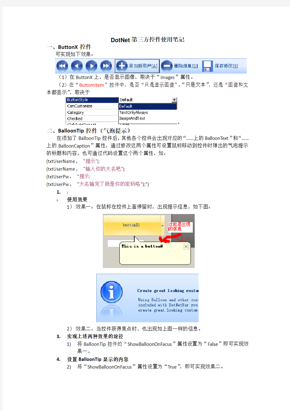
一、ButtonX控件
可实现如下效果:
(1)在ButtonX上,是否显示图像,取决于“images”属性。
(2)在“ButtomItem”控件中,是否“只是显示图像”,“只是文本”,还是“图像和文本都显示”,取决于
。
二、BalloonTip控件(气泡提示)
在添加了BalloonTip控件后,其他各个控件会出现对应的“……上的BalloonText”和“……上的BalloonCaption”属性,通过修改这两个属性可设置鼠标移动到控件时弹出的气泡提示的标题和内容,也可通过代码设置这个两个属性,如:
(txtUserName,"提示");
(txtUserName,"输入你的大名吧");
(txtUserPw,"提示;
(txtUserPw,"大名输完了就是你的密码咯");")
1.{
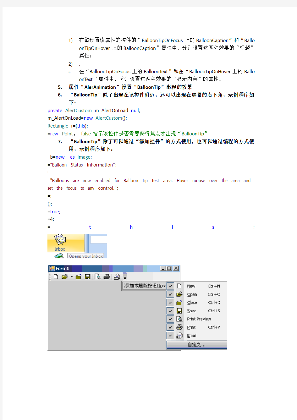
2.使用效果
1)效果一:在鼠标在控件上面停留时,出现提示信息,如下图:
2)效果二:当控件获得焦点时,也出现如上图一样的信息。
3.实现上述两种效果的途径
1)将BalloonTip控件的“ShowBalloonOnFacus”属性设置为“False”即可实现效
果一。
4.设置BalloonTip显示的内容
2)将“ShowBalloonOnFacus”属性设置为“True”,即可实现效果二。
1)在欲设置该属性的控件的“BalloonTipOnFocus上的BalloonCaption”和“Ballo
onTipOnHover上的BalloonCaption”属性中,分别设置这两种效果的“标题”
属性;
2)。
3)在“BalloonTipOnFocus上的BalloonText”和在“BalloonTipOnHover上的Ballo
onText”属性中,分别设置这两种效果的“显示内容”的属性。
5.属性“AlerAnimation”设置“BalloonTip”出现的效果
6.“BalloonTip”除了出现在该控件附近,还可以出现在屏幕的右下角,示例程序如
下:
private AlertCustom m_AlertOnLoad=null;
m_AlertOnLoad=new AlertCustom();
Rectangle r=(this);
=new Point,false指示该控件是否需要获得焦点才出现“BalloonTip”
7.“BalloonTip”除了可以通过“添加控件”的方式使用,也可以通过编程的方式使
用,示例程序如下:
b=new as Image;
="Balloon Status InFormation";
'
="Balloons are now enabled for Balloon Tip Test area. Hover mouse over the area and set the focus to any control.";
=;
();
=true;
=4;
=t h i s;
It provides a utomatic focus management so focused
. =true; .
Bar bar=new Bar("Bar1");
="leftBar1";
}
=; on the line 1
bar=new Bar("Bar3");
="leftBar3";
=; ";
fileItem=new ButtonItem("file2");
="&2. ";
fileItem=new ButtonItem("file3");
="&3. ";
fileItem=new ButtonItem("file4");
="&4. ";
《
fileItem=new ButtonItem("file5");
="&5. ";
ET Framework 中,默认是。
1.示例
(1)private imageList1;
(2)
(3)= ("")));
(4)=
(5)
ells[0].()。
1.DataGridView的示例代码
#region 设置DataGridView的显示格式
= = false;
= false;
= true;
)
isible = false;
"UName","用户名");
"IP","IP地址");
"DeptID","DeptID");
["DeptID"].Visible = false;
"Department","所属部门");
foreach(DataGridViewColumn col in
= ;
= ,);
。
elected = true;
三、控件Color Picker的使用
1.使用效果:
1)单击相应的按钮,工作区(整体)的颜色发生变化。
2)随着鼠标在各种颜色上的移动,工作区(整体)的颜色随着变化。
3)还可以选择“More Colors”进一步改变工作区的颜色。
2.下面是相应的代码
private bool m_ColorSelected = false;
private eOffice2007ColorScheme m_BaseColorScheme = ;
>
}
else
1)改变颜色值
(m_BaseColorScheme,;
2)应用颜色值
(m_BaseColorScheme);
3.工作区的控件的颜色有可能不同时变化
原因:是各个控件的“Style”和“ColorSchemeStyle”采用的风格不统一解决办法:都采用一种风格,如“Office2007”即可
\
1.功能
可实现如下图似的的分组:
2.实现方式
1)右键——>“Add Panel”,进行“分组”。
2)对每一个组进行设置。
3)右键,对每一个组,添加控件。
3.该控件的颜色策略
】
——,sSel,false);
=scheme;
private void sideBar1_ItemClick(object sender,e)
{
item=sender as "ItemClick: "+ +" ("++")\n"+;
}
五、Enum枚举类
1.方法
--返回指定枚举的基础类型。
-public static Type GetUnderlyingType(Type enumType)
!
参数:
enumType
类型:枚举类型。
返回值:
类型:enumType的基础Type。
--示例
static object GetAsUnderlyingType(Enum enval)
{
Type entype = ();
Type undertype = (entype);
#
return ( enval,undertype );
}
2.方法
--在指定枚举中检索具有指定值的常数的名称。
- public static string GetName( Type enumType,Object value)
参数:
enumType
类型:
枚举类型。
value
类型:
特定枚举常数的值(根据其基础类型)。
)
返回值:
类型:
一个字符串,该字符串包含enumType的枚举常数的名称,该常数的值为value;或者,如果没有找到这样的常数,则为nullNothingnullptrnull引用(在Visual Basic中为Nothi ng)。
--示例
using System;
public class GetNameTest
{
enum Colors { Red,Green,Blue,Yellow };
enum Styles { Plaid,Striped,Tartan,Corduroy };
(
public static void Main()
{
("The 4th value of the Colors Enum is {0}",(typeof(Colors),3));
("The 4th value of the Styles Enum is {0}",(typeof(Styles),3));
}
}
3.方法
--检索指定枚举中常数名称的数组。
--public static string[] GetNames( Type enumType)
参数:
:
enumType
类型:System..::.Type
枚举类型。
返回值:
类型:array<>[]()[]
enumType的常数名称的字符串数组。
--示例
using System;
public class GetNamesTest
{
enum Colors { Red,Green,Blue,Yellow };
enum Styles { Plaid,Striped,Tartan,Corduroy };
—
public static void Main()
{
("The values of the Colors Enum are:");
foreach(string s in(typeof(Colors)))
(s);
();
("The values of the Styles Enum are:");
foreach(string s in(typeof(Styles)))
(s);
(
}
}
4.方法
--检索指定枚举中常数值的数组。
--public static Array GetValues( Type enumType)
参数:
enumType
类型:
枚举类型。
返回值:
类型:
enumType的常数值的Array。该数组的元素按枚举常数的二进制值排序。
]
--示例
using System;
public class GetValuesTest
{
enum Colors { Red,Green,Blue,Yellow };
enum Styles { Plaid = 0,Striped = 23,Tartan = 65,Corduroy = 78 };
public static void Main()
{
("The values of the Colors Enum are:");
}
foreach(int i in(typeof(Colors)))
(i);
();
("The values of the Styles Enum are:");
foreach(int i in(typeof(Styles)))
(i);
}
}
5.::.Parse 方法
--将一个或多个枚举常数的名称或数字值的字符串表示转换成等效的枚举对象。
>
名称说明
Parse(Type,St ring)将一个或多个枚举常数的名称或数字值的字符串表示转换成等效的枚举对象。
String包含要转换的值或名称的字符串。
备注:value参数中包含一个值、一个已命名常数或由逗号(,)分隔的已命名常数列表。在value中的每个值、名称或逗号的前面或后面都可以有一个或多个空格。如果value是一个列表,则返回值是各指定名称通过按位“或”运算结合而成的值。
示例:
》
[FlagsAttribute]
enum Colors
{ Red = 1,Green = 2,Blue = 4,Yellow = 8 }; ("The entries of the Colors Enum are:");
foreach(string colorName in(typeof(Colors)))
{
(
"{0}={1}",colorName ,
(typeof(Colors),colorName))
);
}
…
();
Colors myOrange = (Colors)(typeof(Colors),"Red,Yellow"); ("The myOrange value {1} has the combined entries of {0} ",
myOrange,(myOrange));
Parse(Type,St
ring,
Boolean)
将一个或多个枚举常数的名称或数字值的字符串表示转换成等
效的枚举对象。一个参数指定该操作是否区分大小写。
Boolean参数指定该操作是否区分大小写
1)
、
(typeof,sSel,false)
六、Money Style
1.示例代码1
.");
=true;.");
Archive
,
menuItem=new ButtonItem("mArchive","&Archive...");
Exit
menuItem=new ButtonItem("mExit","E&xit"); =true;
将新建的Bar添加到dotNetBarManager1
然后,设置摆放位置
=;
2.示例代码2
hecked) ]
return item as ButtonItem;
else if
{
ButtonItem button = GetCheckedButton,exclude);
if(button != null)
return button;
}
}
return null;
}
;
private void columnContainer_Click(object sender,EventArgs e)
{
(columnSelector );
= true;
}
七、控件ListViewEx的使用
1.示例的使用效果
其中:
1)·
2)标题头部分通过属性“Columns”设置
3)内容部分
前面有图标部分,通过“Items”属性设置
后面的几列,通过“Items”的“SubItems”属性设置
4)
可以通过设置该属性,可以使实现各种排列方式。
八、控件SuperToolTip的使用
1.示例的使用效果
2.用法:
]
只是将控件Super Tool Bar添加到工程中,然后,再在要加入上述效果的控件的属性中,找到“superTooltip上的SuperTooltip”,单击。
随后,会出现如上图所示的对话框,然后,就可以根据该对话框上的提示进行操作。
值得注意的是:这里也可以使用Html语言,使用超链接(实际的效果类似于LinkButto n控件),为该控件添加更多的功能。
只不过的是:需要在SuperToolTip控件的事件进行必要的设置。
通过程序为控件设置“superTooltip上的SuperTooltip”所应该设置的内容,下面以为Tr eeView控件的node节点进行相关设置进行说明:
1)首先,定义了一个NodeSuperTooltipProvider类,为每一个node对象,提供SuperTo
oltip功能
\n\r"+,null,null,
href = "+ ;
}
九、/
十、控件expandableSplitter和控件TabControl的使用
1.expandableSplitter控件的使用示例
控件expandableSplitter将容器的可显示区域分成两个可以调整大小的区域。
建议用法:
1)从左到右,按顺序,一次,拖入如下控件,某个容器控件(Dock设置为Left),Ex pandableSplitter控件(Dock设置为Left)以及另一个容器控件(Dock设置为Fill)2)如果想实现“在控件expandableSplitter 的SplitterBar上单击一下,也能将该控件控
制的区域收起或放开“的功能,可在属性中设
置。
注意的是:在选项中,选择那个控件,那在单击“SplitterBar“时,就收起或打开哪个控件。
3)从网上下载的相关资料
DotNetBar中ExpandableSplitter使用技巧
为了实现如下图1到图2效果,用ExpandableSplitter很方便,设置ExpandableSplitter 的ExpandedControl属性为panelEx_Right即可。
~
但是想实现图3的效果,本以为用这个控件加上Form的Autosize属性即可。没想搞了半天发现不管是Form用Autosize让panel_right的Dock为Fill,还是panel_right锚定都无法实现这个效果。
图1
图2
仔细想想,Autosize肯定不行,其和Dock在实现上就是是矛盾的,呵呵。
真是懒习惯了,动手加下边几句就可以解决,在这里记录一下。
public partial class Test : Form
{
ext);
}
}
:
private void SetTabStyle(eTabStripStyle style)
{
=style;
foreach(TabItem tab in
=;
}
private void tabControl1_MouseDown(object sender,e) {
<
if!=
return;
1)
{0, 25}", p0); ET框架开发人员指南”或文档中的主题图片格式数字串(英文)。
在下例中您将注意到,好心的博士既使用了“#”字符,又使用了“0”字符。如果相应的数字是前导零或尾随零,“#”字符就会替换为空值。无论相应数字的值如何,“0”字符都会被替换为零字符——因此,数字将会被零填补。句号(如果有的话)表示小数分隔符的位置。
十一、SideBar控件实现图标的相互拖动
下面的代码可以将下图,左侧的图标和右侧的图标相互拖动入对方
~
private void listView1_DragEnter(object sender, e)
{
if(m_InternalDragDrop)
return;
if=;
else