雅思写作小作文范文 雅思写作混合图 国际移民.doc
- 格式:doc
- 大小:26.00 KB
- 文档页数:2

关于移民的英文作文1. Immigration is a hot topic these days. People are always talking about who should be allowed to come in and who should be kept out. It's a complicated issue with no easy answers.2. Some people think immigrants are stealing jobs from locals. They believe that immigrants are taking advantage of social services without contributing anything in return. But others argue that immigrants bring new ideas and energy to a country, making it stronger and more diverse.3. The process of immigrating to a new country can be long and difficult. There are often language barriers to overcome, as well as cultural differences to navigate. It can be a lonely and isolating experience for many immigrants.4. Despite the challenges, many immigrants are willing to endure hardship in order to build a better life forthemselves and their families. They are often driven by a strong desire for a better future and are willing to work hard to achieve their goals.5. Immigration policies vary widely from country to country. Some nations have open-door policies, welcoming immigrants with open arms. Others have strict immigration laws, making it difficult for outsiders to enter. It's a complex and contentious issue that shows no signs of being resolved anytime soon.6. At the end of the day, immigration is a deeply personal issue. It's about people leaving behind everything they know in search of a better life. It's about families being torn apart and new ones being formed. It's a human story that deserves to be told with empathy and understanding.。
Some people argue that immigrants should adapt to the local culture when immigrating to a new country. An alternative view is that they can adapt to a new environment by establishing a minority community. Discuss both views and give your opinion.The world in the 21st century is marked by high population mobility. When an increasing number of people have chosen to leave their motherlands and resettle in a new country, they are at crossroads whether to blend in with the local culture or to cherish their own culture heritages by establishing a minority community. In my opinion, the convergence of different cultures does not require one culture to yield another. Instead, it can be achieved by building minority communities.Most immigrants, at the first stage of their life in a new country, are faced with merging into the new culture and integrating into the new society. Accepting the local culture by observing the local traditions is a good starting point. Doing so enables immigrants to interact with locals, especially in the workplace, where locals predominantly work. For example, in Western culture, people customarily keep a certain distance from each other when having a conversation, whereas in some other cultures, the closeness of physical distance is taken as a sign of mutual trust. Examples of this kind are many/abound. A migrant to a new country should recognize the differences and observe local conventions. It will help avoid embarrassment and bring a sense of comfort.While adopting local customs and blending into the local culture, migrants can follow their individual cultural traditions. The coexistence of different minority communities in a country benefits both immigrants and locals. On the one hand, it enables immigrants to counteract the stress that results from culture shock and to increase confidence in their residence in a new country. On the other, the flourishing of different cultures contributes to the establishment of a multi-cultural environment, a prerequisite for attracting skilled workforce from all over the world to settle.By comparing the immigration options above, one can conclude that immigrants can adopt local conventions and cherish their own cultures simultaneously. This allows both locals and immigrants to co-build a harmonious multi-cultural community.。
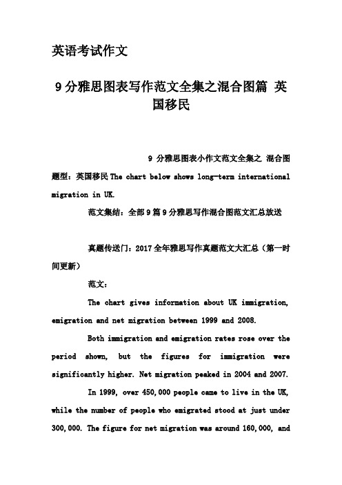
英语考试作文9分雅思图表写作范文全集之混合图篇英国移民9分雅思图表小作文范文全集之混合图题型:英国移民The chart below shows long-term international migration in UK.范文集结:全部9篇9分雅思写作混合图范文汇总放送真题传送门:2017全年雅思写作真题范文大汇总(第一时间更新)范文:The chart gives information about UK immigration, emigration and net migration between 1999 and 2008.Both immigration and emigration rates rose over the period shown, but the figures for immigration were significantly higher. Net migration peaked in 2004 and 2007.In 1999, over 450,000 people came to live in the UK, while the number of people who emigrated stood at just under 300,000. The figure for net migration was around 160,000, andit remained at a similar level until 2003. From 1999 to 2004, the immigration rate rose by nearly 150,000 people, but there was a much smaller rise in emigration. Net migration peaked at almost 250,000 people in 2004.After 2004, the rate of immigration remained high, but the number of people emigrating fluctuated. Emigration fell suddenly in 2007, before peaking at about 420,000 people in 2008. As a result, the net migration figure rose to around 240,000 in 2007, but fell back to around 160,000 in 2008.(159)。
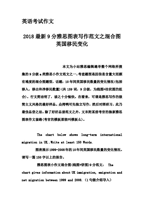
英语考试作文2018最新9分雅思图表写作范文之混合图英国移民变化本文为小站雅思编辑遍寻整个网络所搜集的9分级a类雅思小作文范文之一,考查题型是因信息含量大而颇有难度的混合图题型,话题:10年间英国移民数量的变化情况(包括移入,移出和净移民数量)(共159词,9分级,为线图+柱状图的组合)。
行文简洁明了,读之十分畅快。
在看来,可谓是雅思写作的极简主义风格的最好样品。
众烤鸭可先独立写作,然后对照研习,此乃最佳品尝之法。
除了好好品读范文之外,文末附某前考官的独家雅思图表作文套路(考官的模板那能叫模板么)。
The chart below shows long-term international migration in UK..Write at least 150 Words.图表展示1999-2008年的10年间英国移民数量的变化情况。
请写一篇150字以上的报告。
雅思图表小作文混合图(线图+饼图)9分范文:Thechart gives information about UK immigration, emigration and net migration between 1999 and 2008.(1句做介绍导入)Both immigration and emigration rates rose over the period shown, but the figures for immigration were significantly higher. Net migration peaked in 2004 and 2007.(2句做图表概述)In 1999, over 450,000 people came to live in the UK, while the number of people who emigrated stood at just under 300,000. The figure for net migration was around 160,000, and it remained at a similar level until 2003. From 1999 to 2004, the immigration rate rose by nearly 150,000 people, but there was a much smaller rise in emigration. Net migration peaked at almost 250,000 people in 2004.(3句的细节段1)After 2004, the rate of immigration remained high, but the number of people emigrating fluctuated. Emigration fell suddenly in 2007, before peaking at about 420,000 people in 2008. As a result, the net migration figure rose to around 240,000 in 2007, but fell back to around 160,000 in 2008.(3句的细节段2)(159)附雅思小作文simon考官推荐套路For the task 1 report, I aim for 9 sentences.这是他所擅长的图表作文4段9句大法,具体结构如下:1.Introduction: 1 sentence,Introduction段落,1句话介绍图表大意足矣2.Overview (summary): 2 sentences,Overview段,用2句话做图表信息的摘要3.First ‘details’ paragraph: 3 sentences4.Second ‘details’ paragraph: 3 sentences。

雅思写作最新范文:移民类书信本文来自雅思作文网《移民类书信》。
纵览 2008 年的 24 次雅思移民类考试,不难发现,书信类写作的话题仍主要围绕生活和工作场景展开,其中生活场景中朋友之间交流和相互邀请的书信话题占了很大的比重,而以往常考的投诉类书信的比例则有明显下降。
相对于投诉信这类正式文体书信,像友情信这样的半正式或者非正式文体书信比例的上升,对于移民类考生在语言表达方面的要求相对会宽松些,因此全年书信类写作的整体难度不大。
接下来,我们对全年的移民类书信话题进行分类,以便考生进行复习备考。
• 朋友之间交流和相互邀请话题(08.02.14 )One of your relatives is going to another country where your English speaking friend lives. You want your relative to see your friend. Write a letter to this friend. In your letter,1. tell him who this relative is2. explain why he is going to this country3. say why you think they can become friends(08.03.08 )One of your friends in a foreign country is starting an import-export business, and he has asked you to recommend a product from your country to him. Write a letter to your friend. In your letter,1. say what product you want to recommend to him2. tell him where he/she can get this product3. explain why you want to recommend this product( 08.04.19 ) You have an English-speaking friend who lives in another country. His son has a short vacation before going to college. Write a letter to your friend. In your letter,1. invite your friend's son to come to your city,2. introduce some interesting places to visit3. say something about the weather in the city you live( 08.06.14 ) An English-speaking friend of yours has just had a baby recently. You have bought a gift for her. Write a letter to your friend. In your letter,1. describe the gift2. explain why you chose that item as a gift3. arrange an appointment to meet her and give her the gift(08.06.28 )You won a first prize of in a photography competition and some of your photos are shown in a photo exhibition. Write a letter to invite your friend to the photo exhibition. In your letter,1. give details about the competition and the prize2. describe the photograph you took3. invite your friend to come to the exhibition( 08.07.12 ) Your friend wants to find a part-time job and you know one job which quite suits him. Write a letter to your friend. In your letter,1. tell him about this part time job2. explain why it suits him3. tell him how to apply for the job( 08.09.27 ) You just came back from the holiday and really enjoyed it. Write a letter to a friend you met during the holiday. In your letter,预祝您雅思作文更上一层楼,感谢您阅读《移民类书信》一文.本文来自雅思作文网《移民类书信》。

移民话题英文作文范文Moving to a new country can be both exciting and challenging. It opens up a world of opportunities and experiences, but it also means leaving behind familiar surroundings and starting afresh. Immigrating to a foreign land is like embarking on a new adventure, where every day brings something new and unexpected.The first thing that strikes me about immigration is the language barrier. It can be quite daunting to communicate in a language that is not your mother tongue. However, it also presents an opportunity to learn and grow.I find myself constantly trying to improve my language skills, whether it's through language classes, conversations with native speakers, or simply immersing myself in the local culture. It's a journey of self-discovery and self-expression.Another aspect of immigration that I find fascinatingis the cultural exchange. Living in a different countryexposes me to new traditions, customs, and ways of life. I get to experience firsthand the diversity that exists inthe world. It's not just about trying new foods or visiting famous landmarks, but also about understanding and appreciating different perspectives. It broadens myhorizons and makes me more open-minded.One of the challenges of immigration is adapting to a new environment. Everything feels unfamiliar – the streets, the buildings, the people. Simple tasks like grocery shopping or finding my way around town become a little more complicated. But with time, I learn to navigate throughthis new world. I discover hidden gems, make new friends, and create a sense of home in this foreign land. It's a constant process of adaptation and resilience.Immigration also brings with it a sense of nostalgia. I miss my family, friends, and the familiarity of my hometown. There are moments when I long for the comfort of mymother's cooking or the laughter shared with childhood friends. But these feelings of homesickness remind me ofthe importance of cherishing the memories and connectionsthat I have. It's a reminder to stay connected with my roots while embracing the new experiences.One of the most rewarding aspects of immigration is the personal growth that comes with it. It pushes me out of my comfort zone and forces me to confront my fears and insecurities. I become more independent, adaptable, and resilient. I learn to trust myself and my abilities. It's a journey of self-discovery and self-reliance.In conclusion, immigration is a rollercoaster ride of emotions and experiences. It's a mix of excitement, challenges, and personal growth. It's about embracing the unknown and finding a sense of belonging in a new place.It's about building a life and creating new memories. Immigration is not just a physical movement, but a journey of the heart and soul.。
Immigration has a major impact on the society.What are the main reasons of immigration?Immigration has a significant impact on the contemporary society. Each year, moreand more people from all over the world decide to leave their home countries and move to another place. This essay will examine the reasons and the consequences ofimmigration.移民对当代社会有着重要的影响。
每年,越来越多的来自世界各地的人决定离开他们的祖国搬到另一个地方。
本文将探讨移民的原因和后果。
国搬到另一个地方。
本文将探讨移民的原因和后果。
In my view, the main reason of immigration is a strong desire of better life qualityand safe future. A lot of people from so-called Third World move to developed countriesin search of better employment opportunities, and therefore, higher incomes. Moreover,living in a wealthy country implies living in a country with stable economy, so risks of losing their savings also lessen. For example, labour migration from Mexico to the USA is caused by these facts. Other reasons that force whole families to cross bordersare wars and various cultural conflicts in their homeland. Many people migrate, seekingsecurity and safe future for their children. For instance, most of the refugees who arrived in the European Union were escaping from wars.在我看来,移民的主要原因是对更好的生活质量和安全的未来的强烈愿望。
英文移民类作文范文英文:Immigration is a topic that has been debated for years. Some people believe that immigration is beneficial for a country, while others think it can be detrimental. As an immigrant myself, I believe that immigration can bring positive changes to a country.Firstly, immigrants can bring diversity to a country. When people from different cultures and backgrounds come together, they can learn from each other and create a more vibrant society. For example, in the United States, immigrants have brought their unique cuisines, languages, and customs, which have enriched American culture.Secondly, immigrants can contribute to a country's economy. Many immigrants come to a country to work andstart businesses, which can create jobs and stimulate economic growth. For instance, in Canada, immigrants havestarted successful businesses, such as Tim Hortons and BlackBerry, which have become major contributors to the Canadian economy.However, some people argue that immigration can lead to social problems, such as crime and unemployment. While it is true that some immigrants may struggle to adapt to a new country and face challenges, it is unfair to generalize all immigrants as potential threats. In fact, many immigrants work hard and contribute positively to their new communities.In conclusion, I believe that immigration can bring many benefits to a country. By embracing diversity and welcoming immigrants, we can create a more inclusive and prosperous society.中文:移民是一个长期以来一直争议不断的话题。
国际移民英文作文Moving to a new country can be both exciting and challenging. It's a chance to experience a new culture, meet new people, and learn a new language. However, it can also be difficult to adjust to a new way of life,especially if you don't speak the language or don't know anyone in the area.One of the biggest challenges of international immigration is the language barrier. If you don't speak the language of the country you're moving to, it can bedifficult to communicate with others and navigate your new surroundings. However, learning a new language can also be a great opportunity to expand your horizons and connect with people from different cultures.Another challenge of international immigration is homesickness. It's natural to miss your family and friends back home, as well as the familiar surroundings and routines you're used to. However, it's important toremember that homesickness is temporary and that you'll eventually adjust to your new surroundings and create new memories and experiences.Finding employment in a new country can also be a challenge. Depending on the country you're moving to, there may be different rules and regulations regarding work permits and visas. It's important to research and understand these requirements before you move, and to be prepared to potentially face some obstacles in your job search.Finally, cultural differences can also be a challenge when immigrating to a new country. Customs and traditions may be different from what you're used to, and it can take time to adjust to these differences. However, it's important to keep an open mind and be respectful of the culture and traditions of your new home.Overall, international immigration can be a rewarding and life-changing experience. While there are certainlychallenges to overcome, the opportunity to experience a new culture and broaden your horizons is well worth it.。
雅思写作小作文范文雅思写作混合图独居的人今天我们雅思写作小作文范文的相关文章来研究下混合图。
所谓混合图,即雅思写作task 1的题目中出现两种图形,包括但不限于饼图、柱状图、表格等,需要大家进行比较和描述。
这种题目和一般的题目其实并没有什么差别,只是看着比较唬人罢了。
小编找了一篇考官范文,以供大家参考其具体写法和数据的选取。
雅思写作小作文题目The bar chart below shows the proportions of English men and women of different ages who were living alone in 2011. The pie chart compares the numbers of bedrooms in these one-person households.Summarise the information by selecting and reporting the main features, and make comparisons where relevant.雅思写作小作文范文The two charts give information about single-occupant households in England in the year 2011. The bar chart compares figures for occupants’ age and gender, and the pie chart shows data about the number of bedrooms in these homes.这两张图给出2011年英国独居人口的相关信息。
柱状图比较了居住者年龄和性别的数据,而饼图则展示了这些房子里有多少个卧室。
Overall, females made up a higher proportion of people living alone than males, and this difference is particularly noticeable in the older age categories. This article is from Laokaoya website. We can also see that the most common number of bedrooms in a single-occupant home was two.整体而言,在独居人群中,女性比男性占据更高的比例。
雅思写作小作文范文雅思写作混合图国际移民
今天我们雅思写作小作文范文的文章来研究下混合图。
该图表由两条折线和一些柱状图构成,涵盖从1999年到2008年这10年的时间。
其中最上方的折线表示每年移居到英国的人口数量。
第二条折线表示每年离开英国的人口数量。
柱状图则表示每年的净人口流入量,即流入量减去流出量的差值。
小编搜集了一篇相关的考官范文,以供大家参考。
雅思写作小作文题目
雅思写作小作文范文
The chart gives information about UK immigration, emigration and net migration between 1999 and 2008.
该图表给出了英国在1999年和2008年期间移民进来,移民出去以及净移民人口的相关数据。
Both immigration and emigration rates rose over the period shown, but the figures for immigration were significantly higher. Net migration peaked in 2004 and 2007.
移民进入英国和移民离开英国的数字在上述时间段都有所增长。
但移民进来的人数要明显更高一些。
净流入人口在2004年和2007年达到顶峰。
In 1999, over 450,000 people came to live in the UK, while the number of people who emigrated stood at just under 300,000. The figure for net migration was around 160,000, and it remained at a similar level until 2003. From 1999 to 2004, the immigration rate rose by nearly 150,000 people, but there was a much smaller rise in emigration. Net migration peaked at almost 250,000 people in 2004.
1999年,超过450000的人来到英国,而选择离开英国的人数还不到300000。
净流入人口大约在160000左右。
直到2003年,这一数字都维持在相同的水平。
从1999年到2004年。
移居英国的人口上升了150000人,但选择离开英国的人口上升幅度较小。
净流入人口在2004年的时候达到将近250000的顶峰。
After 2004, the rate of immigration remained high, but the number of people emigrating fluctuated. Emigration fell suddenly in 2007, before peaking at about 420,000 people in 2008. As a result, the net migration figure rose to around 240,000 in 2007, but fell back to around 160,000 in 2008.
2004年以后,移居英国的人口数量仍然很高,但迁出英国的人口数量出现波动。
迁出人口在2007年突然下降,但在2008年又达到顶峰,有大约420000人。
这样一来,净流入人口数据在2007年上升到大约240000,但在2008年又掉回到160000.
雅思写作小作文高分范文,快速提升写作成绩。