英语作文之表格与曲线图
- 格式:doc
- 大小:72.00 KB
- 文档页数:5
图表式英语作文范文如何写图表、图示、图画式英语作文图表作文可细分为表格、曲线图、柱形图和圆形图。
其写作指导中只是对短文提出二至三项要求,而这些要求则类似提纲,因此这类作文往往可以按照所给要求自然分段。
图表作文给出不同形式的图表或图画,且图表又多配有数据或说明。
写此类作文时,首先要以题目中的要求(requirements)为指导,审慎解读图表,准确把握图表传递的信息,将其扩展成文。
Never do things by halves.做事不可半途而废。
前面我们已经提过图表作文可细分为表格、曲线图、柱形图和圆形图。
弄懂这四种图在写作方面的各自特点,我们才可以写好这种类型的作文:1) 表格形式要求考生对表格中所给出的大量数字进行比较分析,从中找出其变化规律。
2) 曲线图形式要求考生认真观察坐标系所显示的数据信息,并且密切注意交汇在坐标横轴和纵轴上的数字及单位。
一,英语作文书信格式:1,最上面顶格写你要把信写给谁。
2,第二段写你要对这个朋友要说的话。
3,写完后最后的一行写上你自己的名字。
二,范文:Dear Mike,I am glad to introduce my family to you. My family is a warm and happy family.There are 5 people in my family, my grandpa, my grandma, my father, my motherand I. My grandparents are both teachers, they are still teaching in a university.Grandpa is for maths, and Grandma is for English, sometimes their students eto our home to sendtheir greetings to them. My father is working in an American factory,he is very busy. Every evening he is doing his work in the midnight. At weekend he alwaysgoes to factory for his work. My mother is a nurse. Her hospital is near my home. I am a student in Junior high school. I hope you will introduce your family to meyourssincerelyTom拓展资料:英语写作文的注意事项:这里很全Sports and my lifeSince I was a child, I always dream about playing table tennis. I did play some nice ball games, but I often got beaten badly. However, it didn‘t reduce my interest in table tennis. I was crazy to stand in front of table and raised my paddle. As soon as I got off the school, I would rash to tennis table right away. There were few tables on the school, therefore I had to wait for a long time to play but my skill didn‘t improve much. Nevertheless, I didn‘t care about it. I thought I had a good time in playing table tennis and I listed it as my best taste.Now, I am grow-up and have left school for a while. I don‘t have time and hardly find a friend to play table tennis. But doctor said I needed some exercise for my health. I figured out I still could play table tennis, onlyif I played the ball against the wall. Many of my friends passed by my house. They llikely came in to see me, because they heard the noices of ball bouncing back and forth. It was my exercises in playing table tennis without table. They were curious about my crazy action. I didn‘t mind they made fun about me. I, on the other hand, liked to introduce to them that was my taste and fancy way of exercise.一.用于作文开头的万能模板1、Many people insist that...很多人(坚持)认为……这句话乍看没亮点,但将众人皆知的"think"换为"insist"有没有觉得高大上了许多?2、With the development of science and technology, more and more people believe that...随着科技的发展,越来越多的人认为……3、A lot of people seem to think that...很多人似乎认为……二.引出不同观点的万能模板1、People's views on... vary from person to person. Some hold that... . However, others believe that....人们对……的观点因人而异。
曲线图英文作文模板Title: Analyzing the Trends in [Insert Topic Here] through Visual Representation.In the realm of data analysis, the power ofvisualization cannot be overstated. Among various graphical representations, curve graphs stand out as a particularly effective tool for understanding patterns, trends, and relationships within datasets. This essay aims to explorethe intricacies of a particular dataset through the lens of a curve graph, offering insights and interpretations that would be difficult to convey through textual analysis alone.The curve graph in question depicts [Insert Brief Description of Dataset]. The x-axis represents [Insert X-axis Description], ranging from [Insert X-axis Range],while the y-axis measures [Insert Y-axis Description], with values scaling from [Insert Y-axis Range]. The graph shows several notable trends and patterns that are worth delving into.Firstly, we observe a gradual increase in [Insert Observation 1] over the course of [Insert Timeframe or Category Range]. This upward trend suggests a positive correlation between [Insert Variables for Correlation 1], indicating that as [Insert Variable 1] increases, so does [Insert Variable 2]. This pattern could be attributed to several factors, including [Insert Hypothetical Reasons for Trend 1]. For example, [Insert Detailed Explanation of Hypothetical Reason 1].Contrastingly, we see a sharp decline in [Insert Observation 2] around the midpoint of the x-axis. This sudden change in direction suggests a significant event or turning point that affected the dataset. It could be linked to external factors such as [Insert Hypothetical External Factor 1] or internal developments like [Insert Hypothetical Internal Factor 1]. For instance, [Insert Detailed Explanation of Hypothetical Factor 1].Another noteworthy feature of the graph is therelatively flat line towards the end of the x-axis,indicating a period of stability or saturation in [Insert Observation 3]. This plateau could suggest that the rate of change in [Insert Variable 3] has slowed down, possibly due to market saturation, technological advancements, or other factors that have leveled out the growth. In this context, it would be interesting to explore whether this stability is temporary or indicative of a longer-term trend.Moreover, the shape and curvature of the graph provide valuable insights into the rate of change. The steeper sections indicate rapid growth or decline, while the gentler slopes suggest slower, more gradual changes. By analyzing these curvatures, we can gain a deeper understanding of the underlying dynamics that are driving the trends.In conclusion, the curve graph presented here offers a visual representation of [Insert Topic Here] that reveals patterns, trends, and relationships that would be difficult to discern from raw data. Through careful analysis of the graph's shape, curvature, and key points, we can gain valuable insights into the dataset and the factors thatinfluence it. These insights can inform decision-making, guide research, and enhance our understanding of the phenomena under study.While this essay has focused on a specific dataset and its representation through a curve graph, the principlesand methods discussed are applicable to a wide range of topics and datasets. The power of visualization lies in its ability to simplify complexity, bringing clarity andcontext to data-driven narratives. As we continue toharness the vast amounts of data generated in today's world, the role of visual representations like curve graphs will become increasingly important in helping us make sense ofit all.。

雅思英语图表作文范文第1篇A类雅思各类图表作文要点及范文一.曲线图解题关键1曲线图和柱状图都是动态图,解题的切入点在于描述趋势。
2在第二段的开头部分对整个曲线进行一个阶段式的总分类,使写作层次清晰,同时也方便考官阅卷。
接下来再分类描述每个阶段的specifictrend,同时导入数据作为分类的依据。
3趋势说明。
即,对曲线的连续变化进行说明,如上升、下降、波动、持平。
以时间为比较基础的应抓住“变化”:上升、下降、或是波动。
题中对两个或两个以上的变量进行描述时应在此基础上进行比较,如变量多于两个应进行分类或有侧重的比较。
4极点说明。
即对图表中最高的、最低的点单独进行说明。
不以时间为比较基础的应注意对极点的描述。
5交点说明。
即对图表当中多根曲线的交点进行对比说明。
6不要不做任何说明就机械地导入数据,这不符合雅思的考试目的。
曲线图常用词汇动词—九大运动趋势一:表示向上:increase,rise,improve,grow,ascend,mount,aggrandize,goup,climb, take off, jump,shoot up暴涨,soar,rocket, skyrocket雅思英语图表作文范文第2篇It is said that countries are becoming similar to each other because of the global spread of the same products, which are now available for purchase almost anywhere. I strongly believe that this modern development is largely detrimental to culture and traditions worldwide.A country’s history, language and ethos are all inextricably bound up in its manufactured artefacts. If the relentless advance of international brands into every corner of the world continues, these bland packages might one day completely oust the traditional objects of a nation, which would be a loss of richness and diversity in the world, as well as the sad disappearance of t he manifestations of a place’s character. What would a Japanese tea ceremony be without its specially crafted teapot, or a Fijian kava ritual without its bowl made from a certain type of tree bark?Let us not forget either that traditional products, whether these be medicines, cosmetics, toy, clothes, utensils or food, provide employment for local people. The spread of multinational products can often bring in its wake a loss of jobs, as people urn to buying the new brand,perhaps thinking it more glamorous than the one they are used to. This eventually puts old-school craftspeople out of work.Finally, tourism numbers may also be affected, as travelers become disillusioned with finding every place just the same as the one they visited previously. To see the same products in shops the world over is boring, and does not impel visitors to open their wallets in the same way that trinkets or souvenirs unique to the particular area too.Some may argue that all people are entitled to have access to the same products, but I say that local objects suit local conditions best, and that faceless uniformity worldwide is an unwelcome and dreary prospect.Heres my full answer:The line graphs show the average monthly amount that parents in Britain spent on their children’s s porting activities and the number of British children who took part in three different sports from 2008 to is clear that parents spent more money each year on their children’s participation in sports over the six-year period. In terms of the number of children taking part, football was significantly more popular than athletics and 2008, British parents spent an average of around £20 per month on their children’s sporting activities. Parents’ spending on children’s sports increased gradually over the followi ng six years, and by 2014 the average monthly amount had risen to just over £ at participation numbers, in 2008 approximately 8 million British children played football, while only 2 million children were enrolled in swimming clubs and less than 1 million practised athletics. The figures for football participation remained relatively stable over the following 6 years. By contrast, participation in swimming almost doubled, to nearly 4 million children, and there was a near fivefold increase in the number of children doing athletics.剑桥雅思6test1大作文范文,剑桥雅思6test1大作文task2高分范文+真题答案实感。

英语作文图表作文(五篇范文)第一篇:英语作文图表作文图表分析作文1As is clearly shown in the table/ figure/ graph / chart, 图表总体描述 between 年代 and 年代.Especially, 突出的数据变化.There are three reasons for 具体表示急剧上升、下降或特殊现象的词.To begin with, 原因一.In addition / Moreover, 原因二.For example, 具体例证.Last but no least, 原因三.In short,总结上文.As far as I am concerned, / For my part, / As for me,作者自己的观点.On the one hand, 理由一.On the other hand, 理由二.In brief,总结上文.图表分析作文2The table / figure / graph / chart shows that 图表总述from 年代to年代.It is self-evident that突出的数据变化.Three possible reasons contribute to 具体表示急剧上升、下降或特殊现象的词或代词代替上文内容.One reason is that原因一.Another reason is that 原因二.For instance,举例证.What’s more原因三.As a result, 重述上文之趋势.However, in my opinion 作者观点.For one thing,理由一.For another, 理由二.T o sum up,总结上文.图表分析作文3It can be seen from the table / figure / graph / chart that图表总述between年代and年代.Especially,突出的数据变化.Why are there such great changes during 图表涉及的年头数years? There are mainly two reasons explaining具体表示急剧上升、下降或特殊现象的词或代词代替上文内容.First,原因一.In the old days,比较法说明过去的情况.But now,说明现在的情况.Second,原因二.As a result,总结上文.In my viewpoint,作者自己的观点.On the one hand,论点一.On the other hand,论点二.图表分析作文4As the table / figure / graph / chart shows,图表总述in the past years年代.Obviously,突出的数据变化.Why are there suchsharp contrasts during 图表涉及的年头 years?Two main factors contribute to具体表示急剧上升、下降或特殊现象的词或代词代替上文内容.First of all,原因一.In the past,比较法说明过去的情况.But now 说明现在的情况.Moreover,原因二.Therefore,总结上文.As I see it,作者自己的观点.For one thing,论点一.For another,论点二.图表作文补充句型• As is shown in the graph…如图所示…•The graph shows that…图表显示…•As can be seen from the table,…从表格中可以看出…•From the chart, we know that…从这张表中,我们可知…• All these data clearly prove the fact that… 所有这些数据明显证明这一事实,即…• The increase of ….In the ci ty has reached to 20%.….在这个城市的增长已达到20%.• In 1985, the number remained the same.1985年,这个数字保持不变.• There was a gradual decline in 1989.1989年,出现了逐渐下降的情况.第二篇:英语图表作文图表描述专题训练(一)这类作文时,注意以下几点:第一,审题时,除了要把握好图表的表层信息外,还要分析图标的深层含义,如原因、根源、可能的发展趋势等。
曲线图作文英文英文:When it comes to line charts, they are one of the most commonly used types of charts in business, science, and engineering. They are used to display trends over time, such as changes in stock prices, sales figures, or temperature fluctuations. Line charts are simple to read and interpret, making them a popular choice for data visualization.One of the benefits of line charts is that they are great for showing changes in data over time. For example, if you are tracking the sales of a particular product over time, a line chart can help you see whether sales are increasing or decreasing. Additionally, line charts can be used to compare multiple sets of data on the same chart, making it easy to see how different factors are affecting the data.Another advantage of line charts is that they are easyto create and customize. Most charting software allows youto choose different colors, line styles, and markers to make your chart look exactly how you want it. Additionally, you can easily add labels and titles to your chart to makeit more informative.However, there are also some limitations to line charts. For example, they are not ideal for displaying large amounts of data, as the chart can become cluttered and difficult to read. Additionally, line charts only show trends over time and do not provide any information about individual data points.Overall, line charts are a valuable tool forvisualizing trends over time and comparing multiple sets of data. They are simple to create and customize, making thema popular choice for data visualization in a variety of industries.中文:说到曲线图,它们是商业、科学和工程中最常用的图表类型之一。
IELTS图表作文讲解:曲线图表格图范文分析:开头段(首段改写)The graph ①illustrates changes in the amounts of② beef, lamb, chicken and fish③consumed in a particular European country④ between 1979 and 2004。
①改写题目中的shows⑧下降表达,类似的有decrease, go down , decline, fall down ,drop ,sink。
这句话描写相反的趋势。
⑨交叉点⑩时间+上升表达⑪⑩最大值结尾段Overall,the graph shows how the consumption of ①chicken increased dramatically while the popularity of ②these other foods decreased over the period.①上升②下降,结尾段一般总结图中最主要的信息或最终要的趋势.❖TABLE③ 低于平均值的家庭类型情况④ 高于平均值的情况⑤ 倍数表达,清晰的对比⑥ 尾段对表中的主要类型的总趋势进行了重述Besides,此文章中作者用括号表达数据,很有新意,清晰三、结构及句型总结首段常用句型:1。
The table /graph shows (that)...2. The figures/statistics show (that)。
3. The diagram shows/ describes/ illustrates how。
.4。
According to/As (is) shown in the/As can be seen from the table/chart, diagram, graph, figures5. It can be seen/obse rved from the/ we can see from the…6. It is clear/ apparent from the table/chart/diagram/graph/figures (that)。
英语图表作文模板及范文(通用12篇)(经典版)编制人:__________________审核人:__________________审批人:__________________编制单位:__________________编制时间:____年____月____日序言下载提示:该文档是本店铺精心编制而成的,希望大家下载后,能够帮助大家解决实际问题。
文档下载后可定制修改,请根据实际需要进行调整和使用,谢谢!并且,本店铺为大家提供各种类型的经典范文,如工作总结、工作计划、合同协议、条据文书、策划方案、句子大全、作文大全、诗词歌赋、教案资料、其他范文等等,想了解不同范文格式和写法,敬请关注!Download tips: This document is carefully compiled by this editor. I hope that after you download it, it can help you solve practical problems. The document can be customized and modified after downloading, please adjust and use it according to actual needs, thank you!Moreover, our store provides various types of classic sample essays for everyone, such as work summaries, work plans, contract agreements, doctrinal documents, planning plans, complete sentences, complete compositions, poems, songs, teaching materials, and other sample essays. If you want to learn about different sample formats and writing methods, please stay tuned!英语图表作文模板及范文(通用12篇)英语图表作文模板及范文第1篇The table/chart diagram/graph shows (that)According to the table/chart diagram/graphAs (is)shown in the table/chart diagram/graphAs can be seen from the table/chart/diagram/graph/figures,figures/statistics shows (that)……It can be seen from the figures/statisticsWe can see from the figures/statisticsIt is clear from the figures/statisticsIt is apparent from the figures/statisticstable/chart/diagram/graph figures (that)……table/chart/diagram/graph shows/describes/illustrates图表类英语作文范文The past years have witnessed a mounting number of Chinese scholars returning from overseas.As is lively illustrated by the column chart, the number of returnees climbed from a mere thousand in 20XX to over thousand in 20XX, at an annual increase rate of around 50%.A multitude of factors may have led to the tendency revealed by the chart, but the following are the critical ones from my perspective.First and foremost, along with the development ofChinese economy and society, the number of Chinese studying abroad has been soaring in the past years, which has provided an eXpanding base for the number of returnees.In the second place, the government has enacted a series of preferential policies to attract overseas Chinese scholars back st but not least, the booming economy, science and technology in this country have generated more attative job opportunites for scholars returning from overseas.The waves of returnees will definitely contribute to this nation’s development, since they have brought back not only advanced science and technology but also pioneering concepts of education and management.With more scholars coming back from overseas, and with the concerted efforts of the whole nation,we have reasons to eXpect a faster rejuvenation of this country.更多培训课程:苏州个人提升英语更多学校信息:苏州虎丘区朗阁教育机构咨询电话:英语图表作文模板及范文第2篇Students tend to use computers more and more frequently nowadays.Reading this chart, we can find that the average number of hours a student spends on the computer per week has increased sharply.In 1990, it was less than 2 hours; and in 1995, it increased to almost 4 hours, and in 2000, the numbersoared to 20 hours.Obviously computers are becoming increasingly popular.There are several reasons for this change.First,computers facilitate us in more aspects of life.Also, the fast development of the Internet enlarges our demands for using computers.We can easily contact with friends in remote places through the Internet.Besides, the prices of computers are getting lower and lower,which enables more students to purchase them.However, there still eXist some problems, such as poor quality, out-of-date designs and so on.And how to balance the time between using computers and studying is also a serious problem.Anyhow, we will benefit a lot from computers as long as we use them properly.英语图表作文模板及范文第3篇As can be clearly seen from the graph/table/chart (As is shown in the table/figure), great changed have taken place in_______,The_________have/has skyrocketed/jumped from _____to _____.When it comes to the reasons for the changes,different people give different eXplanations.Here I shall just give a begin with, ______What’s more,___________, Last but not least, ________.While it is desirable that ___________,there are still some problems and difficulties for __________Firstly, __________,In addition, __________,In a word, __________.以上就是为大家整理的英语专四图表作文范文模板,希望能够对大家有所帮助。
曲线图作文英文英文:When it comes to graph types, one of the most commonly used is the line graph. Line graphs are great for showing trends over time or comparing multiple sets of data. They are also easy to read and understand.Line graphs typically have an x-axis (horizontal) and a y-axis (vertical). The x-axis represents the time period or independent variable, while the y-axis represents the dependent variable. The data points are then plotted on the graph and connected with lines.One advantage of line graphs is that they can show changes in data over time. For example, if you weretracking the sales of a product over the course of a year, you could use a line graph to show how the sales fluctuate from month to month. This would allow you to identify any patterns or trends in the data.Another advantage of line graphs is that they can be used to compare different data sets. For example, if you were comparing the sales of two different products, you could plot the data on the same graph and easily see which product had higher sales at each time point.Overall, line graphs are a great tool for visualizing data and identifying trends over time.中文:说到图表类型,其中最常用的之一就是曲线图。
图表类英语作文范文图表类型的英语写作如果不擅于观察漫画的话,作文写出来可能会偏题。
下面是小编给大家带来图表类英语作文,供大家参阅!图表类英语作文范文篇1第一段:说明图表开篇句:As the bar chart shows, ____ during the years of ____to____.扩展句:1、As early as _____.2、Then _____ years later, ____.3、And arriving in the year ____, ____.第二段:解释图表变化原因主题句:Several factors contribute to _____.扩展句:1、______. (原因1)2、And ______.(原因2)3、Furthermore, ______ (原因3)4、All these result in ____.第三段:提出解决办法结尾句:However, ____ is faced with some problems.扩展句:1、With _____, ____, the effect of which is not only discouraging, but also challenging.2、So my principle is to pay due attention to ___, but notjustto____.示范第一段:说明图表开篇句:As the bar chart shows, the number of people below the poverty line decreased dramatically during the years of 1978 to1997.扩展句:1、As early as 1978, about 250 million people were under the poverty line.2、Then seven years later, the number became three fifths thatof1978.3、And arriving in the year 1997, the number was reduced to50millions.第二段:解释图表变化原因主题句:Several factors contribute to the sharp decrease of the below-poverty population.扩展句:1、The reform and opening following 1978 enabled the peasants to become much better off. (原因1)2、And with the development of Chinese economy, that policy also improved city dwellers lives greatly. (原因2)3、Furthermore, the high-tech introduced made it possible for the countrys economy as a whole to take off. (原因3)4、All these result in the great fall of theChinesepopulationbelow the poverty line.第三段:提出解决办法结尾句:However, a further decrease in the number of poverty-stricken people is faced with some problems.扩展句:1、With quite few employees being laid off, the effect of which is not only discouraging, but also challenging.2、So my principle is to pay due attention to the newcomers, but not just to care for the poor, say, in remote mountain areas.范文As the bar chart shows, the number of people below the poverty line decreased dramatically during the years of 1978 to 1997. Asearly as 1978, about 250 million people were under the poverty line.Then seven years later, the number became three fifths that of 1978.And arriving in the year 1997, the number was reduced to 50 millions.Several factors contribute to the sharp decrease of the below-poverty population. The reform and opening following 1978 enabled the peasants to become much better off. And with the development of Chinese economy, that policy also improved city dwellers lives greatly. Furthermore, the high-tech introduced made it possible for the countryseconomy as a whole to take off. All these result in the great fall of the Chinese population below the poverty line.However, a further decrease in the number of poverty-stricken people is faced with some problems. With quite few employees being laid off, the effect of which is not only discouraging, but also challenging. So my principle is to pay due attention to the newcomers, but not just to care for the poor, say, in remote mountain areas.图表类英语作文范文篇2The past years have witnessed a mounting number of Chinese scholars returning from overseas. As is lively illustrated by the column chart, the number of returnees climbed from a mere 69.3 thousand in 2008 to over 272.9 thousand in 2012, at an annual increase rate of around 50%.A multitude of factors may have led to the tendency revealed by the chart, but the following are the critical ones from my perspective. First and foremost, along with the development of Chinese economy and society, the number of Chinese studying abroad has been soaring in the past years, which has provided an expanding base for the number of returnees. In the second place, the government has enacted a series of preferential policies to attract overseas Chinesescholars back home. Last but not least, the booming economy, science and technology in this country have generated more attative job opportunites for scholars returning from overseas.The waves of returnees will definitely contribute to this nation’s development, since they have brought back not only advanced science and technology but also pioneering concepts of education and management. With more scholars coming back from overseas, and with the concerted efforts of the whole nation, we have reasons to expect a faster rejuvenation of this country.图表类英语作文范文篇3一、图表类型基本单词图表类型:table(表格)、chart(图表)、diagram(图标)、graph(多指曲线图)、column chart(柱状图)、pie graph(饼图)、tree diagram(树形图)、饼图:pie chart、直方图或柱形图:bar chart/histogram、趋势曲线图:line chart/curve diagram、表格图:table、流程图或过程图:flow chart/sequence diagram、程序图:processing/procedures diagram二、图表描述基本词语1、描述:show、describe、illustrate、can be seen from、clear、apparent、reveal、represent2、内容:figure、statistic、number、percentage、proportion三、常用的描述句型The table/chart diagram/graph shows (that)According to the table/chart diagram/graphAs (is) shown in the table/chart diagram/graphAs can be seen from the table/chart/diagram/graph/figures,figures/statistics shows (that)……It can be seen from the figures/statisticsWe can see from the figures/statisticsIt is clear from the figures/statisticsIt is apparent from the figures/statisticstable/chart/diagram/graph figures (that) ……table/chart/diagram/graph shows/describes/illustrates看过图表类英语范文的人还。
怎样写图表分析作文(2):曲线图曲线图常用来表示事物的变化趋势。
常分为带时间参照和不带时间参照两种。
曲线图的特点是信息集中,一目了然。
例:下面的曲线图是我国2006年不同月份汽车事故分布示意图,请以“The number of car accidents in 2006”为题写一篇文章。
要求:1.描述不同月份汽车事故分布(distribution)及总趋势。
2.描述汽车事故的可能原因和对策。
3.参考词汇:peak 顶点,高峰。
词数:100~120 。
【解题分析】英语曲线图作文实际是一篇“解说词”,即通过曲线图提供的信息,分析图中数据,综合出文章的主题。
可采取三段式写法:第一段:用简短的几个句子简述图表。
第二段:根据图表分类,概括性地描述曲线内容。
第三段:对文章整体内容进行结论性总结。
【提炼要点】分析曲线图数据信息。
从图中可看出,曲线图的横轴代表2006年的不同的月份,纵轴代表交通事故的数量。
从交通事故曲线图上可知,前八个月的交通事故的数量有升有降。
曲线图在八月份升到了最高点(39),此后一直呈下降的趋势,十二月份降到了最低点(16)。
可见,2006年的交通事故的数量总体上呈下降的趋势。
One possible versionThe Number of Car Accidents in 2006From the graph,we can see that there were two peaks of accidents in 2006. One was in Feb with the number of 32.The other was in August with the number of 39,which was the highest point of the distribution line. From August,the number of car accident had been decreasing till it reached the lowest point of theyear in December. Two peaks occurred in spring and summer,the two seasons which had most of the year's rain. Driving tends to be more dangerous in rainy days. Maybe the weather is the most important reason for car accidents. Be careful,when you drive a car in rainy days.【语言亮点】①词汇。
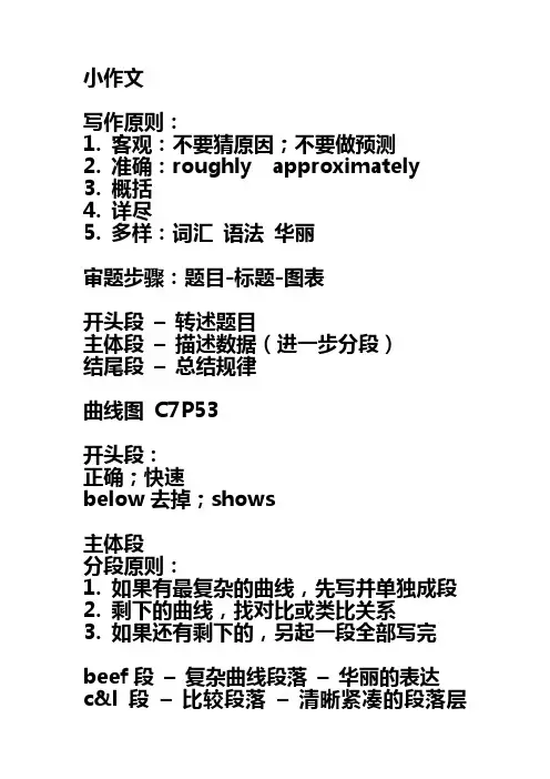
小作文写作原则:1. 客观:不要猜原因;不要做预测2. 准确:roughly approximately3. 概括4. 详尽5. 多样:词汇语法华丽审题步骤:题目-标题-图表开头段–转述题目主体段–描述数据(进一步分段)结尾段–总结规律曲线图C7P53开头段:正确;快速below去掉;shows主体段分段原则:1. 如果有最复杂的曲线,先写并单独成段2. 剩下的曲线,找对比或类比关系3. 如果还有剩下的,另起一段全部写完beef段–复杂曲线段落–华丽的表达c&l段–比较段落–清晰紧凑的段落层次fish段–扫尾段–不同的写作风格beef段概括+详尽–简化图表1. 静态数据的描述2. 单一阶段的描述3. 句子之间的衔接4. 段落之间的衔接1. 静态数据的描述在1979年,牛肉的数量是220克。
In 1979, the amount of beef was 220 grams.在1979年,关于牛肉的数据是220克。
In 1979, the data on beef was 220 grams.在1979年,人们消耗了220克的牛肉。
People consumed 220 grams of beef in 1979.在1979年,220克的牛肉被消耗。
In 1979, 220 grams of beef were consumed.方法:对象词的替换(换主语)数量-数据-人们-被动-其他名词数量VS数据数量:number; amount; quantity数据:data; figure; statistic……的数量the number of + 可数复数the amount of + 不可数the quantity of + 都可以关于……的数据the data aboutthe figure for + 都可以the statistic onthe number s of boys and girlsthe amount s of beef and lambthe figure s for boys and girlsthe statistic s on beef and lambdata单复数同形the data on boys is/was 20the data on boys and girls are/were both 20数量–精确表达数据–模糊表达the amount of electricity produced by coalthe amount of electricity produced by oilthe data on coalthe figure for oil2. 单一阶段的描述上升/下降。
怎么写曲线图的英语作文The curve graph is a visual representation of data that shows the relationship between two or more variables. It is often used to illustrate trends, patterns, and correlations in the data. The curve graph is a powerful tool for analyzing and interpreting data, and it can help researchers and decision-makers make informed decisions.When creating a curve graph, it is important to choose the right type of graph to accurately represent the data. There are many different types of curve graphs, including line graphs, scatter plots, and bar graphs. Each type of graph has its own strengths and weaknesses, so it is important to choose the one that best suits the data being presented.One of the key features of a curve graph is the axes, which represent the variables being measured. The x-axis typically represents the independent variable, while the y-axis represents the dependent variable. It is important tolabel the axes clearly and accurately, and to choose appropriate scales to ensure that the data is presented ina clear and meaningful way.In addition to the axes, a curve graph may also include a title, labels for the data points, and a legend toexplain any symbols or colors used in the graph. These elements help to make the graph easier to understand and interpret, and they can also make the graph more visually appealing.When interpreting a curve graph, it is important tolook for patterns, trends, and correlations in the data. This can help to identify relationships between variables, make predictions about future behavior, and identify areas for further research or investigation. It is also important to consider the limitations of the data and the potentialfor error or bias in the analysis.In conclusion, the curve graph is a valuable tool for analyzing and interpreting data. By choosing the right type of graph, labeling the axes and adding appropriate elements,and carefully interpreting the data, researchers and decision-makers can use curve graphs to make informed decisions and gain valuable insights into the relationships between variables.。
曲线图英语作文(中英文版)English Composition on Curve GraphA curve graph, also known as a line graph, is a powerful tool that illustrates trends and relationships between variables in a visually captivating manner.It consists of a series of data points connected by straight line segments, which form a curvilinear pattern.This essay aims to explore the significance and application of curve graphs in various fields.曲线图英语作文曲线图,亦称为折线图,是一种极具视觉吸引力的工具,它能生动地展示变量之间的趋势与关联。
它由一系列数据点通过直线段连接而成,形成一条曲线形状。
本文旨在探讨曲线图在不同领域中的重要性和应用。
In the realm of economics, curve graphs are indispensable for depicting economic indicators such as GDP growth, inflation rates, and stock market fluctuations.They provide policymakers and analysts with a clear visual representation of economic trends, enabling them to make informed decisions and predictions.在经济学领域,曲线图对于描绘国内生产总值增长、通货膨胀率以及股市波动等经济指标至关重要。
英语曲线图作文模板英文回答:Line Graph Template。
Introduction。
Introduce the topic of the line graph.State the time period covered by the graph.Briefly mention the main trend or pattern observed in the graph.Body Paragraphs。
Discuss the specific trends and patterns observed in the graph.Focus on key data points, including peaks, valleys,and any significant changes in the curve.Use specific examples and evidence from the graph to support your observations.Compare and contrast different aspects of the graph, such as different time periods or variables.Provide possible explanations or interpretations for the observed trends.Conclusion。
Summarize the main findings of the analysis.Reiterate the original statement about the main trend or pattern.Discuss the implications or significance of the observed trends.Make predictions or recommendations based on theanalysis.Example Line Graph Analysis。
英语曲线图表类作文Introduction:The mastery of the English language is a continuous journey for many learners. Curve charts are an effective way to visualize and analyze the trends in English proficiencylevels over time. This essay will discuss the use of curve charts to track and assess the progress of English learners, focusing on factors such as time spent on study, types of activities engaged in, and the impact of various learning methods.Body Paragraph 1 - Time Spent on Study:A curve chart can illustrate the correlation between the amount of time dedicated to studying English and the improvement in proficiency. For instance, a learner who dedicates an additional hour each day to language practice may show a steady upward trend in their English skills over several months. This trend can be plotted on a curve chart with time on the x-axis and proficiency levels on the y-axis, demonstrating the positive impact of consistent study habits.Body Paragraph 2 - Types of Activities:Different learning activities can have varying effects on language acquisition. A curve chart can compare the impact of various activities, such as reading, writing, listening, and speaking exercises. By plotting the proficiency levels achieved after engaging in each activity, learners can identify which methods are most effective for them. Forexample, a student might find that their speaking skills improve more rapidly when they participate in conversation groups rather than when they study alone.Body Paragraph 3 - Impact of Learning Methods:The effectiveness of different learning methods can also be depicted through curve charts. Traditional classroom instruction, online courses, language immersion, and self-study each have unique benefits and challenges. By tracking proficiency levels before and after engaging in each method, learners can make informed decisions about which approach best suits their learning style. A curve chart can show, for example, that a combination of online learning and immersion experiences leads to the most significant improvement in proficiency.Conclusion:Curve charts are a powerful tool for visualizing the progress of English learners. They provide a clear picture of the relationship between study time, types of activities, and learning methods with proficiency levels. By using these charts, learners can tailor their study plans to maximize their language acquisition, and educators can better understand the needs of their students. Ultimately, curve charts help to personalize the learning experience and guide both learners and teachers towards more effective English language education strategies.。
曲线图英语作文模板Template:As shown in the line chart, the data illustrates the trend of a certain phenomenon over a period of time. From the chart, we can see that the trend fluctuates over time, showing the ups and downs of the phenomenon. In this essay, I will analyze the data and explain the possible reasonsfor the trend.Introduction:The line chart shows the trend of the number oftourists visiting a certain city from January to December in 2020. As we can see from the chart, there are fluctuations in the number of tourists over time.Body:In January, the number of tourists was relatively low,at around 10,000. This may be due to the fact that it was winter and the weather was cold, making it less attractive for tourists to visit. However, in February, the number of tourists increased significantly, reaching a peak of over 30,000. This could be due to the Spring Festival holiday, which is a traditional Chinese holiday where people travel to visit their families or go on vacation.In March, the number of tourists decreased slightly, but it remained relatively high at around 25,000. This could be due to the fact that March is still a good time to travel, with pleasant weather and fewer crowds than in the peak tourist season. However, in April, the number of tourists dropped significantly to around 15,000. This could be due to the outbreak of COVID-19, which led to travel restrictions and reduced people's willingness to travel.In May, the number of tourists remained low, at around 10,000, due to the continued impact of the pandemic. However, in June, the number of tourists began to recover, reaching around 20,000. This could be due to the easing of travel restrictions and the resumption of economicactivities.In the following months, the number of tourists continued to increase, reaching a peak of over 40,000 in October. This could be due to the fact that October is a popular month for travel, with pleasant weather and many festivals and events. However, in November and December, the number of tourists decreased slightly, possibly due to the colder weather and the approach of the winter season.Conclusion:In conclusion, the line chart shows the trend of the number of tourists visiting a certain city over a period of time. The trend fluctuates over time, showing the ups and downs of the phenomenon. The reasons for the trend are complex and may be related to factors such as weather, holidays, and the impact of the pandemic. Overall, the data provides valuable insights into the tourism industry and can help policymakers and businesses make informed decisions.。
英语曲线图表类作文300Introduction:The prevalence of English as a global language has been a significant trend over the past century. This essay will analyze the growth of English through the lens of a curve chart, illustrating the rise in the number of speakers, the expansion of English in international communication, and the impact on education and technology.Body:1. Growth in the Number of English Speakers:- The curve chart begins in the early 20th century with a relatively flat line, indicating a stable number of English speakers.- Post-World War II, the line starts to incline more steeply, reflecting the spread of English due to the influence of the United States and the British Commonwealth. - By the turn of the millennium, the curve shoots upward, highlighting the exponential growth in non-native speakers, largely due to globalization and the internet.2. English in International Communication:- A secondary curve on the chart represents the use of English in international diplomacy, business, and travel.- The line for international communication rises steadily, paralleling the increase in speakers, but with a more pronounced slope in the late 20th century.- The chart shows a significant spike in the 1990s withthe advent of global economic integration and the establishment of the European Union, where English is aprimary lingua franca.3. Impact on Education:- A third curve on the chart depicts the integration of English in educational curricula worldwide.- The line begins to rise in the mid-20th century as more countries incorporate English as a second language in schools. - The most dramatic increase is observed in the 21st century, with the curve almost doubling, as English becomes a requirement for accessing higher education and professional opportunities.4. Influence on Technology and Media:- The final curve on the chart illustrates the dominanceof English in technology and media.- The line is almost vertical, especially from the 1990s onwards, with the rise of the internet and digital communication.- English is the primary language for software development, scientific research, and social media platforms, which is evident from the sharp upward trajectory on the chart.Conclusion:The curve chart provides a visual representation of the remarkable ascendancy of English as a global language. It underscores the importance of English in various facets of modern life, from communication to education and technology. As the chart indicates, the trend is likely to continue,emphasizing the need for language education and cultural exchange to keep pace with this global phenomenon.。
表格解题关键1表格与饼图一样,都是静态图。
切入点在描述分配;2表格题考查列举数字的能力和方法。
通过举一些有代表性的数据来说明问题;3横向比较。
介绍横向各个数据的区别、变化和趋势;4纵向比较。
介绍纵向各个数据的区别、变化和趋势;5不需要将每一个数据分别说明,突出强调数据最大值和最小值;6对比时要总结出数据对比最悬殊的和最小的。
表格举例Topic 4-4:The table below shows carbon dioxide emissions from transport in three European countries in 1994 and 2004.Summaries the information by selecting and reporting the main features and make comparisons where relevant.范文The given table provides an overview of carbon dioxide emissions from four main transport sources (namely,road transport,railways,civil aviation and shipping) in the United Kingdom,France and Germany in 1994 and 2004.Germany,although having higher emissions than either the United Kingdom or France did,saw the amount decrease slightly from 47.2 to 46.7 million tonnes.By comparison,France recorded an increase of four million tonnes from 34.7 million in 1994,while the United Kingdom had a smaller growth,2.5 million tonnes over the same period.(纵向比较三个国家1994到2004年间二氧化碳释放量的整体趋势变化。
)In all the three countries, road transport was responsible for the majority of emissions.(横向对四个二氧化碳释放源进行比较,点明最大释放源)In the United Kingdom,road transport produced emissions up to 32.6 million tonnes in 2004,2 million more than ten years earlier,while other three transport sources did not show any remarkable growth.(接着对三个国家的释放源进行描述说明,说明从1994年到2004年间的变化)A similar pattern was seen in France,where road transport added 3.6 million tonnes to the total emissions within ten years.Germany,by contrast,was the only country of the three to experience a drop in road transport emissions.(比较德国和英国法国的区别)Other three transport sources had a lower emission volume as well,except civil aviation,with the amount rising to 1.2 million.(对其它二氧化碳释放源进行描述,比较10年间的变化)As shown in the table,both UK and France failed to reduce carbon dioxide emissions from transport sources during the period 1994 to 2004,in contrast to the decrease in Germany.Road transport continued to account for the biggest source of emissions.(237 words)表格常用词汇noticeable trend 明显趋势pronounced adj. 明显的significant changes一些较大变化rank n. vt. vi. 列为,排列,等级distribute vt. 分布,区别unequally adv. 不相等地average n. vt. vi. adj. 平均corresponding adj. 相应的,通讯的represent vt. 阐述,表现overall adj. 总体上讲in the case of adv. 在...的情况下in terms of / in respect of / regarding 在...方面4.5.2.4表格常用表达开头概述1) The table shows (reveals,illustrates,demonstrates,depicts,describes,indicates) _____.2) According to the table, _____.3) As (is) shown in the table, _____.4) As can be seen from the table, _____.5) Figures/statistics show (that) _____.6) It can be seen from the figures/statistics that _____.7) It is clear from the figures/statistics that _____.8) It is apparent from the figures/statistics that _____.描述比例1) _____ accounts for (takes up) 20%of all._____占总数的20%。
2) On the top of the list is _____, which accounts for 70%.比例最高的是_____,占70%。
3) At the bottom of the list is _____,which takes up 20%only.比例最低的是_____,仅占20%。
4) A ranks first,followed by B at 20%and C at 15%.A占比例最大,其次是B占20%及C占15%。
5) The figure reached the highest/lowest point in _____.数据在_____时候达到最高点(最低点)。
描述对比1) A has almost (nearly/about) over a quarter (half/twice/one third) as many students as (as much money as) B.A的学生数/钱(差不多)是B的四分之一/一半/两倍/三分之一/一样。
2) A has about (approximately/exactly/precisely) the same number (proportion/amount) of students (money) as B.A和B的学生/钱/数量/比例差不多/正好一样。
3) A has something in common with B.A与B有一些共同点。
4) The difference between A and B lies in _____.A与B的不同之处在于_____。
描述趋势1) The number increased (/rose)suddenly (dramatically/rapidly/substantially/considerably /sharply)from _____ to _____.数量从_____激增到_____。
2) During 1990 to 2000,there was a sudden (rapid/dramatic/substantial/sharp/considerable)rise (boom)in the number of private cars from _____ to _____.1990年到2000年间,私人汽车的数量从_____急剧增长到_____。
3) The ten years from 1990 to 2000 witnessed (/saw)a steady growth of private cars from _____to _____.1990年到2000年10年间,私人汽车的数量从_____稳步增长到_____。
4) The number of private cars increased (rose / fell/dropped/declined/decreased) by 20%.私人汽车数量增长了(或:降低了)20%。
5) The number of private cars in 2000 was 5 times more than that in 1990.2000年私人汽车数量是1990年的5倍。
6) The number of private cars roughly (/approximately) doubled (tripled) between 1990 and 2000.1990年到2000年间,私人汽车数量大约是原来的2倍(3倍)。
结尾1) We can conclude from the table that _____.2) In short (In brief), _____.3) In conclusion, _____.4) To conclude, it seems clear that _____.5) From the table/diagram, we can see _____.6) As can be seen from the chart/table/diagram, _____.7) It is clear (/apparent) from the chart (/graph/table) that _____.4.5.2.5表格模板The table shows _____.(简要介绍表中呈现的信息。