
陕西省洋县中学高晓锋白玉龙
纵观近几年高考,英语书面表达大致分为材料作文、图表作文和开放作文。且材料作文逐渐被图表作文取代,图表分析作文就是将数据、图像所包含的信息,转化为表意的说明文字。图表分析作文通常比较复杂,学生不仅要弄清提示,还要看懂所给的图表和数据。由于这类试题提示内容少,信息点分散,审题时一定要领会作者的出题意图,弄清主题再动笔:1.单纯描述解释图表信息,按图表所示内容如实表达,不加评论。2.通过叙述图表(或图画)中的内容和数字变化来分析原因,发表议论。
(一) 柱状图(BAR CHART)
人们日常生活中事物的变化情况通常可以用宽度相等的柱状图形来表示,柱状图的高度差别用来说明事物的动态发展趋势,同时要注意图例说明和坐标刻度所提示的信息。
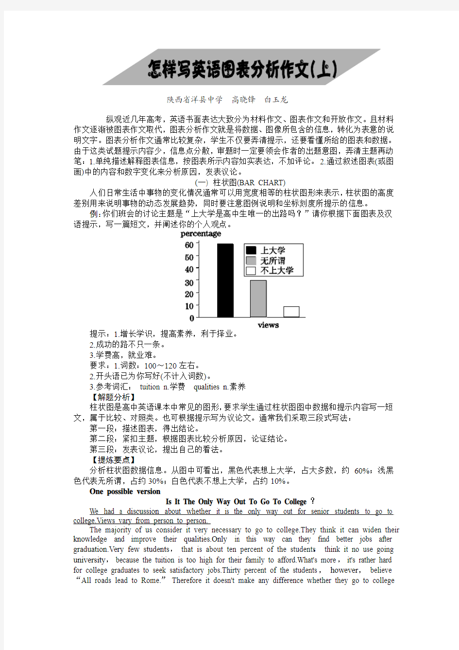
例:你们班会的讨论主题是“上大学是高中生唯一的出路吗?”请你根据下面图表及汉语提示,写一篇短文,并阐述你的个人观点。
提示:1.增长学识,提高素养,利于择业。
2.成功的路不只一条。
3.学费高,就业难。
要求:1.词数:100~120左右。
2.开头语已为你写好(不计入词数)。
3.参考词汇:tuition n.学费qualities n.素养
【解题分析】
柱状图是高中英语课本中常见的图形,要求学生通过柱状图图中数据和提示内容写一短文,属于比较、对照类。也可根据提示写为议论文。通常我们采取三段式写法:第一段:描述图表,得出结论。
第二段:紧扣主题,根据图表比较分析原因,论证结论。
第三段:发表议论,提出自己的看法。
【提炼要点】
分析柱状图数据信息。从图中可看出,黑色代表想上大学,占大多数,约60%;浅黑色代表无所谓,占约30%;白色代表不想上大学,占约10%。
One possible version
Is It The Only Way Out To Go To College?
We had a discussion about whether it is the only way out for senior students to go to college.Views vary from person to person.
The majority of us consider it very necessary to go to college.They think it can widen their knowledge and improve their qualities.Only in this way can they find better jobs after graduation.Very few students,that is about ten percent of the students,think it no use going university,because the tuition is too high for their family to afford.What's more,it's rather hard for college graduates to seek satisfactory jobs.Thirty percent of the students,however,believe “All roads lead to Rome.” Therefore it doesn't make any difference whether they go to college
or not.
In my opinion,we can receive a better education at college so that we can serve our motherland.
【语言亮点】
①词汇。如:consider,widen,afford,seek,satisfactory。
②句式。如:形式宾语:The majority of us consider it very necessary to go to college.
倒装:Only in this way can they find better jobs after graduation.
主语从句:it's rather hard for college graduates to seek satisfactory jobs.
谚语:All roads lead to Rome.
③过渡词。如:that is about ten percent of the students,what's more,however,in my opinion。
【技巧点拨】
1.读懂柱状图坐标刻线及图例说明与文字,比较柱状高低和颜色表示内容及数据。
2.学会看趋势、找规律,从整体看图表有何发展变化,找出特点、规律。
3.引用图表包含信息,使你的文章“由图而发”,言之有据。
【常用句式】
1. As can be seen from the chart,...As is shown in the chart,...
2. The chart shows that about 60 percent of students want to go to college...
3. From the graph/data/results/information above,it can be seen/concluded/shown /estimated...
4.The graph shows the changes in the number of...over the period from...to...
https://www.doczj.com/doc/1f13338352.html,pared with...,the number of the students of...
实战演练
观察下列图表,请以“Changes in the Ownership of House”为主题,为校报写一篇短文。
注意:短文应包括以下内容:
1.根据图示描述该市住房产权的变化。
2.分析产生这些变化的原因。
3.说明这些变化对个人和社会产生的影响。
要求:1.首句已经为你写好。
2.词数100左右。
One possible version
Ownership of Houses in a Big City in China
As can be seen from the chart,ownership of houses in a big city in China changed in the past ten years. In 1995,75 percent of the houses were state-owned. Five years later,the rate of state-owned houses to private ones was 3 to 2. But from then on,the ownership of houses changed rapidly and so far 80 percent of houses have been private.
What caused the changes?There might have been two main reasons. First,from 1995 up to now,the people's living standards have been improving. Most of them can afford to buy the houses. Second,most people do not save a lot of money in the bank for their children as their parents did in the past. They want to have their own home and enjoy life.
Such changes have had a great effect on the development of society. It does good to both the citizens and the government.
真题体验
(2006湖北)受某英文报的委托,你最近对高中生的英语阅读兴趣做了一次调查。请根据以下信息,用英语为该报写一篇100词左右的短文。短文的标题及首句已为你写好。
调查内容:在新闻、故事、科普、学习方法四种英文文章中,学生最喜欢哪一种
调查范围:湖北省的10所中学
调查对象:高中生
调查人数:1,000
调查方式:访谈
调查结果:(见下图)
One possible version
Reading Interests of Senior
Middle School Students
Recently,a survey has been done to find out the reading interests of senior middle school students. In this survey,one thousand senior middle school students from ten schools in Hubei Province were interviewed. They were asked which they liked reading most among the four categories of English articles,news,stories,popular science articles and articles about learning methods.
The survey shows that more than half of the students like to read news most. Twenty-six percent of the students say that English stories are their favorite. Only seven percent of the students are most interested in reading articles about learning methods. However,the number of students who enjoy reading popular science articles doubles that of those who prefer reading articles about learning methods.
(二) 曲线图(LINE GRAPH)
曲线图常用来表示事物的变化趋势。常分为带时间参照和不带时间参照两种。曲线图的特点是信息集中,一目了然。
例:下面的曲线图是我国2006年不同月份汽车事故分布示意图,请以“The number of car accidents in 2006”为题写一篇文章。要求:
1.描述不同月份汽车事故分布(distribution)及总趋势。
2.描述汽车事故的可能原因和对策。
3.参考词汇:peak 顶点,高峰。词数:100~120 。
【解题分析】
英语曲线图作文实际是一篇“解说词”,即通过曲线图提供的信息,分析图中数据,综合出文章的主题。可采取三段式写法:
第一段:用简短的几个句子简述图表。
第二段:根据图表分类,概括性地描述曲线内容。
第三段:对文章整体内容进行结论性总结。
【提炼要点】
分析曲线图数据信息。从图中可看出,曲线图的横轴代表2006年的不同的月份,纵轴代表交通事故的数量。从交通事故曲线图上可知,前八个月的交通事故的数量有升有降。曲线图在八月份升到了最高点(39),此后一直呈下降的趋势,十二月份降到了最低点(16)。可见,2006年的交通事故的数量总体上呈下降的趋势。
One possible version
The Number of Car Accidents in 2006
From the graph,we can see that there were two peaks of accidents in 2006. One was in Feb with the number of 32.The other was in August with the number of 39,which was the highest point of the distribution line. From August,the number of car accident had been decreasing till it reached the lowest point of the year in December. Two peaks occurred in spring and summer,the two seasons which had most of the year's rain. Driving tends to be more dangerous in rainy days. Maybe the weather is the most important reason for car accidents. Be careful,when you drive a car in rainy days.
【语言亮点】
①词汇。如:peak,point,distribution,decrease,reach,occur,tend to。
②句式。如:宾语从句:we can see that there were two peaks of accidents in 2006.
定语从句:which was the highest point of the distribution line.
状语从句:...till it reached the lowest point of the year in December.
...when you drive a car in rainy days.
【技巧点拨】
1.认真观察坐标系信息,抓住曲线图变化趋势,结合提供的时间和数据参照寻求切入点。
2.根据曲线图的变化过程,尽可能利用所给的文字信息进行分类,比较,总结。
3.写作过程中不必要将图中全部数据信息加以描述,只需将典型内容作以分析。
4.注意根据有无时间参照确定整篇文章时态。
【常用句式】
1.As can be seen from the graph,the line shows that...
2.According to the graph,we can see/conclude that...
3.This is a line graph which describes the trend of...
4.The number sharply went up to...
5.The percentage of...stayed the same between...
6.The figures reached the peaks/bottom...
实战演练
1.根据下面曲线图,以Car Explosion in China为题,描述我国近10年来私人拥有小汽车情况,说明人们生活的水平的变化和你的看法。短文开头已给出,不计入总词数。词数:100左右。
One possible version
Car Explosion in China
As is vividly described in the table above,great changes in car ownership have taken place in China over past decade. The number of private cars has accordingly increased nearly 7 times from more than 2 million in 1996 to over 14 million in 2006. What's the reason?
There are two main factors for these changes. To begin with,development in economy plays a vital role in these years. The higher incomes results in Chinese people's owning private cars. What's more,in modern society,time means money,many Chinese need a car to do business on time.
In my view,however,the car explosion will constantly increase year by year,a large number of social problems such as traffic jams,among other things,are turning up nearly every city in China.
2.自1970年至1990年,中国农民个人收入稳步增长,特别是改革开放政策大大促进了农村经济发展。请你根据下面图表及汉语提示,写一篇短文,描述其变化,并简述其原因。
提示:1. 根据图表,简析近20年农民平均个人收入情况。
2. 简析上述变化的原因。
3. 谈谈你的看法。
注意:1. 词数100左右。
2. 参考词汇:图表graph
改革开放reform and opening up
According to the figures given by the graph,the Chinese farmers' personal income rose steadily from 1970 to 1990. In the middle of 1970's their income was rather low. Their annual personal income was about 180 yuan. But in 1980 the average personal income increased to 270 yuan. As is shown by the graph,in 1985 their income doubled up to 540 yuan. After that their income are growing sharply. In a word,during the period of 20 years the farmers' income had gone up rapidly.
There were many reasons for it. Mainly the Chinese government had been carrying out a reform and opening policy,which resulted in the steady growth of farmers' income.
I believe that with a series of agricultural policies being carried out,there is no doubt that the farmers' living standard will be improved to the fullest.
图表分析作文1 As is clearly shown in the table/ figure/ graph / chart, 图表总体描述between 年代and 年代. Especially, 突出的数据变化. There are three reasons for 具体表示急剧上升、下降或特殊现象的词. To begin with, 原因一. In addition / Moreover, 原因二. For example, 具体例证. Last but no least, 原因三. In short,总结上文. As far as I am concerned, / For my part, / As for me,作者自己的观点. On the one hand, 理由一. On the other hand, 理由二. In brief,总结上文. 图表分析作文2 The table / figure / graph / chart shows that 图表总述from 年代to年代. It is self-evident that 突出的数据变化. Three possible reasons contribute to 具体表示急剧上升、下降或特殊现象的词或代词代替上文内容. One reason is that原因一. Another reason is that原因二. For instance,举例证. What’s more原因三. As a result, 重述上文之趋势. However, in my opinion 作者观点. For one thing,理由一. For another, 理由二. To sum up,总结上文. 图表分析作文3 It can be seen from the table / figure / graph / chart that图表总述between年代and年代. Especially,突出的数据变化. Why are there such great changes during 图表涉及的年头数years? There are mainly two reasons explaining具体表示急剧上升、下降或特殊现象的词或代词代替上文内容. First,原因一. In the old days,比较法说明过去的情况. But now,说明现在的情况. Second,原因二. As a result,总结上文. In my viewpoint,作者自己的观点. On the one hand,论点一. On the other hand,论点二. 图表分析作文4 As the table / figure / graph / chart shows,图表总述in the past years年代. Obviously,突出的数据变化. Why are there such sharp contrasts during 图表涉及的年头years? Two main factors contribute to具体表示急剧上升、下降或特殊现象的词或代词代替上文内容. First of all,原因一. In the past,比较法说明过去的情况. But now 说明现在的情况. Moreover,原因二. Therefore,总结上文. As I see it,作者自己的观点. For one thing,论点一. For another,论点二. 图表作文补充句型 ?As is shown in the graph… 如图所示… ?The graph shows that… 图表显示… ?As can be seen from the table,… 从表格中可以看出… ?From the chart, we know that… 从这张表中,我们可知… ?All these data clearly prove the fact that… 所有这些数据明显证明这一事实,即… ?The increase of …. In the city has reached to 20%. ….在这个城市的增长已达到20%. ?In 1985, the number remained the same. 1985年,这个数字保持不变. ?There was a gradual decline in 1989. 1989年,出现了逐渐下降的情况.
图表作文写作指导 图表作文至少包含描述图表与解释原因两个部分,而当前的图表作文大多还有第三个段落。图表作文的规律性很强,不像图画式作文那样富于变化。 1.首段的写作 图表作文有表格(table)、柱形图(bar chart)、饼状图(pie chart)和折线图(diagram)之分,后三种都属于图表的范畴(chart)。不管是chart还是table,都需要进行描述,一般放在文章的第一部分,长度宜适中。描述数据我们要首先看看是几个变量(A),每个变量有几个数据(B),不妨以A*B表示。 如果只有一个变量,有三个数据,可以描述如下: From the chart we can see clearly that the average number of hours a student spends on Internet per week has increased from less than two hours in 1998 to nearly four hours in 2000, and then to 20 hours in 2004. 如果是最常见的是2*3的情形,可以描述如下: From the chart, we can see clearly that in a big city in China, state-owned houses declined from 75% in 1990 to 60% in 1995 and then to 20% in 2000, while private houses rose from 25% to 40% and then to 80% during the same period. 这里用了while引起从句来突显对比,是一种非常好的办法,如果用两句话来描述,也完全可以。 如果是1*n(n>3)的情形,将头与尾描述出来即可,比较好的方法就是在句中描述最后一个与第一个相比变化了多少。 碰到多变量、每个变量多数据的情形,大家应首先进行分类,分成上升、下降两类,或者上升、下降、不变三类,这样问题就迎刃而解了。 2.第二段的写作 第二段是解释原因的段落。我们谈谈两个问题。 首先是过渡句这个问题。这里不大可能放在第一段,因为第一段不可能像某些命题作文那样简洁(如只有一句)——例如提纲式作文中的批驳类文章中除第二段首句批驳之外还有首段末句批驳,效果很强烈。 其次就是此段的主题句(topic sentence)的问题。此句或主观或客观,并无拘束,只要上下文风格统一即可。 主观:We believe that three reasons can account for this phenomenon. I believe that three reasons can account for this phenomenon. In my mind, the reasons why the overseas students are on the rise are as follows. 主观之变体(使用插入语,突显主语):Three reasons, we believe, can account for this phenomenon. Three reasons, I believe, can account for this phenomenon. Three reasons, I firmly believe, can account for this phenomenon. 注意:插入语的使用属于看似平淡却极富功力的技巧,可以达到很好的效果。
大学英语四级考试图表作文 1、图形种类及概述法: 饼图:pie chart 直方图或柱形图:bar chart / histogram 表格图:table 趋势曲线图:line chart / curve diagram 泛指一份数据图表:a data graph/chart/diagram/illustration/table 2、图表中的数据(Data )具体表达法 数据(Data )在某一个时间段固定不变:fixed in time 在一系列的时间段中转变:changes over time 3. 持续变化的data 在不同情况下: 增加:increase / raise / rise / go up 减少:shrink/decrease / drop / fall … 波动:fluctuate / undulate / wave 稳定:remain stable / stabilize / level off 4. 最常用的两种表达法: 动词+副词形式(Verb+Adverb form)形容词+名词形式(Adjective+Noun form ) 5. 图表常用动词:show 、describe 、illustrate 、can be seen from、clear 、apparent 、reveal 、represent 、demonstrate 6. 图表常用名词:figure 、statistic 、number 、percentage 、proportion 7、表示数据变化的单词或者词组 rapid/rapidly 迅速的,飞快的, dramatic/dramatically 戏剧
Statistics of Family Expenses in Shanghai As is shown in the table above, dramatic changes have taken place in family expenses in the City of Shanghai within two decades (from 1984 to 2004). The most obvious change is in expense on food and clothing, which has dropped by 48%; while those on recreation, education and health care have increased respectively by 5%, 16% and 10%. Expenses on other things keep rising from 17% to 35%. The statistics of rise and fall seem to exist in isolation but are in fact closely related to one another. The most likely factors accounting for these changes are as follows: Development in economy is the fundamental one. The increased income results in the lowering percentage of
图表类英语作文范文 图表类型的英语写作如果不擅于观察漫画的话,作文写出来可能会偏题。下面是小编给大家带来图表类英语作文,供大家参阅! 图表类英语作文范文篇1第一段:说明图表 开篇句:As the bar chart shows, ____ during the years of ____to____. 扩展句:1、As early as _____. 2、Then _____ years later, ____. 3、And arriving in the year ____, ____. 第二段:解释图表变化原因 主题句:Several factors contribute to _____. 扩展句:1、______. (原因1) 2、And ______.(原因2) 3、Furthermore, ______ (原因3) 4、All these result in ____. 第三段:提出解决办法 结尾句:However, ____ is faced with some problems. 扩展句:1、With _____, ____, the effect of which is not only discouraging, but also challenging. 2、So my principle is to pay due attention to ___, but not
justto____. 示范 第一段:说明图表 开篇句:As the bar chart shows, the number of people below the poverty line decreased dramatically during the years of 1978 to1997. 扩展句:1、As early as 1978, about 250 million people were under the poverty line. 2、Then seven years later, the number became three fifths thatof1978. 3、And arriving in the year 1997, the number was reduced to50millions. 第二段:解释图表变化原因 主题句:Several factors contribute to the sharp decrease of the below-poverty population. 扩展句:1、The reform and opening following 1978 enabled the peasants to become much better off. (原因1) 2、And with the development of Chinese economy, that policy also improved city dwellers lives greatly. (原因2) 3、Furthermore, the high-tech introduced made it possible for the countrys economy as a whole to take off. (原因3) 4、All these result in the great fall of the
2020年大学英语四级写作模板:图表作文框架 图表作文的框架 as is shown/indicated/illustrated by the figure/percentage in the table(graph/picture/pie/chart), ___作文题目的议题_____ has been on rise/ decrease (goesup/increases/drops/decreases),significantly/dramatically /steadily rising/decreasing from______ in _______ to ______ in _____. From the sharp/marked decline/ rise in the chart, it goes without saying that ________. There are at least two good reasons accounting for ______. On the one hand, ________. On the other hand, _______ is due to the fact that ________. In addition, ________ is responsible for _______. Maybe there are some other reasons to show ________. But it is generally believed that the above mentioned reasons are commonly convincing. As far as I am concerned, I hold the point of view that _______. I am sure my opinion is both sound and well-grounded.
2020年大学英语四级图表作文范文:表面的美丽 Directions:Study the following set of cartoons carefully and write an essay in which you should 1) describe the cartoons, 2) interpret its meaning, and 3) point out its implications in our life. 范文1: In the above cartoons, a young woman happily eats bananas and casually discards the peels on the street, unaware of the fact that such actions not only pollute the environment but also pose a danger to others. In the next illustration adisabled man struggles to properly dispose of the trash she has left behind. Despite the girl's youth and beauty, it is the disabled man who is truly beautiful. True beauty comes from one's actions rather than one's appearance. While most of us enjoy pretty appearances, it is more important to cultivate a clean and beautiful soul. Only such souls can create a genuinely beautiful society. Chinese traditionally uphold the virtues of modesty, generosity, broad mindedness, and politeness. Confucian teachings such as:“do no t do to others as you would not want done to you” and “one should be delighted to hear criticism,” are wise and worthwhile. If people embody these teachings our society can only improve and progress. The thoughts of great minds like Confucius are also worth studying. His writings set fine and noble examples for us to
图表作文(一) 第一节图表作文的类型 图表作文可分为两大类:表作文和图作文。 表作文 表格(Table)可以使大量数据系统化,便于阅读、比较。表格常由标题(Title)、表头(Boxhead)(表格的第一行)、侧目(Stub)(表格左边的第一列)和主体(Body)部分(表格的其余部分)等部分组成。如下表: 用表格表达的信息具体准确,而且表格中的各项均按一定规律排列。阅读表格时要注意找出表格中各个项目的相互关系,表格中各个项目的变化规律。例如,上面的表格中的数字说明,和1978年相比,1983年大学入学的人数在增加,而小学的入学人数在减少。搞清楚这些变化规律也就读懂了表格的内容。 图作文 图作文又可分为三种:圆形图作文、曲线图作文和条状图作文。 (1) 圆形图作文 圆形图(Pie chart)也称为饼状图或圆面分割图。圆形图因为比较形象和直观,各部分空间大小差别容易分辨,所以常用来表示总量和各分量之间的百分比关系。整个圆表示总量,楔形块表示分量。有时圆形图还有数值表,两者结合可把各分量表示得更准确、清楚。例如:This is a pie chart of the average weekly expenditure of a family in Great Britain. As can be see from the chart, the main expenditure of an average British family is spent on food, which accounts for 25% of its total expenditure. The next two significant expending items are transport and housing, which are 15% and 12% respectively. If we take into account clothing and footwear, which makes up 10%, the four essentials of life, that is, food, transport, housing, and clothing and footwear, amount to 62% of the total expenditure. (2) 曲线图作文 曲线图(Line graph)也称为线性图或坐标图。曲线图最适合表示两个变量之间关系的发展过程和趋势。一般来说,曲线所呈现的形状比某一点所代表的变量的值更有意义。曲线图有横轴和纵轴。一般先看横轴所代表的数量或时间等,然后再看纵轴所显示的意义。同时必须找出线条所反映的最高或最低的变化。例如: 这个曲线图的横轴代表1990年的不同的月份,纵轴代表交通事故的数量。从交通事故曲线图上可知,前八个月的交通事故的数量有升有降。曲线图在八月份升到了最高点(39),此后一直呈下降的趋势,十二月份降到了最低点(16)。可见,1990年的交通事故的数量总体上呈下降的趋势。 (3) 条形图作文 条形图(Bar graph)也称为立柱图或圆柱图。条形图由宽度相同但长度不同的条块代表不同的量。当要比较几个项目或量时,常用不同颜色来区分。条形图主要用来表示:1)同一项目在不同时间的量;2)同一时间不同项目的量。阅读条形图时,要先看图例,再看横轴、纵横各代表什么量,每一个刻度所代表的值是多少,最后找出图中各长条所表示的数据及各长条间的相互关系。例如: 左边的条形图的横轴代表时间,纵轴代表期望寿命(Life Expectancy),这一条形图想要体现的是同一项目(期望寿命)在不同时间的量。右边的条形图的横轴也是代表时间,纵轴是代表婴儿的死亡率(Infant Mortality),这一条形图想要体现的也是同一项目(婴儿的死亡率)在不同时间的量。左边的条形图表明1990年的人均期望寿命比1960年的人均期望寿命长20岁,而1990年的婴儿死亡率比1960年的婴儿死亡率下降了50%。
龙源期刊网 https://www.doczj.com/doc/1f13338352.html, 大学英语图表类作文写作特点及技巧分析 作者:胡璐 来源:《卷宗》2017年第13期 摘要:英语图表类写作对英语语言基本功的要求高,对写作者的逻辑推理、综合分析、 知识储备等也均有较高要求,本文结合在“全国高职高专英语写作大赛”中获得的一些经验,对英语图表类写作特点及技巧进行分析,希望能对高职高专英语写作教学带来一些启示。 关键词:英语图表写作;写作特点;写作技巧 “全国高职高专英语写作大赛”是由教育部高等学校高职高专英语类专业教学指导委员会主办,外语教学与研究出版社协办的国家级英语技能竞赛,自从2010年创办以来,该比赛引起了强烈反响,我校也一直踊跃参加重庆市的选拔赛,并曾取得了重庆市选拨赛一等奖的骄人成绩。通过几届比赛的历练,我校公共英语教师在培训学生参赛方面也积累了十分丰富的经验,尤其是占比重最大的图表类写作,为高职院校公共英语写作课程改革带来新的思考。 图表类写作分值在该比赛中所占比重最大,为50%,该题型种类多,涉及题材广,写作难度高,对参赛学生提出很高要求。图表类作文主要分为饼状图、柱状图、曲线图以及图表四大类,所涉及的题材涵盖了经济、社会、文化等多方面的内容。通过在培训过程中的探索、总结,可以发现图表类作文的写作具有以下特点: 1 规范性与开放性并存 几乎所有的图表类作文的题目要求都具有一定的“套路”模式:首先给出一段描述性的题目要求,对该图标进行一个简单介绍,但是一般不会涉及到图表中的数据细节;然后提出要求:首先请描述图表中的重要数据以及其不同或变化,然后阐释该变化的原因,最后根据变化的原因,结合个人观点,得出结论并进行预测。这一系列的题目要求便是图表类作文的“套路”。仔细分析题目要求,不难发现,其实根据题目所引导的思路,在整个写作过程中,是遵循规范与表达个性观点共存的:描述图表中的数据及其不同以及变化趋势是遵循规范的表现,在这一部分很难展示出个人观点;但是在第二部分的分析原因以及第三部分的做出总结并分析趋势便体现了该题目的“开放性”,因为就某一现象是智者见智仁者见仁的,是与个人的受教育背景、知识面、认知能力、体悟能力等息息相关的,也正是这两部分真正能够反映写作者的水平,拉开差距。 2 重点考察逻辑思维能力 图表类作文题目的首要要求便是“分析数据的不同及变化趋势”,该要求重点考察的是 作者的逻辑思维能力。如:2016年公共英语组复赛样题:
How People Spent Their Holidays As can be seen from the table, the past decade have witnessed dramatic changes in the way people spent their holiday between 1990 and 2000.In 1990, 63% of people spent their holidays at home, while the figure dropped considerably to 24% in 2000. It is obvious from the table that people tended to be more and more mobile, and they wanted to get entertainment in the outside world. What contributed to these changes? I think the reasons are as follows. To start with, with the rapid development of economy, people earn by far more money than they used to. Thus, people are able to afford traveling expenses. Secondly, people think it important to get well-informed about the outside world in this new era when everything is on the move. Traveling, of course, is a sure way to achieve this goal. What's more, in this competitive society, people are usually under great stress. However, it is not difficult to find traveling an effective way to relieve people's stress and get relaxation. Last but not least, by traveling outside, people are close to nature, which is not only beneficial to both their health and peace of mind. In conclusion, people prefer to go traveling rather than stay at home during holidays for a combination of reasons. Moreover, it seems that this trend will last in the foreseeable future. 人口增长对野生动物的影响(99年真题) [2.图画/图表描述段] From these graphs, we can draw a conclusion that, with the gro wth of human population, the number of species has decreased rapidly in America, and so me species have even vanished from our planet. [6.原因列军段]Why does this phenomenon appear? There are several possible reasons for this. Above all, as the human population grows rapidly, a growing number of people came to live where some wild species have been living. Then these species have to mov
一、图表作文写作常识 1、图形种类及概述法: 泛指一份数据图表:a data graph /chart/diagram/illustration/table 饼图:pie chart 直方图或柱形图:bar chart / hi stogram 趋势曲线图:line chart / curve diagram 表格图:table 流程图或过程图:flow chart / s equence diagram 程序图:processing/procedures diagram 2、常用的描述用法
shows (that) According to the table/chart d iagram/graph As (is) shown in the table/c hart diagram/graph As can be seen from the table/ chart/diagram/graph/figures, figures/statistics shows (tha t)…… It can be seen from the figure s/statistics We can see from the figures/st atistics It is clear from the figures/s tatistics It is apparent from the figure s/statistics
res (that)…… table/chart/diagram/graph show s/desc ribes/illustrates how…… 3、图表中的数据(Data)具体表达法 数据(Data)在某一个时间段固定不变:fixed in time 在一系列的时间段中转变:change s over time 持续变化的data在不同情况下: 增加:increase / raise / rise / go up …… 减少:decrease / grow down / d rop / fall …… 波动:fluctuate / rebound / un dulate / wa ve ……
?先一句话引出图表总体内容The above bar chart clearly shows us … ?然后具体描述现象We see that…。 ?最后用for instance引出一些具体数据来例证现象。对于柱状图,抓住横抽和纵轴之间的关系,对数字的变化趋势进行总体描述即可。 图表作文写作常识 1、各种图表的名称 1)泛指一份数据图表:a data/ graph/chart/diagram/illustration/table 2)饼图:pie chart 3)直方图或柱形图:bar chart / histogram 4)趋势曲线图:line chart / curve diagram 5)表格图:table 6) 流程图或过程图:flow chart / sequence diagram 7)程序图:processing/procedures diagram 2、常用的描述用法 1)The table/chart diagram/graph shows (that) 2)According to the table/chart diagram/graph 3)As (is) shown in the table/chart diagram/graph 4)As can be seen from the table/chart/diagram/graph/figures, 5)Figures/Statistics shows(that)…… It can be seen from the figures/statistics We can see from the figures/statistics It is clear from the figures/statistics It is apparent from the figures/statistics table/chart/diagram/graph figures (that) …… 3、图表中数据的具体表达法 ?数据(Data)在某一个时间段固定不变:fixed in time ?在一系列的时间段中转变:changes over time ?持续变化的data在不同情况下: ?增加:increase / raise / rise / go up …… ?减少:decrease / grow down / drop / fall …… ?波动:fluctuate / rebound / undulate / wave …… ?稳定:remain stable / stabilize / level off…… ?上升:increase/ rise /go up /climb /mount /level up ?下降: decrease/ fall /drop /decline /reduce ?平稳:remain/maintain/keep/be the same as/similar to ?相比:by contrast/ on the contrary/ likewise/ compared with ?最高点:the highest /the top /the summit /the peak /the most ?最低点:bottom/ less/ least /rock/bottom ?平均:mean /average ?趋势:tendency/ trend/ inclination ?达到顶峰: mount to ?在***中占***:***gain the percentage of
图表作文 图表作文体裁介于说明文和议论文之间。图表作文的题型实质上属于“受控制作文”的范畴。考生在作文中涉及的主要信息是由试题提供的,“信息源”是试题的表格、图形等,当然也会有些简单的文字说明附在图表上。这类试题一般要求考生用英文对图表中的数据、图像等所提供的信息作客观叙述,并且加以分析理解,然后得出正确结论或做出简短评论。 在进行图表作文之前,必须认真地审题,吃透要求,研究图表所传递的所有信息。图表上方或下方的文字通常是其主题,而图表中的文字和说明实质上就是作文中的关键词。只有在深入研究和透彻理解所提供信息的基础上进行分析、比较,发表看法和下结论时,才不易出差错。千万不要因为赶时间而匆匆动笔。下笔之前,应在纸上列出提纲,保证文章有条理,确保内容符合题目要求,没有遗漏。 图表作文一般分为三段,第一段通常阐述主题并描述图表的客观概况。第二段对图中最有意义或最重要的信息进行描述、归纳或分析说明其原因。第三段写出结论或评论,有的时候会提出解决问题的方法。 图表主要有以下几种样式:表格、圆形图、条形图及曲线图。 图表写作常用的句型 图表所表示的内容可以千百万化,但“万变不离其宗”,超不出这几种基本图型,因此考生记住一些常用的句型是有必要的,以免应试时搜肠刮肚。 在写作时,可以运用以下句型: 句型Ⅰ the 句型Ⅱ It can be seen from the ...
句型Ⅲ The 句型Ⅳ句型Ⅴ 句型Ⅵ
表格 表格(Table)是人们最熟悉的图表,其最大特点是使大量的数据分门别类地系统化,直观易读,有利于进行各类有关数据的比较。表格的主要组成部分为:表名 (Title)、表头 (Box head)、侧目 (Stub) 和主体 (Body)。例如: The Female Disadvantages Adult Literacy Rate Life Expectancy Wages as XXX% of Men’s Egypt 37% 65 years 68 Hong Kong 87% 82 years 69 South Korea 96% 75 years 50 表名:The Female Disadvantages 表头:Adult Literacy Rate, Life Expectancy, Wages as XXX% of Men’s 侧目:Egypt, Hong Kong, South Korea 主体:有关数据 阅读表格时,要从纵向和横向获取信息,找出各项目间的关系,以及各数据的异同、变化或规律。正如表名所示,表格的内容是谈妇女的不利情况,从表头上可以看出:成人识字率;期望生存寿命;与男子相比的工资情况。侧目告诉我们有关国家(地区)的名字。通过比较,可以看出妇女受教育程度,最高为韩国,最低为埃及。期望寿命最长为香港,最短为埃及。在收入上,香港妇女的工资为男子的69%,名次最高,韩国妇女为男子的50%,名次最低,埃及比香港只低一个百分点,比较接近。这些仅仅是表层的直观的信息,常常只是写作的第一步,考生应按试题要求去挖掘深层的信息,这深层信息对于得分的高低影响很大。从上面图表中,我们可以提取出在这三个国家(地区)之间的共同点:妇女仍然受到不平等的待遇,这集中反映在受教育和工资收入上。韩国妇女虽然识字率很高,但工资收入比率最低,这也说明该国妇女地位仍然不高。基本状况最差的要算埃及妇女:识字率最低、期望寿命最短。如有必要,我们可以就这些事实发表自己的感想,如真正的男女平等还有很长的路要走,妇女连经济上的平等也得不到的时候,政治上的平等只能是奢谈……在图表作文中,“深层信息”主要是通过应试者的分析、比较来提取,这种素质的形成非一日之功,其实,只要我们肯多动脑筋,善于从多角度去观察、分析试题提供的信息,拓宽自己的思路,总会发现还是“有话可说”的。请看一位学生根据上面表格写成的短文:
大学英语四、六级写作模板:图表式作文 It is obvious in the graph / table/ chart that the rate/ number/ amount of Y has undergone dramatic changes. It has gone up/ grown/ fallen/ dropped considerably in recent years (as X varies). At the point of X1, Y reaches its peak value of …(多少). What are the reasons for this change? Mainly there are …(多少) reasons behind the situation reflected in the graph/ table. First of all, …(第一个原因). More importantly, …(第二个原因). Most important of all, …(第三个原因). From the discussions above, we have enough reasons to predict what will happen in the near future. The trend described in the graph/ table will continue for quite a long time (if necessary measures are not taken括号里的使用于那些不太好的变化趋势). 英语图表作文 图表作文提示部分包括图表和文字要点提示两部分。图表的类型主要有:圆形(饼型)图(piechart)、柱形图(直型图)(graph)、曲线图(chart)和数据统计表(表格)(table)。图表作文的写作内容包括综合理解、客观详述和主观表达。 一. 理解并描述整体信息 首先,读懂图表标题,包括附标题所提供的信息。准确了解主题内容,观察趋向和结果,找出变化的规律。然后,用一两句话,就图表所反映的主题、事物发展的趋向和结果以及所反映出的深层问题等方面做出概括性的评论(一般不包括数字)。 二. 具体信息描述 为了证明第一步已概括的整体信息,需要从不同角度,对图表列出的数据进行描述。在说明数据变化时,既要说明结果,也要表明趋势。对于趋势的描述,至少需引用一组数据变化的例子,有时还需要再举出一组数据与之作比较。顺着这样的思路写下来,文章不仅内容丰富,而且脉络清晰。 常用的引导性套语有: As is shown in the above chart... As can be seen from the graph above... From the graph,we can conclude... Taking a closer look at the figures,we will find... 在描述信息时,还有一些常用的词和短语,例如: rise and fall;rate;vary with;vary from...to;increase by...%;drop by...%; the previous rate;steep rise of;steady decrease;decline;the latest statistic show; getting steadily smaller;a shift away from...to;figure indicate... 图表作文常用句型 1. As is shown by the graph,… (概述图表)in the table. 正如曲线所示,最近54年来该国人口飞速增长。 As is shown by the graph,there has been a rapid increase in the population of the country in the past five years. 2. It can be seen from the table that … (得出结论) shown graph