SilverLight使用
- 格式:doc
- 大小:4.07 MB
- 文档页数:73
数据验证(Validation)是界面程序的常见需求,例如使用正则表达式验证用户输入的Email地址是否合法,然后在界面给出错误提示信息。
在Sivlerlight的MVVM模式中,我们在Model和ViewModel可以做Validation,然后需要把Model和ViewModel的Validation 结果和错误信息通知视图(View)。
在WPF中,我们使用IDataErrorInfo,在Silverlight4中,建议使用INotifyDataErrorInfo。
IDataErrorInfo先简单说一下IDataErrorInfo,这个接口实现了简单的数据验证和错误报告功能,只能说聊胜于无吧。
例子:1<TextBox Text="{Binding Path=, Mode=TwoWay, ValidatesOnDataErrors=True, NotifyOnValidationError=True }"/>INotifyDataErrorInfo这个接口只有Silverlight4以上支持,非常强大,支持一个绑定属性多重错误、异步数据验证、自动通知视图错误信息、ErrorChanged事件、HasErrors属性、GetErrors方法等等。
定义:1publicinterface INotifyDataErrorInfo2 {3bool HasErrors { get; }45event EventHandler<DataErrorsChangedEventArgs> ErrorsChanged;67IEnumerable GetErrors(string propertyName);8 }实现这个INotifyDataErrorInfo接口也非常简单,来个简单的例子:1publicclass SimpleModel : INotifyDataErrorInfo2 {3publicevent EventHandler<DataErrorsChangedEventArgs> ErrorsChanged;45private Dictionary<string, List<String>> _errors = new Dictionary<string, List<String>>();67privatestring _accountID = null;89publicstring AccountID10{11get { return _accountID; }12set13{14if (_accountID != value)15{16var propertyName = "AccountID";1718if (string.IsNullOrEmpty(value))19{20if (!_errors.ContainsKey(propertyName))21_errors.Add(propertyName, new List<string>());2223_errors[propertyName].Add("AccountID can't be null or empty"); 24}25else26{27if (_errors.ContainsKey(propertyName))28_errors.Remove(propertyName);29}3031NotifyErrorsChanged(propertyName);3233//Maybe you don't want to set this field to a value if the validation fails34_accountID = value;35}36}3738}3940public System.Collections.IEnumerable GetErrors(string propertyName)41{42if (_errors.ContainsKey(propertyName))43return _errors[propertyName];4445return _errors.Values;46}4748publicbool HasErrors49{50get { return _errors.Count >0; }51}525354privatevoid NotifyErrorsChanged(string propertyName)55{56if (ErrorsChanged != null)57ErrorsChanged(this, new DataErrorsChangedEventArgs(propertyName));58}59 }异步Validation数据验证和INotifyDataErrorInfo接口这个例子稍微复杂,实现了异步调用WCF RIA Service进行业务逻辑的validation并在ViewModel中把验证的错误提示通知视图,完整的代码下载,需要VS2010和Silverlight环境。

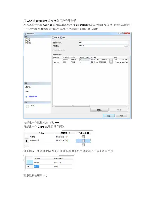
用WCF给Silverlight或WPF做用户登陆例子
本人之前一直做的网站,最近想学习Silverlight的富客户端开发,发现有些内容还是不一样的,特别是数据库访问这块,这里写个最简单的用户登陆示例
先新建一个数据库,命名为test
再新建一个Users表,里面只有两列
这里插入一条测试数据,为了方便,密码我用了明文,实际项目中请加密码使用
程序里要使用的SQL
数据库的准备就好了打开VS2010,新建项目
选Silverlight应用程序
记得勾选最下面的”启用了WCF RIA服务”
第一步,我们在WEB.CONFIG文件里加上数据库连接字符串,因为我在程序里用到了SQL助手类
在WEB宿主程序里添加WCF服务
命名为:DBService.svc
双击进入DBService.svc.cs文件
改写DoWork()方法成下面的样子
到这里,我们的WCF就完成了.别忘了重启生成程序
现在我们在Silverlight程序里添加服务引用
点发现即可
把命名空间改为DBService,即添加完成!
在默认的MainPage.xaml里,创建如下内容
双击登陆,进入CS代码编辑器,键入以下内容
再纺编译程序,按F5运行!。
Sliverlight简介微软Silverlight是一个跨浏览器、跨客户平台的技术,能够设计、开发和发布有多媒体体验与富交互(RIA,Rich Interface Application)的网络交互程序。
Silverlight能创建一种具有很高艺术性的应用程序,具有以下的特点:a)一种跨浏览器、跨平台的技术b)无论在哪运行,都能提供一致的用户体验。
c)它的视频和音频流,视频质量无论从移动设备还是桌面浏览器都是720p HDTV video模式。
d)用户可在浏览器中直接对其进行控制,可以拖动、翻转、放大的图片。
e)它读取数据并且更新外观,但不会通过刷新整体页面来打断f)用户操作。
Silverlight将多种技术结合到一个开发平台,可以在其中选择符合需求的合适的工具和编程语言。
SilverLight提供了如下的特性:1)WPF和XAML。
2)对于JavaScript的扩展。
3)跨浏览器,跨平台的支持。
4)与现存应用程序的集成。
5)可访问.NET Framework编程模型和相关工具。
6)LINQ。
Silverlight包含集成查询(LINQ)语言。
7)如果已经使用,可以将Silverlight集成到熟悉的服务器和客户端功能。
开发工具:A.可以使用已经具有的技能和熟悉的工具来创建基于Silverlight的应用程序,在Web页面中,既可以使用HTML,也可以使用Silverlight的WPF元素,和HTML一样,在Web应用程序中XAML同样可以使用声明的标记来创建用户界面,不同的是,XAML提供了更强大的元素。
B.可以使用强大的Visual Studio 2008 创建Silverlight应用。
(Silverlight在Visual Studio 2008 的IDE中作为一个插件而得到支持。
)同样Visual Studio为Silverlight提供了开发工具,比如.NET Framework中已经为创建应用程序提供的强大的编辑器、项目管理、调试等等。
office阻止激活silverlight控件的解决方法
要解决Office阻止激活Silverlight控件的问题,您可以尝试以下步骤:
1. 检查Silverlight版本:确保您安装了最新版本的Silverlight,并且与您使用的Office版本兼容。
2. 更新Office设置:打开Office应用程序(如Word或Excel),点击"文件"选项卡,然后选择“选项”或“首选项”。
在出现的窗口中,找到“信任中心”或“安全中心”选项,并点击进入。
3. 添加信任站点:在信任中心或安全中心中,找到“受信任的站点”或“受信任的位置”,然后点击“站点”按钮。
在弹出的对话框中,点击“添加”按钮,并输入包含Silverlight 应用程序的网站地址。
4. 启用ActiveX和插件:在信任中心或安全中心中,找到“ActiveX设置”或“插件设置”,然后确保已启用相应的选项。
检查是否启用了Silverlight相关的ActiveX控件和插件。
5. 重新启动Office应用程序:关闭并重新打开Office应用程序,以使更改生效。
这些步骤应该有助于解决Office阻止激活Silverlight控件的问题。
如果问题仍然存在,请确保您已按照正确的步骤进行操作,并考虑参考Microsoft官方文档或咨询相关技术支持人员。
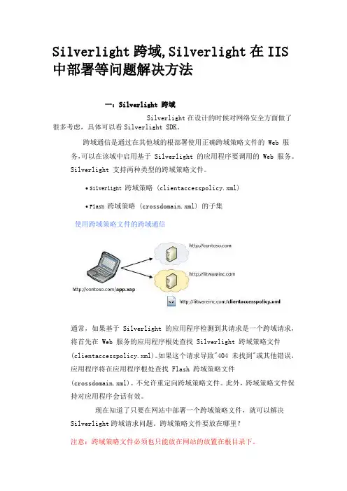
Silverlight跨域,Silverlight在IIS 中部署等问题解决方法一:Silverlight 跨域Silverlight在设计的时候对网络安全方面做了很多考虑,具体可以看Silverlight SDK。
跨域通信是通过在其他域的根部署使用正确跨域策略文件的 Web 服务,可以在该域中启用基于 Silverlight 的应用程序要调用的 Web 服务。
Silverlight 支持两种类型的跨域策略文件。
∙ Silverlight 跨域策略 (clientaccesspolicy.xml)∙ Flash 跨域策略 (crossdomain.xml) 的子集使用跨域策略文件的跨域通信通常,如果基于 Silverlight 的应用程序检测到其请求是一个跨域请求,将首先在 Web 服务的应用程序根处查找 Silverlight 跨域策略文件(clientaccesspolicy.xml)。
如果这个请求导致"404 未找到"或其他错误,应用程序将在应用程序根处查找 Flash 跨域策略文件(crossdomain.xml)。
不允许重定向跨域策略文件。
此外,跨域策略文件保持对应用程序会话有效。
现在知道了只要在网站中部署一个跨域策略文件,就可以解决Silverlight跨域请求问题。
跨域策略文件要放在哪里?注意:跨域策略文件必须也只能放在网站的放置在根目录下。
clientaccesspolicy.xml配置:<?xml version="1.0" encoding="utf-8"?><access-policy><cross-domain-access><policy><allow-from><domain uri="*"/></allow-from><grant-to><resource path="/"include-subpaths="true"/></grant-to></policy></cross-domain-access></access-policy>crossdomain.xml配置:<?xml version="1.0"?><cross-domain-policy><allow-access-from domain="*" /></cross-domain-policy>二:Silverlight 在IIS 部署用silverlight开发的程序,部署到IIS 上,会经常弹出“Sys.InvalidOperationException: InitializeError error#2104 in control 'Xaml1': 无法下载 Silverlight 应用程序。
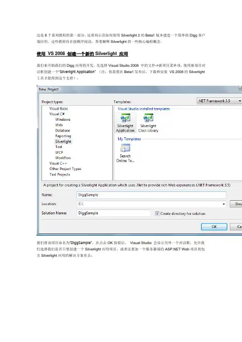
这是8个系列教程的第一部分,这系列示范如何使用Silverlight 2的Beta1版本建造一个简单的Digg客户端应用。
这些教程旨在按顺序阅读,帮着解释Silverlight的一些核心编程概念。
使用VS 2008 创建一个新的Silverlight 应用我们来开始我们的Digg应用的开发,先选择Visual Studio 2008 中的文件->新项目菜单项,使用新项目对话框创建一个“Silverlight Application” (注:你需要在Beta1发布后,下载和安装VS 2008的Silverlight 工具才能得到这个支持):我们将该项目命名为“DiggSample”。
在点击OK按钮后,Visual Studio 会显示另外一个对话框,允许我们选择我们是否只要创建一个Silverlight应用项目,或者还要加一个服务器端的 Web项目到包含Silverlight应用的解决方案里去:在这个例程里,我们将选择还要添加一个 Web Application 项目到解决方案里去,并将它命名为“DiggSample_WebServer”。
在点击OK之后,Visual Studio 会为我们创建一个解决方案,里面包含一个Silverlight 客户端应用和一个 web 服务器端应用:如果我们做一次编译的话,Visual Studio 会自动把编译好的Silverlight 应用拷贝到我们的web服务器项目中去,不需要手工的步骤或配置。
VS为我们创建的默认的web服务器项目包含一个网页和一个静态的HTML网页,我们可以用来运行和测试其中的Silverlight应用。
注:Silverlight应用可用于任何web服务器(包括Linux上的Apache),宿主于静态HTML文件或者任何服务器端生成的网页(包括PHP, Java, Python, Ruby等等)中。
在这个Digg样例中,我们不会写任何服务器端的代码,而是将使用Silverlight的跨域networking功能,来直接访问Digg服务的API。
转载:搭建Silverlight5中⽂开发环境注:我参考原⽂配置了 Silverlight 的开发环境,但是原⽂的图⽚不能显⽰了,这⾥转载⼀下,顺便配上图⽚。
Silverlight 5已于美国时间2011年12⽉9⽇正式发布,其在 Silverlight 4 的基础上新增了 40 多个新功能,完善了媒体⽀持并提供了更加丰富了⽤户界⾯。
这个版本带来了很多改进,⼤家可以通过了解详情,或者点击查看来⾃Pete Brown的多个视频介绍。
下⾯是对Silverlight 5新增功能的简要总结:强数据绑定功能,包括上级绑定、隐式数据模板、⾃定义标签扩展等新增3D图形类库,主要引⼊轻量级XNA 3D功能,该框架⽬前是XBOX游戏的主要开发框架,这也使得3D图形可以轻松地在Web⽹页中呈现改进多媒体功能,包括使⽤XNA的声效库、⽀持H.264媒体硬件解码、变速播放、遥控器的按键⽀持(主要针对Live TV)等增强⽂本功能,包括⽂本清晰度优化、⽂本块间漂移、⽮量打印等新增与操作系统的集成,包括⽀持P/Invoke调⽤外部程序、多窗体、在完全信任模式下⽆限制的⽂件系统访问、⽀持SaveFileDialog 和Ope n FileDialog的默认⽂件名、64位浏览器⽀持等优化整体性能,包括⽹络延迟的改进、使⽤TPL并⾏任务、解析器的性能改进、为改善启动时间的多核⼼JIT等增强控件,包括双击与多击的⽀持、加⼊PivotViewer、ComboBox增强等提⾼开发效率,包括XAML调试与数据绑定调试、团队测试的⽀持等现在,Silverlight开发者可以点击下载正式版和(12⽉版)。
可惜的是⽬前官⽅只发布了英⽂版开发包,按照惯例中⽂版⼀般要等到3-5个⽉之后才会发布,如果您使⽤的Visual Studio 2010是中⽂版,在安装时会出现语⾔不符的提⽰,但我们有办法将英⽂版开发包安装到中⽂开发环境中。
下⾯是如何搭建Silverlight 5中⽂开发环境的具体步骤:1.⾸先确认您的Visual Studio 2010已经升级到SP12.解压下载下来的Silverlight5_Tools.exe(winrar 或者7-zip均可);3.在解压后的⽬录中,打开ParameterInfo.xml,替换所有1033为2052,保存;4.运⾏同⽬录下SPInstaller.exe 安装Silverlight5 Tools;5.通常装完后,在VS中新建项⽬仍然不能使⽤Silverlight5,提⽰需要安装Silverlight4 Tools,此时需要修改注册表,在HKEY_LOCAL_MACHINE\SOFTWARE\Microsoft\VisualStudio\10.0\Setup\VS\BuildNumber下,将 "2052" 的值修改为 "10.0.30319",然后安装Silverlight 4 Tools中⽂版程序(可以到下载);不过,在我这⾥,安装完成之后就已经没有问题了。
个人分享sliverlght调用用MyXls生成Excel报表用MyXls生成Excel报表以下是人根据资料整理出来的经验:MyXls是用C#开源项目,可以应用于 或者 .net应用程序上。
它根据微软公开的Excle文档格式文件(BIFF),以二进制格式直接生成excel文档,支持Excel versions 97 - 2007. 。
这意味着可以不用在服务器上安装office就能够以excle格式输出数据库中存储的数据了。
这对于许多项目来说都是很有用的。
目前MyXls已经实现了单元格(cell)的格式设置,包括文本颜色、文本大小、字体、单位格边框、底色、列宽、行高,合并单元格,多个sheet页等功能。
目前MyXls还不支持在excel文档中生成对象(如、文本框、按钮等)。
MyXls主页称即将实现对excel文件的读取功能,个人认为读取的功能的用处还不是很多使用很方便,下载org.in2bits.MyXls.dll,可以直接打开以下网址下载:/down/2026623/kevin2y引入命名空间即可using org.in2bits.MyXls;using org.in2bits.MyXls.ByteUtil;下面直接进入代码(设置导出一个excel文件单个sheet的):private void ExcelExport(IList< LineLossInfo > lossListExcel){XlsDocument xls = new XlsDocument();xls.FileName = "LineLossMonthDetail.xls";//指定文件名Worksheet sheet = xls.Workbook.Worksheets.Add("LineLossMonthDetail");#region 设置各数据列的大小ColumnInfo colInfo1 = new ColumnInfo(xls, sheet);colInfo1.ColumnIndexStart = 0;colInfo1.ColumnIndexEnd = 1;colInfo1.Width = 15 * 256;sheet.AddColumnInfo(colInfo1);ColumnInfo colInfo2 = new ColumnInfo(xls, sheet);colInfo2.ColumnIndexStart = 2;colInfo2.ColumnIndexEnd = 2;colInfo2.Width = 15 * 256;sheet.AddColumnInfo(colInfo2);ColumnInfo colInfo3 = new ColumnInfo(xls, sheet);colInfo3.ColumnIndexStart = 3;colInfo3.ColumnIndexEnd = 3;colInfo3.Width = 15 * 256;sheet.AddColumnInfo(colInfo3);ColumnInfo colInfo4 = new ColumnInfo(xls, sheet);colInfo4.ColumnIndexStart = 4;colInfo4.ColumnIndexEnd = 4;colInfo4.Width = 15 * 256;sheet.AddColumnInfo(colInfo4);ColumnInfo colInfo5 = new ColumnInfo(xls, sheet);colInfo5.ColumnIndexStart = 5;colInfo5.ColumnIndexEnd = 5;colInfo5.Width = 32 * 256;sheet.AddColumnInfo(colInfo5);#endregionCells cells = sheet.Cells;#region 合并单元格,得到报表标题MergeArea maTitle = new MergeArea(1, 2, 1, 6);sheet.AddMergeArea(maTitle);XF xfTitle = xls.NewXF();xfTitle.HorizontalAlignment = HorizontalAlignments.Centered;xfTitle.VerticalAlignment = VerticalAlignments.Centered;xfTitle.Font.FontName = "宋体";xfTitle.Font.Height = 16 * 20;xfTitle.Font.Bold = true;cells.Add(1, 1, divDataHeader.InnerText, xfTitle);#endregionMergeArea maTime1 = new MergeArea(3, 3, 1, 6);sheet.AddMergeArea(maTime1);XF xfTopBar = xls.NewXF();xfTopBar.Font.FontName = "宋体";cells.Add(3, 1, divDataCondition.InnerText, xfTopBar);#region 设置Excel数据列标题的格式XF xfDataHead = xls.NewXF();xfDataHead.HorizontalAlignment = HorizontalAlignments.Centered; xfDataHead.VerticalAlignment = VerticalAlignments.Centered;xfDataHead.Font.FontName = "宋体";xfDataHead.Font.Bold = true;eBorder = true;xfDataHead.BottomLineStyle = 1;xfDataHead.BottomLineColor = Colors.Black;xfDataHead.TopLineStyle = 1;xfDataHead.TopLineColor = Colors.Black;xfDataHead.LeftLineStyle = 1;xfDataHead.LeftLineColor = Colors.Black;xfDataHead.RightLineStyle = 1;xfDataHead.RightLineColor = Colors.Black;#endregion#region 添加列标题cells.Add(4, 1, "日期", xfDataHead);cells.Add(4, 2, "供电量", xfDataHead);cells.Add(4, 3, "用电量", xfDataHead);cells.Add(4, 4, "损失量", xfDataHead);cells.Add(4, 5, "损失率", xfDataHead);cells.Add(4, 6, "说明", xfDataHead);#endregion#region 设置各数据列的格式XF xfData = xls.NewXF();xfData.Font.FontName = "宋体";eBorder = true;xfData.BottomLineStyle = 1;xfData.BottomLineColor = Colors.Black;xfData.TopLineStyle = 1;xfData.TopLineColor = Colors.Black;xfData.LeftLineStyle = 1;xfData.LeftLineColor = Colors.Black;xfData.RightLineStyle = 1;xfData.RightLineColor = Colors.Black;#endregion#region 填充数据int i = 5;//从第五行开始为数据行double provideTotal = 0;double useTotal = 0;double lossTotal = 0;foreach(LineLossInfo lossItem in lossListExcel){cells.Add(i,1,lossItem.Date,xfData);if (Double.IsNaN(lossItem.ProvideValue))cells.Add(i, 2, "-", xfData);else{cells.Add(i, 2, lossItem.ProvideValue, xfData);provideTotal += lossItem.ProvideValue;}if (Double.IsNaN(eValue))cells.Add(i, 3, "-", xfData);elsecells.Add(i, 3, eValue, xfData);useTotal += eValue;}if (Double.IsNaN(lossItem.LossValue))cells.Add(i, 4, "-", xfData);else{cells.Add(i, 4, lossItem.LossValue, xfData);lossTotal += lossItem.LossValue;}if(Double.IsNaN(lossItem.LossRate))cells.Add(i,5,"-",xfData);elsecells.Add(i,5,lossItem.LossRate,xfData);if(String.IsNullOrEmpty())cells.Add(i,6,"-",xfData);elsecells.Add(i,6,,xfData);i++;}//添加总计cells.Add(i, 2, "总计:", xfData);cells.Add(i, 3, provideTotal, xfData);cells.Add(i, 4, useTotal, xfData);cells.Add(i, 5, lossTotal, xfData);#endregion//发送到客户端xls.Send();}介绍完简单的,下面介绍一个excel导出多个sheet的:#region数据窗口导出EXCEL///<summary>///导出///</summary>///<param name="dw">datawindow </param>///<param name="worksheetsName">Excel Worksheets 的名字</param>private void ExportDW(DataWindow dw){progress.Message="正在导出....";progress.Show();SaveFileDialog sfd=new SaveFileDialog()DefaultExt="xls",Filter="Excel files (*.xls)|*.xls|All files (*.*)|*.*",DefaultFileName=string.Format("明细"),};if (sfd.ShowDialog() ==true){using (Stream file=sfd.OpenFile()){ExportDW(dw, file);progress.Hide();}}else{progress.Hide();return;}}///<summary>///导出///</summary>///<param name="dw">DW</param>///<param name="file">文件流</param>private void ExportDW(DataWindow dw, Stream file){try{XlsDocument xls=new XlsDocument();for (int g=0; g<gys_list.Count; g++) //循环要生成的sheet个数 {/* 个人添加的数据源dw_detail.Reset();for (int j = 0; j < dw.RowCount; j++){string gys_id = dw.GetItemStringAllowNull(j,"gys_pt_id");if (gys_id == gys_list[g].ToString()){int newrow = dw_detail.InsertRow();dw.SingleRowCopy(j,dw_detail,newrow);}}*///获取当前服务商作为sheet命名string print_quoted_compeny=dw_detail.GetItemStringAllowNull(0, "gys_pt_name");Worksheet sheet=xls.Workbook.Worksheets.Add(print_quoted_compeny);//写表头int rowCount=4; // 生成合计的位置(行)int DetailCount=5; //数据开始写的行数int headCount=0;for (int i=1; i<dw_detail.Columns.Count; i++){var item=dw_detail.Columns[i];if (item.Visibility==Visibility.Visible){headCount++;sheet.Cells.Add(4, headCount, item.Header);}}//设置表头格式#regionCells cells=sheet.Cells;XF xfhead=xls.NewXF();xfhead.HorizontalAlignment=HorizontalAlignments.Centered;xfhead.VerticalAlignment=VerticalAlignments.Centered;xfhead.Font.FontName="宋体";xfhead.Font.Height=18*20;xfhead.Font.Bold=true;MergeArea maTitle=new MergeArea(1, 1, 1, 13);sheet.AddMergeArea(maTitle);cells.Add(1, 1, tile, xfhead);cells.Add(2, 1, "询单名称");cells.Add(2, 2, print_title);cells.Add(3, 1, "报价单位");cells.Add(3, 2, print_quoted_compeny);cells.Add(2, 6, "询价单号");cells.Add(3, 6, "采购单位");cells.Add(2, 7, print_inquery_no);cells.Add(3, 7, print_);cells.Add(2, 11, "议价时间");cells.Add(2, 13, "单位:");#endregion//写明细#regionXF xf=xls.NewXF();xf.Format="@";headCount=0;rowCount+=dw_detail.DataSource.RowCount;for (int r=1; r<dw_detail.Columns.Count; r++){var item=dw_detail.Columns[r];if (item.Visibility==Visibility.Visible){headCount++;foreach (var item2in dw_detail.DataSource.Columns){if (item2.ColumnName.Equals(item.ColumnName) ||item.ColumnName.Equals("!RowNumber")){for(int i=0; i<dw_detail.DataSource.RowCount; i++) {if (item.ColumnName.Equals("!RowNumber")){sheet.Cells.Add(i+DetailCount, headCount, (i+1).ToString(), xf);}else{object temp=null;if (item2.EditMode==EditMode.DropDownListBox){temp=dw_detail.DataSource.PrimaryData[i][item.ColumnName].Display;}else{temp=dw_detail.GetItemObject(i, item.ColumnName);}if (temp==null){sheet.Cells.Add(i+DetailCount, headCount, "", xf);}else{sheet.Cells.Add(i+DetailCount, headCount, temp.ToString(), xf);}}}break;}}}}#endregion//写Foot#regionheadCount=0;if (dw_detail.GetType() ==typeof(DataWindow)){sheet.Cells.Add(rowCount+1, 1, "合计");foreach (var item in dw_detail.Columns){if(item.Visibility==Visibility.Visible&&(item.ColumnName =="SUPPLY_QTY"||item.ColumnName=="TOTAL_PRICE")){sheet.Cells.Add(rowCount+1, headCount, item.Footer); }if (item.Visibility==Visibility.Visible){headCount++;}}}#endregion}xls.Save(file);MsgBox.Show("导出完成。
Sliverlight 整理文档Sliverlight概述Microsoft silverlight 是一种跨浏览器跨平台的 .NET Framework 实现,用于 Web 生成和提供下一代媒体体验和丰富的交互式应用程序(RIA)。
Silverlight 统一了了服务器、Web 和桌面的功能。
统一了托管代码和动态语言声明性编程和传统编程以及windows Presentation Foundtion (WPF) 的功能。
Sileverlight 允许创建具有一下功能的最先进的应用程序:它是一种跨浏览器、跨平台的技术。
它在所常见的 Web浏览器中运行,包括Microsoft windows和AppleMac osx 上运行。
它由可在数秒内安装的很小的下载程序支持。
它对视频和音频进行处理。
它将视频品质调到各种环境:从移动设备到桌面浏览器以及720p HDTV 视频模式。
它包括用户可以直接在浏览器中操作(拖动、旋转、缩放)的足够清晰地图形。
它读取数据并更新显示内容,但是不通过刷新整个页面来打断用户。
应用程序可以在 web 浏览器中运行,你也可以配置应用程序,使用户可以在自己的计算机上运行该程序(浏览器外)。
Silverlight 的功能Silverlight 将多种技术组合到单个开发平台,可以允许你根据需要选择合适的工具和编程语言,功能如下:WPF和XAML。
Silverlight 包含WPF技术的一个子集,从而大大扩展了浏览器中用于创建UI的元素。
Silverlight 允许你创建沉侵式图形、动画、媒体、和其他的丰富的客户端功能,使基于浏览器UI远超单独使用 HTML提供的效果。
可扩展应用程序标记语言(XAML)提供用于创建元素的声明性语法。
对JavaScript的扩展。
Silverlight提供对浏览器脚本语言的扩展,可以控制浏览器UI,包括WPF元素。
跨浏览器支持,Silverlight可以在所有浏览器上自如运行。
现有Silverlight程序使用mvvmlight开发框架教程1孙高勇学习整理2012-03-161)创建Silverlight 应用程序。
2)添加mvvmlight引用,如果使用模板创建,会自动生成引用,而这里我们需要自己添加。
3)添加ViewModels、Locators、Models文件夹。
4)为MainWindow添加ViewModel,在解决方案浏览器中,右键ViewModel文件夹,添加新类,类名称为MainViewModel,如果安装了mvvmlight模板,选择类模板为MvvmViewModel5)添加类ViewModelLocator,我们叫它ViewModel加载器,在解决方案浏览器中,右键项目名称,添加新类,类名称为ViewModelLocator,如果安装了mvvmlight模板,选择类模板为MvvmViewModelLocator。
6)打开App.Xaml,先添加ViewModel命名控件引用,然后为ViewModelLocator添加一个全局的资源,app.xaml的内容如下:<Applicationx:Class="SilverlightApplication8.App"xmlns="/winfx/2006/xaml/presentation"xmlns:x="/winfx/2006/xaml"xmlns:d= "/expression/blend/2008"xmlns:mc="/markup-compatibility/2006"xmlns:vm="clr-namespace:SilverlightApplication8.Locators"mc:Ignorable="d"><Application.Resources><ResourceDictionary><ResourceDictionary.MergedDictionaries><ResourceDictionary Source="Assets/Styles.xaml"/></ResourceDictionary.MergedDictionaries><vm:ViewModelLocator x:Key= "Locator" d:IsDataSource= "True" /> </ResourceDictionary><!--全局 View Model 加载器--></Application.Resources></Application>7)打开MainWindow.xaml文件,首先为MainWindow设置DataContext为MainViewModel,MainWindow.xaml代码如下:<UserControlx:Class="SilverlightApplication8.MainPage"xmlns="/winfx/2006/xaml/presentation"xmlns:x="/winfx/2006/xaml"xmlns:navigation="clr-namespace:System.Windows.Controls;assembly=System.Windows.Control s.Navigation"xmlns:uriMapper="clr-namespace:System.Windows.Navigation;assembly=System.Windows.Contro ls.Navigation"xmlns:d="/expression/blend/2008"xmlns:mc="/markup-compatibility/2006"mc:Ignorable="d" d:DesignWidth="640" d:DesignHeight="480"DataContext= "{Binding Main,Source={StaticResource Locator}}">。
这是8个系列教程的第一部分,这系列示范如何使用Silverlight 2的Beta1版本建造一个简单的Digg客户端应用。
这些教程旨在按顺序阅读,帮着解释Silverlight的一些核心编程概念。
使用VS 2008 创建一个新的Silverlight 应用我们来开始我们的Digg应用的开发,先选择Visual Studio 2008 中的文件->新项目菜单项,使用新项目对话框创建一个“Silverlight Application” (注:你需要在Beta1发布后,下载和安装VS 2008的Silverlight 工具才能得到这个支持):我们将该项目命名为“DiggSample”。
在点击OK按钮后,Visual Studio 会显示另外一个对话框,允许我们选择我们是否只要创建一个Silverlight应用项目,或者还要加一个服务器端的 Web项目到包含Silverlight应用的解决方案里去:在这个例程里,我们将选择还要添加一个 Web Application 项目到解决方案里去,并将它命名为“DiggSample_WebServer”。
在点击OK之后,Visual Studio 会为我们创建一个解决方案,里面包含一个Silverlight 客户端应用和一个 web 服务器端应用:如果我们做一次编译的话,Visual Studio 会自动把编译好的Silverlight 应用拷贝到我们的web服务器项目中去,不需要手工的步骤或配置。
VS为我们创建的默认的web服务器项目包含一个网页和一个静态的HTML网页,我们可以用来运行和测试其中的Silverlight应用。
注:Silverlight应用可用于任何web服务器(包括Linux上的Apache),宿主于静态HTML文件或者任何服务器端生成的网页(包括PHP, Java, Python, Ruby等等)中。
在这个Digg样例中,我们不会写任何服务器端的代码,而是将使用Silverlight的跨域networking功能,来直接访问Digg服务的API。
我选择创建一个 web服务器项目,主要是想获得自动的部署,并且使用它内置的web服务器来做测试。
理解Silverlight应用里都有些什么在默认情形下,一个新建的Silverlight应用项目包含一个Page.xaml和一个App.xaml文件,以及与它们相关的后台(code behind )类文件(可以用VB, C#, Ruby 或Python来编写):XAML文件是XML文本文件,可以用来用声明的方式指定Silverlight 或WPF应用的用户界面。
XAML 还可更广泛地用来用声明的方式代表.NET对象。
App.xaml 文件一般用来声明譬如象画刷和样式对象这样可在整个应用中共享的资源。
App.xaml的后台Application类可用来处理应用级的事件,象Application_Startup, Application_Exit 和Application_UnhandledException。
Page.xaml 文件,在默认情形下,是在应用激活时装载的起始的UI控件。
在其中,我们可以使用UI控件来定义我们的用户界面,然后在Page的后台代码类里处理它们的事件(详见后文)。
在我们编译DiggSample项目时,在默认情形下,Visual Studio 会把代码和XAML标识编译进一个标准的 .NET 程序集文件中,然后把它和任何静态的资源(象图片或我们想要包含的静态文件)包装进硬盘上一个叫做“DiggSample.xap”的文件中去:“.xap”文件(其音发作“zap”)使用标准的 .zip压缩算法来减小客户端下载的大小。
一个“hello world”.NET Silverlight 应用(用VB或C#编写的)其大小大概为4KB。
注:Beta1版本中的一些控件是在程序集中实现的,如果使用这些控件的话,这些程序集会重新发布于应用的 .xap 文件中(会增加应用的大小,超出4KB的基底大小)。
在Digg应用中使用的所有控件将会在Beta2版和最终版的核心Silverlight下载包中,这意味着完成的应用的总下载大小大概只在6-8KB范围内(所以是非常小,下载起来非常快)。
要宿主和运行一个Silverlight 2 应用,你可以把<object>标签加到任何标准的HTML页面中(不需要JavaScript )并将其指向 .xap 文件。
Silverlight然后就会自动下载这个.xap 文件,生成实例,将其宿主于浏览器中的HTML网页中。
这是跨浏览器(Safari, FireFox, IE等),跨平台(Windows, Mac, and Linux)工作的。
HTML和测试网页(内含<object>标签,其引用指向我们的Silverlight 应用)是在我们创建项目时为我们自动添加的,这意味着我们只要点击F5编译,运行和测试就可以了。
学习如何添加控件和处理事件现在我们的Digg应用什么都不做,在运行它时,只会调出一个空白的网页。
我们可以打开项目中的Page.xaml文件来改变它,往里面加些内容:我们将开始改变网格的背景颜色,在其中声明一个Button控件。
我们将给按钮一个"x:Name"属性,设置其值为“MyButton“,这会允许我们在后台代码类中用编程的方法引用它。
我们还将设置它的Content, Width 和Height 属性:当我们运行应用时,我们的按钮将会在网页的中间出现,内含”Push Me“内容文字,象下面这样:要给我们的按钮加行为的话,我们可以给它加一个"Click"事件处理函数。
我们可以在源码视图中通过输入事件的名称来做:然后就会提示我们在我们的后台代码类中该使用的事件处理函数:然后我们可以输入一个要用的新事件处理方法的名称,或者只要点击回车键,使用默认的命名约定来命名事件处理方法:然后VS就会自动地在我们的后台代码类文件中创建一个占位的事件处理函数实现。
我们可以使用这个事件处理函数在按钮被点击时,用新的消息更新它的内容:在做完上面的改动后,我们可以重新运行应用,再次点击按钮,现在它的内容就会被更新为“Pushed!”的消息:以下的步骤在完成我们的应用之前,我们还有不少工作要做... :-)下一步,是配置我们的应用的总的UI布局结构,在其中安排更多的控件。
要做那个,就让我们跳到下一个教程《使用布局管理》。
Silverlight Tutorial Part 2: Using Layout ManagementThis is part two of eight tutorials that walk through how to build a simple Digg client application using Silverlight 2. These tutorials are intended to be read in-order, and help explain some of the core programming concepts of Silverlight. Bookmark my Silverlight 2 Reference page for more of Silverlight posts and content.<Download Code>Click here to download a completed version of this Digg client sample. </Download Code>Understanding Layout ManagementSilverlight and WPF support a flexible layout management system that enables developers and designers to easily coordinate how controls are positioned within a UI surface. This layout system supports both a fixed position model where controls are positioned using explicitcoordinates, as well as a more dynamic position model where layout and controls can be automatically sized and flowed as the browser resizes.Developers using Silverlight and WPF use layout panels to coordinate the position and resizing of controls contained within them. The built-in layout panels in Silverlight 2 include three of the most commonly used ones in WPF:∙Canvas∙StackPanel∙GridCanvas PanelThe Canvas panel is a pretty basic layout panel that supports positioning controls contained within it using explicit coordinates.You position elements in a Canvas using a XAML feature called "Attached Properties" - which allow you to specify a control's position relative to its immediate parent Canvas control's Left, Top, Right or Bottom coordinates. Attached properties are useful as they allow a parent panel to extend the property set of a control contained within it. Canvas, by defining an attached property for “Top” and ”Left” basically adds the ability to define left and top atta chment on Button (or any other UI element that is added to the Canvas), without any need to actually add a property to the Button class, or modify the Button class in any way.We could add two buttons to a Canvas container, and position them both 50 pixels from the left of the Canvas, and 50 and 150 pixels from the top using XAML like below (the Canvas.Left and Canvas.Top attributes are examples of the attached property syntax):This would then render our buttons like below:While the Canvas is useful for scenarios where the UI elements contained within it never move, it tends not to be very flexible as you add more controls into it or handle scenarios where the UI needs to resize or move. In cases like these you end up having to manually write code yourself to move things around inside the Canvas (which is a pain). A better solution for these dynamic scenarios is typically to use an alternative layout panel that has built-in semanticsto-do this for you - like the StackPanel and Grid.StackPanelThe StackPanel control is a simple layout panel that supports positioning its contained controls in either a row or column layout. StackPanels are typically used in scenarios where you want to arrange a small subsection of the UI on your page.For example, we could use the StackPanel to vertically arrange three buttons on our page using XAML markup like below:At runtime the StackPanel would then automatically arrange the Button controls in a vertical stack for us like below:We could alternatively set the "Orientation" property of the StackPanel to be "Horizontal" instead of Vertical (which is the default):This will then cause the StackPanel to automatically arrange the Button controls in a horizontal row like below:Grid PanelThe Grid control is the most flexible layout panel, and supports arranging controls in multi-row and multi-column layouts. It is conceptually similar to an HTML Table element.Unlike an HTML Table, you don't embed controls within column and row elements. Instead you specify a Grid's Row and Column definitions using <Grid.RowDefinitions> and<Grid.ColumnDefinitions> properties that are declared immediately under the <Grid> control. You can then use the XAML "Attached Property" syntax on controls contained within the grid to indicate which Grid row and column they should be populated within.For example, we could declare a Grid layout has three rows and three columns, and then position 4 buttons within it using XAML like below:The Grid layout panel would then position the Button elements for us like so:In addition to supporting absolute sizing (for example: Height="60") the Grid's RowDefinition and ColumnDefinition controls also support an AutoSizing mode (Height="Auto"), which automatically sizes the Grid or Row based on the size of the content contained within it (youcan also optionally specify maximum and minimum size constraints - which can be very useful).The Grid's Row and ColumnDefinitions also support a feature called "Proportional Sizing" - which enables the size of a Grid's Rows and Columns to be spaced proportionally relative to each other (for example: you could have the second row grow at 2x the rate of the first one).You'll find that the Grid provides a ton of power and flexibility - and it will probably be the most common layout panel control you'll end up using.Using Layout Panels to Arrange our Digg PageRemember that the goal when building our Digg sample is to create a page that looks like the one below:To create this layout we'll begin by adding a root Grid panel that has two RowDefinitions within it. The first Row will be 40 pixels high, and the second will fill the remaining space(Height="*"):Tip: Notice above how I've set the Grid's "ShowGridLines" property to "True". This will enable us to easily visualize the Row and Column boundaries within the Grid when we test it at runtime:We'll then embed a second Grid panel control as a child control within the first row of the root Grid panel container, and use it to arrange the top row (the header). We'll create three columns within it - one for the Title, one for the Search TextBox, and one for the Search Button:Once this is done we have the basic layout arrangement of our Digg search page in place:Note: As an alternative to nesting Grids, we could have alternatively had one Grid with 3 columns and 2 rows and used the ColSpan/RowSpan feature of the Grid to merge content across multiple columns (similar to how you can do this with HTML tables). I chose to use the nested Grid approach instead because I thought it would be simpler to follow along.Now that we have the layout setup all we need to-do is add controls to it.For the header row we'll use the built-in <Border> control (with a CornerRadius of 10 to get a nice rounded edge) and add some text inside it to create the Title. We'll use the <TextBox> control in the second column for the search textbox. And we'll put a search <Button> in the third column. We'll then put some placeholder text in the second row where we are later going to display the search results.Note: Below I'm embedding style information (FontSize, Colors, Margins, etc) directly on the controls. Later in this tutorial series I'll show how to use Styles to extract and encapsulate these settings in a separate file (ala CSS) which can then be re-used across the application.And now when we run our application it looks like below:Dynamically Resizing our ApplicationOne thing you might have noticed in the XAML above is that our top-level control is currently set to be a fixed width and height:When set this way our Silverlight Application will always remain that fixed size. Expand the browser and this becomes apparent:While constraining an embedded application to be a fixed size within a region of an HTML page is useful in some scenarios, for our Digg search application we really want the application experience to automatically flow and resize with the browser - just like an HTML page would.The good news is that this is easy to implement. Just remove the Width and Height attributes on the root control:Our Silverlight application will then automatically expand (or shrink) to fill the HTML container it is embedded within. Because the SilverlightTestPage.html file that we are testing our Silverlight application within hosts our Silverlight control in a HTML <div> element with a 100% width and height CSS setting on it, our Digg application will now fill the entire browser:Notice how the content within the header of the application automatically resizes and flows based on the width of the browser:When we shrink the browser, the watermark textbox and search button stay the same size because their Grid container columns are a fixed width. The <Border> control containing our "Digg Search" title automatically resizes when we shrink the browser because the Grid column it is in is configured to be Width="*".We did not need to write a single line of code to enable this layout behavior - the Grid container and the layout system took care of dynamically resizing and flowing everything for us.Next StepsWe now have the basic layout structure of our Digg application created, and have our header row defined.Our next step will be to implement the searching behavior of the application - and have it actually retrieve story content from when an end-user using the application searches on a topic.To-do that let's jump to our next tutorial: Using Networking to Retrieve Data and Populate a DataGrid.Silverlight Tutorial Part 3: Using Networking to Retrieve Data and Populate a DataGridThis is part three of eight tutorials that walk through how to build a simple Digg client application using Silverlight 2. These tutorials are intended to be read in-order, and help explain some of the core programming concepts of Silverlight. Bookmark my Silverlight 2 Reference page for more of Silverlight posts and content.<Download Code>Click here to download a completed version of this Digg client sample. </Download Code>Using Networking to Retrieve Digg StoriesSilverlight 2 has built-in networking APIs that enable Silverlight clients to call remote REST, SOAP/WS*, RSS, JSON and XML HTTP services. Silverlight 2 also includes a built-in sockets API (.Sockets) that enables Silverlight clients to communicate overnon-HTTP protocols (ideal for scenarios like chat servers, etc).Cross Domain Network AccessSilverlight 2 applications can always call back to their "origin" server when making network calls (meaning they can call URLs on the same domain that the application was downloaded from). Silverlight 2 applications can also optionally make cross-domain network calls (meaning they can call URLs on different domains from where the application was downloaded from) when the remote web server has an XML policy file in place that indicates that clients are allowed to make these cross-domain calls.Silverlight 2 defines an XML policy file format that allows server administrators to precisely control what access a client should have. Silverlight 2 also honors the default Flash crossdomain policy file format - which means that you can use Silverlight 2 to call any existing remote REST, SOAP/WS*, RSS, JSON or XML end-point on the web that already enables cross-domain access for Flash clients. has a pretty cool set of Digg APIs that they publish over HTTP. Because they have a Flash cross-domain policy file in place on their server, we can call them directly from our Silverlight Digg client application (and not require us to tunnel back through our web-server to reach their APIs). Topic Feed APIWe want to enable end-users using our application to type in a search topic (for example: "Programming") and then click the "Search" button to pull back the top stories from that match it:We can use the List Stories REST API feed API to-do this. It takes a topic parameter in its URL (for example: GET /stories/topic/programming), and then returns back an XML payload of Digg stories that match that topic. Click here to see an example of what this XML looks like.Using .WebClient to Asynchronously Call the Digg REST FeedWhen the SearchButton is clicked above, we'll handle its "Click" event, retrieve the topic string to search for from the TextBox control, and then initiate a network call to Digg to retrieve the XML listing for that topic.Silverlight includes the WebClient helper class within the namespace (this is also in the full .NET Framework). We can use this class to asynchronously download content from a URL. The benefit of downloading our Digg stories asynchronously is that our UI will not block or become unresponsive while waiting on the remote server (allowing us to have a very fluid user experience).All we need to-do to perform an async download with the WebClient class is to register a "DownloadStringCompleted" event handler method that will be invoked once the requested content has been downloaded, and then call the WebClient.DownloadStringAsync(url) helper method to initiate the download:And with the code above we can now asynchronously retrieve a string of XML data that contains the Digg stores about any topic a user wants.Using LINQ to XML to Parse Digg XML Stories into Story ClassesNow that we can retrieve an XML snippet back of Digg story data, our next step will be to parse and convert it into "DiggStory" objects that we can manipulate and databind our controls against.We'll do this by first defining a "DiggStory" class that has properties that map to the XML content from Digg (we'll take advantage of the new C# "automatic properties" feature to-do this):We can then use LINQ (which is built-into Silverlight 2) and LINQ to XML (which is an extra library we can include with our Silverlight application) to easily parse and filter the XML document that was returned from Digg, and translate it into a sequence of "DiggStory" objects using the code below:Notice above how we now have strongly typed DiggStory objects from our XML that we can work against.Displaying our Digg Stories in a DataGrid ControlWe'll use the Silverlight DataGrid control to display the Digg stories in our application. To enable this we'll reference the Silverlight Data controls assembly, and then replace our previous "Todo" text on the page with a DataGrid control declaration (note: you can double click on the "datagrid" control in the toolbox to automatically add one to the page):The DataGrid allows you to explicitly configure column declarations and display types (for maximum control). Alternatively if you do not specify these, the DataGrid control will usereflection on its datasource to create default columns for you based on the schema of your objects.We'll then update our code-behind class to programmatically bind the "ItemSource" property of the DataGrid to the sequence of stories we receive back from Digg when the search button is clicked:And now when we run our Silverlight application and do a search, we'll see a listing oflive topic story data pulled from Digg:Silverlight Tutorial Part 4: Using Style Elements to Better Encapsulate Look and FeelThis is part four of eight tutorials that walk through how to build a simple Digg client application using Silverlight 2. These tutorials are intended to be read in-order, and help explain some of the core programming concepts of Silverlight. Bookmark my Silverlight 2 Reference page for more of Silverlight posts and content.<Download Code>Click here to download a completed version of this Digg client sample. </Download Code>Using Style Elements to Better Encapsulate Look and FeelWPF and Silverlight support a Style mechanism that allows us to encapsulate control property values as a reusable resource. We can store these style declarations in separate files from our pages, and re-use them across multiple controls and pages in an application (as well as re-use them across multiple applications). This is conceptually similar to using CSS with HTML when doing basic customization scenarios.Note: In addition to defining basic property settings (Color, Font, Size, Margins, etc), styles in WPF and Silverlight can also be used to define and re-use Control Templates - which enable super rich skinning and adaptation of control structure (and support customization scenarios not possible with CSS in HTML today). I discuss Control Templates in Part 7 of this series.For our Digg sample application we'll define our Style declarations within the App.xaml file of our project. This will enable them to be reused across all pages and controls in the application:Let's start by encapsulating styles for the <Border> control (and the <TextBlock> title contained within it) of our Digg page:We can create two Style elements within our App.xaml file that encapsulate the <Border> and <TextBlock> settings we were previously declaring inline using the markup below:Note how we are giving each Style a unique "Key" value above. We can then update our<Border> and <TextBlock> controls to reference the Styles using these keys. We'll be using a XAML feature called "markup extensions" to do this. Markup extensions are used when there are non-literal values that we want to set (another example of where we'll use this feature is with databinding expressions).When we update the other controls within our Page.xaml file to use styles as well, we are left with a file that looks like below:Encapsulating the style settings this way allows developers to better focus on the behavior semantics of the application, and also enables us to re-use styles across other controls/pages we build.Next StepsNow that we've cleaned up the markup of our Page.xaml file using Style references, let's go one step further and customize the appearance of our Story data more.To-do that let's jump to our next tutorial: Using the ListBox and Databinding to Display List Data.The Silverlight Datagrid supports all the standard features you expect with a client-side grid control: two way in-place editing, selection, scrolling, column resizing, column re-ordering, etc. It also supports auto-flow layout, which means it can dynamically expand or shrink to fill the content container it is in. The DataGrid also has a rich templating model that allows you to customize both the display and editing of column data.Next StepsWe can now retrieve Digg story data from and display the story data within our application.Our next step will be to go back to our Page.xaml markup and remove the in-line style declarations we are currently using there.To-do that let's jump to our next tutorial: Using Style Elements to Better Encapsulate Look and Feel.Silverlight Tutorial Part 5: Using the ListBox and DataBinding to Display List DataThis is part five of eight tutorials that walk through how to build a simple Digg client application using Silverlight 2. These tutorials are intended to be read in-order, and help explain some of the core programming concepts of Silverlight. Bookmark my Silverlight 2 Reference page for more of Silverlight posts and content.<Download Code>Click here to download a completed version of this Digg client sample. </Download Code>Displaying our Digg Stories using the ListBox and DataBindingPreviously we've been using the DataGrid control to display our Digg stories. This works great when we want to display the content in a column format. For our Digg application, though, we probably want to tweak the appearance a little more and have it look less like a DataGrid of stories and more like a List of them. The good news is that this easy - and it doesn't require us to change any of our application code to accomplish this.We'll start by replacing our DataGrid control with a <ListBox> control. We'll keep the control name the same as before ("StoriesList"):When we run our application again and search for stories, the ListBox will display the following results:You might be wondering - why is each item "DiggSample.DiggStory"? The reason for this is because we are binding DiggStory objects to the ListBox (and the default behavior is to call ToString() on them). If we want to display the "Title" property of the DiggStory object instead, we can set the "DisplayMemberPath" property on the ListBox:When we do this the Title will be what is displayed in the ListBox:If we want to show more than one value at a time, or customize the layout of each item more, we can override the ListBox control's ItemTemplate and supply a custom DataTemplate. Within this DataTemplate we can customize how each DiggStory object is displayed.For example, we could display both the DiggStory Title and NumDiggs value using a DataTemplate like below.We can databind any public properties we want from our DiggStory object within the DataTemplate. Notice above how we are using the {Binding Path=PropertyName} syntax to accomplish this with the two TextBlock controls.With the above DataTemplate in place, our ListBox will now display its items like below:Let's then go one step further and change our DataTemplate to the one below. This DataTemplate uses two StackPanels - one to stack row items horizontally, and one to stack some textblocks together vertically:The above DataTemplate causes our ListBox to display items like the screen-shot below:when we define the following Style rules in our App.xaml (note how we are using a LinearGradientBrush to get the nice yellow gradient background on the DiggPanel):One important thing to notice about our ListBox - even though we have customized what the items in it look like, it still automatically provides support for hover and item selection semantics. This is true both when using the mouse and when using the keyboard (up/down arrow keys, home/end, etc):The ListBox also supports full flow resizing - and will provide automatic scrolling of our custom content when necessary (notice how the horizontal scroll bar appears as the window gets smaller):Next StepsWe've now switched our data visualization to be List based, and cleaned up the content listing of it.Let's now complete the last bits of the functionality behavior in the application - and implement a master/details workflow which allows end-users to drill into the specifics of a story when they select an article from the list. To-do that let's jump to our next tutorial: Using User Controls to Implement Master/Detail Scenarios.Silverlight Tutorial Part 6: Using User Controls to Implement Master/Detail ScenariosThis is part six of eight tutorials that walk through how to build a simple Digg client application using Silverlight 2. These tutorials are intended to be read in-order, and help explain some of the core programming concepts of Silverlight. Bookmark my Silverlight 2 Reference page for more of Silverlight posts and content.<Download Code>Click here to download a completed version of this Digg client sample. </Download Code>Understanding User ControlsA fundamental design goal of Silverlight and WPF is to enable developers to be able to easily encapsulate UI functionality into re-usable controls. Developers can implement new custom controls by deriving a class from one of the existing Control classes (either a Control base class or from a control like TextBox, Button, etc). Alternatively they can create re-usable User Controls - which make it easy to use a XAML markup file to compose a control's UI, and which are easy to implement.For our Digg application, we want to implement a master/details scenario where the application allows an end-user to search on a topic, populate a list of stories related to that topic, and then enable them to select a story to bring up details about it. For example, selecting the below story in the list:would bring up this detailed view about the story:We are going to implement this details view by building a "StoryDetailsView" UserControl that we'll display when a story is selected from our ListBox.Creating a StoryDetailsView User ControlWe'll start by right-clicking on our DiggSample project node in Visual Studio and by selecting "Add New Item". This will bring up a new item dialog. We'll select the UserControl item template and name the new control we want to build "StoryDetailsView":This will add a new UserControl with this name to our DiggSample project:Building a Basic Modal Dialog Using a User ControlWe are going to use our StoryDetailsView control to effectively display a dialog containing story details. When our story details user control displays we are going to want to have it appear on top of the other content on the page, and ensure that an end-user can't do other things with the page until they close the details view.。