英语图表作文写作及范文
- 格式:ppt
- 大小:680.50 KB
- 文档页数:52
英语写作大赛图表作文在英语写作大赛中,图表作文是一个常见的题型,它要求参赛者根据图表提供的数据进行分析,并撰写一篇有逻辑、有条理的文章。
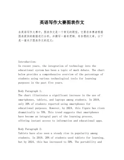
以下是一篇关于图表作文的范文:Introduction:In recent years, the integration of technology into the educational system has been a topic of much debate. The chart below provides a comprehensive overview of the percentage of students using various technological tools for learning purposes in the past five years.Body Paragraph 1:The chart illustrates a significant increase in the use of smartphones, tablets, and laptops among students. In 2019, only 30% of students reported using smartphones for educational purposes. However, by 2024, this figure has risen dramatically to 70%. This trend suggests that smartphones have become an integral part of the learning process,offering instant access to information and educational apps.Body Paragraph 2:Tablets have also seen a steady rise in popularity among students. In 2019, 20% of students used tablets for learning, but by 2024, this has increased to 50%. The portability andversatility of tablets make them an attractive option for students who prefer a more interactive and dynamic learning experience.Body Paragraph 3:While the use of laptops has not seen as dramatic an increase as smartphones and tablets, there has still been a notable uptick. The percentage of students using laptops for educational purposes has grown from 40% in 2019 to 60% in 2024. Laptops remain a staple for more traditional forms of learning, such as writing essays and conducting research.Conclusion:The data presented in the chart clearly indicates that technology plays an increasingly significant role in education. The rise in the use of smartphones, tablets, and laptops demonstrates a shift towards a more technologically integrated learning environment. As educators and policymakers, it is crucial to harness this trend to enhance the educational experience and prepare students for the digital age.在撰写图表作文时,重要的是要确保文章结构清晰,包括引言、主体段落和结论。
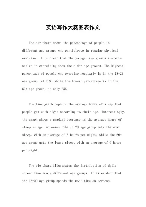
英语写作大赛图表作文The bar chart shows the percentage of people indifferent age groups who participate in regular physical exercise. It is clear that the younger age groups are more active in exercising than the older age groups. The highest percentage of people who exercise regularly is in the 18-29 age group, at 75%, while the lowest percentage is in the60+ age group, at only 25%.The line graph depicts the average hours of sleep that people get each night according to their age. Interestingly, the graph shows a gradual decrease in the average hours of sleep as age increases. The 18-29 age group gets the most sleep, with an average of 8 hours per night, while the 60+ age group gets the least sleep, with an average of 6 hours per night.The pie chart illustrates the distribution of daily screen time among different age groups. It is evident that the 18-29 age group spends the most time on screens,accounting for 40% of the total daily screen time. On the other hand, the 60+ age group spends the least time on screens, making up only 10% of the total daily screen time.The table presents the percentage of people in various age groups who report feeling stressed on a daily basis. The data shows that the 30-39 age group has the highest percentage of people reporting daily stress, at 50%, while the 60+ age group has the lowest percentage, at 20%.In conclusion, the data from these charts and graphs highlights the differences in lifestyle and habits across different age groups. It is clear that younger age groups tend to be more active, get more sleep, spend more time on screens, and report less daily stress compared to older age groups.。
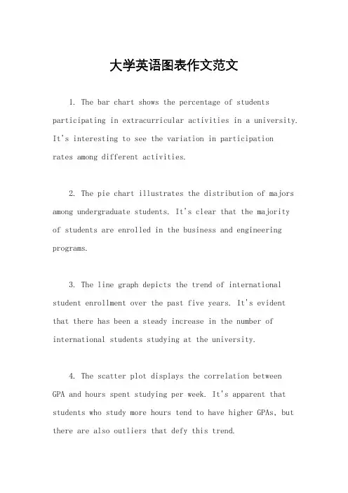
大学英语图表作文范文1. The bar chart shows the percentage of students participating in extracurricular activities in a university. It's interesting to see the variation in participationrates among different activities.2. The pie chart illustrates the distribution of majors among undergraduate students. It's clear that the majorityof students are enrolled in the business and engineering programs.3. The line graph depicts the trend of international student enrollment over the past five years. It's evident that there has been a steady increase in the number of international students studying at the university.4. The scatter plot displays the correlation between GPA and hours spent studying per week. It's apparent that students who study more hours tend to have higher GPAs, but there are also outliers that defy this trend.5. The table presents the average class sizes in various departments. It's notable that classes in the humanities department tend to be smaller compared to those in the science and technology departments.6. The heatmap indicates the peak times of library usage throughout the day. It's clear that the library is most crowded during the late afternoon and evening hours.7. The radar chart showcases the skills and competencies developed by students through internships.It's impressive to see the diverse range of skills that students have acquired in areas such as communication, problem-solving, and teamwork.8. The histogram displays the distribution of student grades in a particular course. It's evident that the majority of students fall within the average grade range, with a smaller number of students achieving high or low grades.9. The box plot illustrates the variability in student performance on a standardized test. It's interesting to see the range of scores, as well as any outliers that may indicate exceptional performance or areas for improvement.10. The area chart shows the allocation of university funding across different departments. It's clear that a significant portion of the budget is allocated to research and development, reflecting the university's commitment to academic excellence.。
英语图表作文精选10篇四级英语作文图表类篇一图片模板:It seems to me that the cartoon / drawing issending a message about ____________(图画内容),which reveals ____________(稍作评价).In myperspective of view, ____________ (表明个人观点)。
Apparently, ____________(将个人观点和图片内容相结合,得出观点。
)For one thing, ____________(从社会角度论证).For another thing, ____________(从个人角度说明).For example, ____________(自己、朋友或他人,只要自己知道或听过的例子).Last but not least, ____________(从反面角度谈论).Asa result, the drawer of the illustration is urging us to _____________(建议或措施).Only inthis way can we ____________(展望结果).In conclusion / To my understanding, ____________(再次表明观点或态度).We should____________(进一步说明个人的观点).图表模板:According to the bar chart / pie chart / line graph displays the changes in the numberof____________(图表整体趋势).There was an increase in ____________(图表细节).At the point of ____________, ____________reaches its peak value of ____________(数据或变化).What has caused these changes? There are mainly three reasons.Firstly, ____________ (原因一).Secondly, ____________(原因二).The number of ____________ increased overthe period.____________ rose by _________ from ________ to ________________.Andthere were____________.Finally, ____________(最后一个原因).In conclusion / We can safely draw the conclusion that ____________(结论).Therefore, ____________(进一步谈论更多个人想法).英语四级图表类作文篇二In the morning, the clear sky, father-in-law of the sun was inlaid with a golden halo. A group of happy little magpies chirped in the branches, as if holding a singing contest, very lively!Noon is the hottest time of the day. The sun gave out a blazing light, as if to roast the earth. There was no one in the street. Everyone hid in the house to blow the air conditioner, for fear that they would be cooked outside. At this time, the little magpie on the tree also became quiet, they all hide in the deep leaves of the nap. Only the indefatigable cicada was still shouting “hot, hot.。

雅思英语图表作文范文第1篇A类雅思各类图表作文要点及范文一.曲线图解题关键1曲线图和柱状图都是动态图,解题的切入点在于描述趋势。
2在第二段的开头部分对整个曲线进行一个阶段式的总分类,使写作层次清晰,同时也方便考官阅卷。
接下来再分类描述每个阶段的specifictrend,同时导入数据作为分类的依据。
3趋势说明。
即,对曲线的连续变化进行说明,如上升、下降、波动、持平。
以时间为比较基础的应抓住“变化”:上升、下降、或是波动。
题中对两个或两个以上的变量进行描述时应在此基础上进行比较,如变量多于两个应进行分类或有侧重的比较。
4极点说明。
即对图表中最高的、最低的点单独进行说明。
不以时间为比较基础的应注意对极点的描述。
5交点说明。
即对图表当中多根曲线的交点进行对比说明。
6不要不做任何说明就机械地导入数据,这不符合雅思的考试目的。
曲线图常用词汇动词—九大运动趋势一:表示向上:increase,rise,improve,grow,ascend,mount,aggrandize,goup,climb, take off, jump,shoot up暴涨,soar,rocket, skyrocket雅思英语图表作文范文第2篇It is said that countries are becoming similar to each other because of the global spread of the same products, which are now available for purchase almost anywhere. I strongly believe that this modern development is largely detrimental to culture and traditions worldwide.A country’s history, language and ethos are all inextricably bound up in its manufactured artefacts. If the relentless advance of international brands into every corner of the world continues, these bland packages might one day completely oust the traditional objects of a nation, which would be a loss of richness and diversity in the world, as well as the sad disappearance of t he manifestations of a place’s character. What would a Japanese tea ceremony be without its specially crafted teapot, or a Fijian kava ritual without its bowl made from a certain type of tree bark?Let us not forget either that traditional products, whether these be medicines, cosmetics, toy, clothes, utensils or food, provide employment for local people. The spread of multinational products can often bring in its wake a loss of jobs, as people urn to buying the new brand,perhaps thinking it more glamorous than the one they are used to. This eventually puts old-school craftspeople out of work.Finally, tourism numbers may also be affected, as travelers become disillusioned with finding every place just the same as the one they visited previously. To see the same products in shops the world over is boring, and does not impel visitors to open their wallets in the same way that trinkets or souvenirs unique to the particular area too.Some may argue that all people are entitled to have access to the same products, but I say that local objects suit local conditions best, and that faceless uniformity worldwide is an unwelcome and dreary prospect.Heres my full answer:The line graphs show the average monthly amount that parents in Britain spent on their children’s s porting activities and the number of British children who took part in three different sports from 2008 to is clear that parents spent more money each year on their children’s participation in sports over the six-year period. In terms of the number of children taking part, football was significantly more popular than athletics and 2008, British parents spent an average of around £20 per month on their children’s sporting activities. Parents’ spending on children’s sports increased gradually over the followi ng six years, and by 2014 the average monthly amount had risen to just over £ at participation numbers, in 2008 approximately 8 million British children played football, while only 2 million children were enrolled in swimming clubs and less than 1 million practised athletics. The figures for football participation remained relatively stable over the following 6 years. By contrast, participation in swimming almost doubled, to nearly 4 million children, and there was a near fivefold increase in the number of children doing athletics.剑桥雅思6test1大作文范文,剑桥雅思6test1大作文task2高分范文+真题答案实感。

英语作文图表作文(五篇范文)第一篇:英语作文图表作文图表分析作文1As is clearly shown in the table/ figure/ graph / chart, 图表总体描述 between 年代 and 年代.Especially, 突出的数据变化.There are three reasons for 具体表示急剧上升、下降或特殊现象的词.To begin with, 原因一.In addition / Moreover, 原因二.For example, 具体例证.Last but no least, 原因三.In short,总结上文.As far as I am concerned, / For my part, / As for me,作者自己的观点.On the one hand, 理由一.On the other hand, 理由二.In brief,总结上文.图表分析作文2The table / figure / graph / chart shows that 图表总述from 年代to年代.It is self-evident that突出的数据变化.Three possible reasons contribute to 具体表示急剧上升、下降或特殊现象的词或代词代替上文内容.One reason is that原因一.Another reason is that 原因二.For instance,举例证.What’s more原因三.As a result, 重述上文之趋势.However, in my opinion 作者观点.For one thing,理由一.For another, 理由二.T o sum up,总结上文.图表分析作文3It can be seen from the table / figure / graph / chart that图表总述between年代and年代.Especially,突出的数据变化.Why are there such great changes during 图表涉及的年头数years? There are mainly two reasons explaining具体表示急剧上升、下降或特殊现象的词或代词代替上文内容.First,原因一.In the old days,比较法说明过去的情况.But now,说明现在的情况.Second,原因二.As a result,总结上文.In my viewpoint,作者自己的观点.On the one hand,论点一.On the other hand,论点二.图表分析作文4As the table / figure / graph / chart shows,图表总述in the past years年代.Obviously,突出的数据变化.Why are there suchsharp contrasts during 图表涉及的年头 years?Two main factors contribute to具体表示急剧上升、下降或特殊现象的词或代词代替上文内容.First of all,原因一.In the past,比较法说明过去的情况.But now 说明现在的情况.Moreover,原因二.Therefore,总结上文.As I see it,作者自己的观点.For one thing,论点一.For another,论点二.图表作文补充句型• As is shown in the graph…如图所示…•The graph shows that…图表显示…•As can be seen from the table,…从表格中可以看出…•From the chart, we know that…从这张表中,我们可知…• All these data clearly prove the fact that… 所有这些数据明显证明这一事实,即…• The increase of ….In the ci ty has reached to 20%.….在这个城市的增长已达到20%.• In 1985, the number remained the same.1985年,这个数字保持不变.• There was a gradual decline in 1989.1989年,出现了逐渐下降的情况.第二篇:英语图表作文图表描述专题训练(一)这类作文时,注意以下几点:第一,审题时,除了要把握好图表的表层信息外,还要分析图标的深层含义,如原因、根源、可能的发展趋势等。

英语图表作文模板及精选4篇(经典版)编制人:__________________审核人:__________________审批人:__________________编制单位:__________________编制时间:____年____月____日序言下载提示:该文档是本店铺精心编制而成的,希望大家下载后,能够帮助大家解决实际问题。
文档下载后可定制修改,请根据实际需要进行调整和使用,谢谢!并且,本店铺为大家提供各种类型的经典范文,如总结报告、合同协议、规章制度、条据文书、策划方案、心得体会、演讲致辞、教学资料、作文大全、其他范文等等,想了解不同范文格式和写法,敬请关注!Download tips: This document is carefully compiled by this editor. I hope that after you download it, it can help you solve practical problems. The document can be customized and modified after downloading, please adjust and use it according to actual needs, thank you!Moreover, our store provides various types of classic sample essays, such as summary reports, contract agreements, rules and regulations, doctrinal documents, planning plans, insights, speeches, teaching materials, complete essays, and other sample essays. If you want to learn about different sample formats and writing methods, please pay attention!英语图表作文模板及精选4篇学而不思则罔,思而不学则殆,以下是本店铺给大伙儿收集整理的英语图表作文模板及精选4篇,欢迎参考。
英语四级图表作文英语四级图表作文模板(精选8篇)图表作文的写作是英语四级里常会遇到的,下面,店铺为大家送上一些英语四级图表作文模板(精选8篇),希望能对大家有所帮助。
英语四级图表作文篇1As can be clearly seen from the graph/table/chart (As is shown in the table/figure), great changed have taken place in_______, The _________ have/has skyrocketed/jumped from _____ to _____.When it comes to the reasons for the changes, different people give different explanations. Here I shall just give a few.To begin with, ______What’s mo re,___________, Last but not least, ________.While it is desirable that ___________, there are still some problems and difficulties for __________ Firstly, __________ ,In addition, __________ ,In a word, __________英语四级图表作文篇2as is shown/indicated/illustrated by the figure/percentage in the table(graph/picture/pie/chart), ___作文题目的`议题_____ has been on rise/ decrease (goesup/increases/drops/decreases),significantly/dramatically/st eadily rising/decreasing from______ in _______ to ______ in _____. From the sharp/marked decline/ rise in the chart, it goes without saying that ________.There are at least two good reasons accounting for ______. On the one hand, ________. On the other hand, _______ is due to the fact that ________. In addition, ________ is responsible for _______. Maybe there are some other reasons to show ________. But it is generally believed that the above mentioned reasonsare commonly convincing.As far as I am concerned, I hold the point of view that _______. I am sure my opinion is both sound and well-grounded. 英语四级图表作文篇3It is obvious in the graph/table that the rate/number/amount of Y has undergone dramatic changes. It has gone up/grown/fallen/dropped considerably in recent years (as X varies). At the point of (接近)X1, Y reaches its peak value of (多少).What is the reason for this change? Mainly there are (多少) reasons behind the situation reflected in the graphic/table. First of all, (第一个原因). More importantly, (第二个原因). Most important of all, (第三个原因).From the above discussions, we have enough reason to predict what will happen in the near future. The trend described in the graph/table will continue for quite a long time (if necessary measures are not taken括号里的使用于那些不太好的变化趋势).英语四级图表作文篇4①As can be clearly seen from the graph/table/chart,great changes have taken place in __________②The __________ have/has skyrocketed/jumped from _____ to _____.③When it comes to the reasons for the changes, different people give different explanations. Here I shall just give a few.④To begin with, . 原因之一⑤Whats more, . 原因之二⑥Last but not least, 原因之三⑦While it is desirable that ___________, there are still some problems and difficulties for __________⑧Firstly, __________ 要点一⑨In addition, __________ 要点二⑩In a word, __________ 总结补充:1.As we can see from the chart/graph/table/diagram2.The chart/graph/table/diagram shows thatAs is shown in According to As can be seen in3. This chart/graph/table/diagram shows a sharp great//sudden/slow/rapid. increase/drop...4. To make a generalization; on the whole; in general/generally speaking英语四级图表作文篇5(1)模版1According to the chart / graph / diagram / table, we clearly learn that _________. As early as _________,___________. Then,_________. Last,__________. In contrast, by _________,__________.There are many reasons accounting for _________. Firstly, _________.Secondly,__________. Finally,_________. As a result,_________.As far as I am concerned,_________. For one thing,__________. For another,________. In brief, I hold that__________.(2)模版2What is shown in the chart / graph / diagram / table above indicates that in recent years, more and more people pay attention to _________. The number of those who _________ has increased ________, and furthermore,____________.There are two factors responsible for the changes. In the first place,_________. Moreover,__________. Yet, it is noticeable that __________.From the analysis, we can safely draw the conclusion that__________. It is possible that in the future, the tendency will__________.(3)模版3As is shown in the chart / graph / diagram / table above, __________ has charged drastically in the past _________. While ___________,now the percentage of__________ is __________. Meanwhile, the number of _________ has soared up to ________.There are mainly two possible reasons contributing to the rapid changes. The first is that _________. Secondly,__________.In my point of view, the changes have a great influence on _________. At the same time,_______. To sum up ,_________.英语四级图表作文篇6Students tend to use computers more and more frequently nowadays. Reading this chart, we can find that the average number of hours a student spends on the computer per week has increased sharply. In 1990, it was less than 2 hours; and in 1995, it increased to almost 4 hours, and in 2000, the number soared to 20 hours.Obviously computers are becoming increasingly popular. There are several reasons for this change. First, computers facilitate us in more aspects of life. Also, the fast development of the Internet enlarges our demands for using computers. We can easily contact with friends in remote places through the Internet. Besides, the prices of computers are getting lower and lower, which enables more students to purchase them.However, there still exist some problems, such as poor quality, out-of-date designs and so on. And how to balance the time between using computers and studying is also a serious problem. Anyhow, we will benefit a lot from computers as long as we use them properly.英语四级图表作文篇7It can be seen from the graph that the rate of car accidents in Walton City experienced rises and falls in 1990. From Januaryto March last year it increased by 45%. From March to June it dropped by about half the previous rate. From June to August there was a steep rise of 50%. After that, however, there was a steady decrease.There are several reasons for this improvement, but the following are the most critical ones. First, new traffic regulations have made drivers more careful. Second, more people are using bicycles for transportation. Finally, in the later part of the year good weather made the roads safer to drive on.I am confident that there will be even fewer car accidents in Walton in the future. First, major roads have been repaired and the number of public buses has been increased in the past few months. Moreover, a traffic safety campaign has made all the local people more aware of the dangers of unsafe driving.英语四级图表作文篇8As can be clearly seen from the graph/table/chart (As is shown in the table/figure), great changed have taken place in_______, The_________ have/has skyrocketed/jumped from _____ to _____. When it comes to the reasons for the changes, different people give different explanations. Here I shall just give a few.To begin with, ______What’s more,___________, Last but not least, ________. While it is desirable that ___________, there are still some problems and difficulties for __________ Firstly, __________ ,In addition, __________ ,In a word, __________ .【英语四级图表作文模板(精选8篇)】。

您目前旳位置: 首页 > 英语四级 > 英语四级作文 > 英语四级作文综合辅导 > 正文英语四级图表作文旳类型及参照范文图表作文也是四(六)级考试中常见, 并且被认为是一种较难旳作文形式。
图表作文就是把非文字信息(一般为多种图表表达旳数字信息等)转换成文字信息旳一种作文。
它规定我们用文字来描述非文字性旳图表或对图表显示旳关系作解释阐明。
下面我们先来看一看图表作文旳类型。
第一节图表作文旳类型图表作文可分为两大类: 表作文和图作文。
表作文表格(Table)可以使大量数据系统化, 便于阅读、比较。
表格常由标题(Title)、表头(Boxhead)(表格旳第一行)、侧目(Stub)(表格左边旳第一列)和主体(Body)部分(表格旳其他部分)等部分构成。
如下表:用表格体现旳信息详细精确, 并且表格中旳各项均按一定规律排列。
阅读表格时要注意找出表格中各个项目旳互相关系, 表格中各个项目旳变化规律。
例如, 上面旳表格中旳数字阐明, 和1978年相比, 1983年大学入学旳人数在增长, 而小学旳入学人数在减少。
弄清晰这些变化规律也就读懂了表格旳内容。
图作文图作文又可分为三种: 圆形图作文、曲线图作文和条状图作文。
(1) 圆形图作文圆形图(Pie chart)也称为饼状图或圆面分割图。
圆形图由于比较形象和直观, 各部分空间大小差异轻易辨别, 因此常用来表达总量和各分量之间旳比例关系。
整个圆表达总量, 楔形块表达分量。
有时圆形图尚有数值表, 两者结合可把各分量表达得更精确、清晰。
例如:Thi.i..pi.char.o.th.averag.weekl.expenditur.o..famil.i.Grea.Britain.A.ca.b.se.fr o.th.chart.th.mai.expenditur.o.a.averag.Britis.famil.i.spen.o.food.whic.account. fo.25.o.it.tota.expenditure.Th.nex.tw.significan.expendin.item.ar.transpor.an.ho using.whic.ar.15.an.12.respectively.I.w.tak.int.accoun.clothin.an.footwear.whic. make.u.10%.th.fou.essential.o.life.tha.is.food.transport.housing.an.clothin.an.f ootwear.amoun.t.62.o.th.tota.expenditure.(2) 曲线图作文曲线图(Line graph)也称为线性图或坐标图。
英语作文图表类范文Here is an essay on the given topic of "English Essay Sample with Graphs and Tables" with more than 1000 words, written entirely in English without any additional punctuation marks.Effective Communication through Graphical RepresentationsIn the realm of academic and professional writing, the seamless integration of textual information and graphical elements has become an essential skill. Graphical representations, such as charts, tables, and diagrams, possess the remarkable ability to convey complex data and ideas in a concise and visually appealing manner. By strategically incorporating these visual aids, writers can enhance the clarity, comprehension, and overall impact of their written work.One of the primary advantages of using graphical representations is their ability to organize and present data in a structured and readily understandable format. Tables, for instance, excel at displaying numerical information or categorical data in a clear and systematic manner. They allow readers to quickly compare and contrast different values or characteristics, enabling them to identify patterns, trends, and relationships that may not be immediately apparent in apurely textual format.Similarly, charts and graphs offer a powerful means of visualizing quantitative data. Bar graphs, line charts, and scatter plots can effectively illustrate trends, distributions, and correlations, making complex information more accessible and digestible for the reader. These visual tools can often convey the essence of a dataset more effectively than a dense paragraph of text, allowing the audience to grasp the key insights at a glance.Beyond numerical data, graphical representations can also be employed to simplify and clarify conceptual information. Flowcharts, for example, can be used to map out step-by-step processes or decision-making frameworks, providing a clear and logical flow of information. Venn diagrams, on the other hand, can be instrumental in demonstrating the relationships and overlaps between different concepts or categories.The strategic placement of graphical elements within a written work can also serve to enhance the overall organization and readability of the text. By positioning relevant charts, tables, or diagrams alongside the corresponding textual explanations, writers can create a seamless integration of visual and verbal content, guiding the reader through the information in a logical and intuitive manner.Moreover, the use of graphical representations can help to break up the monotony of dense textual passages, making the written work more visually appealing and engaging for the reader. Carefully selected and well-integrated graphics can serve as visual anchors, directing the reader's attention and aiding in the retention of key information.However, the effective incorporation of graphical elements in writing is not without its challenges. Writers must ensure that the chosen graphics are truly relevant and add value to the content, rather than serving as mere decorative elements. Additionally, it is crucial to maintain consistency in the style, formatting, and labeling of the graphical representations, as this can significantly impact the overall coherence and professionalism of the written work.Furthermore, writers must be mindful of the accessibility considerations when incorporating graphical elements. Ensuring that the graphics are legible, appropriately sized, and accompanied by clear captions or textual descriptions can make the information accessible to a wider range of readers, including those with visual impairments or other accessibility needs.In conclusion, the strategic use of graphical representations in writing can be a powerful tool for enhancing communication and comprehension. By skillfully integrating charts, tables, and othervisual aids, writers can effectively convey complex information, highlight key insights, and engage their audience in a more meaningful and impactful way. As the demand for clear and visually appealing communication continues to grow, the ability to effectively leverage graphical elements in written work will become an increasingly valuable and sought-after skill.。

英语图表作文模板及范文(通用12篇)(经典版)编制人:__________________审核人:__________________审批人:__________________编制单位:__________________编制时间:____年____月____日序言下载提示:该文档是本店铺精心编制而成的,希望大家下载后,能够帮助大家解决实际问题。
文档下载后可定制修改,请根据实际需要进行调整和使用,谢谢!并且,本店铺为大家提供各种类型的经典范文,如工作总结、工作计划、合同协议、条据文书、策划方案、句子大全、作文大全、诗词歌赋、教案资料、其他范文等等,想了解不同范文格式和写法,敬请关注!Download tips: This document is carefully compiled by this editor. I hope that after you download it, it can help you solve practical problems. The document can be customized and modified after downloading, please adjust and use it according to actual needs, thank you!Moreover, our store provides various types of classic sample essays for everyone, such as work summaries, work plans, contract agreements, doctrinal documents, planning plans, complete sentences, complete compositions, poems, songs, teaching materials, and other sample essays. If you want to learn about different sample formats and writing methods, please stay tuned!英语图表作文模板及范文(通用12篇)英语图表作文模板及范文第1篇The table/chart diagram/graph shows (that)According to the table/chart diagram/graphAs (is)shown in the table/chart diagram/graphAs can be seen from the table/chart/diagram/graph/figures,figures/statistics shows (that)……It can be seen from the figures/statisticsWe can see from the figures/statisticsIt is clear from the figures/statisticsIt is apparent from the figures/statisticstable/chart/diagram/graph figures (that)……table/chart/diagram/graph shows/describes/illustrates图表类英语作文范文The past years have witnessed a mounting number of Chinese scholars returning from overseas.As is lively illustrated by the column chart, the number of returnees climbed from a mere thousand in 20XX to over thousand in 20XX, at an annual increase rate of around 50%.A multitude of factors may have led to the tendency revealed by the chart, but the following are the critical ones from my perspective.First and foremost, along with the development ofChinese economy and society, the number of Chinese studying abroad has been soaring in the past years, which has provided an eXpanding base for the number of returnees.In the second place, the government has enacted a series of preferential policies to attract overseas Chinese scholars back st but not least, the booming economy, science and technology in this country have generated more attative job opportunites for scholars returning from overseas.The waves of returnees will definitely contribute to this nation’s development, since they have brought back not only advanced science and technology but also pioneering concepts of education and management.With more scholars coming back from overseas, and with the concerted efforts of the whole nation,we have reasons to eXpect a faster rejuvenation of this country.更多培训课程:苏州个人提升英语更多学校信息:苏州虎丘区朗阁教育机构咨询电话:英语图表作文模板及范文第2篇Students tend to use computers more and more frequently nowadays.Reading this chart, we can find that the average number of hours a student spends on the computer per week has increased sharply.In 1990, it was less than 2 hours; and in 1995, it increased to almost 4 hours, and in 2000, the numbersoared to 20 hours.Obviously computers are becoming increasingly popular.There are several reasons for this change.First,computers facilitate us in more aspects of life.Also, the fast development of the Internet enlarges our demands for using computers.We can easily contact with friends in remote places through the Internet.Besides, the prices of computers are getting lower and lower,which enables more students to purchase them.However, there still eXist some problems, such as poor quality, out-of-date designs and so on.And how to balance the time between using computers and studying is also a serious problem.Anyhow, we will benefit a lot from computers as long as we use them properly.英语图表作文模板及范文第3篇As can be clearly seen from the graph/table/chart (As is shown in the table/figure), great changed have taken place in_______,The_________have/has skyrocketed/jumped from _____to _____.When it comes to the reasons for the changes,different people give different eXplanations.Here I shall just give a begin with, ______What’s more,___________, Last but not least, ________.While it is desirable that ___________,there are still some problems and difficulties for __________Firstly, __________,In addition, __________,In a word, __________.以上就是为大家整理的英语专四图表作文范文模板,希望能够对大家有所帮助。
图表英语作文范文带翻译Title: The Importance of Graphs and Charts in Presenting Information。
Graphs and charts play a crucial role in conveying complex information effectively. In today's data-driven world, they are indispensable tools for analyzing trends, making comparisons, and illustrating relationships. This essay will explore the significance of graphs and charts in presenting information, examining their various types, and discussing their advantages and limitations.To begin with, graphs and charts offer a visual representation of data, which enhances understanding and interpretation. For instance, a line graph can illustrate changes over time, such as fluctuations in stock prices or temperature variations throughout the year. Similarly, a bar chart can depict comparisons between different categories, like sales figures for various products or the population distribution across different regions. Bypresenting data visually, graphs and charts simplify complex information, making it easier for audiences to grasp key insights at a glance.Moreover, graphs and charts facilitate data analysis by highlighting patterns and trends. Through visualizations, researchers and analysts can identify correlations, outliers, and other significant features in the data. For example, a scatter plot can reveal the relationship between two variables, such as the correlation between study hours and exam scores. By plotting data points on a graph, patterns emerge, enabling researchers to draw conclusions and make informed decisions based on evidence.Furthermore, graphs and charts aid in effective communication by presenting information in a clear and concise manner. In presentations or reports, visual aids like pie charts or histograms can convey key findings more compellingly than lengthy text or numerical tables. Visual representations engage audiences and help them absorb information more readily. Additionally, graphs and charts can be customized with colors, labels, and annotations toemphasize important points or differentiate between data sets, enhancing clarity and impact.However, it is essential to acknowledge the limitations of graphs and charts. While they excel at summarizing large datasets and identifying trends, they can also oversimplify complex phenomena. Misleading visualizations, such as distorted scales or truncated axes, can distort the true nature of the data and lead to erroneous conclusions. Therefore, it is crucial to critically evaluate the design and accuracy of graphs and charts to ensure they accurately represent the underlying information.In conclusion, graphs and charts are invaluable tools for presenting information effectively in various fields, from scientific research to business analytics. They offer visual clarity, facilitate data analysis, and enhance communication by simplifying complex concepts. However, it is essential to use them judiciously and critically evaluate their accuracy to avoid misinterpretation. Ultimately, when used appropriately, graphs and charts are powerful instruments for conveying insights and drivinginformed decision-making.标题,图表在呈现信息中的重要性。
图表类作文范文英文英文回答:In the given chart, we can observe the trends in smartphone ownership and internet usage among different age demographics in a certain region. The data is presented in a bar graph format, categorizing the population into five age groups: 18-24, 25-34, 35-44, 45-54, and 55 and above.Smartphone ownership has witnessed significant growth across all age groups in recent years, with the highest penetration rate among younger individuals. In the 18-24 age group, an overwhelming 95% of individuals own a smartphone, indicating near-universal adoption of this technology. The ownership rate remains high in the 25-34 age group, with 92% of individuals owning a smartphone. In the 35-44 age group, the ownership rate stands at 86%, followed by 79% in the 45-54 age group. Even among the oldest age group, 55 and above, smartphone ownership has reached 62%, demonstrating the widespread adoption of thisdevice across all generations.Internet usage, closely tied to smartphone ownership, also exhibits a strong correlation with age. The highest internet usage rate is observed among the 18-24 age group, where 97% of individuals access the internet. The usage rate remains high in the 25-34 age group, with 93% of individuals using the internet. Internet usage starts to decline gradually in older age groups, with 88% usage in the 35-44 age group, 80% in the 45-54 age group, andfinally 58% among individuals 55 and above. It is noteworthy that a significant proportion of older individuals still engage in internet usage, highlighting the increasing digital literacy and accessibility of online resources across all age demographics.In summary, the chart reveals the pervasive adoption of smartphones and the widespread use of the internet among different age groups. The high ownership and usage rates, particularly among younger individuals, reflect the transformative impact of these technologies on communication, information access, and daily life. As wemove forward, it will be crucial to ensure equitable access to these technologies and promote digital literacy to harness their full potential for social and economic development.中文回答:图表显示了某个地区不同年龄段的人群中智能手机拥有率和互联网使用率的趋势。
图表分析作文英文1. The chart shows the percentage of different age groups in a population. It is clear that the largest age group is the 25-34 age range, accounting for 30% of the population. This is followed by the 15-24 age group, which makes up 25% of the population. The smallest age group is the 65 and over category, comprising only 5% of the population.2. Moving on to the next chart, it illustrates the distribution of income levels among households. Interestingly, the majority of households fall into the middle-income bracket, with 40% of households earning between $30,000 and $60,000 per year. On the other hand, the lowest income bracket, with earnings below $20,000 per year, accounts for 20% of households, while the highest income bracket, with earnings above $100,000 per year, represents 15% of households.3. Now let's turn our attention to the bar graph, whichdisplays the consumption of different food groups. Unsurprisingly, grains and cereals are the most consumed food group, with 40% of the population regularly consuming them. Fruits and vegetables come in second place, with 30% of the population including them in their diet. Dairy products and meat are consumed by 20% and 15% of the population respectively, while sweets and snacks are the least consumed, with only 10% of the population indulging in them.4. The final chart provides information on the modes of transportation used by people for their daily commute. Itis evident that the majority of people prefer to useprivate cars, accounting for 50% of the population. Public transportation, including buses and trains, is the second most popular mode of transportation, used by 30% of the population. Walking and cycling are chosen by 10% of the population, while motorcycles and scooters are used by 5% of the population. Surprisingly, only a small percentage of the population, around 5%, use taxis or ride-sharing services.5. In conclusion, these charts provide valuableinsights into the demographics, income distribution,dietary habits, and transportation choices of a population. It is clear that there is a wide range of age groups, income levels, food preferences, and transportation preferences within the population. This diversityhighlights the different needs and lifestyles ofindividuals within the society.。
图表类英语作文范文下面是一篇图表类英语作文范文供参考:The bar chart provides information about the number of tourists visiting a specific amusement park in a four-year period. Overall, the visitor numbers increased steadily from 2017 to 2020, with a significant surge in 2019.In 2017, the amusement park welcomed around 1.5 million visitors. The number then rose by nearly 300,000 to approximately 1.8 million in the next year. The growth continued in 2019, with the visitor numbers reaching approximately 2.5 million, representing an increase of about 700,000 compared to the previous year. Finally, in 2020, the number of tourists further increased to approximately 2.8 million, an increase of around 300,000 compared to 2019.There could be several reasons for the steady growth in visitor numbers over the four-year period. Firstly, the amusement park might have improved its marketing strategy and attracted more tourists through various promotions and advertising campaigns. Secondly, the park might have added new attractions or made improvements to the existing rides, making it more appealing to potential visitors. Lastly, word-of-mouth recommendations from satisfied tourists could have played a significant role in attracting more visitors to the amusement park.In conclusion, the bar chart illustrates a consistent growth in the number of tourists visiting a specific amusement park from 2017 to 2020. The reasons for this increase in visitor numbers could beattributed to effective marketing strategies, improved attractions, and positive recommendations from previous visitors.。
1. The charts below show the percentage of their food budget the average family spent on restaurant meals in different years. The graph shows the number of meals eaten in fast food restaurants and sit-down restaurants.You should write at least 150 words.Give reasons for your answer and include any relevant examples from your own knowledge or experience.Over the past 30 years, the average family has dramatically increased the number of meals that they eat at restaurants. The percentage of the family's food budget spent on restaurant meals steadily climbed. Just 10 percent of the food budget was spent on restaurant meals in 1970, and 15 percent in 1980. That percentage more than doubled in 1990, to 35 percent, and rose again in 2000 to 50 percent.Where families eat their restaurant meals also changed during that 30-year period. In 1970, families ate the same number of meals at fast food and sit-down restaurants. In 1980, families ate slightly more frequently at sit-down restaurants. However, since 1990, fast food restaurants serve more meals to the families than do the sit-down restaurants. Most of the restaurant meals from 2000 were eaten at fast food restaurants. If this pattern continues, eventually the number of meals that families eat at fast food restaurants could double the number of meals they eat at sit-down restaurants.(164 words)2.The table below shows the sales at a small restaurant in a downtown business district.Summarize the information by selecting and reporting the main features, and make comparisons where relevant.You should write at least 150 words.Give reasons for your answer and include any relevant examples from your own knowledge or experience.model answer:The sales at this small restaurant during the week of October 7 to 13th followed a fairly set pattern from Monday to Friday, and then showed notable shift on the weekend. The lunch and dinner sales during the week peaked on Friday and then dipper down as the weekend set in.During the week of October 7-14th, the lunch sales averaged at approximately $2,400. The highest lunch sales occurred on Friday, and the lowest occurred on Sunday. Sunday's lunch sales were approximately $1,000 less than the average lunch sales during the rest of the week.Dinner sales, which generated at least $1,000 to $1,500 more a day than lunch sales, also remained steady during the week. Just like the lunch sales, the dinner sales peak on Friday and dipped down for the weekend.Excluding Wednesday and Thursday, the lunch and dinner sales from October 7-11 rose gradually until the end of the business week. Midweek, on Wednesday and Thursday, the sales were slightly lower than they were on Tuesday.According to the sales report, this restaurant has a steady lunch and dinner crowd. The most profitable day during the second week of October was Friday. Sunday, was the least prof¬itable day, with the full day's sales totaling/totalling less than the Friday dinner sales. These numbers are reflective of a restaurant that is located in a business/financial district where business hours are Monday through Friday.3. In June 1996, an experimental flu vaccine was trialled in a large country town on females only.Summarise the information by selecting and reporting the main features, and make comparisons where relevant.You should write at least 150 words.Give reasons for your answer and include any relevant examples from your own knowledge or experience.model answer:The diagrams show data for a flu epidemic which hit a large country town in 1996. Figure 1 gives the number of persons who died; Figure 2 shows the percentage breakdown of females who received a new flu vaccine; and Figure 3 gives the number of cases of flu before and during the epidemic.In Figure 1 it can be seen that the flu was responsible for the deaths of 2 females but no males in the period from March to May. However, from June to August, there were 4 female deaths and 1 male death.According to the pie chart in Figure 2, only those females most at risk were given the new flu vaccine; 28% did not take part in the trial. Of those females who took part, 35% were aged (over 65 years old); 24% were babies or children; and 13% were either hospitalised or receiving other medical attention.From Figure 3 it is clear that the new vaccine had a positive effect on the number of new cases of flu reported in females. There were just over 1000 cases reported in March, climbing rapidly to a peak of 3500 in June. Thereafter, the number of cases dropped slowly to about 2800 in August, before levelling off at 2500 for the rest of the year. For males, the figures were lower but showed a similar trend throughout the epidemic.(232 words)。
英语作文看图表写报告范文Sales Performance Analysis Report.Period: January 1, 2023 June 30, 2023。
Introduction.This report presents a comprehensive analysis of the sales performance of our company over the first six months of 2023. The analysis is based on data from our sales dashboards and other internal sources. The report covers product sales, regional performance, and marketing initiatives.Product Sales.Overall product sales for the first six months of 2023 were $12,500,000, representing a 10% increase compared to the same period last year. The top-selling products were:Product A: $4,000,000。
Product B: $3,200,000。
Product C: $2,500,000。
Regional Performance.Sales performance varied significantly across different regions. The East region was the top performer, generating $6,000,000 in revenue, followed by the West region with $4,500,000 and the South region with $2,000,000.Marketing Initiatives.Several marketing initiatives were implemented during the first six months of 2023, including:Social media campaign: This campaign generated over 100,000 impressions and resulted in a 5% increase in website traffic.Email marketing campaign: This campaign sent outregular newsletters to our customer base, resulting in a 10% increase in conversion rates.Strengths and Weaknesses.Strengths:Strong sales team with a proven track record.High-quality products and services.Effective marketing initiatives.Weaknesses:Limited distribution channels in some regions.Competition from larger players in the industry.Opportunities and Threats.Opportunities:Expansion into new markets.Development of new products and services.Partnerships with other companies.Threats:Economic downturn.Changing consumer preferences.Increased competition.Recommendations.Based on the analysis conducted, the following recommendations are proposed:Increase distribution channels: Explore partnershipswith distributors and retailers to expand our reach in underrepresented regions.Develop new products and services: Conduct market research to identify customer needs and develop innovative solutions to meet those needs.Strengthen marketing efforts: Increase investment in digital marketing and consider implementing additional marketing channels, such as paid advertising.Monitor market trends: Stay abreast of industry trends and economic conditions to identify potential opportunities and threats.Foster employee development: Provide ongoing training and support to sales employees to enhance their skills and knowledge.Conclusion.Overall, the sales performance of our company for thefirst six months of 2023 has been positive. While there are opportunities for improvement, the company has a strong foundation upon which to build. By implementing the recommendations outlined in this report, we can expect to achieve even greater success in the coming months and years.。