雅思写作task1
- 格式:ppt
- 大小:9.16 MB
- 文档页数:50
1. 主章开头图表类型:table; chart; diagram; graph; column chart; pie graph描述:show; describe; illustrate; can be seen from; clear; apparent; reveal; represent内容:figure; statistic; number; percentage; proportion2. 表示数据一般:have 10%; at 10%; over 10%最高(低)点:peaked; reached a peak / high pointbottomed out; reached the bottom变化:recover 略有回升; increase; jump; rise/rose; climbdecrease; fall/fell; drop; decline; reducefluctuate 浮动,摇摆不定remained steady/stable; stay the same; little/hardly any /no change变化程度:sudden/suddenly 突然的,意外的rapid/rapidly 迅速的,飞快的,险峻的dramatic/dramatically 戏剧性的,生动的significant/significantly 有意义的,重大的,重要的sharp/sharply 锐利的,明显的,急剧的steep/steeply 急剧升降的steady/steadily 稳固的,坚定不移的gradual/gradually 渐进的,逐渐的slow/slowly 缓慢的,不活跃的slight/slightly轻微的、略微地stable/stably 稳定的表示范围:from XXX to XXX; between XXX and XXX; for XXX to XXX多长时间直到表示程度:almost adv. 几乎,差不多nearly adv. 几乎,密切地approximately adv. 近似的,大约about adv. 附近,大约,转向,左右,周围just over 刚超过over adv. 结束,越过,从头到尾exactly adv. 正确地,严密地precisely adv. 正好精确地;清晰地比例:20 per cent 20%one in three 1/3one out of every four 1/43. 其它在描述中的常用到的词significant changes 图中一些较大变化noticeable trend 明显趋势during the same period 在同一时期grow/grew 增长distribute 分布,区别unequally 不相等地pronounced 明显的average 平均no doubt 无疑地corresponding adj. 相应的,通讯的represent vt. 阐述,表现overall 总体上讲except 除外in the case of adv. 在...的情况下in terms of / in respect of / regarding 在...方面in contrast 相反,大不相同in conclusion adv. 最后,总之in comparison 相比之下inversely adv. 相反地,倒转地in general 通常,大体上,一般而言range fromexcessive adj. 过多的,过分的,额外lower v.降低,跌落elapse vi.(时间)过去,消逝总校地址:苏州市干将西路305号荣利大厦4-6层热线电话:65226422 园区校址:园区苏州大道西229号尼盛尚品汇3楼热线电话:65129512。
雅思写作-地图第一段:改写题目主要句式:图表名称+动词+描述主题+时间图表名称:The diagram/map/picture动词:show/illustrate/give information about/indicate描述主题:1. The development/change of 某地方。
2. How +某个地方+changed/developed. 3. The development/the change that has taken place +某个地方。
举例子:1.The maps show the development of Stokeford village over an 80 years period from 1930 to 2010.2.The diagrams illustrate some changes to a small island which has been developed for tourism.3.The two pictures compare the layout of a school as it was in the year 2004 with a proposed/planned/projected/expected site design for the year 2024.4.The diagrams show West Park Secondary School at three different stages in its development: 1950, 1980 and 2010.第二段:总结主要特征。
一般来说选取一两个最重大的变化特征。
或者从全局来看,描述最显著的变化。
同时还可以从地图功能的变化阐述其主要变化,比如说可以容纳更多学生,转变成居民区了,或者是旅游/娱乐设施完善了。
主要句式:1. It is clear that +某地方+has changed considerably with the construction of some new facilities.It is clear that the island has changed considerably with the introduction of tourism.2.数量+new features can be seen in the second diagram.Six new features can be seen in the second diagram.3. The main developments are that + 句子(描述一个或两个重大变化)The main developments are that the island is accessible and visitors have somewhere to stay.4. It is clear that the main change for+ 时间It is clear that the main change for 2024 involves the addition of a new school building.It is apparent from the pictures that the village has become increasingly populated over this time frame第三,四段细节描述(动词enlarge, widen, divide, replace, move, convert, relocate, demolish, renovate, extend , develop, modify)主要句式(下列句式中A,B 为建筑物)1. 位于be located/situated/sitedChorleywood Park and Golf Course is now located next to this original village area.A 位于B (城镇)的东方/西方/南方/北方A is/ lies/ is located/ is sited to/in the east/west/south/north part of B方位的表达和介词的搭配A be built/located to the east/north/south/west(southeast, southwest, northeast, northwest) of BA be built/located in the west/north/south/west part of BA be built/located to the left/right (hand side) of BA be built/located beside/next to/adjacent to/behind/in front of/ in the front of/ opposite to B2. 被建造be constructed/builtA motorway was built to the east of the villageA second car park will be built on the site of the original sports field3. 被改建成be turned to/converted toA large area behind the school was turned into a playgroundThe farmland has been converted to residential building.类似句式:The area+ 方位描述+be +建筑物The area behind the houses was farmland.4. 被拆除be demolished / dismantled / removedThe house had been demolished in order to make way for(腾出空间,让路)a small car park and an additional school building,5. 连接connect/linkThere is also a short road linking the pier with the reception and restaurant.类似表达Footpaths connect the huts6. 被分离be separated/divided1.The two school buildings were separated by a path running from the main entrance to the sports field.2.The original playground was divided into two.7. 保持不变No changes be made=remain unchanged1.No changes will be made to the main entrance and original car park.2. The school building remained unchanged8. 被扩大be extended/enlarged=increase in size1.The primary school opposite(opposite 做介词而非动词)the post office has been extended to include two new buildings2.The school has increased in size9. 被缩小be reduced in size/shrink(shrank, shrunk)9. 分叉split off/branch off1.Two new roads split off from the main road2. A new road to the south-west of the school braches off from the main road and extends out to the river.10. 道路两边的建筑描述1. Both new roads are accompanied by a small number of new houses on either side.2. A number of new properties were attached to the road heading south.11.道路的描述A railway line was built crossing this area from west to east.12.表现有建筑和规划建筑的改变(Proposed, current, future, existing, planned, it is expected that, at present, it is anticipated that, prospective)1.The current entrance to the gallery is on the right hand side of the building and visitors pass through a large lobby before entering the gallery itself. One of the proposed changes is to allow entrance on to the main exhibition area, where an existing entrance will be widened.2.At present, the exhibition rooms are divided into three separate areas. According to the plans, the dividing walls will be removed and one large exhibition space will be created.3. In addition, the gallery will gain an education center. This area will replace the existing lobby, which will also be enlarged to create a more functional space with large table and seating.4. To replace the current straight staircase, a new set of winding stairs will be installed in the corner of the living room.5. By 2024, it is expected that there will be 1000 pupils, and a third building will have been constructed.12. with 的用法(适用于高分学员)1.Two footpaths split off from the main road, with the eastern-facing road replacing old farmland. (先描述一个变化,用with接名词+现在分词(主动)或过去分词(被动)描述这一变化的详细内容)2. The farmland was converted to residential purpose, with a number of new houses attached to the road heading south.上课案例讲述和练习OG test3 Task1第一段:改写题目第二段:总结学校扩大了,停车场被建造和扩大了。
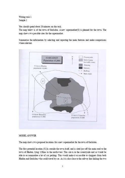
Writing task 1Sample 1Y ou should spend about 20 minutes on this task.The map below is of the town of Garlsdon. A new supermarket(S) is planned for the town. The map shows two possible sites for the supermarket.Summarise the information by selecting and reporting the main features and make comparisons where relevant.MODEL ANSWERThe map shows two proposed locations for a new supermarket for the town of Garlsdon.The first potential location (S1)is outside the town itself, and is sited just off the main road to the town of Hindon, lying 12Kms to the north-west. This site is in the countryside and so would be able to accommodate a lot of car parking. This would make it accessible to shoppers from both Hindon and Garlsdon who could travel by car. As it is also close to the railway line linking the twotowns to Cransdon(25km to the south-east), a potentially large number of shoppers would also be able to travel by train.In contrast, the suggested location, S2, is right in the town centre, which would be good of local residents. Theoretically the store could be accessed by road or rail from the surrounding towns, including Bransdon, but as the central area is a no-traffic zone, cars would be unable to park and access would be difficult.Overall, neither site is appropriate for all the towns, but for customers in Cransdon, Hindon and Garlsdon, the out-of-town site (S1) would probably offer more advantages.Sample 2The table below gives information about the underground railway systems in six cities.Summarise the information by selecting and reporting the main features, and make comparisons where relevant.Underground Railway SystemsMODEL ANSERThe table shows the details regarding the underground railway systems in six cities.London has the oldest underground railway systems among the six cities. It was opened in the year 1863, and it is already 140 years old. Paris is the second oldest, in which it was opened in the year 1900. This was then followed by the opening of the railway systems in Tokyo, Washington DC and Kyoto. Los Angeles has the newest underground railway system, and was only opened in the year 2001. In terms of the size of the railway systems, London, for certain, has the largest underground railway systems. It has 394 kilometers of route in total, which is nearly twice as large as the system in Paris. Kyoto, in contrast, has the smallest system. It only has 11 kilometers ofroute, which is more than 30 times less than that of London.Interestingly, Tokyo, which only has 155 kilometers of route, serves the greatest number of passengers per year, at 1927 millions passengers. The system in Paris has the second greatest number of passengers, at 1191 millions passengers per year. The smallest underground railway system, Kyoto, serves the smallest number of passengers per year as predicted.In conclusion, the underground railway systems in different cities vary a lot in the size of the system, the number of passengers served per year and in the age of the system.Sample 3The graph and table below give information about water use worldwide and water consumption in two different countries.Summarise the information by selecting and reporting the main features, and make comparisons where relevant.MODEL ANSWERThis model has been prepared by an examiner as an example of a very good answer. However, please note that this is just one example out of many possible approaches.The graph shows how the amount of water used worldwide changed between 1900 and 2000.Throughout the century, the largest quantity of water was used for agricultural purposes, and this increased dramatically from about 500 km3 to around 3,000 km3 in the year 2000. Water used in the industrial and domestic sectors also increased, but consumption was minimal until mid-century. From 1950 onwards, industrial uses grew steadily to just over 1,000 km3, while domestic use rose more slowly to only 300 km3oth far below the levels of consumption by agriculture.The table illustrates the differences in agricultural consumption in some areas of the world by contrasting the amount of irrigated land in Brazil (26,500 km3 ) with that in the D.R.C. (100 km3). This means that a huge amount of water is used in agriculture in Brazil, and this is reflected on the figures for water consumption per person: 359 m3 compared with only 8 m3 in the Congo. With a population of 176 million, the figures for Brazil indicate how high agricultural water consumption can be in some countries.Sample 4The table below gives information about changes in modes of travel in England between 1985 and 2000.Summarise the information by selecting and reporting the main features and make comparisons where relevant.A verage distance in miles traveled per person per year, by mode of travelSAMPLE ANSERThis is an answer written by a candidate who achieved a Band 6score. Here is the examiner’scomment:This answer does not introduce the information in the table, nor does it report it accurately. The figures are misinterpreted as representing the number of people rather than the average number of miles traveled per person per year. Consequently the information about the increase in total travel is simply not mentioned, so not all key information is covered. There is an attempt to summarise trends in the figures, but the reader cannot get a clear overall picture of the information because of the fundamental confusionNevertheless, the information is organized and the writing flows quite well because of good use of referencing and other connectors, but there are occasional errors in these and the links between ideas are slightly confusing at times.The strong feature in this answer is the range of vocabulary which is used with some flexibility and good control. A good range of structures is also used, but there are still some fairly basic mistakes, such as in the choice of tense, subject/verb agreement and inappropriate use of the passive.In 2000 the most preferred mode of travel is by car with 4,860 people. There’s a noticeable decrease in public transportation locally where it dropped from 429 people in 1985 to 274 people in 2000. However the long distance bus rides is much more preferred by people as its figures are more than doubled in the last 15 years. People who chose to walk or cycle are decreased slightly in 2000, which probable made people take the train more often. There is a significant increase in the numbers of people who traveled by train. It jumped from 289 in 1985 to 366 in 2000. This makes the train second popular mode of transportation. The biggest leap in the chart is the increase of taxi users who are tripled in 2000 with 42 people where it was only 13 in 1985.Apart from all this modes of travel, there are some more different types of travel as well of course. Number of people choosing different modes of travel is rapidly increased from 450 to 585 in 2000.Sample 5The diagrams below show the life cycle of the silkworm and the stages in the production of silk cloth.Summarise the information by selecting and reporting the main features, and make comparisons where relevant.MODEL ANSWERThis model has been prepared by an examiner as an example of a very good answer. However, please note that this is just one example out of many possible approaches.The first diagram shows that there are four main stages in the life of the silkworm. First of all, eggs are produced by the moth and it takes ten days for each egg to become a silkworm larva that feeds on mulberry leaves. This stage lasts for up to six weeks until the larva produces a cocoon of silk thread around itself. After a period of about three weeks, the adult moths eventually emerge from these cocoons and the life cycle begins again.The cocoons are the raw material used for the production of silk cloth. Once selected, they are boiled in water and the threads can be separated in the unwinding stage. Each thread is between 300 and 900 metres long, which means they can be twisted together, dyed and then used toproduce cloth in the weaving stage.Overall, the diagrams show that the cocoon stage of the silkworm can be used to produce silk cloth through a very simple process.Sample 6The charts below give information about USA marriage and divorce rates between 1970 and 2000, and the marital status of adult Americans in two of the years.Summarise the information by selecting and reporting the main features and make comparisons where relevant.SAMPLE ANSWERThis is an answer written by a candidate who achieved a Band 6.5 score. Here is the examiner’s comment:The task Achievement is the weak point in this answer. Some of the data is summarized but the points are not well-selected to convey the key trends shown in the charts. The main features of the first chart are not adequately presented and the overall conclusion does not summarise the main information. No figures are given to illustrate the points made.The information is well-organised, however, with clear paragraphing and well-signaled sections. The accurate use of a range of sequencers and other linkers makes it easy to follow the writing. There are examples of errors but they are not frequent and do not cause confusion.A range of vocabulary is used with flexibility, in spite of some inappropriate collocations and awkward phrasing. Structures are varied and generally accurate, while any mistakes do not make the message unclear.We are given two charts which show us a few sets of data about the marital status of the Americans between 1970 and 2000.The first chart compares the number of marriages and divorces in the United States of America between 1970 and 2000. We can see that data is given for each decade; the number of people who are getting married decreased slightly since 1980, as well as the divorces one. Nevertheless, divorces increased between 1970 and 1980.The second chart is more precise about the different marital status of the Americans between 1970 and 2000. The number of divorced people has risen more than the double during this two years, and the data for the never married people has also increased significantly. However, less and less people are married, as the first chart showed us; the widowed American number is also decreasing.As a conclusion, we can say that the marital status background of the Americans has maybe known the greatest change it had ever seen.Sample 7The graph below shows the demand for electricity in England during typical days in winter and summer. The pie chart shows how electricity is used in an average English home.Summarise the information by selecting and reporting the main features, and make comparisons where relevant.SAMPLE ANSWERThis is an answer written by a candidate who achieved a Band 6score. Here is the examiner’s comment:This answer focuses too closely on the details in the graph but fails to compare trends or general differences between figures of winter and summer. Some comparisons are made, but these are about details, and it is difficult to get a clear idea of the information from this description.Similarly, information in the pie chart is simply listed using the language from the chart and there is no attempt to relate this to information in the graph.The description is not well organized, although a range of linkers are used, and the use of paragraphs does not reflect the different sections of information covered.There is a suitable range of vocabulary for this task, although some words are misused and there are several spelling errors. The range and control of grammatical structures is the strong point ofthe main part of this response. There are examples of complex structures that are used with accuracy and some flexibility.The use of electricity in England is indispensed with demand for electricity in England during typical days in wither and summer is illustrated in the graph. The use of electricity in an average English home is shown in the pie chart. From the graph, it is generally obvious that the demand is in its maximum around 2100 in winter times, and in its minimum around 400, being almost constant between 1200 and 2100 in winter times. During summer times, on the other hand, the demand reaches its top point around 1300, and the bottom point around 900, being almost constant between 1550 and 2000.In wither times, the curve gradually increases to reach 40,000 units of electricity by 3 o’clock in the morning. This is followed by gradual decline to its lowest limit of 30,000 units at 9 o’clock. A gradual rise is obvious again to reach a stationary level between 3 o'clock and 9 o’clock of about 40,000 units again. Then, there is a sharp rise in the next hour to reach its maximum before collapsing again to a a lower level by the end of the day.In summer time, the curve gradually decrease to reach its lower limit around 9 o’clock of a bit more that 10,000 units. A gradual increase is noticed to reach its top of 20,000 after which a stationary phase is obvious between 3 o’clock and 10 o’clock at night of about 15,000 units.The pie chart, on the other hand, shows that 52.5% of the electricity is used for heating rooms and water. 17.5% is consumed for ovens, kettles and washing machines, 15% is used in lighting, TV and radio, and finally 15% is consumed in the sue of vacuum cleaners, food mixtures and electric tools.。
Task1必备词汇图表chart = graph = diagram直线line 曲线curve 柱bar /column 饼pie 表table = figures = statisticsthe thin(细线) / thick(粗线) / broken(虚线) / dotted(点线) line表明,表示,阐明show , give information about,reveal,indicate,demonstrate直线图类词汇(上升类动词)Increase------------ decrease (下降类动词)go up-------------- go downrise up-------------- fall downclimb-----------------slideascend --------------declinekeep an upward tendency ----keep a downward tendency波动动词类:fluctuatefluctuate upward / downward(波动向上/向下)保持平稳类动词:keep / remain / maintain / stayunchanged / constant / stable(形容词,不变的)修饰动词的副词:slightly 轻微地,slowly 缓慢地,gradually 逐渐地,steadily 稳定地,rapidly 迅速地,significantly 明显地,sharply 明显地,dramatically急剧地,修饰名词的形容词:slight, slow, gradual, steady, rapid, moderate, significant, sharp, dramatic大约,大概,左右类词汇:almost / approximately / around / roughly / more or less / nearly 时间from … to …/during the period/ between … and … / starting from ….曲线图类词汇峰值:peak (v. & n.) summit (v. & n.) highest point(n.)谷值:touch the bottom (v.) nadir (n.) lowest point(n.)稳定时期:constant(adj.)stable(adj.)stationary phase (n.)饼形图类词汇表“占有”的动词:share, occupy ,account for ,be in charge of ,be responsible for 主动be shared by,be occupied by,be in the charge of 被动“百分比”percentage , proportiona small percentage of … (20%)a quarter of …(25%)the minority of … (40%)half of …(50%)the majority of … (60%)three quarters of …(75%)most of … (80%)one-fifth / one-third基本句型:1occupies / accounts for the majority of A (x%).y% of A is shared by / is in the charge of 2.3 and4 are responsible for / in charge of the rest, with z% and w% respectively.倍数的表达方式Double 是两倍/大一倍Increase/decrease three times 增长/减少了三倍five times as much/many/big as…流程图/示意图/地图介绍段:The flow chart / diagram / map illustrates … The whole procedure can be divided into … stages.主体段(一般过渡:时间、顺序、目的)时间:to begin with, next, then, later, finally; at the same time顺序:the first stage involves … / in the second stage / in the third stage / in the last stage 目的:in order to / in order that; so as to / so thatArgumentationReport大作文如何开头S1 (背景)现如今,在当代in the present age today at present nowadaysin current society in contemporary society众所周知It is generally believed that….widely acceptedcommonly acknowledgedIt is popular/common belief that……越来越重要….plays an increasingly key/crucial/essential/important/significant role in……以惊人的速度向前发展…is advancing/developing at an amazing/rapid/accelerated speed in preaent-day society.…越来越流行…is increasing popular in the contemporary world.…彻底改变了我们的生活… has completely changed our lives.(负面背景)…的问题越来越严重The problems of … are becoming increasing severe/serious/worrying.S2 引出话题备用句型But in the meanwhile,… has become a highly debatable issue.But meanwhile, wheather …. is an issue open to debate.S3 转述观点可能会用到some people some some individualsthink believe say argue claimS4 自己的观点可能会用到As far as I am concerned, I am in favor of the former/latter view.Speaking for myself, I think…Personally,….In my view,….第二段/第三段同义词替换:S1 There is no denying that…It is true that…It is obvious that…It is clear that…There is no doubt that…S2 –S5 First , Firstly , To begin withSecond , Secondly , Moreover , Furthermore , BesidesLastly , Finally , More importantlyTherefore ,thus , hence , consequently , as a result , as a consequenceS6,S7 In other word , By the I mean, In fact , As a matter of fact结尾段同义词S1 In summary to sum up In sum From the above analysis In conclusion S2 I am convinved that…I believe….单一主体Most high level jobs in the government are done by men. Some people believe that the government should encourage a certain percentage of these jobs to be reserved for women. To what extent do you agree or disagree?①Today, while more and more women are playing increasingly essential roles in modern society, it has to be noted that most high-level governmental jobs are still within men’s grasp. ②For this reason, some people propose that a certain percentage of such positions should be assigned to women.①From some people’s point of view, the practice may sound reasonable based on the following reasons.②First of all, it is beneficial for the women to bring their talents in certain fields into full play. ③It is widely accepted that women are generally more careful, patient and gifted in certain field like arts compared with their male counterparts and preserving some governmental positions related to such fields for them seems to be a decent idea. ④ Moreover, the move could be regarded as a sign of equality between men and women, which indicates the women’s value has been realized.①While the above reasons seem sounding, the negative side of the practice should never be overlooked. ② Firstly, the packed-schedule of a governmental top position is likely to make women become so busy with their job that their family lives are always neglected. ③ The fact that the majority of female top employees in the US government are either single or divorced serves as a convincing example. ④More importantly, the practice also harms certain capable male candidates’ interests and it is likely to make women to be more dependent on such preferential policies.①To sum up, it does bring benefits to the government if more women participate in certain fields of governmental positions. ②Such benefits, nevertheless, are based on the sacrifice of the women’s family lives and the interests of their male counterparts. ③So I think it is acceptable for the government to encourage women to commit themselves to some high level jobs, but on no account should we reserve them for women purposely. (306 words)双重观点:二选一结构Some people believe that developing countries should concentrate on improving industrial skills. Some people argue that developing countries should promote education first. Discuss the both viewpoints and give your own opinion.*At present, quite a number of developing countries always find themselves caught in a dilemma that whether they should regard the development of industrial skills or the promotion of education as their priority. ③ While it seems that both options have their reasons, I am in favor of the latter one personally.① Apparently, those who advocate the development of industrial skills do have their reasons to a certain extent.② They believe that compared with promoting education, laying stress on industry brings immediate economic return for developing countries more directly. ③The improvement of industrial skills, nevertheless,is simply of short-term interests. ④ Without sufficient talents, how long such economic prosperity could last is quite questionable.①While we have to admit that there is some element of truth in the above argument, the latter opinion, nevertheless, is more convincing to me.②Indeed, education costs a lot instead of bringing immediate economic return. ③The point should not be overlooked is that only by the promotion of education can we ensure the progress of the national strength in the long run. ④ A country that fully concentrates on the improvement of industrial skills, due to the lack of effective education, is likely to suffer from a huge lack of talents who have the ability to propel the society further forward.① From the above analyses, we can see that only by the progress of education can we lay a solid foundation for the long-term development for a developing country. ② For this reason, I believe that it is wiser to develop education first instead of industrial skills. (258 words)双重观点:改良模式Some people think that it is the responsibility of government to ensure that people have healthy lifestyle by taking compulsory measures. Others think people should be given the full freedom to make their lifestyle decisions. Discuss the both viewpoints and give your own opinion. (2008.3.29)② Some people hold that government should hold the full responsibility to make sure that people lead their lives in a healthy way. ③Others, however, argue that it is only the people themselves that can decide which lifestyle they pursue.① On one hand, the proposal sounds reasonable to a certain extent.② If government does take certain compulsory measures, for instance, banning all pubs and internet cafes in cities, it is possible that a number of people, especially teenagers who stay up late for parties or PC games, will have to discard their obsession and revert to a normal lifestyle. ③Nevertheless, it has to be pointed out that although the practice seems to be sounding, it is unlikely to solve the problem thoroughly. ④ For example, even if all the pubs and internet cafes are officially banned, chances are that those young people will still indulge themselves in unhealthy lifestyles playing PC games or throwing parties till midnight at home.①On the other hand, those who call for the freedom to choose their own lifestyles also have a point. ②Indeed, it would be a sign indicating that people’s freedom are fully recognized and respected if a government leaves the decision to people themselves. ③However, it should not be ignored that some young people who do lack self-control are possibly to be fully obsessed with self-indulgent lifestyles if the government virtually does nothing about it. ④ Such excessive freedom would turn out to be nothing but a curse.①From the above analysis, it could be noted that either viewpoint has obvious problems. ②In my opinion, the government needs to play a role in guiding people to live in a healthy way but it is never possible for the government to literally “ensure” that by taking compulsory measures. (292 words)论点可用论证方法1.举例说明For example For instance T ake (Consider)…as an example2.解释说明It means That is to say In other words3.因果论证因:as a result of due to owing to果:as a result as a consequence thus hence therefore4.比较与对比on the contrary in contrast by contrast on the other hand 5.让步与反驳Although while admittedly however nevertheless。


IELTS Task 1范文1.A glance at the graph provided reveals some striking similarities between the Chinese and US birth rates during the period from 1920 to 2000. It is evident that both nations saw considerable fluctuations in fertility, with lows during the 1940s and highs during the 1950s.1920 to15 percent in 1935, China’sThis was followed by a period of exponential growth, with fertility in the countrypercent in 1950.in this figure.The US birth rate, meanwhile, and 13 percentin 1950, followed by a steady fall.It is interesting to note that whileuntil 1950, the gap between the two after this time as fertility in China slid away.2.Given are two figures concerning criminality in Britain. The first provides data on the rates of conviction among men and women of various ages, while the second indicates the gender balance of the UK prison population.the rate of conviction among Britsof both during adolescence the age of about 20. men are far more likely to offend than women.From a negligible 2 percent among 10-year-old boys, the male conviction rateto approximately 20-year-olds. The percentage of0 percent among girls of 10 to some 5 percent for 20-year-olds. The however, see dramatic decreases in criminality among both sexes. A mere 2 percent of crimes are committed by 60-year-old men and 0 percent by women of the same age.As for the proportion of male and female prison inmates, men outnumber women 24 to 1. Some 96 percent of all prisioners are men, while the remainder are female.A glance at the two pie charts provided reveals the relative popularity of various leisure activities among European adults in 1985 and 1995.Of these activities in both years, at 32 percent in 1985 and a slightly lower 30 percent in 1995. Yet, by far the most significant change to take place during this period was the increased popularity of computer games. Not a single respondent to the survey rated playing computer games as their preferred leisure activity in 1985. However, by 1995 this figure stood at 27 percent –the second highest overall. Also more popular in 1995 was talking with friends, at 26 percent compared to 21 percent a decade earlier.In stark contrast, however, all other activities decreased in popularity. Eating out –which was the second most widely enjoyed pastime in 1985,percent of respondents – slipped to a mere 8 percent in 1995. Likewisealso considerable decreases in the popularity ratings of talking withactivities and (as previously mentioned) watching television.4.Given are two figures providing a comparison of internet use in five European countries (namely Switzerland, Germany, France, Spain and the UK) in 1995, 2000 and 2004, as well as the popularity of internet shopping in these countries.It is evident from the information provided that Britain had by far the highest number of internet users in all three years. From 16 million in 1995, the number of British users climbed steadily to 22 million in 2000, before soaring to a staggering 41 million in 2004. Second in terms of internet use was Germany. This country saw a threefold increase during the period in question, from 5 million people in 1995 to 14 million in 2000 and 15 million in 2004. A similar increase took place in France. The two nations with the fewest internet users, meanwhile, were Switzerland and Spain. It is also interesting to note that internet shopping was far more common in the UK than in any other country listed.In fact, the prevalence of internet shopping in Britain was double that of Germany and triple that of Switzerland. France and Spain, meanwhile, had moderate levels of online shopping.A glance at the table provided reveals a number of clear differences between the major metro systems of the world in terms of age, scale and annual carrying capacity.One particularly interesting fact highlighted by the figure is that the more recently established metro systems are considerably shorter than the older ones. Completed in 1863, the London underground is the oldestthe longest, extending for 1100 kilometres.stark contrast, howeverand 2001 respectively– are far shorter. The formerthe latter just 14 kilometre s.With regard to yearly carrying capacity, the metro systems mentioned in the table vary greatly. The Tokyo metro is equipped to carry the largest number of passengers, at 1434 million. With 850 million, meanwhile, the Paris metro has the second largest carrying capacity. The systems with the smallest capacities are those of Kyoto and Washington DC, transporting just 11 million and 70 million people per year respectively.6.Given are two column graphs comparing the rates of secondary and tertiary education among males and females in various different parts of the world.compared with only 20 Asia, meanwhile, have moderate levels of secondary education – between 40 and 50 percent for both sexes.With regard to higher education, the figures are much lower throughout the world. In Europe, some 50 percent of adult females and 45 percent of adult males gain a higher education.Sub-Saharan Africa The figures for Latin America and East Asia are marginally higher thanAlso noteworthy is the fact that receive a secondary education in all regions except East Asia, but less likely to receive a tertiary education in all regions except Europe.。
详解雅思写作Task1常出现的问题对于雅思写作中的T ask1而言,很多考生容易忽视里面出现的问题。
因为字数少,要求又不多,而且通常都是比较描述等。
所以很多考生都不是特别重视,往往导致得分很低。
因为我们通常要求task 1能拿到高分,这样才能有效为你的雅思写作Task1获得高分。
今天店铺就为大家介绍常出现的两大问题。
详解雅思写作Task1常出现的两大问题雅思写作Task1需要注意的主语问题通常我们在Task 1会遇到很多变化类的图表题,例如表格,柱状,饼状图等。
常常需要描述某数据的变化趋势,以及对比哪些不同,发表一下简单的预测等。
我们可以看下面分析:WRITING TASK 1 (剑9 Test 4 Task 1)You should spend about 20 minutes on this task.The graph below gives information from a 2008 report about consumption of energy in the USA since 1980 with projections until 2030.Summaries the information by selecting and reporting the main features, and make comparisons where relevant.Write at least 150 words.通过上述的图表可以得知,Petrol and Oil这条线是能够很轻易的看得出他的变化趋势即整体上升,虽然在一开始这个数据是存在波动的。
于是大多数考生就会写出下面的语句:Petrol and oil increase from 1980 to 2030, despite initial fluctuations.当我们看到这样的语句时,通常喜欢选择正确的谓语动词以及相应的趋势名词来进行描述其变化,但是关键问题是主语在描述数据变化趋势时,广大考生一定要擦亮眼睛,并不是所有的名词都能够作为变化趋势的主语,比如这道题目中上升或者波动的其实并不是汽油和石油,而是它们的消耗量。
雅思13test1writing task 1范文摘要:1.概述图表内容2.分析图表特点和亮点3.对比各项数据变化4.总结图表传达的信息正文:相信很多准备雅思考试的同学都对写作任务1中的图表作文有一定了解。
今天我们就以雅思13test1的写作任务1范文为例,详细分析一下如何应对这类题目。
首先,我们来概述一下图表内容。
图表通常会展示一段时间内某一事物的变化趋势,例如本题中的图表描绘了某城市居民每天花费在户外活动、看电视和上网的时间。
通过对图表的观察,我们可以发现三个时间段(早上、中午、晚上)的数据变化。
其次,分析图表的特点和亮点。
本题的图表采用柱状图形式,清晰地展示了各个时间段内居民活动类型的变化。
从图表中我们可以直观地看到,户外活动在早上和中午时段逐渐增加,而看电视和上网的时间则在减少。
这种变化趋势有助于我们更好地理解居民生活习惯的转变。
接下来,我们对比各项数据变化。
从图表中可以看出,户外活动在早上6点到8点间增长了约15%,而在中午12点到14点间增长了约20%。
相比之下,看电视的时间在这两个时间段内分别减少了约10%和15%,上网时间则减少了约15%和20%。
这些数据变化反映出人们在一天中的生活习惯规律。
最后,总结图表传达的信息。
通过观察这幅图表,我们可以得出以下结论:随着时间推移,某城市居民越来越注重户外活动,而看电视和上网的时间则在逐渐减少。
这可能与人们越来越关注健康生活、减少室内娱乐活动的趋势有关。
当然,这种变化也可能受到其他因素的影响,如政策倡导、环境改善等。
总之,在应对雅思写作任务1的图表作文时,我们要注意观察图表内容、分析数据变化、提炼信息要点,并运用恰当的表达方式使文章更具可读性和实用性。
雅思写作第一部分满分攻略雅思写作第一部分满分攻略TASK 1写作三大步骤(1)审题:找出主要信息点,具体为两个任务:A: 辨别所要写图表的类型,是线状(line ),柱状(bar ),还是饼状(pie)等B: 找图表的主要内容,是人口变化,交通工具,受教育水平,或者是一项工艺的制作流程。
(2)构思:审题是对文章主要内容的一个大概认识,而构思就是对自己认识的进一步深化。
构思的主要任务为:分析图表的主要特征,弄清写作重点并选用适当的分析方法。
图表的主要特征是指其所描述现象或者问题的规律,并找出描述重点,不是图表上所出现的所有信息都要写出来,之后就是分析方法的选择,主要的分析方法有:数据分类,数据比较,平铺直叙法等,具体选哪种,需要根据图表的内容来确定。
(3)写作:写作是对前两个步骤的确认。
考生把自己的想法准确而详细的落实下来。
一般来说,这个部分的写作可以采用三或四段式:1)引言段(用简短的语言来描述图表的主要内容)。
一把来说,写作命题会给出的主要信息,如,The line chart below shows thegrowth of households with personal computers in the U.S.通过这句话,我们可以了解图表的主要信息,“美国每个家庭所拥有计算机量的增长变化。
”在这种情况下,考生可以重现组织一下这个具体,在中间加入一些具体的数字和变化年限等,使得阅卷老师一下就明白图表的主要内容。
引言段通用句式如下:This is a table / chart / (line线状 bar柱状pie饼状)graph whichdemonstrate / illustrate / reveal /depict/privide informationabout.............2)图表具体信息描述段:这个段落主要描写体现图表主要特征或总体变化规律的数据或信息,并用恰当的连接词语,如,on contrast , on theotherhand, however, like wise 等,把文章内容紧密的衔接起来。
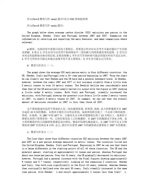
剑11Test3雅思写作task1题目+范文-CO2排放趋势图剑11Test3雅思写作task1题目:The graph below shows average carbon dioxide (CO2) emissions per person in the United Kingdom, Sweden, Italy and Portugal between 1967 and 2007. Summarise the information by selecting and reporting the main features, and make comparisons where relevant.a)解析:包括回答中需要讨论的主要特征、需要进行的对比以及考生可能对题目产生的错误理解。
8要点1.学生应该写出在四个欧洲国家中二氧化碳人均排放量的变化趋势。
2.学生应该对这些趋势做出相应的比较。
8错误理解1.学生在写作的时候可能会用现在时而不是过去时。
2.学生写作时有可能过多地注意细节而不是主要特征。
3.学生有可能忘记写单位。
b) 雅思写作范文(一):The graph shows the average CO2 each person emits in four different countries: the UK, Sweden, Italy and Portugal over a 40- year period beginning in 1967. From the chart we can clearly see that Sweden and the UK have had a general downward trend. In Sweden, however, between the years 1967 and 1977 it did increase slightly from a little over 8 metric tonnes to over 10 metric tonnes. The Swedish decline was considerably more than that of the UK and actually nearly halved its output with the figure in 2007 showing a little under 6 metric tonnes. Both Italy and Portugal, steadily increased the emissions, with Portugal showing the greatest rise from a little under 2 metric tonnes in 1967, to nearly 6 metric tonnes by 2007. In summary, we can see that the overall amount of emissions recorded in 1967 is less than those of 2007.这个图表描述的是四个国家的人均二氧化碳排放量,即英国、瑞典、意大利和葡萄牙从1967年起的40年间的数据。
雅思task1写作模板全文共四篇示例,供读者参考第一篇示例:雅思写作任务1是雅思考试中的第一部分,要求考生根据图表、图形或表格等形式的信息,对相关数据进行描述和比较。
这部分考试主要是考察考生的数据分析和描述能力。
为了帮助考生更好地应对雅思写作任务1,下面提供一份雅思task1写作模板供考生参考。
雅思task1写作模板第一段:引言在第一段,我们需要简要介绍图表的背景信息,如图表内容、数据来源、时间范围等。
同时简要概括图表呈现的数据趋势。
例如:This bar chart illustrates the amount of consumption of three different types of beverages in 2015 and 2020.以上就是一份简单的雅思task1写作模板,希望考生能够根据此模板进行练习和准备,提高自己的写作水平,取得理想的雅思考试成绩。
祝考生们考试顺利!第二篇示例:雅思考试是全球最著名的英语语言考试之一,被广泛认可和应用于全球范围内的教育和职业领域。
雅思写作任务1是两种写作任务之一,要求考生根据给定的图表、数据或图像来描述和解释相关信息。
为了帮助考生更好地应对雅思写作任务1,以下是一个常用的模板供考生参考:第三段:比较要点1. highlight any comparisons or contrasts shown in the graph/picture2. discuss similarities and differences between different categories or groups3. analyze the reasons behind the differences以上是一个典型的雅思写作任务1模板,考生可以根据具体情况在这个模板的基础上进行增减和调整。
在应对雅思写作任务1时,考生应该注意遵循规定的字数要求、清晰明了地描述数据和信息、合理分析数据并提出相关见解。
To sum up/Overall,年份(时间)、万能句型+对象(最大的比例)+ 范围,whereas/while + 对象(最小的比例)。
1.Bar chart:Eg1. To sum up,in 1950,it is significant clearly that foot had the highest percentage in the four modes of transport, whereas cars had the lowest percentage. In 1970, bus was the most popular mode of transport, but foot became the least popular. However, in 1990, while automobiles have become the most popular means of transportation, bike was the least popular.Eg2.To sum up,it is significant clearly that local fixed line calls were still the most popular in 2002, although the gap between the three categories had narrowed considerably over the second half of the period .Eg3:Overall,it is significant clearly that France was the most popular country for UK residents in 1999.Spain had the second largest number of UK visitors in the five countries.Turkey was the least popular country among the five countries.2.Pie graph:Eg1:每个饼图都是同样的类别,结尾如:Overall, it is significant clearly that teachers’ salaries constituted the largest cost to the school during the period from 1981 to 2001, while spending increased dramatically for equipment and insurance by2001, there were corresponding drops in expenditure on things such as books and on other workers’ salaries.EG2:四个饼图中:每2个饼图为一类或一个国家。
雅思小作文 T A S K 1 图表题规律注意事项:1 . Task1 是客观写作,要求客观真实。
2 . 客观性:不应该有任何图里没有而靠自己主观想象加入的成分。
结尾段针对图形做出的总结性结论也应该是根据图表的实际内容做出的符合逻辑的总结。
准确性:图表里面的数据介绍要力求精确,不能抄错数字。
但当一个特征点没有落在一个准确的坐标值上时,允许进行合理的目测或估计一个大概数值。
详尽性:要有层次感,并不需要把所有的数字都推到文章里。
3 . 类型Table 表格题Line Graph 线图Bar Chart 柱状图Pie Chart 饼状图Process Chart 流程图4 . 看图要注意单位,标题和图例。
5 . 对于多数小作文题,题中给出了几个图就对应的写出几个主体段。
题目里只给出一个图,根据图中包含几类图形元素写几个主体段。
图中只给了一个图,但图中所含图形元素很多,则分类。
题目中出现多线多柱多饼,用“对应提取法“,把每组里的对应元素提出来组织主体段。
6 . 时态和发生时间意义对应。
陈述永恒事实的句型,其主句的谓语动词必定用一般现在时。
若题目里没有出现时间,则全文都使用一般现在时。
7 . 结构开头段(1~2句)改写原题主体段1 总体概括具体介绍数字主体段N 总体概括具体介绍数字结尾段(1~2句)介绍总数(若图里并没有明确的给出总数,则省略)结论(根据图里的数据得出有一定合理性的结论)8 . 开头段的改写题目中ShowProportion InformationThe number/amount of FamilyMalesFemaleInfluence改写成illustrate /compare percentagedatathe figure for householdmenwomenaffect/effectCategories kinds/typesSubway system Storeunderground railway/train system shop9 . 介绍数据或描述变化趋势的常用词。
Task One : Aim to include several key features in the description: a paraphrase of the question, a proportion phrase, some comparison, some general and specific statements and a concluding statement.Describing TrendsSales of / Ipod sales / purchase of / consumption of / production of / exports of / imports of / development of / research investment / the quality of / the quantity of / the number of /1.fall / drop / decline steadily / slightly / dramatically / suddenly / noticeably /from almost (nearly) … in January to just … in December2.rise gradually / climb sharply / rise significantly /exponentially/ go up byvarying degrees3.fluctuate wildly / remarkably4.the trend was upward / downward5.fall and then level off / decreased and then level off6.wildly / sharply / dramatically / suddenly / noticeably7.slowly / steadily / gradually / slightly8.were down / up over the year9.The consumption of chocolate fell steadily / there was a steady fall in theconsumption of chocolate10.the former experienced a steady fall in June, but after that …11.a noticeable decrease in /12.the most striking feature of … /13.the graph (chart / diagram / maps) / the three pie charts illustrates /provides information about …/ describes / represents / provides a breakdown of / shows forecasts for / trend for … over a period from 1992 to 1999 / overthe first ten months (分述) / between January and July /, with pie chart indicating … (用于多图表加述) / throughout the period14.there are N basic general trend(s): downward and upward.15.followed by a sudden increase to …in December / income rose steadily,ending the year at approximately (around/about) $130000 / followed closely by the USA16.as regards /17.by contrast / conversely / likewise / similarly18.furthermore / meanwhile19.approximately / an approximate20.in general / overall21.British shares ended the day 1 penny up at 287 pence.22.It is noticeable that …23.… appeal more to… /24.for the arts society, the pattern is reversed. / for students, the patternappears to be slightly (very / considerably) different. / show similar trends / there is a clear trend towards using …/ the percentages of …are very different in each case. / the pattern is the complete reverse when it comes to …25.Membership of the archaeological society stands at 45 for both groups.26.… vary considerablyComparing Information1.More / fewer males than females2.was more popular among males than females3.the most popular form of …4.rank … as the most important /5.as many females as males / not as many females as males select (choose/optfor/pick/vote for)6.has the greatest number ofAdverbs in Comparison7.far / slightly / significantly / considerably / many / substantially / clearlymore / less people than expected / anticipated / predicted8.almost / practically / nearly as many males as females /9.Illiteracy is much less common than in previous generationsComparing and Contrasting1.whereas / but / while / although2.in comparison with…/ compared with…/ fewer females as opposed tomales …3.considerable difference between …in the proportion of / the most strikingdifference in the data was that …4.Women are more / less likely to …The Passive1.The production of a car involves various stages / the diagram show theprocess by which … / the diagram shows how energy is produced from coal / the diagram show the process from packaging to delivery / the life cycle2.first of all / then / after that / at the next stage of the process / following that /in turn / over the years / subsequently / when the cycle is completed, it repeats itself all over again.General and Specific Statements1.the overwhelming (vast / sizeable) majority of …2. a minority of students …3.the figures were 80% and 65% respectively4.the average for all students in the category is a hefty 97 %5.out of this total, 23 % of students …6.almost a third of the corresponding figure for PhD level studentsDescribing Proportions7.three quarters / 75 percent / three out of fouralmost half / nearly half / just under one half / close to one half / 48 percent one third / one in three / 33 percent26 percent / about one in four / just over a quarter8.the vast / overwhelming majoritya massive 85 percent / a hefty 85 percenta tiny minoritya modest twelve percent / a mere twelve percent9.Overall, the proportion of … is very close to …ernment subsidies account for 63 percent of all funding.Describing Changes1.there are dramatic developments / complete transformations / a totalreconstruction of / a total redevelopment of / a rebuilding of old houses / a complete modernization of the entertainment district2.be turned into / be converted into / undergo a total transformation / bereplaced byDescribing Locations1.in / to north of the river / north-west of the lake / beside the railway lineStatements Concluding Data1.It is clear / evident / noticeable / is interesting to note / also noteworthy is thatthe overwhelming major of … are in favor of … / opinions are split almost equally between the three options as regards …2.Overall, just over half of … surveyed …, with …3.To conclude / in conclusion / to sum up, only a small minority of …4.Just under a half are of the opinion that …5.…were named as the most important factors by approximately equalnumber of the remaining tourists in the survey.6.be considerably behind other close trading partnersConcession1.although / nevertheless, / however, / despite accounting for / stillAdverbs1.consistently / constantly / (erratically 不稳定的)under-represented in sciencejobs2.highly paid jobs3.be slightly / considerably behind …4.Sales were marginally up on the previous quarter.5.Income for the arts center was substantially down on the previous year.pletely – partiallyUsing Adverbs to Evaluate Data1.it is interesting that the sales failed to recover2.Numbers will probably continue to…3.Not surprisingly,4.Evidently, …5.Noticeably, the pattern for investment is reverse.6.More importantly, the cost is set to fallMaking Predictions1.it is predicted that / the prediction is that / the number is predicted to …2.it is projected / assumed / forecast / anticipated that3.be projected / expected / forecast to …4.be set to …附: The table provides a detailed breakdown of expenditure by department.NB: Occupy is misrepresented as the similar meaning to Account for.线图:单线图: 描述首尾值,详述期间变化趋势多线图: 先描述首值,分清排序—再看多线中有几个变化趋势,如向下的趋势中有的是快速下,有的是缓慢下,此外在趋势句后面补充尾值. (常有超越现象,请用overtake, fall behind等词.)。
雅思写作之7种作文类型
雅思写作考试包括两个部分,Task1(小作文)和Task2(大作文),用时1个小时。
Task1主要有三种类型:
1.双边讨论型(Discussion):要求讨论一个话题的两个不同观点,并给出个人观点。
2.观点型(Opinion):要求表达个人观点,通常是同意或不同意某个观点。
3.问题及解决措施型(Problem·Solution):要求识别一个问题,并提出解决问题的方法。
Task2 主要有以下几种类型:
1.议论文(Argumentation):通常需要分析一个论点或者一种现象,然后提出自己的看法,并进行论证。
2.说明文(Exposition):需要解释一个概念或者问题,可能是解释一个事件的发生过程或者一个问题的解决方法。
3.对比类(Comparison):需要对两种相似的事物进行比较和分析,比如比较两种不同的教育方式等。
4.原因结果类(Cause and Effect):需要分析一个现象的原因和结果,可能是分析一个问题的原因和解决方法。
以上就是雅思写作的主要题型,考生在备考过程中需要针对不同的题型进行分别准备,以应对考试的需要。
雅思task1写作模板雅思写作Task 1是许多考生感到挑战的部分,因为它要求考生在规定的时间内,对图表、表格或流程图进行分析,并以清晰、连贯的方式呈现出来。
以下是一个雅思Task 1写作模板,旨在帮助考生更好地组织文章结构,提高写作效率。
雅思Task 1写作模板:一、开头段落1.概括介绍:简要描述图表、表格或流程图的主题,说明要分析的内容。
Example: The table below presents data on the population of three countries from 2000 to 2010.2.主题句:明确指出文章要分析的主题。
Example: This report will focus on analyzing the changes in population of these countries over the given period.二、主体段落1.第一段:描述图表/表格/流程图中的第一个数据点或阶段。
a.主题句:指出要分析的数据点或阶段。
Example: The first stage of the process involves ...b.详细描述:对数据点或阶段进行详细描述,包括数据变化、比较等。
Example: In 2000, the population of Country A was 10 million, which accounted for 20% of the total population of the three countries.2.第二段:描述图表/表格/流程图中的第二个数据点或阶段。
a.主题句:指出要分析的数据点或阶段。
b.详细描述:对数据点或阶段进行详细描述,与第一段类似。
3.依次类推,描述其他数据点或阶段。
三、结尾段落1.总结句:总结文章分析的主要结果。
Example: In conclusion, the population of these three countries experienced significant changes from 2000 to 2010.2.指出可能的趋势或关联:如有必要,指出数据之间的趋势或关联。
雅思写作task1范文Task 1 of the IELTS writing exam requires candidates to describe and interpret visual data, such as charts, graphs, tables, and diagrams. This task assesses the test-taker's ability to report and compare data, describe the stages of a process, or explain how something works. In this article, we will provide a sample response for a task 1 question and analyze the key features of a high-scoring answer.The given bar chart presents the percentage of household expenditure on five different categories in a European country in 2016. The categories include housing, food and drink, transport, leisure and education, and finally, other goods and services. It is evident that housing accounted for the largest proportion of household spending, while leisure and education had the lowest share.To begin with, housing was the most significant expenditure for households, comprising approximately 35% of the total budget. This was followed by food and drink, which represented around 20% of the expenditure. Transport and leisure and education accounted for similar proportions, at approximately 15% and 10% respectively. Finally, other goods and services made up the smallest share, at just under 10%.In terms of the key features of a high-scoring response, it is essential to accurately describe the data presented in the visual, as well as make comparisons where relevant. This sample response provides a clear and concise overview of the main trends in the data, including the highest and lowest expenditure categories, as well as the similarities and differences between the other categories. Additionally, the response uses a range of appropriate vocabulary to describe the data, such as "comprising," "represented," and "proportions."Furthermore, the response is well-organized and logically structured, with a clear introduction, body paragraphs, and conclusion. The information is presented in a coherent and cohesive manner, with each paragraph building on the previous one and leading to a logical conclusion. This demonstrates the test-taker's ability to effectively organize and present information in a written format.In conclusion, the sample response provided effectively describes and interprets the visual data presented in the bar chart. It accurately reports the main trends and features of the data, uses a range of appropriate vocabulary, and is well-organized and logically structured. These key features are essential for achieving a high score in task 1 of the IELTS writing exam.。